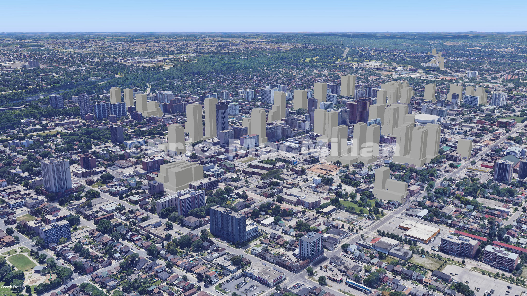
Being somewhat familiar with the area, I think this plan - though better than the first draft - is still lacking.
From the renderings, the buildings look a bit podgy in advance. The four towers are indistinguishable from one another, which will make the views of the thing look lumpen from any distance.
There seems to be very little redeeming about the continuous bricked base. Although as xy3 noted, it's good to see more than just one or two floors of it, making the podium more substantial, I don't see any evidence of delight, esprit, variety nor special detailing in it that might make it truly appealing. The ground-floor retail looks low and unremarkable, the floors above it just a slightly alternating mash of a few types of window/balcony combinations set into an essentially flat wall. That doesn't bode well, and I hope I'm wrong. Otherwise, we might be praying for galloping ivy.
More variety and careful detailing at street level is needed. A few of the towers need to be differentiated from the others, not just by finishes and form, but by height as well.
It is also a huge shame that the former Eaton Centre's clock tower doesn't seem to survive into this incarnation. That should be rectified, as it was one of the few good things about the 'Janet' Jackson Square addition (as my dyke friends used to call it, due to its frills - this
was the '80's, after all).
It was meant to reference the Old City Hall that used to stand on the site, and I thought the clock faces had heritage designation of some sort.
It should be retained.
A pic of mine from a few years back, taken from the Library:
