You are using an out of date browser. It may not display this or other websites correctly.
You should upgrade or use an alternative browser.
You should upgrade or use an alternative browser.
Toronto 700 Bay Street | 94.79m | 32s | KingSett Capital | BDP Quadrangle
- Thread starter Automation Gallery
- Start date
AlbertC
Superstar
Nov 28, 2020
Red Mars
Senior Member
Jul 13, 2021
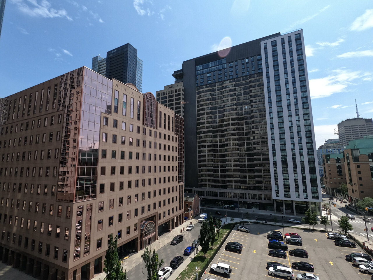
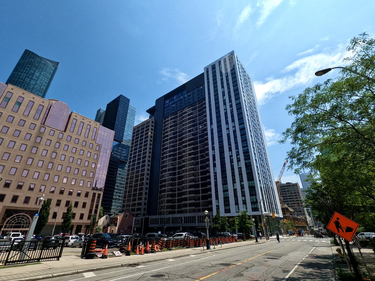
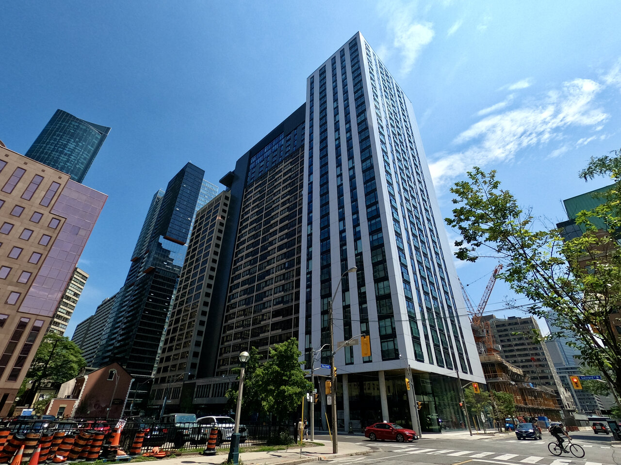
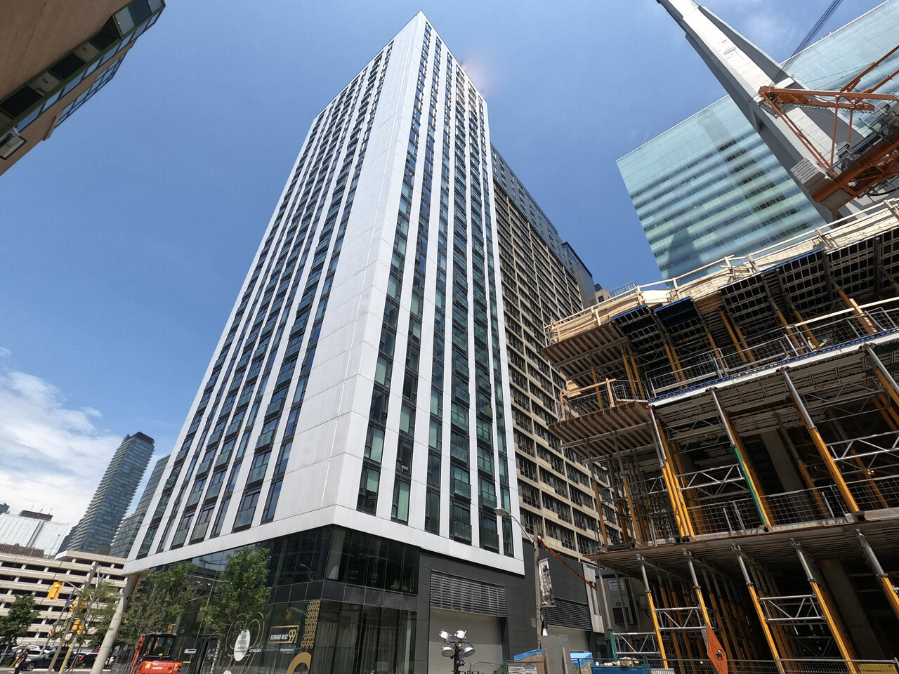
Last edited:
Amare
Senior Member
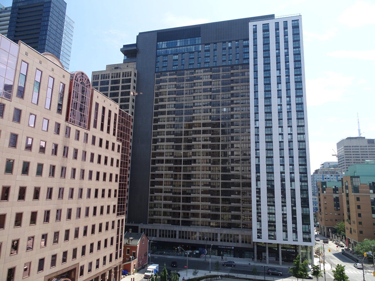
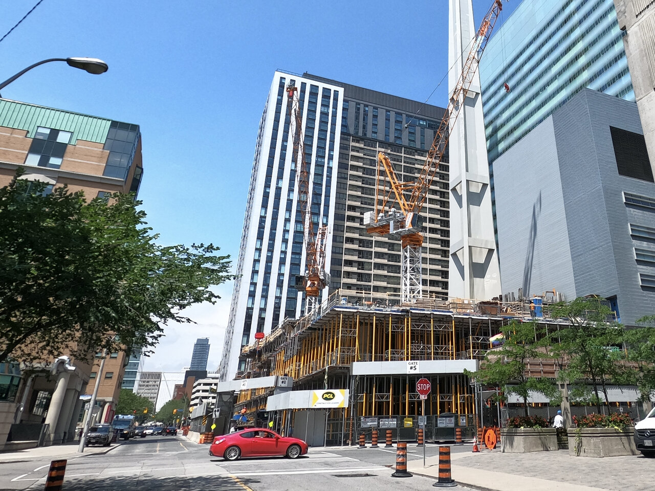
^This thing is an embarassment in every way, shape, and form possible. It makes the Simpson Tower re-clad shine somehow, and that's virtually impossible to do.
UtakataNoAnnex
Superstar
From brutalist to brutal. And not in a good way. /sigh
Lachlan Holmes
Active Member
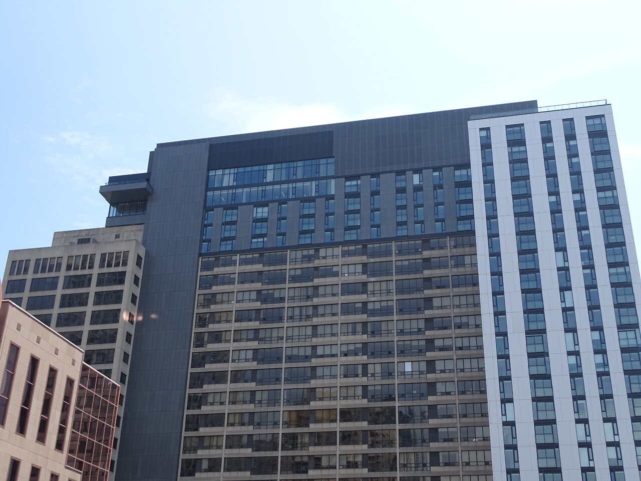
The four (but more like seven) storey addition on the slab tower really looks gross. I can't say that I really see how it's a better result than the original proposed point tower addition...
TossYourJacket
Senior Member
Ugh. It's not that hard to imagine something where they add the west tower, reclad the original residential units (if necessary) while adding a matching vertical extension, and we end up with something that adds additional space, updates the building look, and respects what was already there. Instead we get what looks like 4 buildings eating each other. Just such a complete failure on all counts.
dusk
Active Member
This building is comically bad. First year architecture students should be taken to a tour of the building and told "don't do this".
AlvinofDiaspar
Moderator
Took a perfectly coherent building and turned it into straight up barf.
Or take them on the tour and told "this might be your future".
AoD
This building is comically bad. First year architecture students should be taken to a tour of the building and told "don't do this".
Or take them on the tour and told "this might be your future".
AoD
ProjectEnd
Superstar
It's a shame it turned out less than spectacularly, because this was an *extremely* difficult project at every stage.
A Torontonian Now
Senior Member
I have an odd soft spot for this. It's a monster that does not pretend to be anything but. The original already looked cobbled-together, this just adds another layer of incoherence.
christiesplits
Senior Member
I have an odd soft spot for this. It's a monster that does not pretend to be anything but. The original already looked cobbled-together, this just adds another layer of incoherence.
Agreed. Bad or not, I don't think it belongs in the same category as the Simpson Tower reclad.
AlvinofDiaspar
Moderator
Agreed. Bad or not, I don't think it belongs in the same category as the Simpson Tower reclad.
Personally I thought it looked even worse simply because it wasn't a complete reclad of the entire structure. It looks incredibly messy and interrupts the rhythm of the original building (like that vertical strip of black cladding that just chewed through everything and sticks out visually - topped by an addition that made no attempt to complement the original slab). Definitely one of the most aesthetically wanting addition in this town.
AoD
Last edited:
AlbertC
Superstar
99 Gerrard | BDP Quadrangle
Quadrangle Architects Limited is among Canada’s most dynamic architectural firms with a diversified client list that includes major players in the media, residential, commercial and hospitality industry.