Toronto 550 Wellington West and 1 Hotel | ?m | 15s | Freed | a—A

I give it an A+ as well. Along the north side there are a lot of balconies. Should get pretty loud during the warmer months.
 
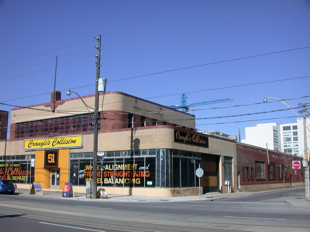
Crangle's revisited. Fairly true to the original facade.


From post #18 by cabeman:

550WellingtonW1.jpg


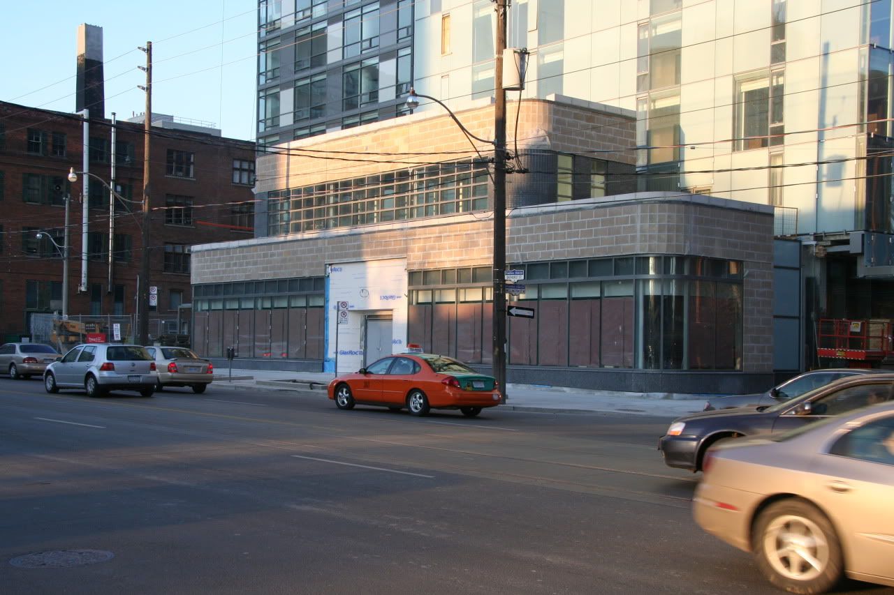
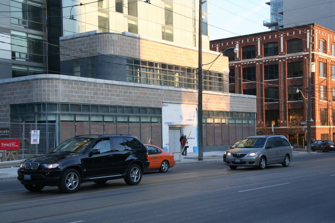
Today by me:

IMG_4092.jpg


IMG_4095.jpg
 
I like it. From afar it looks strange with the new building behind it, but we don't built architecture to look good from afar (unless it's a highrise I suppose).

It will be great for the pedestrian experience. I wish they could've used all the original materials but... I actually more and more agree with the concept of facadism. It is only natural to feel that mimicking the old facade is a good exercise when the original one cannot be incorporated or salvaged. It's the next best thing.
 
The grouting looks like it was done by a DIY "home" handyman.
 
It looks a bit awkward - but you do have to give them credit for not cheaping out - like the curved glass panels at the corners for instance.

AoD
 
I bet they will take this further whether it was their initial intent or not because it looks hideous at the moment and Thompson will not stand for it as is.
 
When I went by this site on the weekend, it made me cringe. But I hope that when it is complete it might look like something - certainly, the rest of the building is classy so I can't imagine we are seeing anything like the finished product.
 
And the last time I checked (not that I ever have), it was impossible to officially confer a higher mark than an A+. Those who believe that this building is worthy of such a grade failed to specify that there existed such a 10% 'grey zone' and in lieu of such information, inferred that it was, essentially, perfect.
 

Back
Top