cdr108
Senior Member

Wow, I must be out of it.
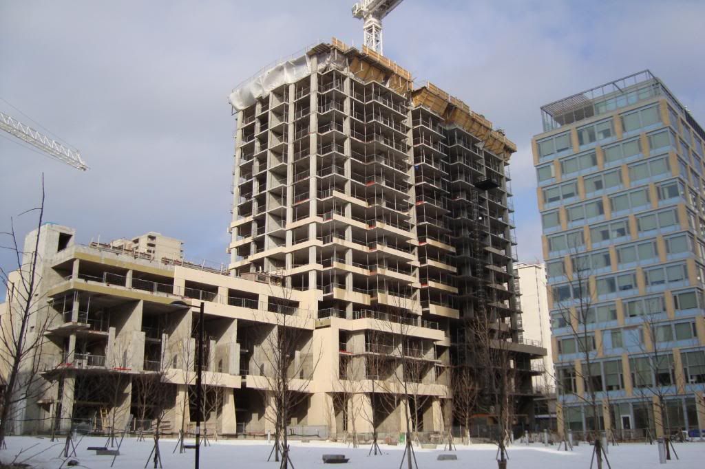
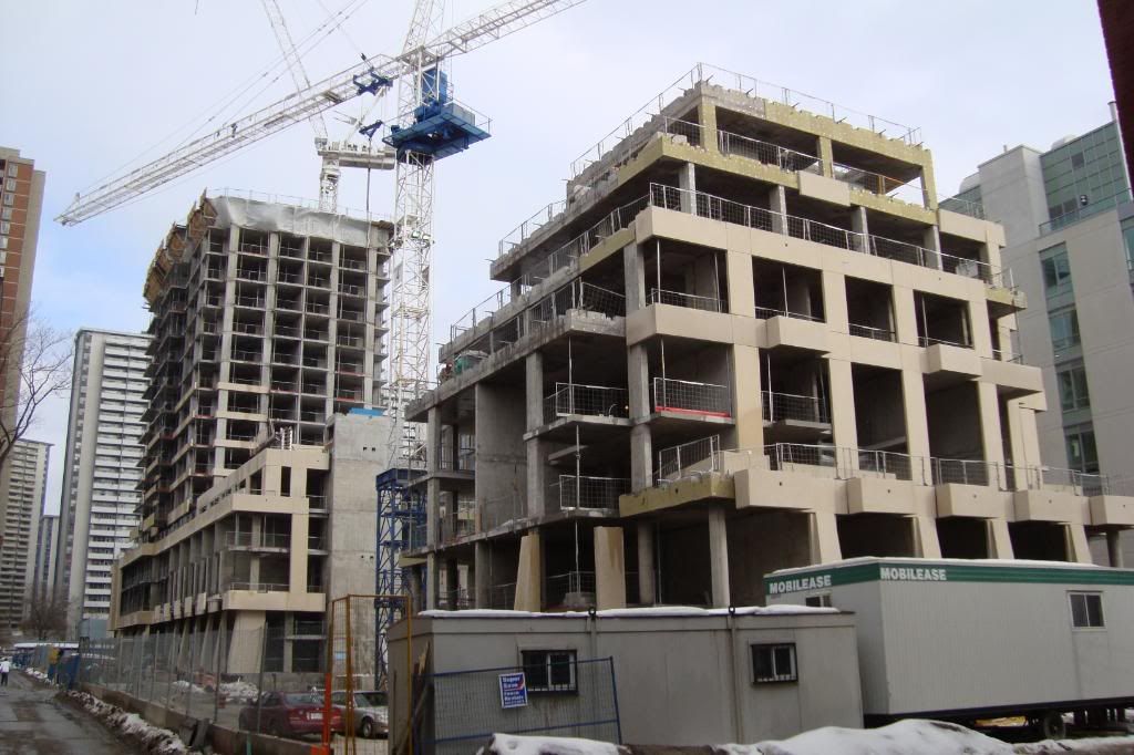
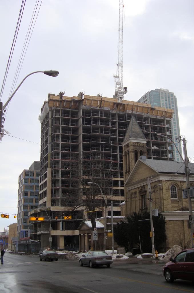
When did this project change to 2 towers?
I recall at the beginning of sales the shorter tower on the right was proposed as a series of stacked townhouses.


It looks so weird how they're separated somehow, idk, this rendering is somehow wrong.

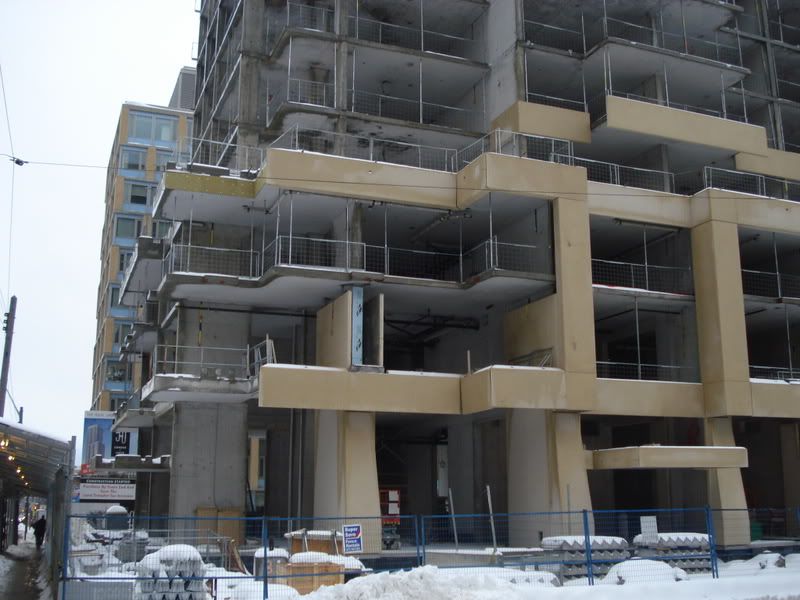
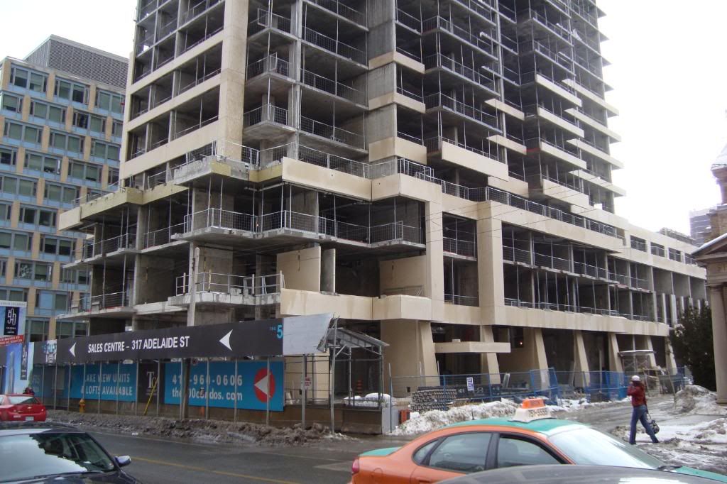

The colour of the precast is a lot darker then in the renderings.
Which is pissing this future owner off. The colour was supposed to be the same as the precast on the Verve (a light gray). This is 70's beige.
Some segments are crooked and have gaps. I complained to the sales team, and they seemed to think that the crew will plaster the bad spots....