Toronto 415 Yonge | 231m | 66s | Marwest | Kirkor Architects

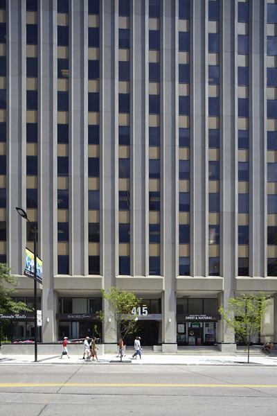
I like the strong lines of the facade, at street level it should still dominate even with the glass intrusion.
MG_6547.png

(http://www.artisreit.com/office/415-yonge-street/)
 
Also doesn’t help that it is rendered on a still image taken from Google Earth. But that’s also good thing, showing that this is still in it’s very early design stages. Details will likely be ironed out in future revisions, I don’t see the lower facade staying.
Why? It's a rental, no need for fancy marketing
 
a render costs about a grand to produce from my understanding. likely around 0.0003% of this project's budget. There will almost certainly be one produced at some point.
 
Hopefully whatever eventually gets built is a far cry from that irregular glass mass squatting awkwardly over the original building. It looks great up top, but where the two meld together it's ridiculous.
 
There are some pretty significant issues with the ground floor layout including access to the residential lobby, vertical circulation and egress widths that need to be dealt with. Yes the rendering appears as if the glass tower is coming down to grade on the east side but the elevations appear to be more detailed in maintaining the glass box above the line of the existing building. They did forget to turn on their finish legend notes on the partial elevations in order to tell what that new scissor stair on the south east corner is clad in.
 
My god, the stupidity. It's not April 1, or anything like, either. I think a reality check must be applied. This proposal is stupid, stupid, stupid.
 
The glass tower looks good, with that office building as a base.....it's bipolar.

I agree just take down the existing building and build a nice all glass beauty.
 
This is what we have been waiting for??? Yikes! First time seeing the render. That’s just.. it’s that it... k ya NOPE! Ennn try again.

It ruins the look here with Aura and hopefully soon to be YSL. Not to mention the possible Chelsey Towers. Allof them similar heights together just won’t look good at all. Not a place for that kind of Shanghai like look.

Nice tower design I’ll say...not for here. To flat like a huge wall. From ground it just be over massive looking. Not in a good way with this odd angles.

With the rest of you on ridding the old tower. All together. This just looks extremely like something out of a bad google earth crop.
 
Last edited:
They might as well just demolish 415 and start from scratch. Any addition to it would look horrid no matter what the design is.

Such a tall addition to this building does not look to be inexpensive. I wonder how much money the developer is saving compared to completely starting from scratch.

In any case, I don't like this proposal. The addition is awkwardly "plopped" onto the tower, and it looks mismatched. No deference was payed to the original design of the building at all.
 

Back
Top