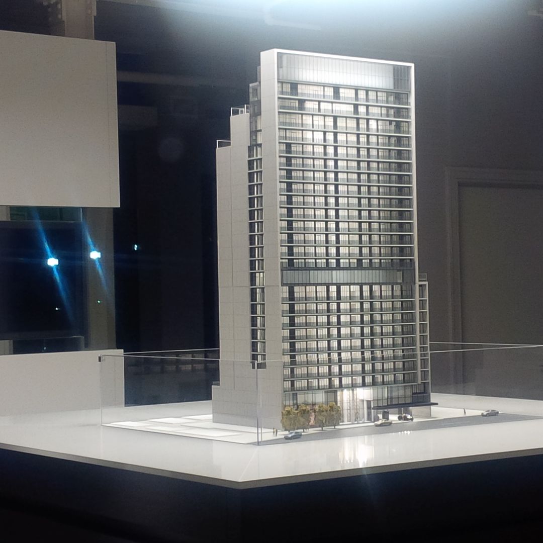
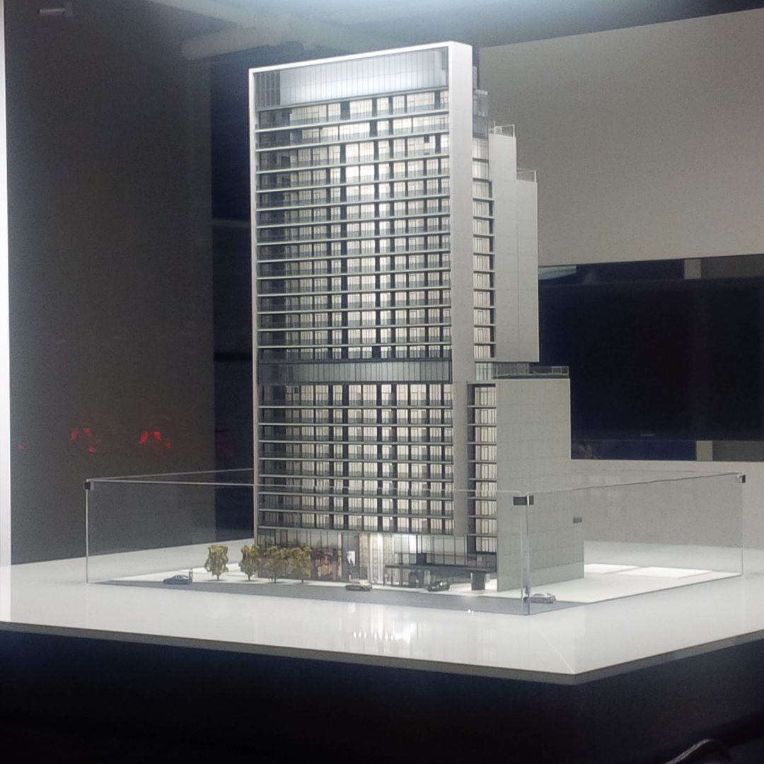
Toronto 330 Richmond | 93.57m | 27s | Greenpark | Core Architects

i dont know, its a shame that such an ugly bldg. will rise right side by side to Picasso

I definitely agree with you on this one. It looks very ugly next to Picasso.

On the East side, it has Picasso; South side, it has Tableau, and West side, it has QRC West. Basically, the units will be blocked to some extent on three sides, except North.

Picasso, Tableau and QRC West fit very well. Look like three elegant ladies, each with its own character.

Now, this ignominious broad one has to spoil the party. Can you imagine looking at this condo block from Queen Street ?
 
What's wrong with this building? It looks pretty nice to me, and much better than average.
 
What's wrong with this building? It looks pretty nice to me, and much better than average.

I agree, it adds variety of styles so that each building is distinctive. I'd hate to see a city designed in such a way where each building built, has to play off it's neighbours design....that would be boring!
 
Pics taken Oct 1, 2015


0pMVitv.jpg


GXymfsZ.jpg


69vlWDI.jpg
 
If you peek in through the windows they have a promo video that plays on a loop. Claims this will be an icon. Video shows basically the same design as the more recent renders. Looks ok. Seems like the top might be a light feature. It's hard to tell... But the strip across the top appears illuminated.
 
peeked through sales office window and notice the Scaled Model ... sure doesn't look like any icon :(

 
I agree not an icon by any means. But it will help make richmonds street wall even more impressive. I like that their are no set backs from the street.
 
I think this design is a lot better then any other box condo design we've been getting over the past 10 yrs (ie: Maple Leaf Square box style, Casa box style, etc...). It's a nice change from the typical designs we tend to see.
 

Back
Top