Front page story up
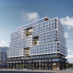
here. I have to say that I really like how the upper storeys are handled here. Alternating two fenestration styles in three levels of interlocking boxes that slow step back as the building rises, and interrupting them with the landscaped alcoves, really articulates a large building very well. I also like the Space Age 60s vibe here too; there's both some flair/vibrancy and some restraint/discipline with this one: it feels very well thought out. In the ground realm, I am glad they have masonry piers coming down to the sidewalk at regular intervals, but I'm not so sure it's cured the too-much-uninterrupted-glass syndrome that now faces redeveloped Toronto. The all-glass recessed third floor where the amenities are housed though, works very well to separate the two sections. My only hope is that this design is not killed by mullions when it's realized: this will depend upon the frames working as shown in the rendering, and not being lost in a maze of mullions. So, while some differences with the final product are inevitable, and I do not believe the final product can look quite this good, I am hoping for minimal Cheapening™. We will see how it goes.
42