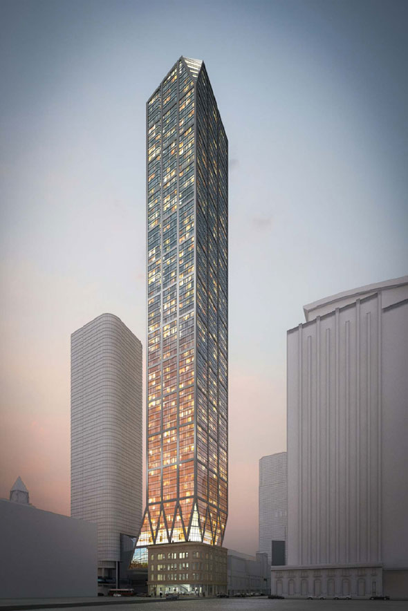
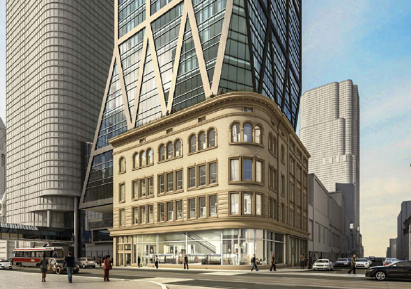
Toronto 2 Queen West | 34.44m | 7s | Cadillac Fairview | Zeidler

Well, it always looked more or less like it does now; so, that means, budget PoMo. ("Budget" as in "economy level", rather than "sleazy hackwork".)

In a way, as "miraculous" resurrections go, 2 Queen might be seen as the Dineen Building of the 1980s.
 
I am curious as to why only a partial restoration of the facade was done. Was the rest of the original facade too far gone to be restored, so it was decided to keep it covered? Would that mean that a full restoration of the facade would actually be a reconstruction of the old design, using mostly new materials?
 
Ah yes Zeidler! Got confused given the circumstances. But yes what I said about the design still stands. Very interesting base and the windows/balconies had a great arrangement.
 
I am curious as to why only a partial restoration of the facade was done. Was the rest of the original facade too far gone to be restored, so it was decided to keep it covered? Would that mean that a full restoration of the facade would actually be a reconstruction of the old design, using mostly new materials?

Probably partly "too far gone", and partly working on a low budget that precluded full restoration.

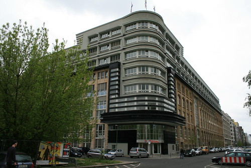
In a way, the end result turned out like an inverse version of Erich Mendelsohn's Mossehaus

2449449940_32d2a6615f.jpg
 
I saw this project ... the first few floors are interesting (reminiscent of Hearst Tower in NYC) , but the rest of the project was dark and scary.... had an evil headquarters feel to it.
 
Ahhh perfect, just what we need in our discombobulated assortment of sparatically built towers, the Legion of Doom headquarters! Lol! (Rolling eyes!). For the love of god, please, I beg them, design a tower with some flare, make it a super tall, and don't screw with the proposal until we're left with a mere shadow of what the original design intended (can you tell I'm getting fed up with city council, none of whom have a background in architecture, but all seem to be experts, especially in the evil art of shadowing, I mean, god forbid that a skyscraper in the downtown core cast a shadow, until they invent transparent concrete and steel, I think they may reconsider their seemingly ridiculous reason to deny building a really great tower).
 
Which really great tower? Have there been renderings of this released? I haven't seen any. It seems to me that you're blaming the City for something that is, at least in some cases, a legitimate concern and all before we've seen the proposal. But I suppose what it looks like, how it meets the street at this very important intersection, and yes if it'll cast shadows on NPS, are of no importance if this is "supetall". Thank goodness for the fine folks over at City Hall!
 
none of whom have a background in architecture

Council really has no say on the look so why should they have a background in architecture. Blame the developers if you don't like the look as they are the ones making the decisions.
 
This thing's literally on top of Queen Station. Why drive anywhere? If you need a car on short notice, a handful of zipcars docked in the Eaton Centre parkade should be more than enough.
 
Looks sharp, although it's funny how the rendering makes the area look so soft! Who ya foolin Cadillac Fairview?

Back to topic, I think this development should help out the Queen Street entrance to the Eaton Centre as well. It's been looking pretty broken as of late, it'd be nice to see some money be put into that corner.
 
Last edited:

Back
Top