xy3
Active Member
If this application is rejected, or DRP requests somthing "more contemporary" like they did with 88 Scott, I'll be livid.
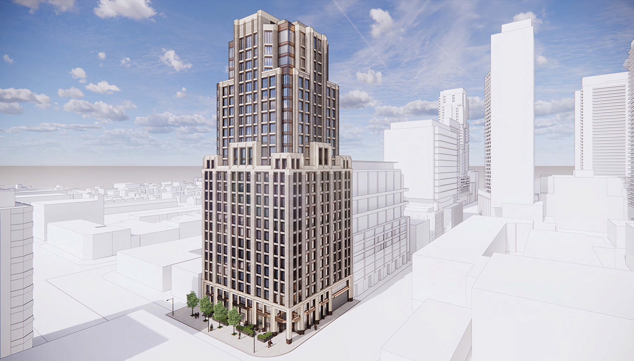
There's no arcade, just a notched corner at Richmond for a grander commercial entrance.Love everything but find the giant planters (and possibly an arcade?) a horrendous choice for Spadina frontage. Keep the fine grain retail, somehow please.
eta: it appears there is patio space along spadina. Still doesn’t explain the arcade to me.

A few businesses occupy the redevelopment site, and the two owners we spoke to are showing a mix of reactions learning that the building is now on the chopping block.
Pasquale Belsito of Fusaro's Italian Kitchen tells blogTO, "we were informed of the intentions to redevelop the building when Hullmark introduced themselves to us. No timetable was given to us but it was assumed that it wouldn't be for a couple of years."
Despite the potential disruption to his business, Belsito says the restaurant is "excited about the changes," stating that though their lease is up in two years, they have been offered future retail opportunities by the property owner. "Hullmark has been really good to us from the day they took over the building."
In stark contrast to Fusaro's statement, another tenant within the same building who wishes to remain anonymous tells blogTO that they had heard nothing of redevelopment plans prior to being approached for comment.
"We were aware that the building had been bought out by Hullmark. We also assumed that there would be some development in the future however we were completely unaware that a proposal had been submitted for a new development already. We were shocked to find this information out."
The two other businesses in the building could not be reached for comment. Hullmark Developments was also approached for comment, but the company has yet to respond.
I appreciate the update/correction!There's no arcade, just a notched corner at Richmond for a grander commercial entrance.
42
I read that as Porno-deco. >.<Pomo-deco?

Whoa, ok, there's a lot going on here. I'd call this proposal a 21st-century postmodern reinterpretation of Art Deco, which was itself unabashedly modern and not intended to invoke tradition during the brief time it was in vogue. Art Deco became fashionable after Art Nouveau lost its novelty, and Art Nouveau itself was known as the Modern Style when it was popular. Architecture has been following trends and pursuing novelty for hundreds of years -- this is in no way a 20th-century phenomenon. And let's not forget 80s and 90s PoMo, which was all about the references to historic styles. I like this proposal and think the architecture is interesting, but let's not pretend that this design represents a rejection of modernity and a return to "tradition", whatever that might mean.Architecture followed remarkably consistent principles for thousands of years that were pretty much all thrown out in the mid 20th century for no good reason. Architects largely look down on what they misguidedly consider outdated and now favour novelty above all else
Whoa, ok, there's a lot going on here. I'd call this proposal a 21st-century postmodern reinterpretation of Art Deco, which was itself unabashedly modern and not intended to invoke tradition during the brief time it was in vogue. Art Deco became fashionable after Art Nouveau lost its novelty, and Art Nouveau itself was known as the Modern Style when it was popular. Architecture has been following trends and pursuing novelty for hundreds of years -- this is in no way a 20th-century phenomenon. And let's not forget 80s and 90s PoMo, which was all about the references to historic styles. I like this proposal and think the architecture is interesting, but let's not pretend that this design represents a rejection of modernity and a return to "tradition", whatever that might mean.