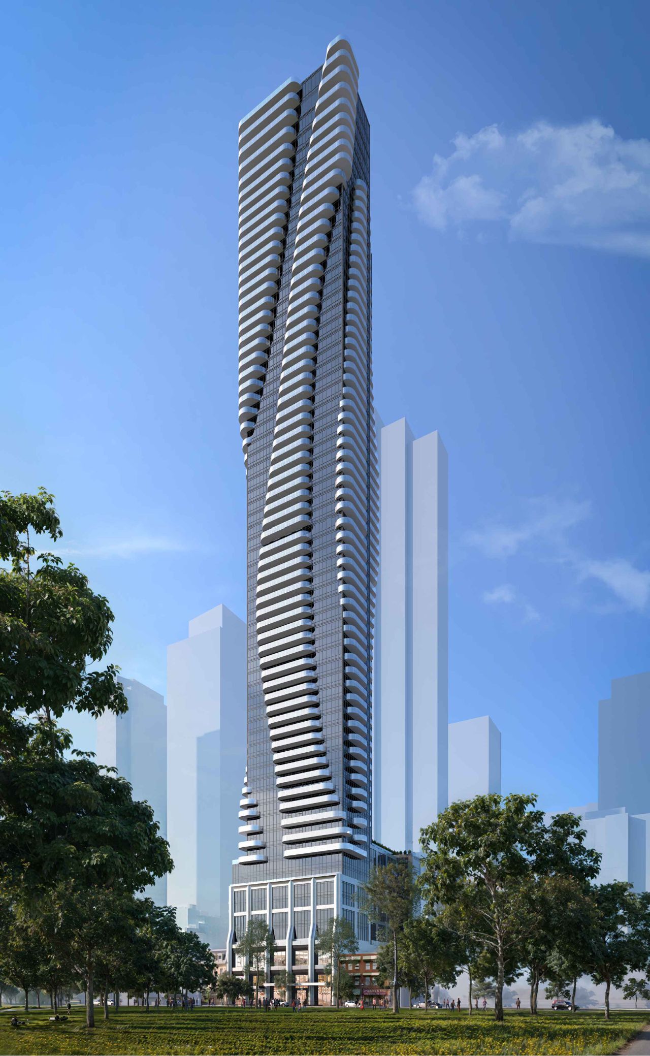
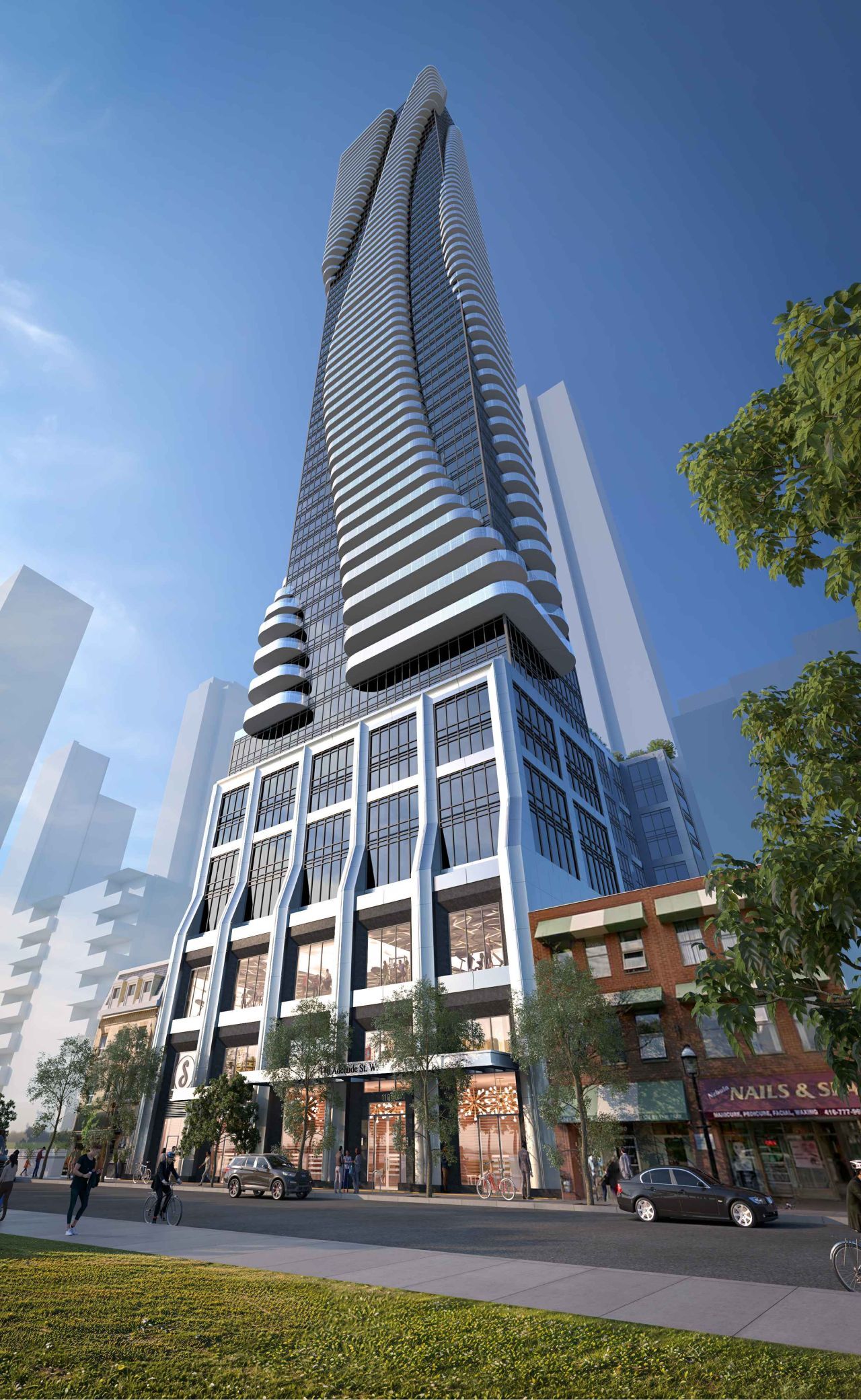
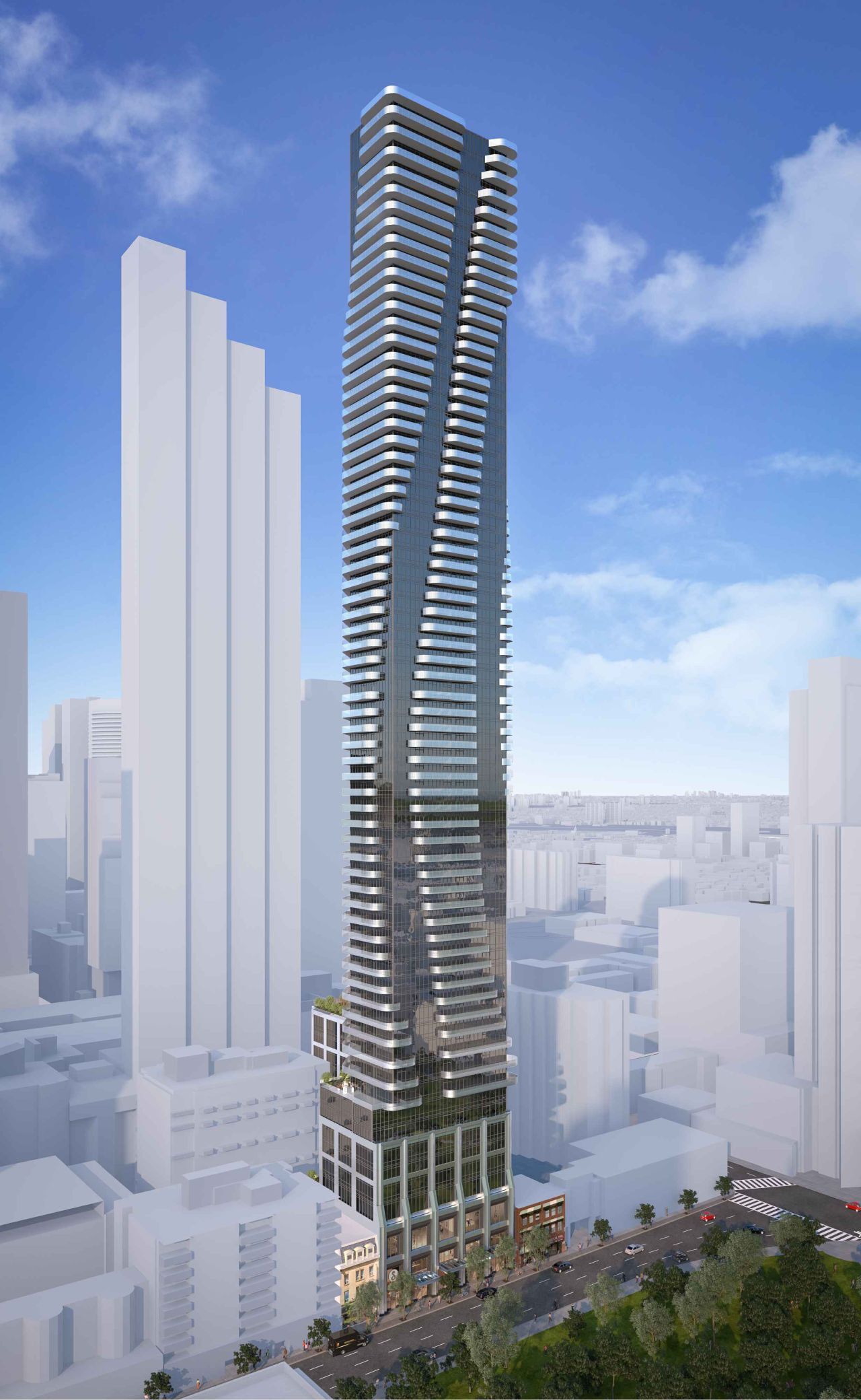
I completely forgot to write up the DRP's encounter w/this proposal. Here we go:
From this recording:
Ok.....everyone....hold your laughter............when the proponent team was presenting........they showed this image of the podium:
The comment was then the horizontal cant was suggested to resemble or pay homage to the mansard roof adjacent.
While the vertical columns were said to resemble the buttresses on St. James Cathedral.

Ok, once everyone has picked themselves up off the floor, we'll go on.
There is some commitment to sustainability, geothermal is contemplated, but the cladding will be very inefficient.
****
In questioning one thing that comes up is the ground level of retail isn't very functional, its semi-integrated to the lobby and would have an elevator and probable stairs to second floor in retail.
Also some questioning about the pedestrian clearway ending up on private property, probably secured via easement and on materiality (just clarifying).
****
Discussion:
- Don't see design as particularly engaging for pedestrians - Too much grade-level glazing.
- Facade on Adelaide has problematic relationship to St. James Park, too imposing, too tall, reads as interrupting the streetwall, materiality doesn't fit well with adjacent buildings.
- Architectural expression quite aggressive in materials and massing.
- Development needs to give more to the neighbourhood given the ask.
- Energy efficiency is too poor, reconsider cladding system.
- Architectural over-scaled, no regard for adjacent datum or materiality.
- Suggest a block-long elevation study. Look at breaking down the scale with smaller elements. Would encourage use of more noble materials, particularly brick.
- Tower gives appearance of being top heavy, need to consider tapering as building gets taller.
- Level of concern over setbacks has risen since previous application.
- Very high FSI for this location (just over 28).
- Consider moving columns visible from Adelaide to the interior of the building.
- Architecture should be more considerate of St. James Cathedral and less of a distraction from it.
- Sum-up by panel chair (Meg) (she has an opinion, and she's letting it show, LOL)
The expression of the architecture is aggressive and unrelated to the context.
The materials exacerbate and amplify the disconnect of the building massing and design from the neighbourhood.
The vertical elements of the column do not recall or align with the buttresses of St. James or the local mansard roofs.
In summary/essence
a different architectural expression is required.
Additionally, building expression is over-scaled.
Setbacks associated with previous proposal are no longer sufficient.
Public realm not engaging requires thorough redesign.
Panel unanimously votes non-support.


