Toronto 100 Yorkville at Bellair | 61.57m | 16s | Invar Building | Hariri Pontarini

I know I'll catch crap from some of you for saying this, but......I think the condo towers are mundane...I thought that when I lived in Yorkville and the pics appeared showing what was going in....boring/generic.....I have to admit that I like the Diesel store....and I don't know what the problem people have with the Teatro Verde store is....I like it and I don't mind the signage that much.....as for the townhouses....they'll age with acid rain and fit right in with the historical buildings across the street....they're fine.
 
I agree quite closely with the previous comment. I think the scale and massing and mixed use / retail along the Yorkville frontage is really well done. The proportion of the condo towers is very good, though the style is quite bland. But I have to say the design and detail of work on the townhouses is amazing to me and is the highlight of this project.
 
The form is fantastic. But the teal still looks terrible next to the pink precast.

From Panorama:

3826974026_cb56ae1361.jpg
 
City Planning Final Report

This puts an END to the townhouse portion of 100 Yorkville ... the final Draft Plan of Condominium application will leadsto condominium registration :)

For consideration by Toronto and East York Community Council on Sept 15/09:

The application proposes to create a common elements condominium consisting of a ramp, drive aisle and 6 underground parking spaces for the six townhouses located on lands municipally known as 76, 88R, 92 Yorkville Avenue 98, 109, 115, 119 and 121R Scollard St.

This report reviews and recommends approval of the Draft Plan of Common Elements Condominium, subject to conditions.

http://www.toronto.ca/legdocs/mmis/2009/te/bgrd/backgroundfile-21947.pdf
 
Condo Critic: Yorkville rich with everything but substance

March 6, 2010
Christopher Hume
Source here


No one ever accused Yorkville of good taste. Ever since it became boutique central in the '70s, the Village has been the best place in Toronto if you're looking for a $10,000 bomber jacket.

Architecturally speaking, however, Yorkville long ago lost much of the 19th-century charm that made it so appealing. Though Hazelton St. remains basically intact, Yorkville, Cumberland and Scollard streets have been remade into something more contemporary and generic.

The most recent wave of development – the new condo towers around Bay – could well be most remarkable yet, but for all the wrong reasons. What we have here is a kitsch contest between developers and their architects, each trying to outdo the other by designing and constructing the gaudiest tower. These are the kind of buildings that remind us why less really is more.

Still, looking at some of the stuff that appeared during the 1970s and '80s – try 101 Yorkville – even 21st-century kitsch is preferable. Through it all, however, the neighbourhood has retained a sense of its own identity; it has changed over the years but Yorkville remains a destination, probably more popular than ever.

The advent of Cumberland Park in 1993 marked a turning point of sorts. This highly engaging urban facility – complete with a piece of the Canadian Shield – is a civic highlight, more enjoyable even than the shopping for which Yorkville has grown famous.

On the other hand, although a number of art galleries can still be found in the Village, the creative energy has moved onto other parts of the city.

Condo Critic

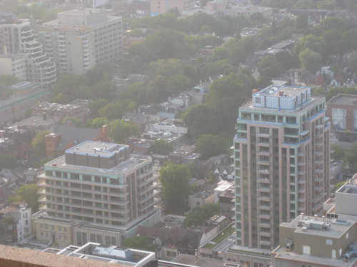
100 YORKVILLE AT BELLAIR: When word of this development first got around, the reaction was unanimous – everybody from Jane Jacobs on down hated it. It was too tall, they charged, and incompatible with Yorkville's Victorian character. Such feelings aren't hard to understand but the reality is a bit more complicated. For a start, let's not forget that much of the land on which the complex sits was a parking lot. In many respects, the scheme gives more to the area than it takes. As an infill project, it brings density to the city core, which makes more sense than ever. The two "towers," eight and 17 storeys tall, are set back from the street and do not loom over the neighbourhood as critics feared it would. Sitting on the north side of Yorkville, the condo incorporates the facade of the old Mount Sinai Hospital and a couple of new stone-clad storefronts that add a much-needed note of elegance to this surprisingly shabby stretch. The complex is punctuated with pathways.

Curiously, the weak points are the two main structures. Given expectations, both seem just a little too ordinary for their own good. The green glass doesn't help, and neither do the precast concrete exteriors. On the other hand, the designers have not overlooked the details. They have incorporated some lovely materials, most notably limestone.

It's too bad the buildings themselves are so slab-like in their massing and that the townhouses on the north side of the site aspire to an ersatz historicism. That having been said, not only did 100 Yorkville not destroy the neighbourhood, it may be the first mixed-use development in the area that accepts the complexities and contradictions of the city. For that we should be thankful.

GRADE: B+

WHAT DO YOU THINK? Email: condocritic@thestar.ca.
 
The towers are hideous and dated and their proportions awful, yes-- (see above aerial shot)-- but they add pedestrian walkways through and behind and that, to me, is what Yorkville is all about.

I also have a bit of a soft spot for the taller tower because it forms a nice view terminus down Bellair from Bloor.
 
^Don't forget the copper coatings applied here and there.


I'm also fine with the taller tower, but the lower tower does something nasty to the whole block.
 
absolutely love the entire development! theyve made very good use of the site... there's a very lively feeling to it in the photos above!
 
the thing that really bothers me the most is the powder-green coloured spandrel colour on this project ~
 
the thing that really bothers me the most is the powder-green coloured spandrel colour on this project ~

yeah, at first sight, it doesn't fit or work with the surroundings... but the more you look at it... it still doesn't really work. i guess you have to be eccentric to like this, an acquired taste like eating durian??
 
I walked by this development yesterday, and strangely enough didn't mind it at all. The colours look better in person, though I would've appreciated something bolder and less pastel. Because of the density and mishmash of buildings here already, I found that they don't really stand out too much but rather fit in. Like SP!RE mentioned, the walkways and general pedestrian friendliness made it decent at ground level, and I didn't feel as if the Victorian character was impeded upon.

Those townhouses are vulgar though. I just don't understand why people with the money to buy here are so hung up on historicist pastiche.
 

Back
Top