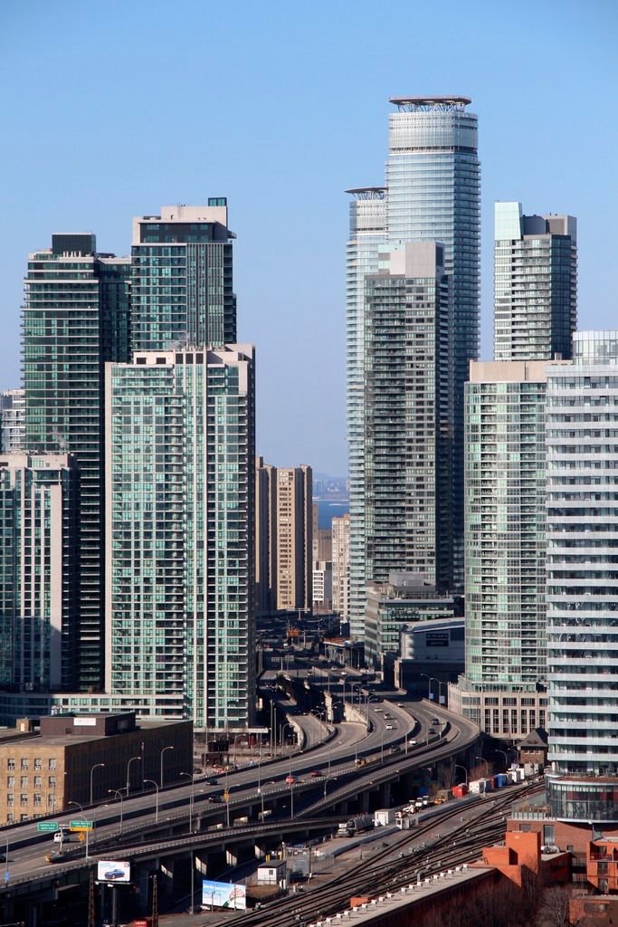
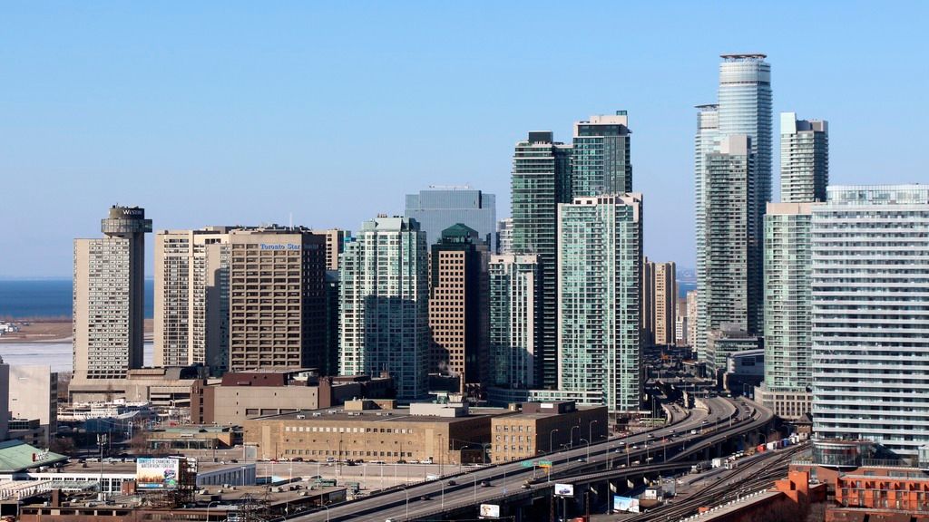
Toronto Ïce Condominiums at York Centre | 234.07m | 67s | Lanterra | a—A

The replication of a single design over multiple buildings is not just about making it cheaper. It's also about the the power to impress, the idea being that a complex of buildings is more impressive than just one building of the same design; "look at us, we're important enough to fill a whole city block, not just a site on the block", that kind of thing. The twin towers of the World Trade Centre in New York were the obvious ultimate example of that… and still, right across from them are the three sibling towers of the World Financial Center. In Kuala Lumpur you get the Petronas Towers which compound their power to impress through the bridge linking them, and the Puerta de Europa Towers in Madrid which manage to lean toward each other to ratchet up their effect.

Twinned or tripletted or quadrupled residential towers are more common than replicated office towers though, and that's not just a Toronto thing, it happens all around the world. Yes, it brings down the design cost, but in the case of residential towers I think it's less about the power to impress and more about the cohesion of the buildings to help create a "neighbourhood" feel. I always wished that Palace Place had been a twin of Palace Pier, and not cousin; the two have always been less impressive to me because they are slightly off. In the Toronto of yesteryear when we didn't have some many impressive towers, the Leaside Towers were the ones I judged the Palace Pier cousins against, and despite their duller design, the Leaside Towers came of as more impressive because of their identical nature.

There's nothing innate about a repeated design that bothers me, unless it's a just plain bad design, or unless it's repeated ad nauseum into a Le Corbusier-an dystopia (which has more to do with now rejected planning principles and not architecture so much). Two of something though, as long as it's a good design, is often twice as nice.

42
 
Last edited:
One of the handful of buildings architect Peter Clewes says he is particularly proud of....Ice. From http://news.nationalpost.com/2015/0...worried-about-the-emerging-shape-of-downtown/

thanks greenleaf ! great article indeed.

It is it ironic this feeling comes from Peter Clews: "In his eyes, many of the towers now popping up through Toronto’s core are depressingly similar", from an architect that brought us the ironically similar glass box towers wraps with balconies Casa I+II+III, MYC, Pure+Clear Spirits, 1000 Bay, U condos, TeaHouse ... ?
 
As an artist I'm sure he sees the problem but he's not the ones building these things. Ultimately it is out of his hands especially if he'd like to feed himself.
 
In fairness, I think it's an idea of "you do you". aA has always been behind the neo-modernist glazed towers typology in Toronto, but many lesser firms have created endless recreations that are not of the same quality. Instead of trying to do the aA thing, they would be better off creating their own approach.

The aA window-wall-point-tower-with-scissor-stairs typology is so efficient for developers, one might say it's been too successful, thus its proliferation and profitability around Toronto.

I respect that some people see what Clewes is saying as hypocritical. It's certainly a grey area. That said, I think it's fair for him to pin the blame on developers; they are the ones putting the money forward and have very different values ($$$ vs. investment in design which is not always easy to value in dollar figures) than the architect teams at the end of the day. On the other hand, he is not an artist. He is a principal architect and a businessman. Firms have the choice to negotiate their designs with developers a lot of the time; a good businessperson-architect can bring design into the bottom-line discussions and persuade developers to take risks try new things with great benefit. Clewes has done very well for himself based on the window-wall-condo typology.

I'm in the middle on it.
 
Last edited:
The replication of a single design over multiple buildings is not just about making it cheaper. It's also about the the power to impress, the idea being that a complex of buildings is more impressive than just one building of the same design; "look at us, we're important enough to fill a whole city block, not just a site on the block", that kind of thing. The twin towers of the World Trade Centre in New York were the obvious ultimate example of that… and still, right across from them are the three sibling towers of the World Financial Center. In Kuala Lumpur you get the Petronas Towers which compound their power to impress through the bridge linking them, and the Puerta de Europa Towers in Madrid which manage to lean toward each other to ratchet up their effect.

42

Right, but the thing about most condos is that very little about their designs actually call for being 'twin towered' as part of their design, or deliberately to make that sort of impact by being twinned over. Most of them aren't enhanced in any way by twinning them, and like you said aren't designed to impress or to be iconic buildings/complexes like the World Trade Center or even the TD Centre. Because they're condos on very different budgets and scales as those world class projects. As for creating a neighborhood feel, yes, probably in many cases (like ROCP perhaps) but when it comes to those like X1 and X2 which IMO, aside from mimicking the TD Centre in design don't actually look very good next to each other as they have different heights and footprints, a testament to them not being truly planned as a duo, it's a design that's sort of just slapped on. Same applies for Casa I, II, and III.
The problem isn't the twins, but the fact that there are so many of them beginning to dominate out skyline. It's nice to see that the 1 Yonge project plans to have towers on a single block by a single developer that is attempting to do buildings with dramatically different designs (for the most part, I think 2 of them are twinned).
For the most part, I associated these types of twin-tower condo projects outside the downtown core like the Leaside Towers or Palace Pier, or most of the NYCC condos that dominate their skyline; where large parcels of land are abundant, unlike a downtown core.
 
Last edited:
I still see a bias against twins in your response that colours your view of whether or not we have too many of them, but it's a subjective thing, so I'm fine to agree to disagree.

I definitely see the Ãce complex as greater than the sum of its already lovely fraternal twin parts… but then just next door you get Infinity, where there's only one good wall doubled in amongst all the bad stuff that's doubled too. Is two times a bad thing is lesser than the sum of its parts? I suppose we do slip into subtraction in those cases.

I will say that if Monarch and Goldman were building a second Picasso, I'd love to see the same design language for the second tower, but with altered volumes. Put buildings in an interesting dialogue with each other, and my interest level increases.

42
 
From a few weeks ago
IMG_0247.JPG
 

Attachments

  • IMG_0247.JPG
    IMG_0247.JPG
    1 MB · Views: 1,047
I always wished that Palace Place had been a twin of Palace Pier, and not cousin; the two have always been less impressive to me because they are slightly off. In the Toronto of yesteryear when we didn't have some many impressive towers, the Leaside Towers were the ones I judged the Palace Pier cousins against, and despite their duller design, the Leaside Towers came of as more impressive because of their identical nature.

It isn't too surprising that Palace Pier towers aren't identical since tower 1 was built in 1978 and the 2nd didn't arrive until 13 years later, I would say it is more surprising that they aren't completely different. I guess the developer asked for a design that was similar to the original but with more modern updates.
 
0.png


1.png


2.png
 

Attachments

  • 0.png
    0.png
    1.2 MB · Views: 2,987
  • 1.png
    1.png
    1.3 MB · Views: 6,388
  • 2.png
    2.png
    1.4 MB · Views: 2,994
Last edited by a moderator:
Over the weekend I was stuck in traffic on the Gardiner and couldn't help to notice the window washers having a difficult time cleaning the windows at Ice. Looks like they were doing a cleaning test on a floor above the podium level -- about three people were on the platform lift with a team of 5 people standing on the podium terrace below. One of the guys on the platform was trying to clean between the glass railing and the window wall with what looks to be an awkwardly long squeegee or a very wide flat mop. There doesn't seem to be much room between the glass railing and window wall and the guy seemed to have some trouble trying to clean in there.

I could see window washing will be a very expensive maintenance item for Ice.
 

Back
Top