Toronto Ïce Condominiums at York Centre | 234.07m | 67s | Lanterra | a—A

A slightly different angle:

WP_20130404_002.jpg
 

Attachments

  • WP_20130404_002.jpg
    WP_20130404_002.jpg
    95.9 KB · Views: 577
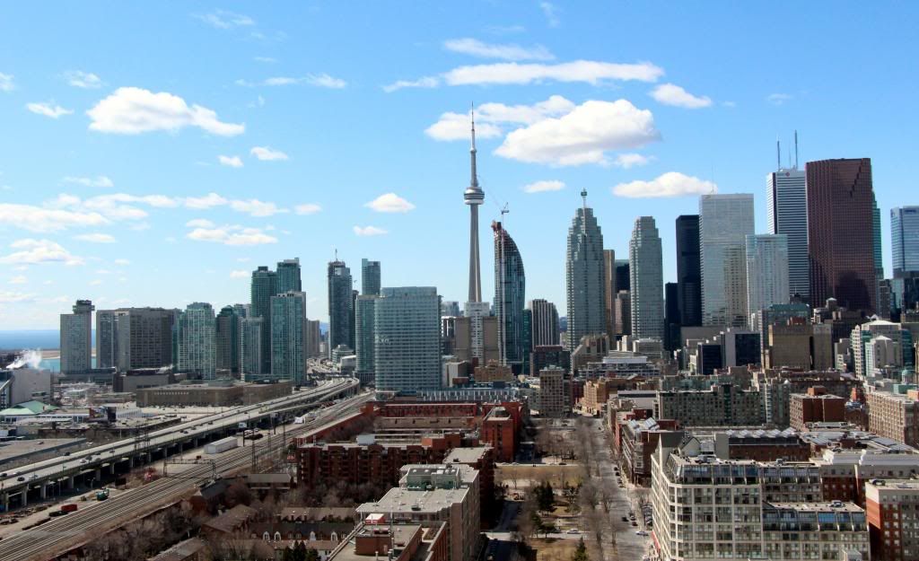
Thanks for the update sMT. And this is in no way a critique of your photography skills, but that is probably the ugliest picture of Toronto I have ever seen.

Bland and uninspired highrise architecture, railway tracks, high voltage transmission line towers, elevated expressway, industrial plant including smoke stack, warehouses and big-boxesque low-rise buildings. Depressing.

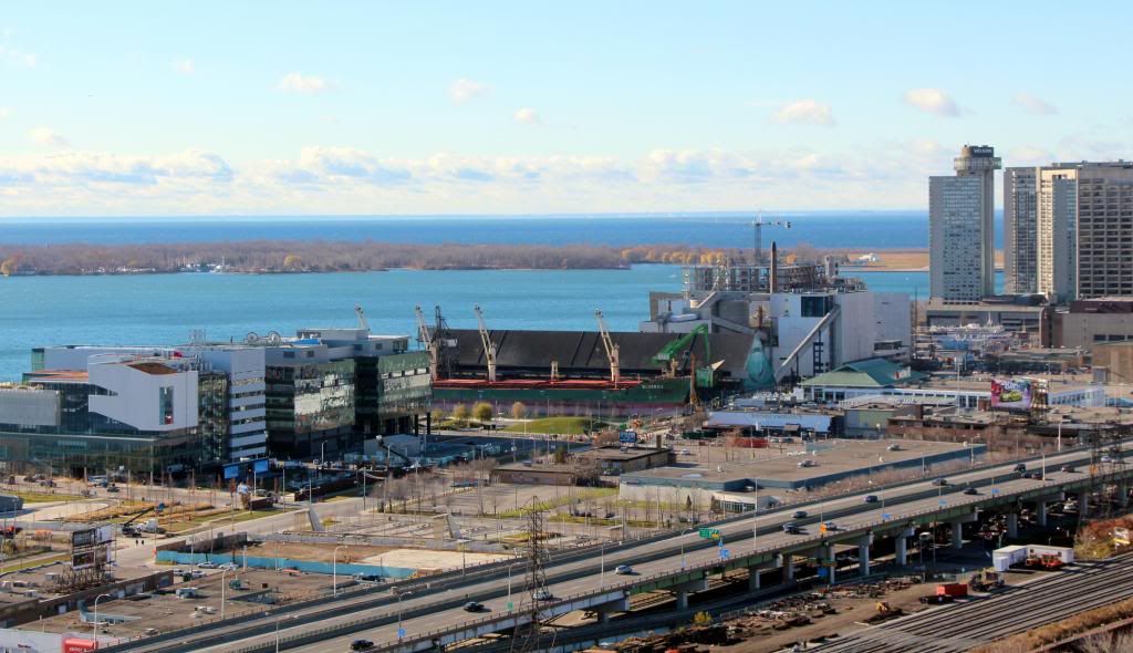
Don't forget all the bare trees.
 
Thanks for the update sMT. And this is in no way a critique of your photography skills, but that is probably the ugliest picture of Toronto I have ever seen.

Bland and uninspired highrise architecture, railway tracks, high voltage transmission line towers, elevated expressway, industrial plant including smoke stack, warehouses and big-boxesque low-rise buildings. Depressing.

Perhaps it's not pretty, but it's a nice snapshot of different eras of development along this part of the waterfront. It also captures some of the many necessary components that make the City tick. The bland high-rise architecture is unfortunate, which may only be exacerbated by the redevelopment of the 1-7 Yonge site, with more of the sameness built, but only bigger and more apparent. Ice is turning out quite nicely so far, but it seems to be getting lost in the sea of forgettable buildings taking up too much space in this part of our skyline.
 
I like the urban grittiness of that picture, but I agree that it would look nicer without MLS and the Pinnacle Towers. The rest I really don't mind at all.

I think the 1-7 Yonge development will actually improve that view considerably.
 
Aura would have been right at home down here.
 
I like the urban grittiness of that picture, but I agree that it would look nicer without MLS and the Pinnacle Towers. The rest I really don't mind at all.

I think the 1-7 Yonge development will actually improve that view considerably.

agreed. there is a plateau effect directly to the left of Success Tower, a drop off of those 100mish buildings. the 1 Yonge development will drastically change that.

I actually don't mind Success Towers at all though. Imo, they're one of the better looking condos built in the past decade. They hold up well and have sharp designs. (and the white blinds inside don't seem to effect them that much)

and ya, as ugly as the foreground leading up to the cluster of towers is... It does sorta add to the view. the fact that these towers rise up suddenly.. Eventually though, hopefully those low-rise warehouses/parking lots are replaced. Although the waterfront developments upcoming to the east tend to be more mid/low-rise :(
 
I actually don't mind Success Towers at all though

Yes I agree. Up close, I don't really think most of the buildings in that shot individually are that bad, but a mass of minimally reflective window wall, white blinds and heavy mullions just looks jumbled from a distance. For me, the only tall buildings that look great in any light, from any angle, at any distance, are stone-clad. Scotia Plaza, for example, looks perfect from everywhere.
 
Thanks for the update sMT. And this is in no way a critique of your photography skills, but that is probably the ugliest picture of Toronto I have ever seen.

Bland and uninspired highrise architecture, railway tracks, high voltage transmission line towers, elevated expressway, industrial plant including smoke stack, warehouses and big-boxesque low-rise buildings. Depressing.


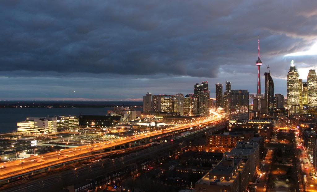
sMT’s focused shots do not do the view justice, and one really has to be standing where he was when he took those images to appreciate how impressive the view is of the Gardiner corridor when seen in the context of its surroundings (i.e. Lake Ontario, the Toronto Islands and East Bayfront on the left, the St. Lawrence neighbourhood in the foreground, and the CN Tower and the bank towers to the right). It is truly a magnificent view, and the gritty industrial character of the rail corridor and East Bayfront appeals to me. It is always animated and dynamic, with constant movement from trains, planes, boats, automobiles (and people too). If you want to live in a large metropolis and experience urban living, this is the place to be, and the view I refer to captures all of that, and more.

At night, the view changes dramatically as the brightly lit Gardiner winds its way between the sparkling condo point towers. It is truly a sight to behold. Most people who have witnessed it from my vantage point comment on how beautiful the Gardiner appears at night – almost an art form in and of itself.

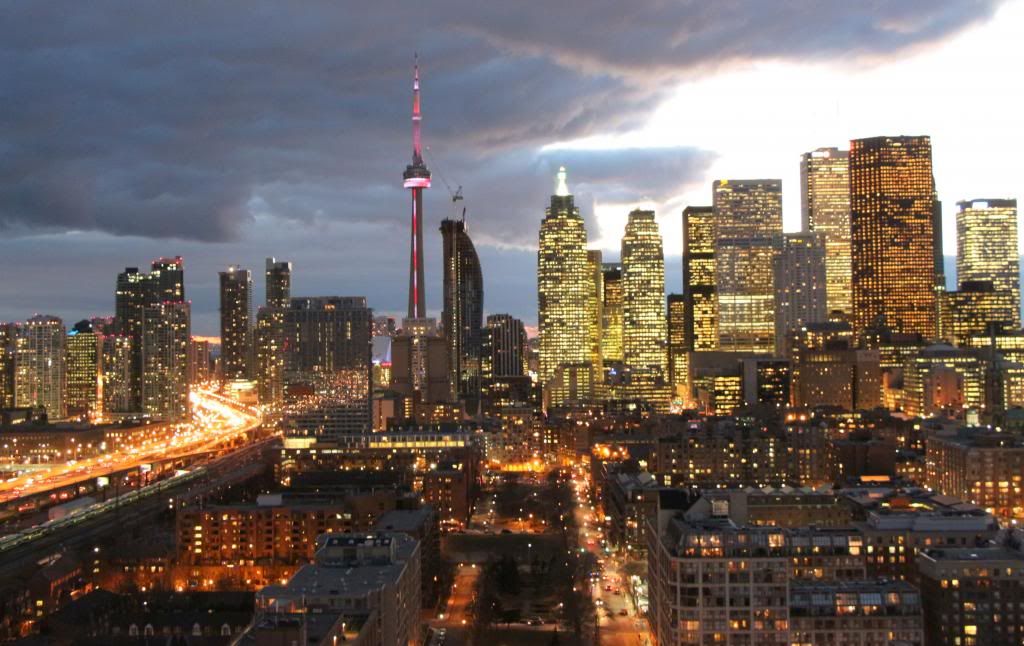
I hope the following images (that I posted on other threads in the past) help put my comment in proper perspective. The monotony of the crowded green glass condo towers that you refer to is muted when you step back and can appreciate the broader landscape outside the frame of the camera lens.

IMG_1245_zpsf9f951d2.jpg


IMG_0682_zps7ef899f5.jpg


IMG_0905_zpse85df5c2.jpg


IMG_0904_zps1359b912.jpg


Sorry to be off topic, but I had to get my two cents worth in...
 

Back
Top