Toronto Ïce Condominiums at York Centre | 234.07m | 67s | Lanterra | a—A

19 January 2013: Some people went to watch a hockey game tonight. I went to centre Ice! (And Longo's for the first time--gotta say the ladies of MLS are indeed rather cute.:D)

20130119140350.jpg


20130119140827.jpg


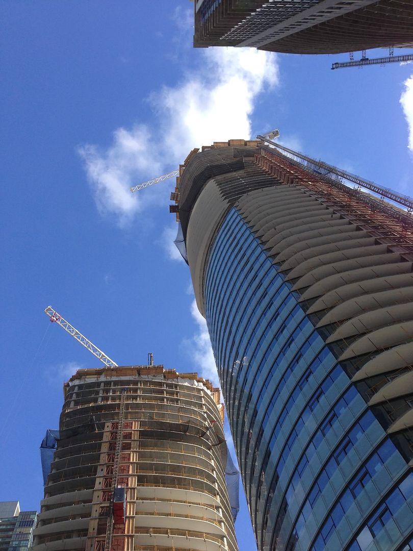
Kirkor c.2003 meets aA c.2013: Both kinda corporate dreary on their own terms. Ice is of course much taller and refined, but it's still got this monotonous look to it that is boring me lately (100% all glazed condos bore me the more I get into architecture/NimbyTecture.)

20130119151345.jpg


All is not lost though--unlike WC, Ice podiums should score a hat trick.

20130119152035.jpg


20130119153151.jpg
 
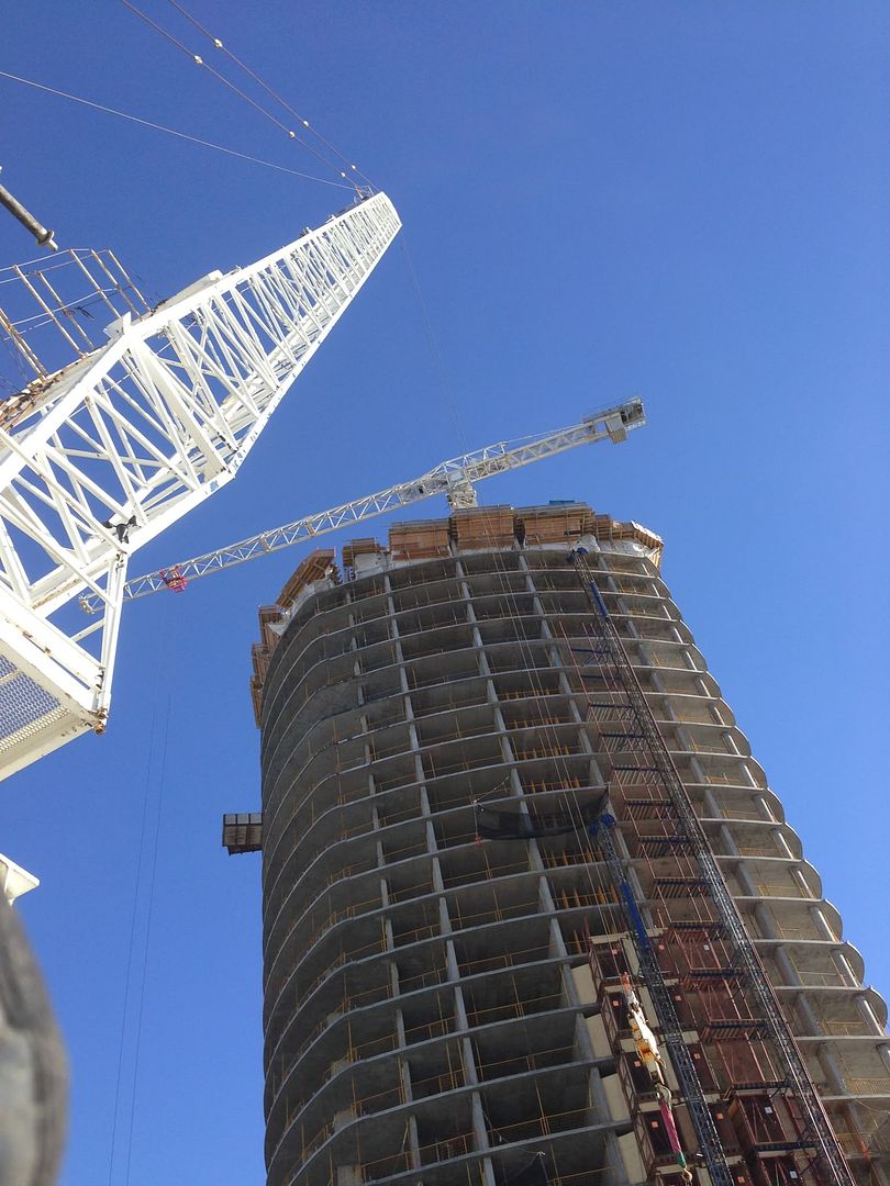
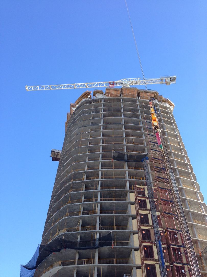
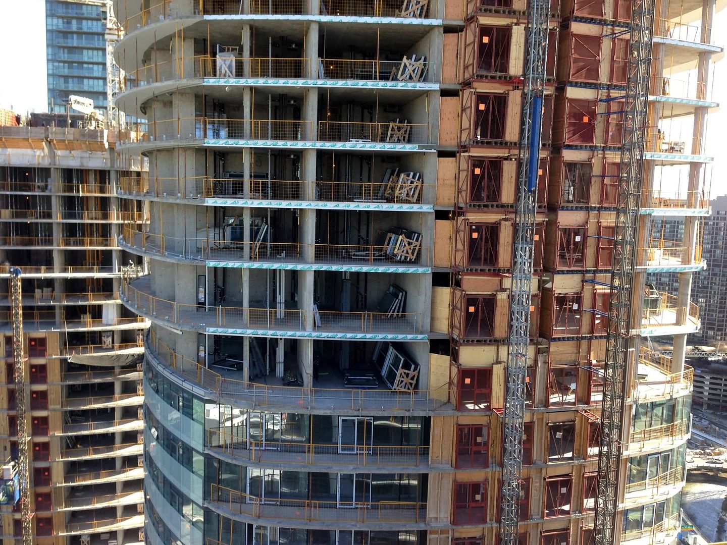
A brother sent me some pictures Friday morning. Forgive please if I get this ICE Infinity thing mixed up somewhere.

photo.jpg

Photo by CL

photo4CL.jpg

Photo by CL

photo7CL.jpg

Photo by CL

photo10CL.jpg

Photo by CL
 
Tonight:

qMPCPBR.jpg


I even left enough room for Traynor to turn this shot into a rendering. I hope he sees this
 
Last edited:
It's amazing how all it takes is a round floorplate to make things a little more interesting. Looking great!
 
Ice is all glass done right. The issue is due to the banality and lack of variety of a dense collection of all-glass buildings, exemplary buildings get lumped into the negativity; UD's shot with the Waterclub podium in the foreground is a perfect illustration of the tyranny of the cheaper, plasticky glass condos in the area.

That said, as Southcore and the surrounding condo-burbs start to fill out, they're almost starting to "make sense". They don't have the same liveliness or beauty of more established neighbourhoods, but there's a certain energy and big-city-look-at-all-the-tall-buildings excitement that I'm starting to enjoy.
 
Truly breathtaking photo, sMT! Ice looks quite majestic from that striking angle.

+1! Love the colour scheme too! the balcony glass perfectly accents the tower. (if ICE looked this colour during the day, it would look amazing)
Even infinity II looks good in that pic lol
 
Ice is all glass done right. The issue is due to the banality and lack of variety of a dense collection of all-glass buildings, exemplary buildings get lumped into the negativity; UD's shot with the Waterclub podium in the foreground is a perfect illustration of the tyranny of the cheaper, plasticky glass condos in the area.

That said, as Southcore and the surrounding condo-burbs start to fill out, they're almost starting to "make sense". They don't have the same liveliness or beauty of more established neighbourhoods, but there's a certain energy and big-city-look-at-all-the-tall-buildings excitement that I'm starting to enjoy.

I think I get what you're saying. The neighbourhood is taking on a uniformed look that makes it feel very much like a "district" unto itself wherein each tower makes sense within the context of the neighbourhood. Anywhere you go in the world, it's not unusual to find neighbourhoods that predominately feature a single architectural style, set of materials or colour palette. In the end it's not that this neighbourhood doesn't have character. It actually has a very distinct character. It feels very clean, modern and corporate, but also very dense and imposing, creating a kind of futuristic vibe.
 
Southcore is by far, the most futuristic part of Toronto.

Honestly, I feel like I'm 20 years in the future when I walk down there. Feels like "blade runner"
 
It feels very clean, modern and corporate, but also very dense and imposing, creating a kind of futuristic vibe.

Agreed. I am hesitant to defend this area a lot of the time since it doesn't exactly strike me as good neighbourhood planning, but rather very corporate and cold, BUT the urbanite in me who loves dramatic cityscapes likes this area. I too feel very much in 2012 (or indeed the future) when I walk around this area.
 
I think I get what you're saying. The neighbourhood is taking on a uniformed look that makes it feel very much like a "district" unto itself wherein each tower makes sense within the context of the neighbourhood. Anywhere you go in the world, it's not unusual to find neighbourhoods that predominately feature a single architectural style, set of materials or colour palette. In the end it's not that this neighbourhood doesn't have character. It actually has a very distinct character. It feels very clean, modern and corporate, but also very dense and imposing, creating a kind of futuristic vibe.

Yeah, I agree with that. Developers are finally varying the glass they use as well, which is helping create a little bit of variety. I definitely think the area appeals to the Blade Runner/futuristic megacity fan in me, and even though I'd rather live somewhere like the Junction I really like passing through Southcore.
 

Back
Top