


spaced
Active Member
Is this were I can rant?
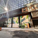
Already this isn't correct though, is it? Where's the curved LED ticker?
What's most annoying about all this is that all these rendering seem to blatantly lie. Did you ever see the adverts for Be Bloor? Nothing like the rendering other than they were both slabs--not that this project is as bad. I guess "Artist Rendition" just means "False Advertising". These developers should not be able to blatantly lie like this--and they do know what they are doing. We're is the accountability?
")
