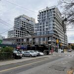
Wait, what are we talking about here? The building or the square?
I'm becoming more and more fond of the square as a civic space as time goes on. (The stage isn't abhorrent, but it's not endearing either; my biggest beef is the clunky folding canopy.) But the more I like the square, the more I detest Metropolis (let's just call it that) for looming oppressively over one side, reminding us of our worst habits of dis-inspiration and un-ambition.
Reclad with more glass? Well, glass is transparent, so it doesn't do much good if you slap it on a building with nothing to see inside.
I'm told that the ultimate feeling with the contractor (or was it the develper? I'm fuzzy tonight) was that this building was a mistake to build in the first place, given the complexities of building over the Ryerson garage. (It took two contractors to finish the job in the end.) So part of me wonders what opportunities there were for capital-d Design in the first place, given the project's material constraints.
And I know - I
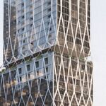
know - it's idle fanwankery, but whenever I see Metrolpolis looming over the square like (as Chris Hume so excellently put it) and intergalactic coal carrier, all I can think of is
this better model from a braver city. Might-have-beens.


