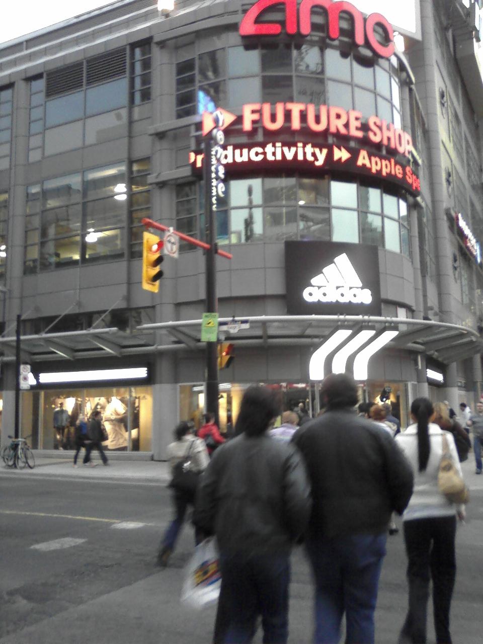
Those stripes are the sort of proprietary signs that we need to see added to TLS to give it some flavor.
I still think that the worst part of TLS is what Sir Novelty Fashion refers to as how Toronto Life Square
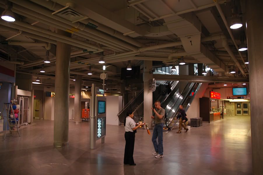
"Somehow manages to be enormous on the outside yet claustrophobic on the inside".
The layout within is not well thought out, not intuitive and definitely not attractive.
I'll be a little more proactive and suggest fixes to this seemingly unfixable mess:
Outside:
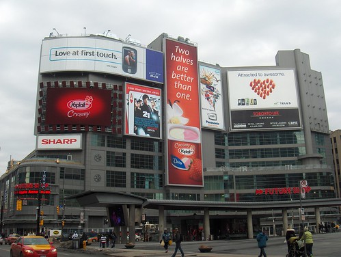
• Fix the spacing of the satellite screens. Having it wrong for months is inexcusable.
• Eliminate the blank corrugated wall on the east side under the ads. To do this, continue the window wall the rest of the distance, even if the windows are opaque "fake" walls.
• Do the same for the fans. Remove the fake fans and continue the wall of windows with dark opaque glass.
• Install an attractive wall and roof along Yonge St.'s façades. Perhaps a curved LED wall displaying a news and ad ticker.
• Encourage SHARP to install a permanent sign under the big screen. They've had their cheap ad there since the screen went up. They might as well invest in a set of individually lit letters forming their logo.
• Improve the visibility of the main entrance on Dundas St.
• Seek out a "permanent" major advertising sponsor for the central pillar ad. Take the example of the COKE ad at Time Square: A large vertical LED screen customized like the Coca Cola stripes
FutureShop
• PenEquity should give FutureShop a break on office space rental so that they can free up their "lunch room" for a public area. TLS has plenty of office space available on the upper levels. There's no need to use such a visible and valuable space as an employee area.
FutureShop should relocate their office and employee room to an office in the upper floors and turn that lunch room into a TV specialty space. Hang all the TVs on the back wall so that their glow is visible from Dundas Sq.
• In exchange for concessions for office space -- which allows them to increase their floor space -- FutureShop would open up the space surrounding the down escalator. Currently, that escalator is incredibly cramped and claustrophobia inducing.
That is the
only way down from the Food Court, AMC theatres and all the restaurants above. I foresee major problems with that.
Common areas:
• Tile the floors. This is an obvious upgrade that can make a big difference along with the following point...
• Install attractive ceilings. Look to Yorkdale for an excellent example. Yorkdale has hands down
The most attractive commercial ceilings that I've ever seen in a mall.
• Relocate -- or otherwise block off with screens -- access to sprinklers near escalators
• Introduce art. Add sculptures, hang pieces down the escalator well, place beautiful photography on blank walls.
• Lighting. The cheap warehouse lights that they've installed throughout really set the tone for everything else.
• Open the Adidas Store to the main lobby via windows where possible. Nearer to the entrance, there's a fire exit that stands between the lobby and Adidas. Use this blank wall for a video screen for ads.
... now to reward you for reading all my points, I've found a very interesting early video rendering of Metropolis. PenEquity at least had the idea along the right lines. They just cheaped out in the execution.
Metropolis: Early Video Rendering
