You are using an out of date browser. It may not display this or other websites correctly.
You should upgrade or use an alternative browser.
You should upgrade or use an alternative browser.
Toronto The Tenor (10 Dundas St E) | Ent Prop Trust | Baldwin & Franklin | 10s
Dan416
Senior Member
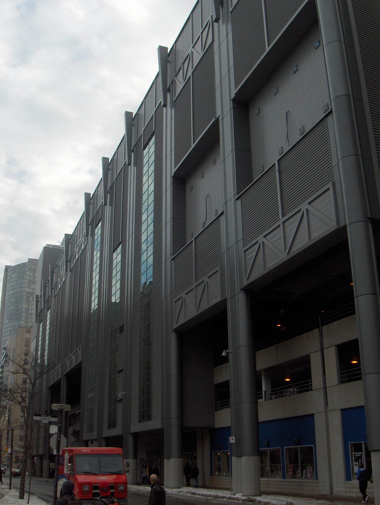
Wow it looks like a Borg ship from this angle.
EDIT: I actually kinda like it!
H
Hydrogen
Guest
Prepare to be consumilated.
egotrippin
Senior Member
I've noticed there are wires coming out of each of those recessed areas. Is something (signs or what-have-you) going in those spots? Anything, really, to break up the monotony would be nice.
MetroMan
Senior Member
Yes, Ryerson was given those two spots. They can use it for revenue generating ads, student work, screens with info, etc...
allabootmatt
Senior Member
What a disaster this thing is...
alklay
Senior Member
It basically destroys the sidewalk and the pedestrian experience on one side of the street. Its quite amazing that it was allowed. It was if the street was expendable.
allabootmatt
Senior Member
My problem isn't even with the concept or massing....it's just so....GRAY. In a city that really needs colour, why gray? Seriously!
Urban Shocker
Doyenne
Because grey is the ultimate neutral and the garish ads will stand out against it better than if the building were scarlet, or purple, or orange, or emerald, or baby blue, or shocking pink ...
caltrane74
Senior Member
I can't wait for the Sponsor ads!!!
That will complete the concept at least in my mind. And throw Dundas Square over the top.
And then of course, we have the retail signage (restaruants, fitness stores, coffee shops, drug stores, movie theatre) which should also add some visual stimulus to the project.
That will complete the concept at least in my mind. And throw Dundas Square over the top.
And then of course, we have the retail signage (restaruants, fitness stores, coffee shops, drug stores, movie theatre) which should also add some visual stimulus to the project.
egotrippin
Senior Member
Because grey is the ultimate neutral and the garish ads will stand out against it better than if the building were scarlet, or purple, or orange, or emerald, or baby blue, or shocking pink ...
True, but even if some elements were coloured. Especially on the sides with no/less ads. Some sort of contrast on those, things, sticking out near the top or on some of the criss-cross panel work.
At least something's going in those two spots though, hopefully Ryerson makes it interesting.
Tuscani01
Senior Member
True, but even if some elements were coloured. Especially on the sides with no/less ads. Some sort of contrast on those, things, sticking out near the top or on some of the criss-cross panel work.
At least something's going in those two spots though, hopefully Ryerson makes it interesting.
I predict a giant R in the left spot, and a giant U on the right.
H
Hydrogen
Guest
With that opening onto the old parking lot, it looks like the whole building landed on top.
A parking assimilated by the Borg Mall.
A parking assimilated by the Borg Mall.
Dan416
Senior Member
With that opening onto the old parking lot, it looks like the whole building landed on top.
A parking assimilated by the Borg Mall.
Haha indeed!
And I still love it!
condovo
Senior Member
Battleship Toronto Life Square.


