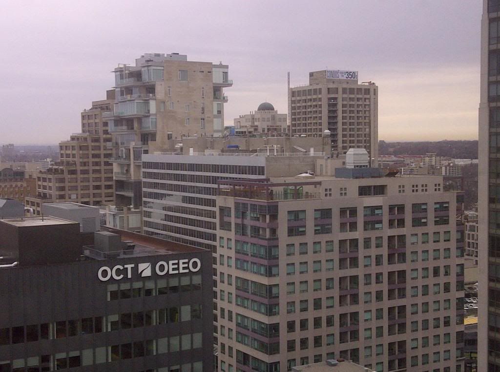
Toronto The New Residences of Yorkville Plaza | 92.05m | 31s | Camrost-Felcorp | WZMH COMPLETE

Should the Queens Park view corridor be preserved?

  • Yes

    Votes: 168 43.3%
  • No

    Votes: 145 37.4%
  • Don't Know

    Votes: 15 3.9%
  • Don't Care

    Votes: 60 15.5%

  • Total voters
    388
The old windows matched the tower, while the new ones don't. They should've taken out the concrete separating the windows between floors and replaced it with spandrel that matches better. Alternatively, they could've just left the windows as-is, there wasn't anything wrong with them.
 
If there was nothing wrong with them, they probably wouldn't be replacing the windows. These things cost a lot of money and I doubt they are doing in purely for aesthetics (not to say the new glass looks any better) . The new windows are undoubtedly much more energy efficient, a major factor for condominiums where every bill adds up.
 
I believe they will be painting the concrete if i read that correctly in the beginning few pages. also the renderings clearly show it as a white building. not exposed concrete also a second building beside it, that mimics it.
its ok, better then it was.
 
In terms of the interior design styles of this project, which one do you guys prefer, the classic one or the modern one?
interior-2.jpg
interior-5.jpg
 

Attachments

  • interior-2.jpg
    interior-2.jpg
    56.2 KB · Views: 561
  • interior-5.jpg
    interior-5.jpg
    67.7 KB · Views: 542
Looking at androiduk's picture, it doesn't look like the new windows open? :confused:
 
Modern looks a lot better, IMO.

Sigh...I'm a big fan of brutalism, so this is quite a blow to me. If they paint it white, I'll be really sad :( If they change the cladding (not just white painted concrete), that might look okay. As of now though, the old windows were a much better match for the building. I would've loved to see them use similar looking windows that are more energy efficient, and put up another tower that looks exactly like this one (maybe a little taller).

I just hope this isn't a trend (destruction of Brutalism) that will be repeated at Manulife (or even worse, Robarts)!

Agreed. I've all but resigned myself to the total destruction of this building, and those windows are the first blow. I could see the highrise apartments in the Manulife going condo some day, they're huge, have a separate entrance & elevators from the lowrise section and aside from washers & dryers are pretty much "condo ready". From what I can recall the concrete is in good shape on the building too. Being run by U of T, I have every confidence that Robarts is safe.
 
Agreed. I've all but resigned myself to the total destruction of this building, and those windows are the first blow. I could see the highrise apartments in the Manulife going condo some day, they're huge, have a separate entrance & elevators from the lowrise section and aside from washers & dryers are pretty much "condo ready". From what I can recall the concrete is in good shape on the building too. Being run by U of T, I have every confidence that Robarts is safe.

Looks like you and I are part of the minority here, dt. The only comments I ever hear about Brutalism are negative ones, though my perception may be a little skewed because of my gf's passionate hatred for anything brutalist (she'd love to see Robarts torn down).
 
As of now though, the old windows were a much better match for the building. I would've loved to see them use similar looking windows that are more energy efficient, and put up another tower that looks exactly like this one (maybe a little taller).

Agreed.

Bronze, not silver coloured mullions here would have been a nice choice. They would give it that new old look.
 
The window looks fine but the concrete definitely needs some work. Btw, I bought one unit for myself in this project, and it seems the interior selection will start soon. Does anyone else here also bought into this project? We can start to discuss some interior selection topics in Yorkville Plaza R/E section below:
http://urbantoronto.ca/forum/showthread.php/17895-Yorkville-Plaza-(Camrost-Felcorp)-Real-Estate

The windows look like they are sealed tight. I wouldn't want to live in an air tight box.
 
Looks like you and I are part of the minority here, dt. The only comments I ever hear about Brutalism are negative ones, though my perception may be a little skewed because of my gf's passionate hatred for anything brutalist (she'd love to see Robarts torn down).

A dozen years ago I wouldn't have given a second look at most brutalist buildings, since then we've lost some wonderful examples in Toronto. Brutalism gets little respect, adma, among a few others, is a big supporter of Brutalism and was the one who opened my eyes to brutalist architecture on this board.

The windows look like they are sealed tight. I wouldn't want to live in an air tight box.

Like The Ritz condos. It looks like these side windows might push open, outward at the bottom.
 

Back
Top