3Dementia
Senior Member
Submission completed May 28/09
Designer: Martin Cooper
Bridge Type: box truss
Project Description: see below including May 28/09 updates
Poll: attached
Images: attached
PROJECT DESCRIPTION
Many of the most beautiful bridges in the world are suspension bridges. They often have a graceful arc of cable supporting them or a dramatic arrangement of fanned cables flying the deck and its passengers across the open space in a form that is both slender and beautifully delicate. Picture postcards of bridges often show the bridge being admired from below for it’s majestic form when seen aginst the empty sky.
While I would like to suggest such an engineers dream bridge, I feel this is not a location that needs a suspension bridge with the difficult engineering involved and it’s attendant costs. It is also a place that will not show the graceful form of a suspension bridge to it’s best effect. Urban situatiions are very busy especially at street level. This is true both activity-wise and visually. This bridge will be placed slightly above street level over railroad tracks and a serene graceful shape of a suspension bridge I believe would be wasted, lost amongst the rectiliniar clutter of buildings, tracks, bridges etc that would mix in with it visually. The view looking up at the bridge from below is unavailable at this location as well because there are very limited opportunities to view it from track level. People can and will look down on this bridge from the tall buildings around it but most will see it from the side and at a distance.
The dramatic sweeping support arcs of a bridge design like the Bloor viaduct also will not suit this location since the trains need all the space underneath.
The architects of the buildings at CityPlace will be working with a design theme and to have the same architects design the bridge with that matching theme should come first in improving the bridges looks particularly at the Cityplace approach ramp.
A cheap box truss is being proposed and we are challenged to come up with something better. For many practical reasons I feel a box truss is a good starting point for a bridge design in this location. The challenge is to design something that functions like a box truss without looking like one.
This bridge will be specifically created for pedestrian traffic and bicycles. It is a bold statement in favour of people over cars in the downtown core. Since bicycles are part of the mix, stairs and steep slopes should be avoided. Most box truss bridges are designed with economy in mind I believe that the costs for this bridges should be kept down so that other bridges may be built at other times and at other locations.
The simple vertical and diagonal elements of a standard box truss have a form that connects the load points with the least amount of material. A connect-the-dots approach. I suggest that these elements can be modified and re-configured t create a graphic image that speaks languages other than simply geometry and economics.
I have sketched a couple of suggested designs that can be seen on the accompanying file.
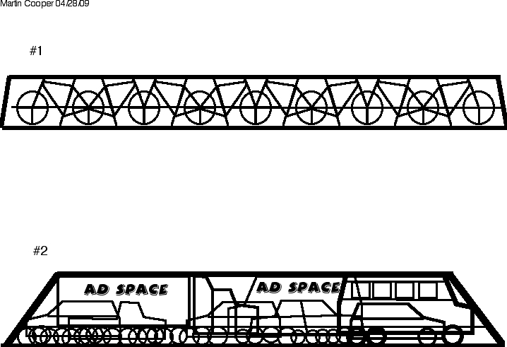
Sketch #1 is to show a side view of a bridge with the main upper and lower structural elements drawn as a bold outline and instead of the standard X bracing filling the side space, It can be filled with a repeating design of bicycles. The triangular elements of the bike frames are integrated into the girder and carry the web loads preventing buckling and racking in the usual way. This provides a visually interesting design feature and makes a statement at the same time.
Sketch # 2 shows a similar approach with a different theme. Sketching out a traffic jam seen from the side, metal structure shaped like the outilnes of cars and trucks to creates a screen of verticals and diagonals with the lower portion a mass of circular shapes like wheels.
In engineering the bridge these design elements would be employed to carry the vertical and diagonal loads of a box truss as well as providing a railing/grillwork in the form of the intersecting circular wheel shapes.
Seen from a distance, the design is clearly showing the traffic as frozen in place while bicycles and pedestrians move freely across. To emphasize this I would add lights like traffic lights that change periodically from red to yellow to green while the cars and trucks remain fixed. The moving elements in the scene are the real people and cyclists that pass through within the bridge.
Seen on end by the people using the bridge, the or bike traffic theme disappears. The users see only the shape of the opening and clear path to their destination on the other side. The profile of the tube truss should be defined by the shape of the crosswise arches above them and a shape serene and uplifting as well as open to as much sky as possible would be best. This should give a feeling of reverence to the space as they cycle through.
This design theme also suggests that some of the spaces defined as the outlines of trucks could be used as actual advertizing space. The overall design theme still carries across regardless of what is placed on what would be the side of a big truck.
The bridge should have dedicated traffic lanes for cyclists down the middle and leave the edges for pedestrians so that they can move closer to the side railings and view the railway activity and it’s surroundings.
The box truss design is a relatively inexpensive type of bridge and well understood by the engineering community. I believe that building in this design theme would not add greatly to the cost of the bridge while allowing it to be built elsewhere and installed quiclkly. Railway traffic would not need to be interrupted for long. I would see a need for a central support at the location suggested on the maps.
IMAGES
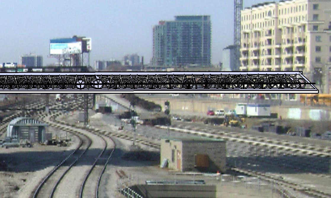

UPDATED MAY 28/09
Designer's notes: I'm sending this new view of the model I drew in sketchup to show what it would be like to be in the bridge. It is a requirement that the bridge have enclosure to it. I have only drawn the structure. The infill could be mesh or glass. Those sort of details could be decided by the engineering team.

Designer's notes:
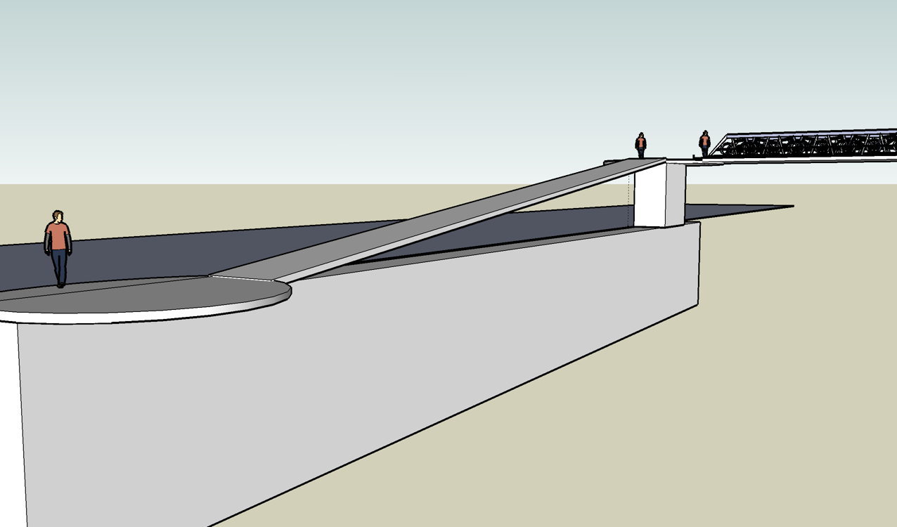
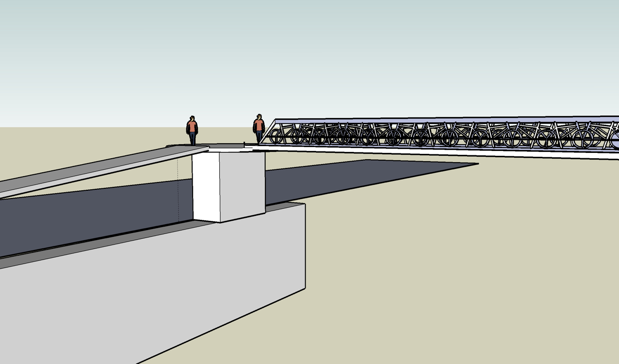
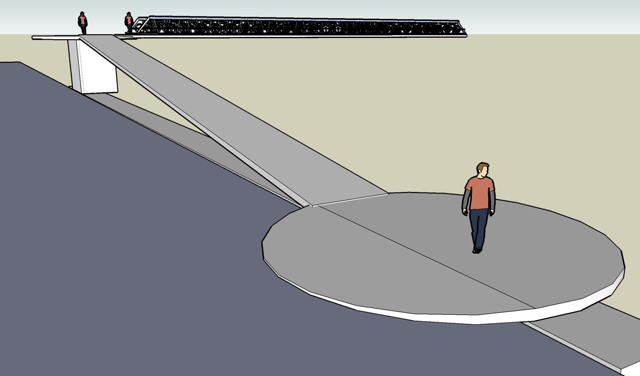
Below are 3 images that illustrate the way I would handle the entrance ramp. Since there is very little space beside the Front Street at Portland, I would make a circularly swelled area that ramps slightly out into the road to eliminate the curb there. The other side of this circular area could cantelever out over the wall as much as was possible.
A raised a platform at the bridge entrance high enough( 14 ft) that trucks could safely drive under it would allow cyclists to make the turn off the bridge without stopping. For the sake of simplicity I have not drawn railings on these ramp areas and the scale of the bridge is not right but it should show the concept.
Speaking of concepts, I really prefer my other design of the sides being made of a graphic of trucks and cars stuck in gridlock, but it's way too hard to draw for a no-prize idea bank. This and your IMAGINATION will have to do.
Last edited:
