News   Jul 05, 2024
 2.8K     0 
News   Jul 05, 2024
 1.9K     13 
News   Jul 05, 2024
 673     0 

Spacing's "ThinkToronto" Contest

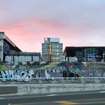
Amazing ideas....all of em. I like the station designs and the subway entrances and transit signs in particular. The changes they would make to the 'attractiveness' of urban transport and the streetscape are striking.
 
Well, Wylie... what can I say? You've gone from designing one train station that I absolutely loved (your Union shed concept) to three that I love.

York U station looks great without being unfeasible. And Sheppard west looks fantastic, too. Too bad the design would be wasted on the 100 or so people who are actually going to use that station when it opens. I question its feasibility in cases of blowing snow (and if you're going to get blowing snow anywhere, it's gong to be beside a wide open airport). But if it could be made to work, that design would make for a pleasant subway-riding experience.
 
I'm hoping that the DRL, once designed, will offer some incredible stations, since it would be the primary touristic line.

We need a bit of pizzazz in our subway system, and wilye, those stations are absolutely gorgeous!
 
The latest from Spacing.ca...

September 23rd, 2008
Wow! Over 100 thinkTORONTO entries!
Posted by Matthew Blackett

2883514484_a2b61e5013_o.jpg


The editors of Spacing would like to thank everyone who took the time to enter thinkTORONTO. We received over 100 entries and we’re extremely excited by the quality (and quantity) of submissions.

We’re still receiving entries from the far corners of the country (via postmarked mail) and have to spend a bit more time organizing the submissions. We’re not prepared to give a specific date when we’ll be announcing the finalists since our jury is a busy bunch who are travelling around the continent with their own work. It is fair to say that finalists will be contacted by our editors in October since we plan to profile them in the upcoming issue of the magazine.

Again, thank you for your hard work and we look forward to thoroughly examining your submissions.

If there are about 100 entries in the competition, then it seems like there is a pretty good chance someone from UT will have a winning design. Good luck, guys!

I wonder what's in that FedEx box.
 
The latest from Spacing.ca...


If there are about 100 entries in the competition, then it seems like there is a pretty good chance someone from UT will have a winning design. Good luck, guys!

I wonder what's in that FedEx box.

i really thought there would be a bit more. i know waterloo arch. students were supposed to enter this. my computer apps course had this competition as a first assignment but i don't think many people submitted from that class.
 
Wylie,

I really like the Ellesmere super stop. What a simple yet powerful concept!

Your Spadina extension station designs are great, too.
 
haha, you caught me. Funny you mentioned that. I had originally sketched some ideas only to find the legible london examples midway through my designs so I had to try to make them look as different as i could while still including some really great features of the London ones.

I think mine take quite a bit of inspiration from the Eatons Centre mall directories as well.

If I could have handed in a direct copy of the London ones without getting caught, I would!
 
The only reason I noticed was because I was in London a few weeks back and really took notice of them.

I still think they are all class (both of them) and would be a definite boost to the city's public realm.

Has anyone heard anything about their entry's?
 
I've heard from Spacing about the Transit Signs and the Subway Entrances. Don't know how they ended up but I had a couple of guys contact me for some interviews. Really excited. I have no idea how they did or how many winners there are.
 
Ugh, I finally finished yesterday afternoon. Didn't end up doing as much as I would have hoped but still managed to submit 4 different entries.

Here are my entries. Some are more detailed than others.
http://www.jayomatic.com/upload/01_wayfinding.pdf

http://www.jayomatic.com/upload/02_subwayentrance.pdf

http://www.jayomatic.com/upload/03_transitsigns.pdf

http://www.jayomatic.com/upload/04_treerings.pdf

Jayomatic, your designs are excellent.

I really like the transit & wayfinding signs. I might change the proportions a little, but they're great. Modern, practical, stylish and very consistent.

Your subway entrances are also well done. The angled semi-rectangle is my favourite. The only issue I could see is the practicallity if there's an emergency and they need to lift someone out from the top (though I don't think that happens often).


Smucky

I love that underpass design. Very unique without being impractical. With the proper materials it could be a very low maintenance solution.


Wylie

The station designs are fantastic. I might change some of the the colour combinations though.


All of these designs seem practical and affordable. There are some very talented people on this board.
 
Like the underpass installations. They do this thing quite a bit in France and it is amazing what just a little bit of lighting can do to change the atmosphere under a highway
 
Congrats to Jayomatic for ending up as a finalist for his wayfinding signs and also his subway station entrances as runners up!

They looked great on the big boards at the Spacing party. They were a pain to hang up but it seemed that everyone enjoyed looking at them.
 

Back
Top