You are using an out of date browser. It may not display this or other websites correctly.
You should upgrade or use an alternative browser.
You should upgrade or use an alternative browser.
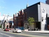
Royal Conservatory Of Music - Telus Centre for Performance & Learning (KPMB)
TOPHX
New Member
Are those utility meters? You would think they could have been located in less conspicous place.
andrejeffry
Active Member
OMG this telus building is an eye-sore compare to the one next to it.
WTF is wrong with architectural plan for new projects for Toronto cultural institutes?
they are all cheap half-ass, downright horrible to mediocre at best
andrejeffry
Active Member
What a great stretch of street this is. A sports stadium, the Royal Conservatory of Music, Philosopher's Walk and then the ROM. No one tries to fit in, they all keep their individuality but everything's in harmony. Just what a city should be.
huh?!?!
are you serious?!?!
Northern Magus
Active Member
huh?!?!
are you serious?!?!
Lol I guess if you're not into contemporary architecture, this area must drive you mental. But trust me, if you are, it's absolutely brilliant.
Me, I've got mixed feelings about the Telus Centre entrance structure. I love its forms, but I'm not sure that the materials work for me. That said, I don't know what else could have been used to make it look better.
DT Geek: It's not clear from your pic what the state of the landscaping is. Were you able to get a decent look?
Observer Walt
Senior Member
I'm not sure that I would agree with Androiduk that everything is "in harmony". This street (within, say, a couple of blocks) exemplifies quite a range of ages and architectural styles. You have buildings dating back perhaps 100 years. You have the 1920s style of the older ROM, the 1950s School of Social Work on the NW corner of Bloor and Bedford, the vaugely brutalist OISE building which just scrams early 1970s, the merging of old and new at the ROM and now at the Conservatory, etc. A bit farther along is the very nice-looking Woodsworth Residence building. Not to mention the new Varsity Stadium, which I continue to think was a missed opportunity, but, oh well ...
I think "harmony" is overrated. There's nothing wrong with being able to stand in one plae and see a range of styles. What is important is that you have a street lined with buildings which respect the street and which individually contribute. I think, for the most part, we have that here.
I think "harmony" is overrated. There's nothing wrong with being able to stand in one plae and see a range of styles. What is important is that you have a street lined with buildings which respect the street and which individually contribute. I think, for the most part, we have that here.
Urban Shocker
Doyenne
Shifting the ROM entrance back to Bloor street ( where it was from 1914 to 1934 ) strikes me as a smart move, since it orients the museum to a main pedestrian thoroughfare and adds life to that street. The Conservatory reno has gained them more teaching space - for more students - and the concerts at Koerner Hall will enliven Philosopher's Walk in the evenings too. I'm not a fan of High Victorian, but neither am I thrilled at how the west side of McMaster Hall is blocked from view by KPMB's addition. And D+S's sports stadium, in turn, partly blocks that when seen from the west. The openness of the new sports field is a refreshing change from the big brick wall that was there before, and opens up nice views across the campus. All in all, a fairly successful rejuvenation of this stretch of street, I think ...
dt_toronto_geek
Superstar
DT Geek: It's not clear from your pic what the state of the landscaping is. Were you able to get a decent look?
Urban Shocker's observations are quite valid but that said I love the west addition to Performance and Learning Centre.
I did not observe the landscaping, I didn't walk on the south side of the street today however I'm keeping a close eye on it, I'm by there 2-3 times a week. Once the landscaping is complete I'll grab a shot and put it up.
andrejeffry
Active Member
Lol I guess if you're not into contemporary architecture, this area must drive you mental. But trust me, if you are, it's absolutely brilliant.
Me, I've got mixed feelings about the Telus Centre entrance structure. I love its forms, but I'm not sure that the materials work for me. That said, I don't know what else could have been used to make it look better.
DT Geek: It's not clear from your pic what the state of the landscaping is. Were you able to get a decent look?
Just because it's new, doesn't mean it's contemporary. Contemporary implies style or having some bold modern style. That building has no style whatsoever. It's literally a box for godsake and it's grey. It's protruding into the sidewalk, taking up the whole pedestrian space. If you're coming from the west, it hides the beautiful building next to it.
That building is more appropriate for Telus cellphone/mobility store.
No, the area is a butchery. ROM crystal pretty much destroyed the old architecture building. ROM crystal is an interesting concept, but failure in implementation. Of course budget is one of the problems. But if you want to go bold, you better put up the money
Last edited:
ProjectEnd
Superstar
con⋅tem⋅po⋅rar⋅y
/kənˈtɛmpəˌrɛri/ Show Spelled Pronunciation [kuhn-tem-puh-rer-ee] Show IPA adjective, noun, plural -rar⋅ies.
–Adjective
1. Existing, occurring, or living at the same time; belonging to the same time: Newton's discovery of the calculus was contemporary with that of Leibniz.
2. Of about the same age or date: a Georgian table with a contemporary wig stand.
3. Of the present time; modern: a lecture on the contemporary novel.
Furthermore, I'm not really sure what you desire because you seem to hate equally Marianne's beautiful box and Danny's hey-look-at-me Crystal. What would have been a better treatment in your opinion?
andrejeffry
Active Member
con⋅tem⋅po⋅rar⋅y
/kənˈtɛmpəˌrɛri/ Show Spelled Pronunciation [kuhn-tem-puh-rer-ee] Show IPA adjective, noun, plural -rar⋅ies.
–Adjective
1. Existing, occurring, or living at the same time; belonging to the same time: Newton's discovery of the calculus was contemporary with that of Leibniz.
2. Of about the same age or date: a Georgian table with a contemporary wig stand.
3. Of the present time; modern: a lecture on the contemporary novel.
Furthermore, I'm not really sure what you desire because you seem to hate equally Marianne's beautiful box and Danny's hey-look-at-me Crystal. What would have been a better treatment in your opinion?
This is a sample on how you suppose to do a crystal building
http://www.wayfaring.info/2007/05/16/real-accomplishment-with-european-design-in-dresden/

this is stylish, Haas building in Vienna

Telus building is definitely not stylish.
junctionist
Senior Member
Telus building is definitely not stylish.
The Telus addition is a functional addition that compliments and not competes with the stylish old building. It uses some unique and high quality cladding materials on the side which faces Bloor, with floor to ceiling glass. It's quite a pleasant addition.
And regarding the Crystal, glass could have made it sleeker like the building in the photo, but it's a museum, and glass would not do.
Northern Magus
Active Member
AJ: I agree those are great buildings, but I'd be interested to know how much they cost to build, and what their winter heating bills are. Since glass has little thermal resistance, when the mercury drops something like that could very well turn into an energy hog. Ditto for the summer. I can see how in a more moderate climate that doesn't have our range of extremes, cladding something like this completely in glass wouldn't be a big deal. I know this reasoning doesn't fully engage with your aesthetics arguments, but I think I could sympathize with these kind of practical considerations.
Personally, I'm a big fan of the ROM Crystal and think that more locals will learn to love it only after years of adoration from tourists. (Parisians originally felt the same way about the Eiffel tower.) The Crystal is brash and extroverted and challenging and engaging. I think it's beautiful too, and that both its sculpture-like aesthetics and its urbane piazza add a lot to the neighbourhood, forming a great bookend to the Mink Mile.
More to the point, the RCM addition, especially the parts behind McMaster Hall, are already loved and adored by many. The new entrance structure arguably parallels Mazzoleni Hall, just on a larger and more contemporary scale. Like a lot of KPMB projects, it's classy and understated and will probably age very well. I'm hoping that myself and a lot others will come round to it more once the front landscaping is finished and all the elements have a more integrated feel.
adma
Superstar
this is stylish, Haas building in Vienna

Telus building is definitely not stylish.
Though maybe that's a good argument for "not stylish", because I can see a lot of casual observers regarding Haas as "dated" today...
Well, "dated" in the sense that Scandinavian/Festival-Of-Britain Modern was "dated" by the 1970s.
SP!RE
°°°°°°
The above posted building is hideous and the materials are even worse.
It's also a mostly irrelevant building to share with us because it has a different program/use as the Royal Conservatory redevelopment and also lacks a historical building in the development.
It's also a mostly irrelevant building to share with us because it has a different program/use as the Royal Conservatory redevelopment and also lacks a historical building in the development.


