News   Nov 15, 2024
 2.4K     7 
News   Nov 15, 2024
 2K     1 
News   Nov 15, 2024
 2.3K     0 

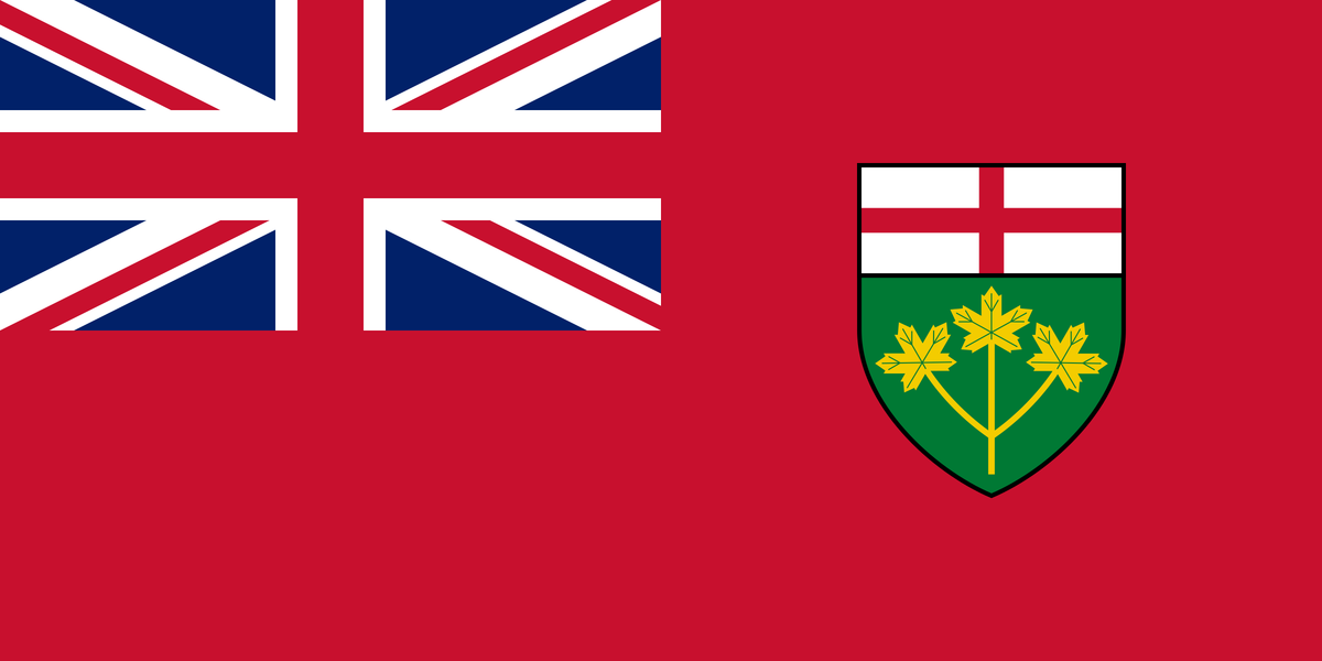
Ontario Flag needs replacing

I think that would be a great flag for a united Ireland (I find the Republic's tri-colour rather generic), though it would likely be stylized for a future flag. I imagine the boobs alone would be an absolute no-go.
Yet there are thousands of paintings of Mary breastfeeding Jesus...

This one by Leonardo Da Vinci, and a little something else...
leonardo_madonna_litta-683x1024.jpg
From link.
 
Last edited:
There are a couple of very memorable features in this design, anyone guess?

2560px-Green_harp_flag_of_Ireland.svg.png

Did someone mention boobs? Gosh, the two big things I referred to were: 1. the lady doesn't have any arms; and, 2. The lady doesn't have any legs.

Nice flag, but perhaps distracting for some. With current politicians penchant for announcements and conferences in front of a whole background of flags, this flag's prominent feature(s) may well distract!

But my point has been made: it is very memorable, absolutely distinct and deeply historical and that no new invented flag would come close.
 
Last edited:
Oooookay, I go away for a few weeks and somehow the thread about Ontario's flag yields... breasts and Jesus on the nipple. I am really interested in seeing how we got from A to Z on this one. :)
 
@Lone Primate you raise some interesting points.

There is no debate on the Ontario flag, so far as I am aware. I can probably assume with a high degree of certainty that the general public doesn't care.
I can't really argue with that point. :) I think what we're discussing here is, at least for the moment, largely an interesting academic exercise, but little more than that.
 
I take your point on fussiness & forgetableness, so here's a wee quiz ....and no cheating ;-)

Okay, I wanna try this. :)

1. What heraldry is besides the sun on the BC flag?

There's a stylized view of the Pacific beneath it, if that's what you mean. There's also one of the ugliest crowns I've ever seen superimposed on the Union Jack at the top.

2. How many mountain peaks on the Alberta flag? How many have snow?

Two, I think, and on both of them. But I admit I'm kind of vague about it.

3. What is on the shield of the Saskatchewan flag? What colour and position of the background colours?

Wheat sheaves, I think, annnnnnnnd the cross of St. George...? The background is green above and yellow below.

4. What animal on the Manitoba flag?

A bison. It's practically the only thing that makes it different from Ontario's flag, which is another reason we might just consider rejigging ours...

5. What animal on the NB flag? What colour is it?

A lion, at the top, red, one paw raised, and facing left.

6. What animal on NS flag? What direction is it facing?

Another lion, also red if I remember correctly, and he faces right, depicted on the provincial shield, backed by a colour-reversed Scottish flag. Was my flag till I was 12. :)

7. What objects are on PEI flag? How many?

Oak trees. Two of them, I think; one large on the left and one smaller on the right. It's possssssssssible there are three? One for each county? But I think it's two. I might be thinking of an acorn.

8. On the Newfoundland flag….sorry, even I cannot remember.

Essentially a stylized Union Jack.
LOL, nice tries. I just noticed there was a cheat sheet right at the top of the page! Well, I was in the ball park in most respects, if I did flip right and left around a couple of times. :D
 
But the British & French flags have flown on this land for nearly 4 centuries, doesn’t that qualify as genuine or legitimate Canadian symbols? And if not, why not?
Well, no; they're British and French. That's why you called them "British" and "French"; not "Canadian" or "Ontarian"... They belong to those people. Not us. They're borrowed at best. Sooner or later, it's a good idea to give back the things you borrow from someone else and get your own.
 
Well, no; they're British and French. That's why you called them "British" and "French"; not "Canadian" or "Ontarian"... They belong to those people. Not us. They're borrowed at best. Sooner or later, it's a good idea to give back the things you borrow from someone else and get your own.

Well that's a thought. So most of our cultural and social icons, constitutional inheritance and parliamentary traditions, systems of governance, the Common Law, models of judiciary - both official languages - all mainstream Christian churches, free market economic model, Scouts, soccer, curling, maybe even hockey (no!!!!) and infinite more items that do not conform to a narrow definition of authentic Canadian-ness have been reduced to a status of being borrowed, like Ned Flanders' lawnmower.

If you accept the 'borrowing' principle, then reductio ad absurdum. :D

Well, you're right, it is absurd. You're basically arguing we can't change anything unless we change everything. And that's simply ridiculous, isn't it? Seriously, now. Creating a new flag for a new identity on the one hand and creating a new language on the other are hardly equivalencies. After all, we've changed the flag of our nation in the lifetime of many of the people here; several countries have in the past 60 years or so. We also need to take into account the raison d'etre for doing so: representing oneself to the world as distinct from other, similar groups. In speaking English or French, in conducting law based on precedent, in having a legislature that is responsible to its membership—none of these self-identifies with the policies of other nations. Electing to maintain their overt symbols of national identity, on the other hand, does; and for the reason that it's one of the few things that is so very, very simple to change that actually choosing not to sends a message in and of itself. That's why Nasser objected to Canadian troops being among the peacekeepers in the Suez Crisis, after all. A Canadian—Lester Pearson—might have come up with the way to end the crisis, but the troops from his country would be marching ashore at the canal under a flag that still had the Union Jack on it... the very symbol of one of the nations supposedly to be held at bay on one side of the line. That was, in fact, the very reason Pearson undertook to give us our own symbol, and did once he was in a position to do so. But on the other hand, Nasser hardly expected Canadians to cease speaking English or French in order to have legitimacy, any more than we expected Egyptians to stop speaking Arabic. But Egyptians choosing to live under the Saudi flag would have been rather different, I think you'll agree. It's the ideas and values you espouse (and the symbols you choose to telegraph them) that matter in the world, not the language in which birth compels you to express them.
 
Last edited:
Hi Everyone. I've got an ongoing project that's crossing over this discussion. I run an On-Line Flag study project on Facebook and the group looks at mostly US state flags. This month we are having an "away month* looking at designs for Ontario. With so many good designs listed within this thread the options for change are well stocked. We try and pull together all known designs, make some new ones and then vote between them till we have a winner. We welcome local participation and having a revolving crowd often brings new blood. So, if anyone has new work or wants to join in being a judge (it's your local flag) then please do pop in and check out what designs we are finding and backing.
Link: https://www.facebook.com/groups/452687255183305
 
I found a page of proposals on a vexillology site:


I don't mind this one, by FNTS1

View attachment 345459

Please--nothing with the three guys in a hottub Ontario logo! I think replacing the green with red would look better and be a nod to the Canadian flag.

I am no photoshop expert as you can tell but I would keep the colours of our current flag. I would like to see more of the trillium as well.
Blue representing our lakes, rivers and bays. The green and white trillium represents lush native Ontario as well as French Ontario. Red represents Canada of course.
New Ontario Flag.png
 
I am no photoshop expert as you can tell but I would keep the colours of our current flag. I would like to see more of the trillium as well.
Blue representing our lakes, rivers and bays. The green and white trillium represents lush native Ontario as well as French Ontario. Red represents Canada of course.View attachment 393653

Its been suggested that this would be more appropriate for Ontario-themed condom packaging?

Suits you sir!
 
Please excuse my crude PP attempt below. While not a design that I personally would pick, I believe it's a decently elegant and simple compromise that would be palatable to traditionalists while following vexillological recommendations. It retains design cues and the colours of the Union Jack while still creating a distinctive flag for Ontario. The blue stripes on the top and bottom can also be interpreted as a nod to the bodies of water at the northern and southern ends of the province (Hudson Bay and the Great Lakes). Maybe to compromise even further and make it even more British-y for those loathe to give up that influence you could angle the stripes diagonally as well, which could make it more striking. And with the presence of both conservative blue and liberal red, there's something here to like for those of all political stripes! Thoughts?

Ontflag1.jpg
 
Last edited:
Please excuse my crude PP attempt below. While not a design that I personally would pick, I believe it's a decently elegant and simple compromise that would be palatable to traditionalists while following vexillological recommendations. It retains design cues and the colours of the Union Jack while still creating a distinctive flag for Ontario. The blue stripes on the top and bottom can also be interpreted as a nod to the bodies of water at the northern and southern ends of the province (Hudson Bay and the Great Lakes). Maybe to compromise even further and make it even more British-y for those loathe to give up that influence you could angle the stripes diagonally as well, which could make it more striking. Thoughts?

View attachment 453667

Well, we aren't quite DPNK yet.

AoD
 

Back
Top