News   Nov 15, 2024
 2.3K     7 
News   Nov 15, 2024
 1.9K     1 
News   Nov 15, 2024
 2.3K     0 

Ontario Flag needs replacing

I would suggest that changing the Ontario flag is certainly not a matter I consider a personal priority. I've always been more interested in substance, than symbols.

That said, I find nothing particularly attractive or interesting about the current Ontario flag.

Looking at the proposals submitted on the page linked by @BurlOak I personally like this one the best.

185


I like the Trillium which all Ontarians now link to the provincial government by way of health cards and driver's licenses.

The Maple Leaf draws the allusion to Canada, while preserving the existing styling.

The colours have the incidental value of representing each of the 4 major political parties in Ontario, meaning one does not draw a link to the flag as being a partisan instrument.
It didn't jump out at me before, but I do like the colours. I always thought of Ontario as Blue and Red - kind of royal colours.
It does lose some of our heritage by dropping the St. George cross and Union Jack. How about adding a crown.?
Ontario Flag 2.jpg

Or maybe.

Canada 5.jpg
 
Last edited:
I hope this government gets rid of the terrible 'three men in a bathtub trillium' logo that the Liberals felt free to play with. I think those iconic symbols are bigger than governments.
 
I hope this government gets rid of the terrible 'three men in a bathtub trillium' logo that the Liberals felt free to play with. I think those iconic symbols are bigger than governments.


Agreed - though I have some doubts as to whether the wisdom exists to readopt the old, stately logo.

AoD
 
Which old one?

iespos6yedfdvxxcgoot.jpg
vrjdru01tw2glesxegrv.jpg
2006
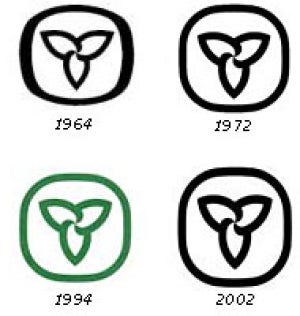
1972. I don’t think the Davis version required any Liberal tinkering. I didn’t know of the 1994, nor 2002 revisions until now. The 2006 logo is dreadful and represents Liberal attempts to erase memory of what preceded them. Even a government as ballsy as “the Harper government” didn’t have the courage to play with the Canada wordmark. This logo should also be untouchable.
 
Last edited:
1972. I don’t think the Davis revision required any Liberal tinkering. I didn’t know of the 1994, nor 2002 revisions until now. The 2006 logo is dreadful and represents Liberal attempts to erase memory of what preceded them. Even a government as ballsy as “the Harper government” didn’t have the courage to play with the Canada wordmark. This logo should also be untouchable.
Harper did change the National Anthem though. No, that was the Liberals too.
 
Harper did change the National Anthem though. No, that was the Liberals too.
‘Twas. That I feel less strongly about. Tinkering with iconic visual symbols is a no no. Updating wording - I’ll never remember it - it’s not the version burned into my skull - in the name of gender balance is fine.

@BurlOak , although both situations involve changes to important symbols of government, one was political re-branding to suit a government or party of the day, and one was a change - the anthem - which it is hard to see as related to any party's brand but does reflect our society.
 
Last edited:
I miss this Ontario. I think it was noticeably better run than today’s. Less fanfare and more ‘just getting on with it’. I would not roll the clock back on where today’s society is in any manner and one cannot argue with the current dynamism of Toronto. But this was a more confident time. People felt good about the world.

 
This version is much better than the crap the Peterson government toned it down with, but already a sad second to the first version which was more dynamic again. They re-did the commercial each year for a decade and this has more restrained language and music than the first.

The first started more confidently.

Start at the dawn of a new day
Feelin’ the sun shining strong
Follow the trails where they’re leading you
And discover a place you belong

[note - even 30 years back we were emphasizing an inclusive Ontario]

[chrous]

In Ontario... etc etc.

This was noticeably better than “Ca-na-da now we are twenty million...We love thee...”

Thinking about it, “Ontario -Yours to Discover” was an awesome advertising slogan.
 
Last edited:
  • I tried to lighten up the blue a bit - to more like the Maple Leafs, or to represent water. The green and gold are official Ontario colours (although I don't really know this from seeing existing flag or teams - such as in Canada games or Brier). The red is from the old flag.
  • The crown represents our Monarchy, and also King's highway system (around since the 1930's) which connects Ontarians.
  • The 3 Maple Leaves represent the old flag (and has been on coat of arms for over 100 years).
  • The Trillium is the symbol of Ontario for the past 50 years (actually, since 1937).
Ontario Flag 6a.jpg
 
  • I tried to lighten up the blue a bit - to more like the Maple Leafs, or to represent water. The green and gold are official Ontario colours (although I don't really know this from seeing existing flag or teams - such as in Canada games or Brier). The red is from the old flag.
  • The crown represents our Monarchy, and also King's highway system (around since the 1930's) which connects Ontarians.
  • The 3 Maple Leaves represent the old flag (and has been on coat of arms for over 100 years).
  • The Trillium is the symbol of Ontario for the past 50 years (actually, since 1937).
View attachment 164106

I won't bother embarking on whether we need a new flag and/or should we maintain a connection with the Crown (not a provincial issue anyway) but the problem with trying to come up with any design would be, since bureaucrats would be involved, every single group will want to be represented. Simply as an example, your proposal has no aboriginal reference. We seem to have d/evolved to the point that if something doesn't reference me or speak to me then it therefore offensive to me.

I recall reading an article about the development of the Canadian flag. There are many aspects of heraldry and vexillology that I don't understand (ok, most aspects) but the logic of the ultimate design made sense when explained.
 
If Ontario were to get a new flag, and I like the idea of a proper provincial flag I'd like something simple.

If I was forced to come up with something, I'd take the Pearson Pennant, move the two blue bars from vertical to horizontal, representing the Great Lakes/St. Lawrence and Hudson Bay/James Bay, to represent north and south. The triple maple leaf (often used to represent three founding peoples - First Nations, French and British) would come from the provincial crest, rather than the style used in the proposed national flag (which is now the logo of Dominion City Brewery in Ottawa).

The best US state flags are either simple and distinctive, or just very distinctive. Texas, New Mexico, South Carolina, and Colorado do simple and recognizable well (it's hard to beat New Mexico's). Maryland and Arizona are also very distinctive (though both are a bit busy) and they are very popular. California's is at least rooted in historical precedent.
 

Back
Top