News   Nov 22, 2024
 665     1 
News   Nov 22, 2024
 1.2K     5 
News   Nov 22, 2024
 3.1K     8 

More Lost Toronto in colour

Then again, the way the Royal York's gotten hemmed in and skyline-blocked, it's less and less easy to "notice" the asymmetry...
 
Great minds think alike. I'd consider demolishing that addition for a taller tower set back from the landmark original building to restore the symmetry, ensure there's enough space between the new tower and the original building to maximize the original's aesthetic impact, and obviously to make money.

Certainly they need to think about a major renovation, and that might not be a terrible idea. I've found the rooms seem very tired and dated, especially in comparison with the new competition in the Ritz, Shangri-La, etc.
 
1930's:

POSTCARD - TORONTO - SKYLINE - ROUNDHOUSE - AERIAL PANORAMA - 1930s.jpg
 

Attachments

  • POSTCARD - TORONTO - SKYLINE - ROUNDHOUSE - AERIAL PANORAMA - 1930s.jpg
    POSTCARD - TORONTO - SKYLINE - ROUNDHOUSE - AERIAL PANORAMA - 1930s.jpg
    102.3 KB · Views: 893
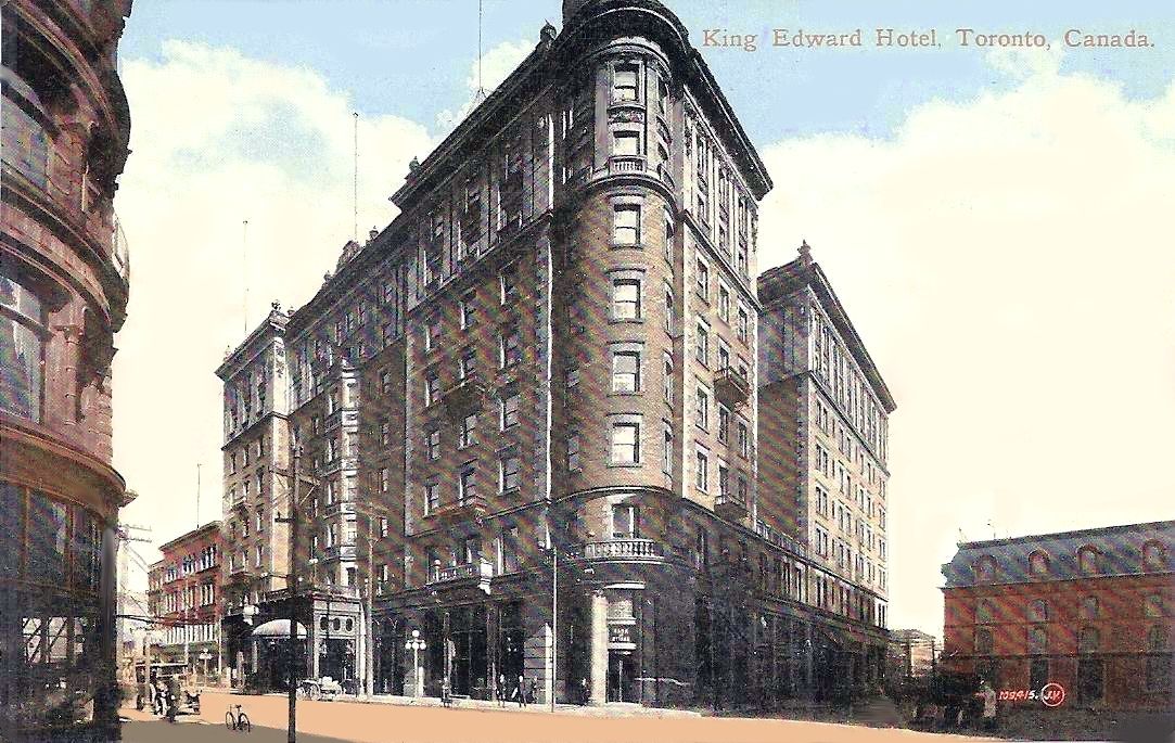
Of course, symmetry is just one aspect of design. E. J. Lennox at the King Edward Hotel designed a symmetrical façade around the King Street main entrance, but then added the cylindrical corner element at Victoria Street which added a nice asymmetrical touch. This harmony was brutally changed with the 1922 addition.

1903:

kingedward.jpg


1922 Addition:

postcard-toronto-king-edward-hotel-part-of-direction-united-hotels-of-america-1928.jpg


From the Naylor fonds, 1973-1983:

ke.jpg


ke2.jpg


ke3.jpg


ke12.jpg


ke4.jpg


ke5.jpg


ke6.jpg


ke7.jpg


ke8.jpg


ke9.jpg


ke10.jpg
 

Attachments

  • postcard-toronto-king-edward-hotel-part-of-direction-united-hotels-of-america-1928.jpg
    postcard-toronto-king-edward-hotel-part-of-direction-united-hotels-of-america-1928.jpg
    67.3 KB · Views: 840
  • kingedward.jpg
    kingedward.jpg
    97.4 KB · Views: 837
  • ke.jpg
    ke.jpg
    94.1 KB · Views: 813
  • ke2.jpg
    ke2.jpg
    74.6 KB · Views: 819
  • ke3.jpg
    ke3.jpg
    89.8 KB · Views: 811
  • ke4.jpg
    ke4.jpg
    97.6 KB · Views: 801
  • ke6.jpg
    ke6.jpg
    91.4 KB · Views: 798
  • ke5.jpg
    ke5.jpg
    91 KB · Views: 808
  • ke7.jpg
    ke7.jpg
    66.2 KB · Views: 812
  • ke8.jpg
    ke8.jpg
    97.6 KB · Views: 802
  • ke9.jpg
    ke9.jpg
    91.7 KB · Views: 843
  • ke10.jpg
    ke10.jpg
    92.9 KB · Views: 807
  • ke12.jpg
    ke12.jpg
    93.2 KB · Views: 811
Last edited:
Interesting that the King Eddy tower-as-built is far less ornate than originally mooted--a plain brick shaft, no quoins, nothin' (and further aggravated through cornice/balcony removal)
 
I've always disliked that addition to the Royal York because it ruined the symmetry of the original building.

Agreed. They also cheaped out on some of the minor flourishes.

I do seem to recall reading that there had once been a plan for a north wing but they lost out on the land at some point in time and the extension to the east was their only option. Seems logical. Confirmation anybody?
 
"I do seem to recall reading that there had once been a plan for a north wing but they lost out on the land at some point in time and the extension to the east was their only option."
QUOTE: dbailey62.

The only buildings that I remember being on the north side of Piper Street were The Toronto Club, (s/e corner of Wellington & York) and

The Royal York's, if indeed it was The Royal York's own garage, to it's east. The Toronto Club would not want to move, so that would leave

a parking problem for the hotel during construction. This would later be limited as "redevelopment" provided more parking space, especially

when the garage itself was sold with the East Wing already having been built beforehand.


Regards,
J T
 
Two views of Broadview and Gerrard. 1911 and 2013

BROADVIEW AND GERRARD - STREETCAR - STORES - AWNINGS - STUNNING - 1911.jpg
broadview and gerrard after 2013 fire.jpg
gerrard fire munro.jpg
Third photo from Steve Munro`s website.
 

Attachments

  • BROADVIEW AND GERRARD - STREETCAR - STORES - AWNINGS - STUNNING - 1911.jpg
    BROADVIEW AND GERRARD - STREETCAR - STORES - AWNINGS - STUNNING - 1911.jpg
    95.4 KB · Views: 1,060
  • broadview and gerrard after 2013 fire.jpg
    broadview and gerrard after 2013 fire.jpg
    49.1 KB · Views: 1,080
  • gerrard fire munro.jpg
    gerrard fire munro.jpg
    41.9 KB · Views: 1,090
Last edited:
Interesting reminder that what appears to be a solid "block" is actually a series of de facto "units" within a common envelope--presumably for fireproofing purposes (and here we have it demonstrated for us)
 
Agreed. They also cheaped out on some of the minor flourishes.
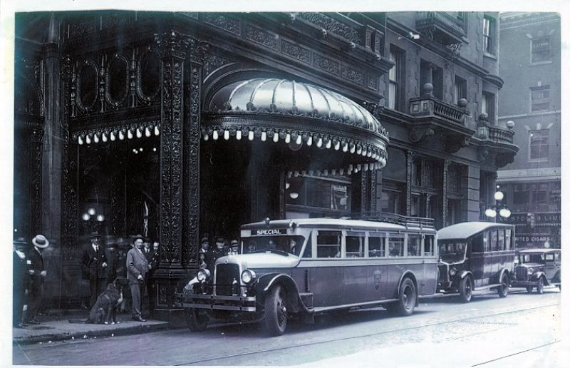
Though to be fair, what appears to be "cheaping out" is actually a *splurge* by late 50s standards. (The "cheaping out" is more apparent inside, where the upper-level public/convention spaces in the addition are pure Khruschev-Nixon-era blah.)
 

Back
Top