News   Apr 19, 2024
 287     1 
News   Apr 19, 2024
 588     3 
News   Apr 19, 2024
 710     1 

Miscellany Toronto Photographs: Then and Now

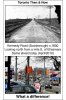
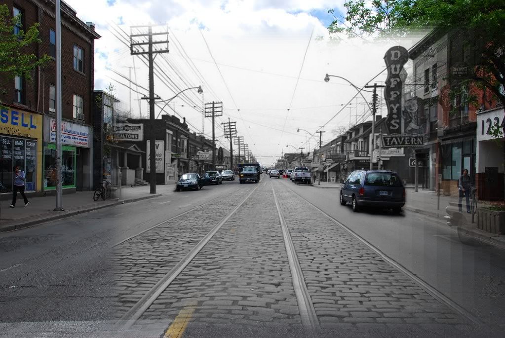
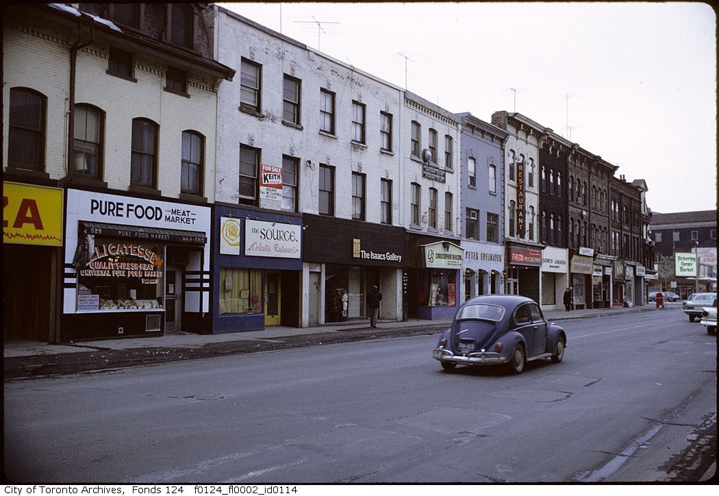
It's amazing just how common cornice stripping has been. We have so many Victorian commercial streets intact, but so much of their roofline ornamentation has been stripped. Its my hope that with the increased interest in recreating Victorian styles (i.e. in new subdivisions) and awareness of Victorian ornamentation by the online publishing of archival photos, we'll see a movement towards restoring the ornamentation, at least with more prominent buildings at first.

One example of the reversal of cornice stripping (a great phrase!) is the building at the NE corner of The Esplanade and Church Street. It had its cornice reinstalled a couple of years ago, at least on the two street-fronting sides. It certainly made the building look MUCH better!
 
June 4 addition Remixed

June 4 addition.

Then. Bloor west looking W from Margueretta. "196?" says the Toronto Archive photo notes.

Now. May 2010. Duffy's Tavern is still there.

Duffy's has a website which includes a Youtube segment of a 1954 TV show - "Duffy's Tavern" (which is unrelated to the Toronto Duffy's Tavern). There is also an old menu with old prices.

http://duffystavern.ca/about-us.html

.

4666734439_fb2830cc48_b.jpg
 
June 4 addition Remixed


4666734439_fb2830cc48_b.jpg


What a one-of-a-kind-art form that old Duffy's sign and others like it were. What a loss.


June 9 addition.


Then. Yonge looking NNW from N of Cumberland.


f0124_fl0002_id0114.jpg


Now. May 2010. Not many changes building-wise on this block, but it's always interesting to look at vanished businesses.


DSC_0225.jpg
 
Yeah, there are examples of improvements, but I'm struck by how many examples of the opposite I've seen in this thread, whether it be the loss of a beautiful building, the architectural details on a building, a vibrant strip, cool signage, or whatever.

It's not just use improvements - which are pretty important - it's the fact that the past will always look more "beautiful" or "charming" to us because these buildings are no longer being built, and are therefore precious for their rarity and exoticism. Modernism looks relatively ugly to us now because it is common.

Also, we don't see the buildings the way the people did in the 19th century. For example, a lot of people seem to get sentimental about what were clearly really rough taverns and slums. For the people living then, these would be considered ugly. Since we can't be hurt by these slums anymore, they seem quaint. Dirt always looks better in the past, because we don't have to clean it. And it's kind of terrible: people turn what was ugly and mean and scary into safe decoration. Will future generations revile us for tearing down Regent Park?

The "classy" connotations of black and white also adds a layer of beauty to the old photos. Look at how "now/then" doesn't work as well when the "then" is in colour.

And no offense to Mustapha - who does a wonderful job - but when he lines up his "now" pictures with the exact position of the "then" pictures, you lose the ability to freely frame the new buildings. This usually means we are comparing properly framed old buildings to pretty random parts of new buildings. This makes the "now" look stranger and wrong.

These are just a few reasons why although I enjoy the now/then photo comparisons, I don't trust them.

Thank you. :) An interesting series of view points leading to your argument in the last two paragraphs.

By presenting two moments of a geographic location spanned by Time, I think the practioners of the Now and Then photographic documentary form are trying to, among other things that I can think of right now in the middle of the night:

* Allow a viewer to derive from viewing a Then and Now their own conclusions, opinions, reminisces or just mere entertainment.
* Allow the viewer to make their own judgement of any "losses" or "gains".

The edges of the Then photo image - rightly or wrongly - determines that the Now photo adheres to the same view. This is the practice followed by posters world wide as far as I know. Ie., see the Flickr Then and Now albums, many books in print, among others. This allows an exact comparison of the geographic location. Apples to apples as it were. What is out of the frame of either the Then or the Now pictures isn't irrelevant, but in my opinion should not distract.

Not saying you're wrong; not sure I'm right, either. :)
 
Now. May 2010. Not many changes building-wise on this block, but it's always interesting to look at vanished businesses.

Esp. given the nature of the businesses, i.e. w/Issacs and all, this was "gallery row"--disconcertingly juxtaposed against artifacts like the Pure Food Meat Market. (And it's worth it to discern that there was already a pizza joint where Pizza Pizza now stands)
 
By presenting two moments of a geographic location spanned by Time, I think the practioners of the Now and Then photographic documentary form are trying to, among other things that I can think of right now in the middle of the night:

* Allow a viewer to derive from viewing a Then and Now their own conclusions, opinions, reminisces or just mere entertainment.
* Allow the viewer to make their own judgement of any "losses" or "gains".

The edges of the Then photo image - rightly or wrongly - determines that the Now photo adheres to the same view. This is the practice followed by posters world wide as far as I know. Ie., see the Flickr Then and Now albums, many books in print, among others. This allows an exact comparison of the geographic location. Apples to apples as it were. What is out of the frame of either the Then or the Now pictures isn't irrelevant, but in my opinion should not distract.

Yes, Mustapha - I am definitely not criticizing your hard work and adherence to a particular form. That's what makes your comparisons entertaining!

I'm just saying that the "natural" conclusion many people get from these comparisons (then is better) is always going to be a little questionable based on the format of the comparison.

But yes, great work: keep it up!
 
I think I've finally discovered (once again) how to upload my images. Hooray!
This one is a reminder of the road I've used for over 50 years.
Click to enlarge:
 

Attachments

  • TN Lawrence thru Don Mills.jpg
    TN Lawrence thru Don Mills.jpg
    102.9 KB · Views: 340
Yes, Mustapha - I am definitely not criticizing your hard work and adherence to a particular form. That's what makes your comparisons entertaining!

I'm just saying that the "natural" conclusion many people get from these comparisons (then is better) is always going to be a little questionable based on the format of the comparison.

But yes, great work: keep it up!

I think the overall theme of these comparison photos is "change". For someone who hasn't been around that long I like these photos for its presentation of "change over time".

I am often drawn to the Thens a little more because they are the "unchangable unkowns". Most of us are certainly familar with the Nows and can easily place ourselve there at any moment, but thens place me in the unkown past. No matter how the now is presented, I beleive the thens will always be a better eye catcher in a sense that it can not be changed. Its a stamp on history. Whereas, nows are waiting to be changed. I hope this makes some sense because I am still trying to figure it out. :)

4602962808_e83a2670a4_o.jpg
 
as if i had to confirm it, but the poster of the patio beside the flatiron circa mid 80's is indeed staged (love the indoor cafeteria type chairs). i actually have the mounted poster in my office here at work. i used to work for the provincial ministry of tourism and recreation and was always on the lookout for vintage or dated paraphanalia such as this poster for my office. over the years i had the poster on the wall, 'old-timers' from around the ministry would come by and point out various bureaucrats they knew in the poster (i think they even knew whose child that was)...

too funny!!
 
What a one-of-a-kind-art form that old Duffy's sign and others like it were. What a loss.


June 9 addition.


Then. Yonge looking NNW from N of Cumberland.


f0124_fl0002_id0114.jpg


Now. May 2010. Not many changes building-wise on this block, but it's always interesting to look at vanished businesses.


DSC_0225.jpg

There doesn't appear to be any street lamps or sidewalks in the then photo. Perhaps those are lights tacked to the side of every forth building. The city didn't put much effort into street beautification back then eh?
 
No, though two of Toronto's leading art galleries were in that block, and a restaurant that was a meeting place for the arts community.
 
as if i had to confirm it, but the poster of the patio beside the flatiron circa mid 80's is indeed staged (love the indoor cafeteria type chairs). i actually have the mounted poster in my office here at work. i used to work for the provincial ministry of tourism and recreation and was always on the lookout for vintage or dated paraphanalia such as this poster for my office. over the years i had the poster on the wall, 'old-timers' from around the ministry would come by and point out various bureaucrats they knew in the poster (i think they even knew whose child that was)...

too funny!!

I'm certainly pleased that you saw as much humour in this 'government' photo, as I did.
I'll give you the 1985 LIFE Magazine with the advertisement if you'd like to add it to your archives.
Here's the page as it appeared:
 

Attachments

  • patio.jpg
    patio.jpg
    77.5 KB · Views: 331
So culture can exist without pretty lamps and potted plants? Which restaurant would that have been? Is it in the above shot?
 
Some east-end images

Kennedy Road in Scarborough has sure changed!
And Kew Beach once had some elegant cottages along the waterline.
We need an update to this Kew Beach view - 'Now' 80 years later!
Who wants to go to the beach?
 

Attachments

  • TN Kennedy Road.jpg
    TN Kennedy Road.jpg
    102.5 KB · Views: 347
  • TN Kew Beach.jpg
    TN Kew Beach.jpg
    66.8 KB · Views: 361

Back
Top