WB62
Senior Member
None of these proposed features ever made it to the Bi-Level, but it still became one of the most successful railcars in North America, with over 1,300 made.
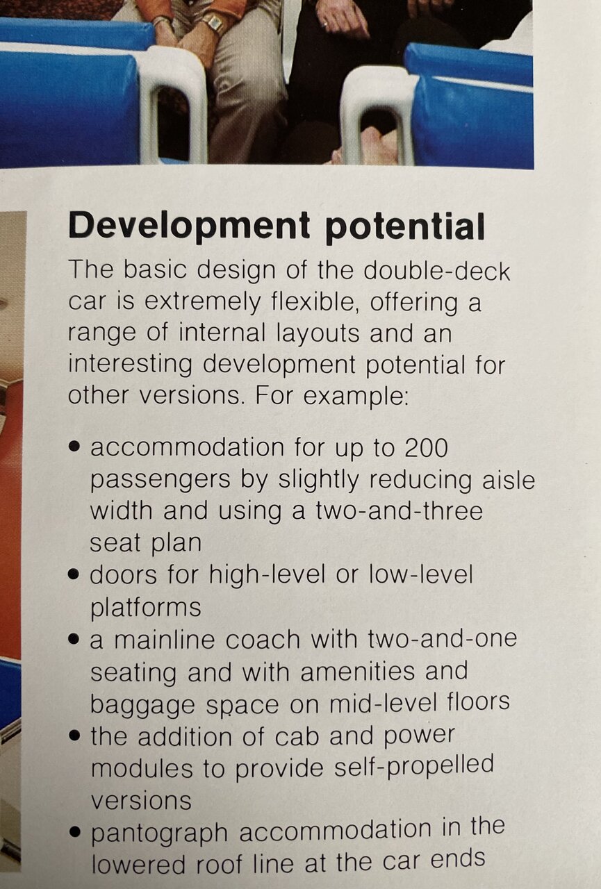
None of these proposed features ever made it to the Bi-Level, but it still became one of the most successful railcars in North America, with over 1,300 made. View attachment 425137
That was the original plan. There was a old photo of one with a pantograph.I knew the bilevel design could allow for high-platform loading with the entry doors in the mid level at the end of each car. The different seating configurations are pretty much a given. I did not know that they were designed for self-propelled or MU diesel or electric propulsion.
 seanmarshall.ca
When is the Alstom operating contract up for renewal?Sadly, I have come to the conclusion that GO Transit is broken, and that no one with the power to do anything about it cares enough.

GO Transit is broken – and other transit updates
GO Transit is broken. So far, I have seen no initiative from Metrolinx or any level of government to fix it. That should outrage all of us.seanmarshall.ca
That is the Bi-Level Series I booklet from 1978. A very nice crew member gave me a whole bunch of old GO stuff to compliment my already expansive collection of modern stuff:What a find! What book is that?
So are they just not going to use their $100+ million bus terminal anymore? Everything except Barrie buses (since there are no trains) are detoured to Port Credit again today...I did a quick trip to Aurora this morning and traffic wasn't even that bad. Not sure why they keep doing this every weekend.
While waiting for my bus, I saw multiple people come in, look at the screens with all the cancelled buses and then leave disappointed.
This was the other thing I noted last weekend that left me absolutely baffled. Not the faintest hint of communications about why the buses are cancelled or what options travellers have. What the hell is going on at Metrolinx?While waiting for my bus, I saw multiple people come in, look at the screens with all the cancelled buses and then leave disappointed.
So are they just not going to use their $100+ million bus terminal anymore? Everything except Barrie buses (since there are no trains) are detoured to Port Credit again today...I did a quick trip to Aurora this morning and traffic wasn't even that bad. Not sure why they keep doing this every weekend.
While waiting for my bus, I saw multiple people come in, look at the screens with all the cancelled buses and then leave disappointed.
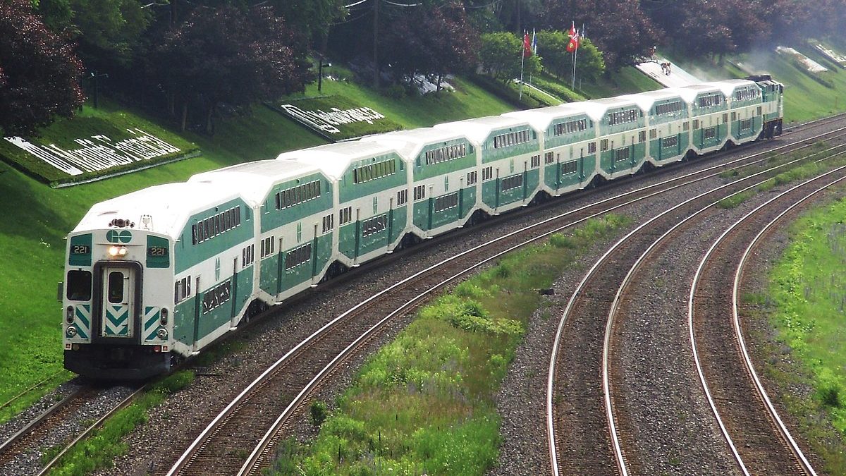
There was an unfortunate situation yesterday near exhibition station.
Hundreds stranded on Toronto GO Train as delay spans hours
GO Transit notified the public of a police investigation on track level just after midnight, which suspended service between Union Station.toronto.citynews.ca
Even though the investigation was over they didn't let the passengers off the train for hours.
Could they not bring another train and park it beside the train that was involved in the accident and allow customers to board the train directly beside it? It would be easier than walking the entire distance of the train.
There has to be a better solution than keeping people hostage on a train for 5 hours with no communication.
If you can park a train and match the door locations you could have an emergency plank to allow people to cross over. You don't need to open all of the doors. Just 6 or so would be enough.AMA's unending array of excuses, many ill-informed or erroneous grow tedious.
At the very least, there is no excuse for failing to keep riders informed.
But the extent of that delay, and trapping people on the train was entirely unnecessary.
There certainly were choices for how to affect an evacuation of that train, safely. Some may not have been particularly desirable and none without challenges (ie. stopping all service through the affected section of tracks to allow people to exit)
At any rate........time for AMA to go......and she can take Phil w/her.


