You are using an out of date browser. It may not display this or other websites correctly.
You should upgrade or use an alternative browser.
You should upgrade or use an alternative browser.
GO Transit: Construction Projects (Metrolinx, various)
- Thread starter drum118
- Start date
Amare
Senior Member
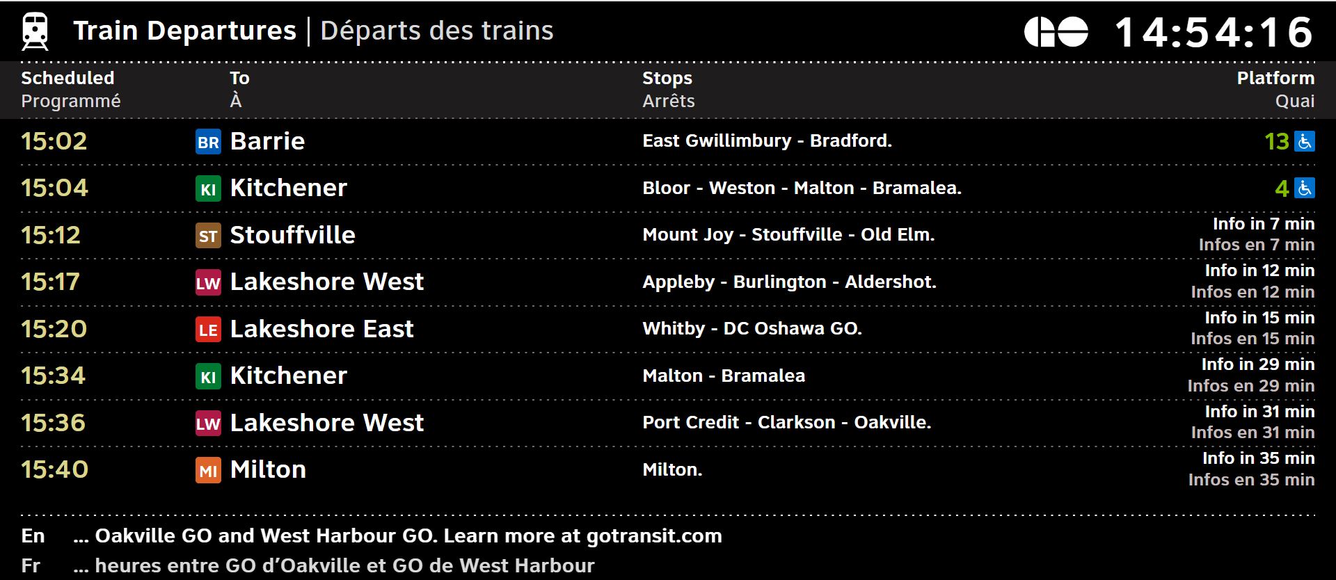
Metrolinx is updating Union Pearson Express and GO Transit information screens across the network:


GO Transit & UP Express digital screens sport new look
We’ve updated information screens across the GO & UP network to make taking transit even easier
www.metrolinx.com
Northern Light
Superstar
Metrolinx is updating Union Pearson Express and GO Transit information screens across the network:

GO Transit & UP Express digital screens sport new look
We’ve updated information screens across the GO & UP network to make taking transit even easierwww.metrolinx.com
From the above:
Rollout begins with UP Express Stations, GO in General and Union to follow.
Amare
Senior Member
I'm pretty sure I saw the layout at Weston GO about 2 weeks ago for the Union Pearson screens so it's possible they were testing things out; I wasnt really impressed with how it looked but overall it looked clean and easy to pull information from which I suppose is the ultimate goal of these screens so it works well.
Let's see if Metrolinx can get it done right for the GO information screens without making things more complicated than they should be.
Let's see if Metrolinx can get it done right for the GO information screens without making things more complicated than they should be.
WB62
Senior Member
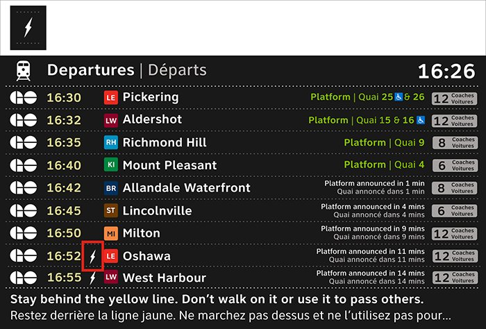
The description of the GO screens in that article sounds a lot like the design that Metrolinx surveyed people on 2-3 years ago:

SaugeenJunction
Senior Member
This design is so far superior to what we have now. Only design change I’d make is to have the entire horizontal bar for each train the colour of the line.The description of the GO screens in that article sounds a lot like the design that Metrolinx surveyed people on 2-3 years ago:View attachment 542750
T3G
Senior Member
The new one is pretty unimpressive. Love how half of the screen is for advertising. 
The one from 2-3 years ago looks a lot better. So of course they didn't use it.
The one from 2-3 years ago looks a lot better. So of course they didn't use it.
crs1026
Superstar
Platform number should be larger, needs to be at least as large as the time digits. Coach length is useful but should be smaller especially in relation to the platform number. Maybe platform number can be colour coded.
Bigger issue at outlying stations is how many of the screens are not legible in bright light. Maybe they need shrouding - or just replacing.
- Paul
Bigger issue at outlying stations is how many of the screens are not legible in bright light. Maybe they need shrouding - or just replacing.
- Paul
WB62
Senior Member
It’s not much different from the old UP Express screenThe new one is pretty unimpressive. Love how half of the screen is for advertising.
The one from 2-3 years ago looks a lot better. So of course they didn't use it.
UP and GO are getting different screens, they didn’t show what the GO one will look like
Coolibop
Active Member
Why someone needs to reference a website for latest service updates is a bit baffling...From the above:
View attachment 542735
View attachment 542736
Rollout begins with UP Express Stations, GO in General and Union to follow.
cplchanb
Senior Member
honestly is ML so broke that they need to sacrifice 2/3s their screen to ads? next train displays should only be for ETAs only!It’s not much different from the old UP Express screenView attachment 542826
UP and GO are getting different screens, they didn’t show what the GO one will look like
Dan416
Senior Member
Are they still planning to eventually use the A B C D etc. naming scheme for the GO lines? Or are they sticking to LW LE KI etc?
TheHonestMaple
Active Member
I guess we'll get these new screens at Hamilton. Now to figure out what the other ~$200 million in upgrades are.. 
Fritter
Active Member
I don't think ML is broke, it just likely has a mandate to lower or eliminate government subsidies. Every dollar earned from an ad is a dollar less the Provincial government has to spend subsidizing GO operations.honestly is ML so broke that they need to sacrifice 2/3s their screen to ads? next train displays should only be for ETAs only!
T3G
Senior Member
I don't object to advertising on transit, but there's certain things that should just not be done, in my book, and putting advertising on information boards is one of them.I don't think ML is broke, it just likely has a mandate to lower or eliminate government subsidies. Every dollar earned from an ad is a dollar less the Provincial government has to spend subsidizing GO operations.
And this is mild compared to the displays the TTC has. Unless you happen to be standing close to the board, or have a telephoto lens on your person, you can't see the next train arrival time at all. That information should be in the maximum possible size, viewable from all distances along the platform. There are loads of blank walls in every station where advertisement boards could be put up, and as for the news that they display, well, no one needs to see that. I'm honestly surprised they didn't straight up put a feed from CP24 and be done with it. Because when I'm waiting for a train (or eating in a fast food joint), there is nothing that will improve my mood quicker than those parasites informing me that somewhere in the world, someone committed a heinous crime.


