You are using an out of date browser. It may not display this or other websites correctly.
You should upgrade or use an alternative browser.
You should upgrade or use an alternative browser.
Erin Mills Expansion & Cineplex Junxion | 14.75m | 1s | OPB | MMC Architecture
- Thread starter ShonTron
- Start date
AlvinofDiaspar
Moderator
I am curious to know how they'd be able to keep it watertight.
AoD
AoD
Jasonzed
Senior Member
theawesomeSC4sim
New Member
Update 10/29/14
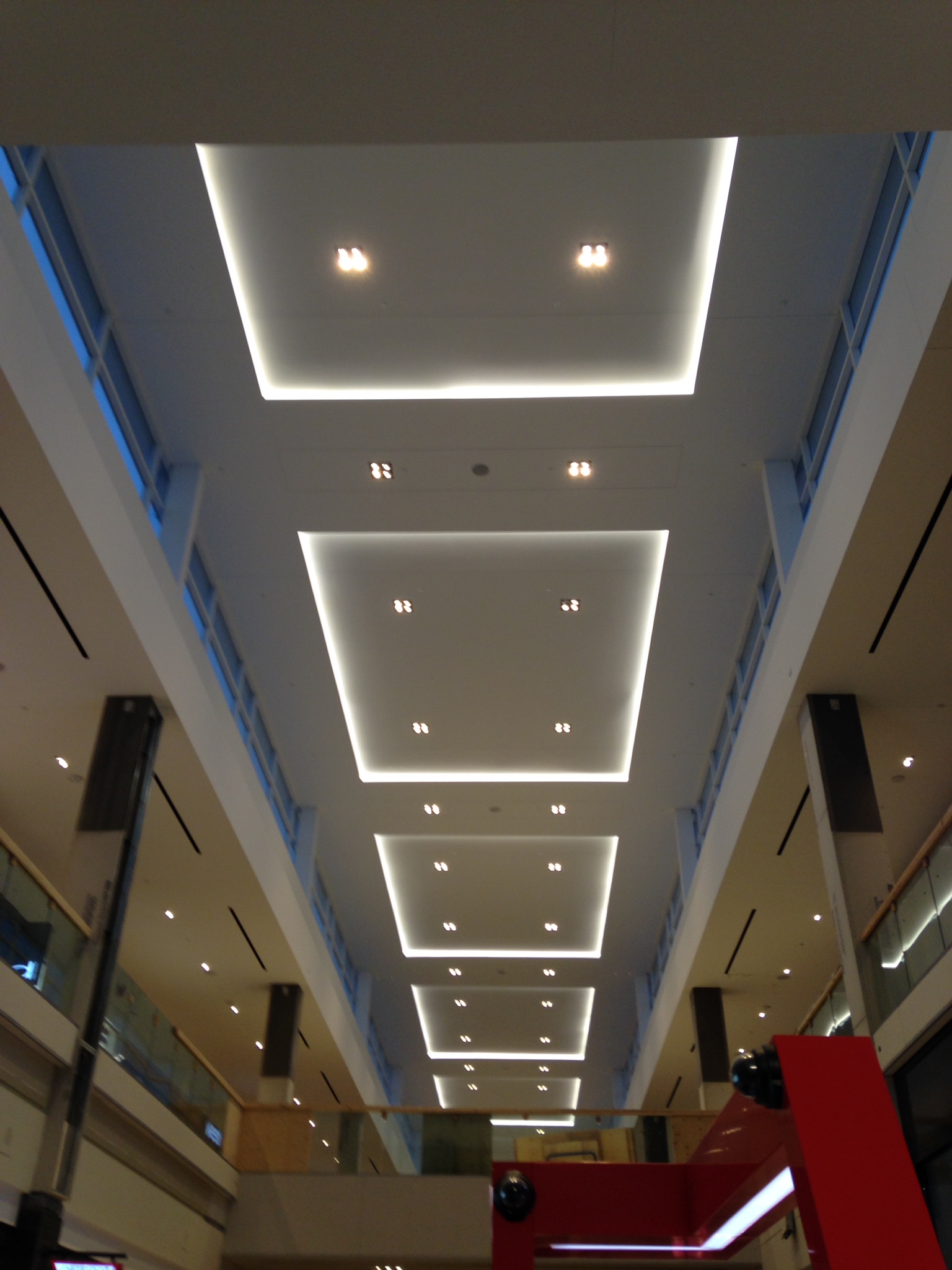
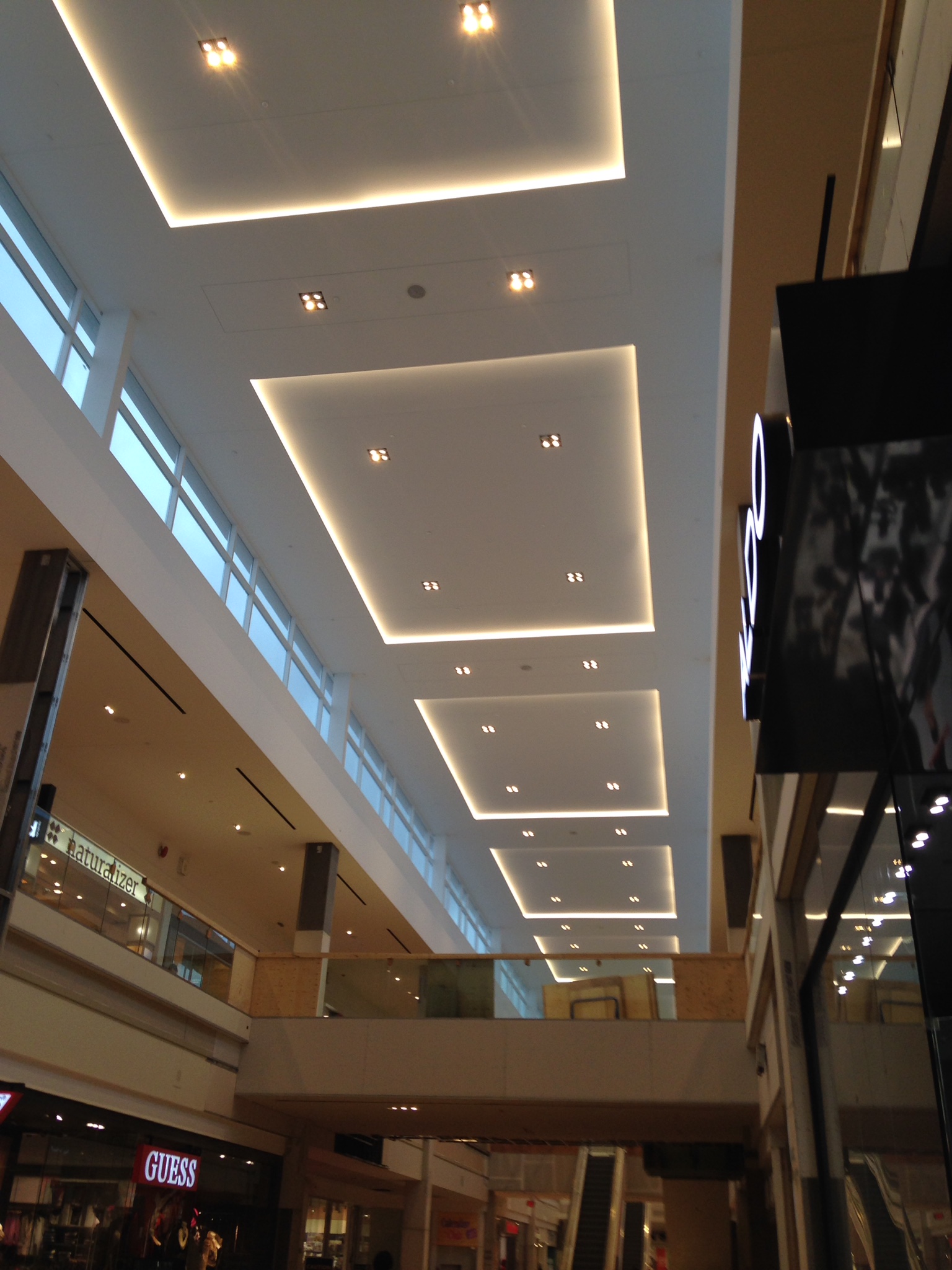
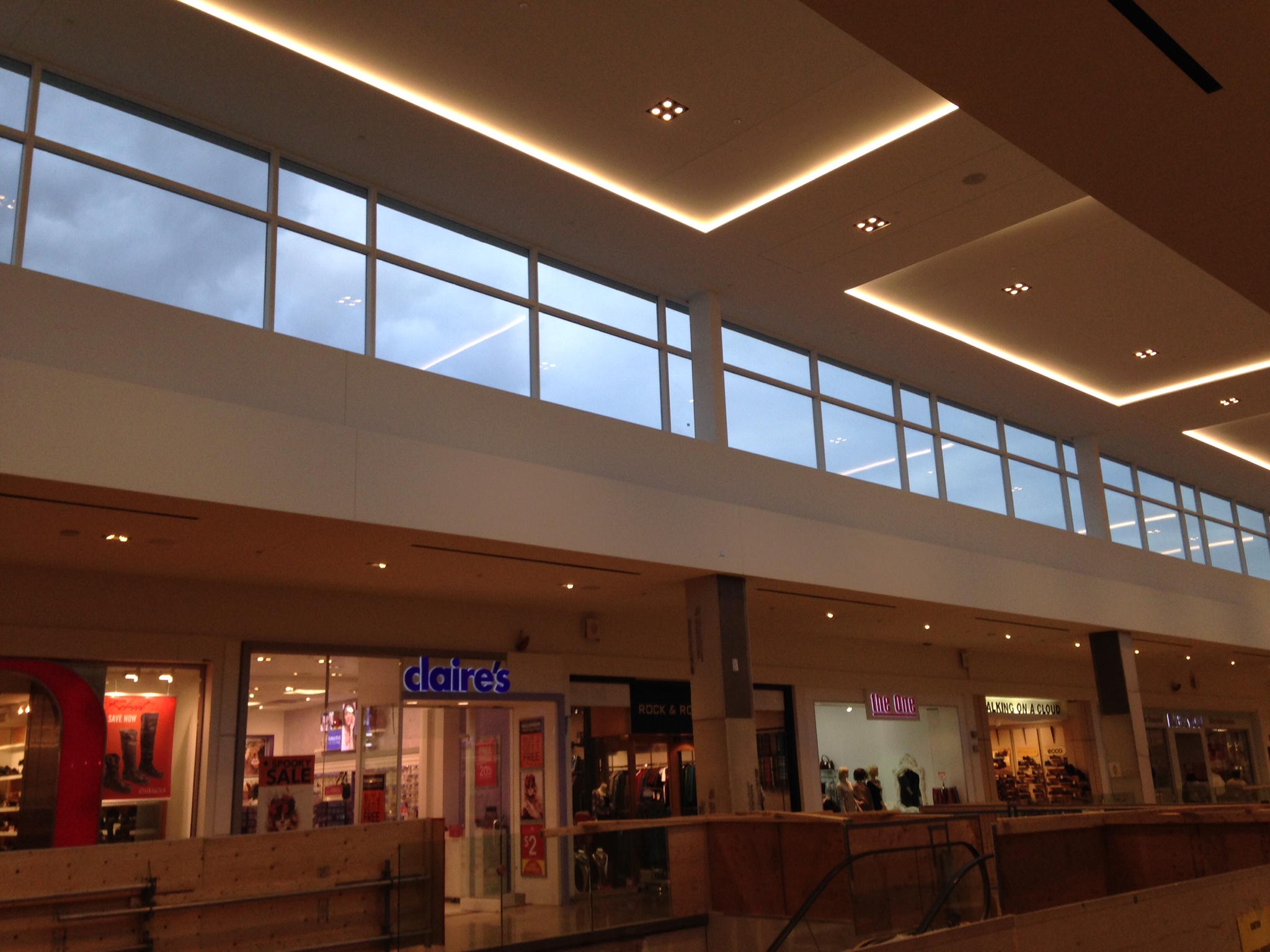
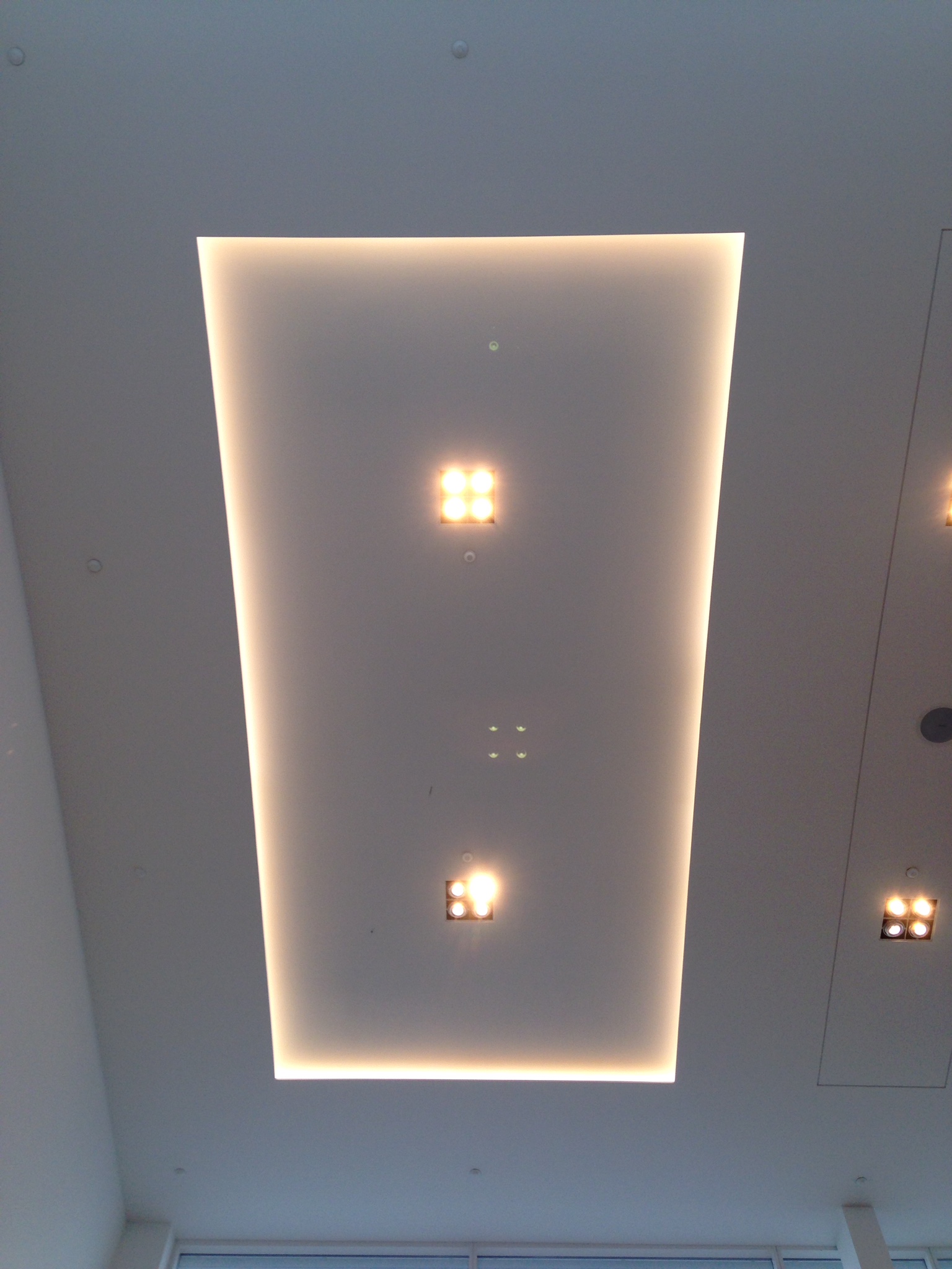
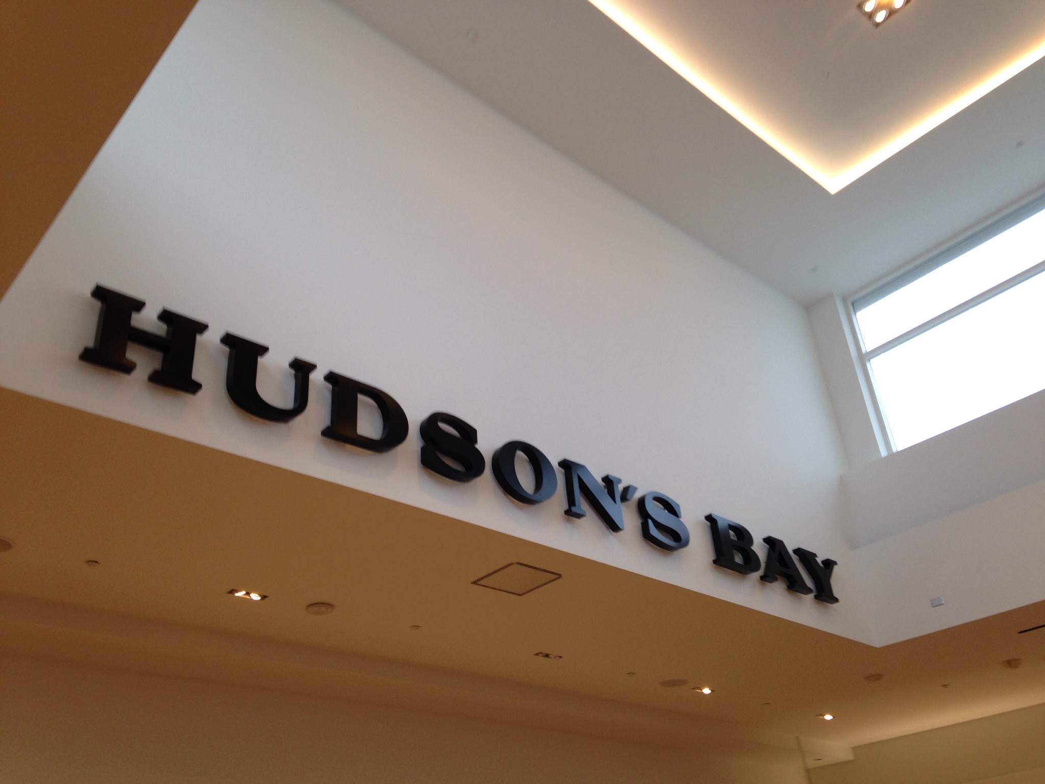
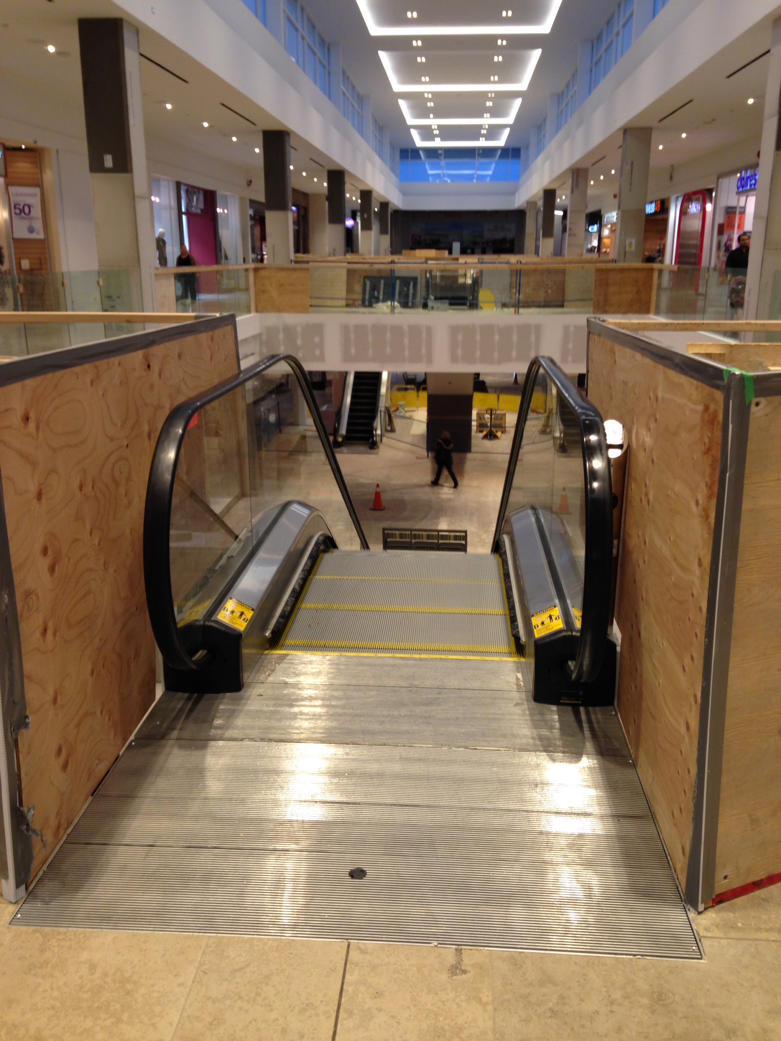
New Lighthing Installed On Hudson's Bay Wing
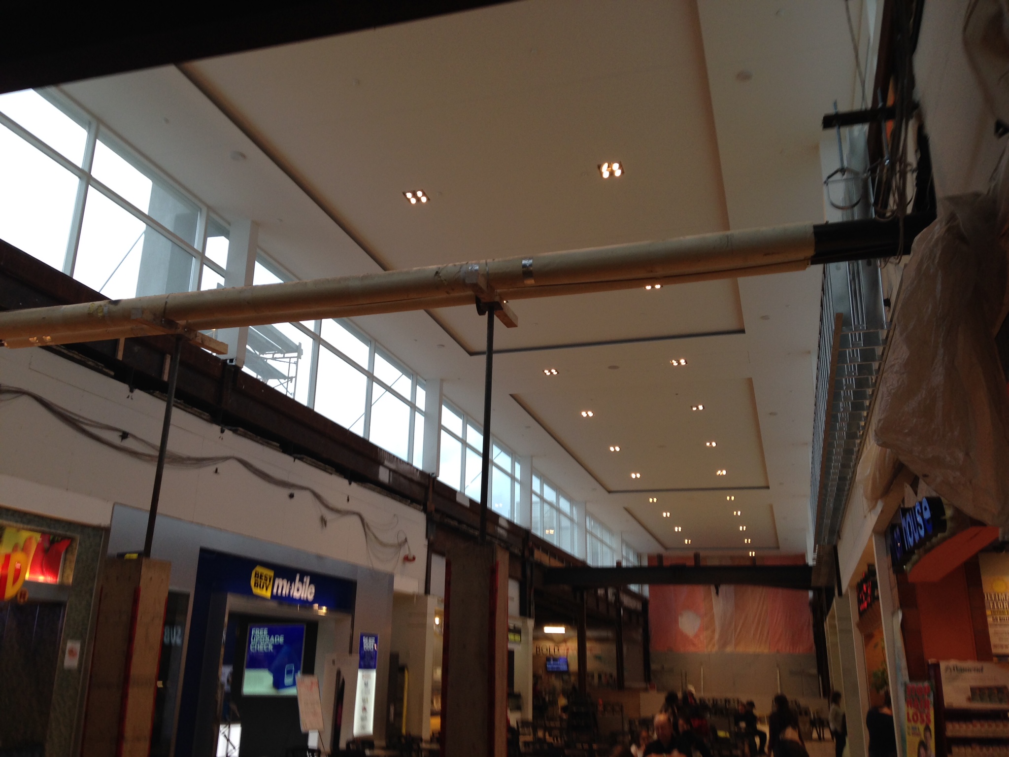
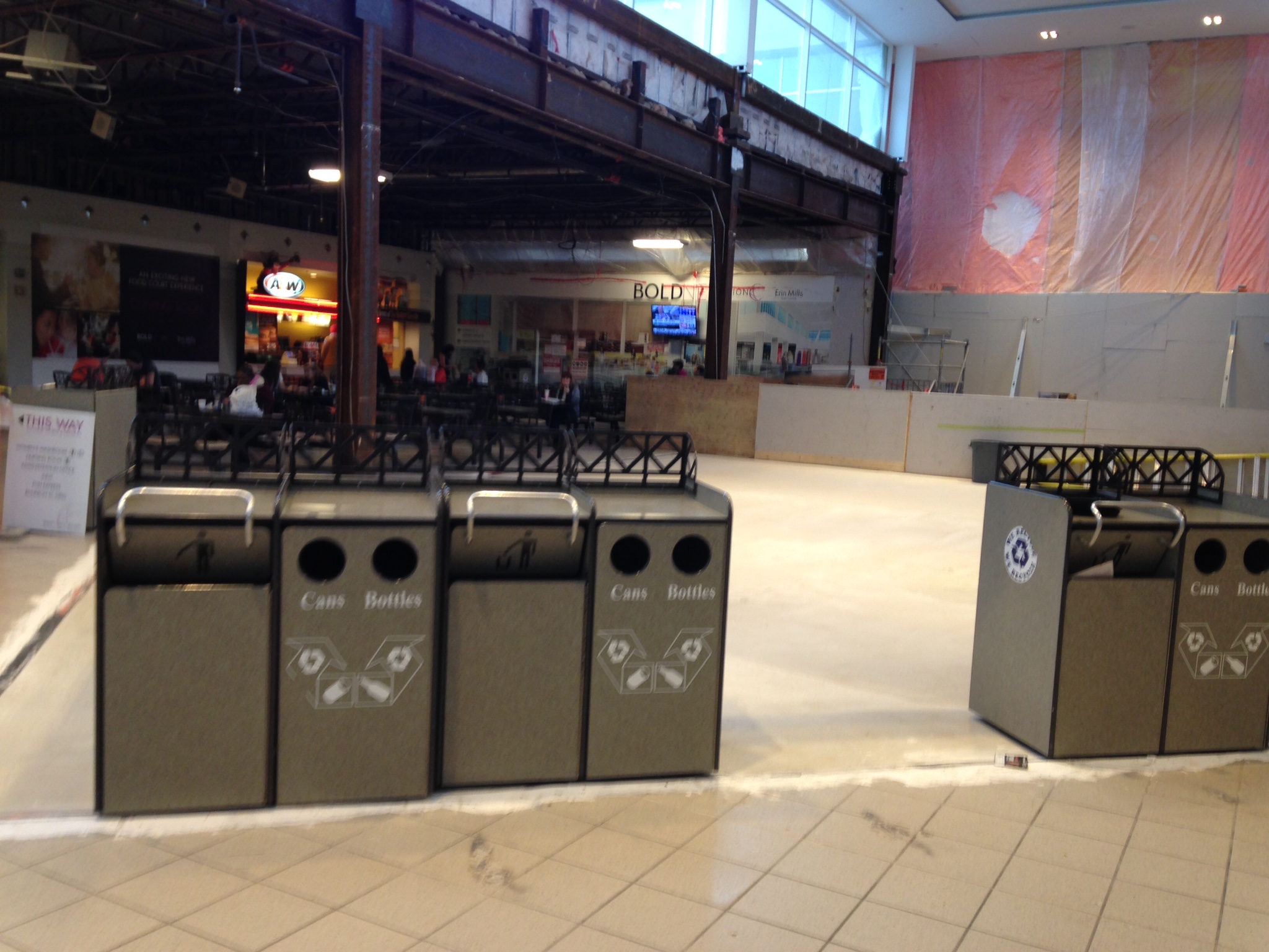

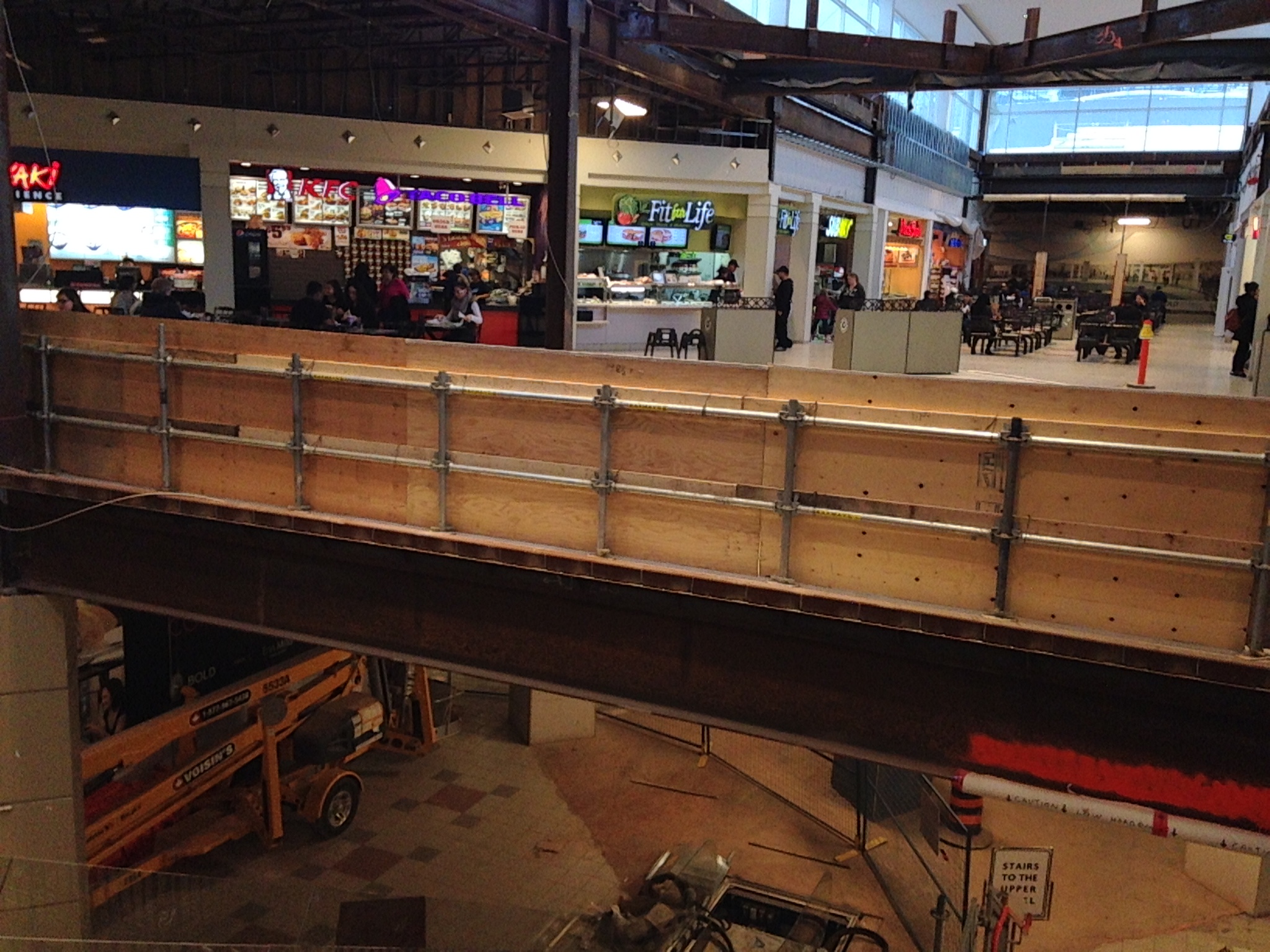
Food Court And Main Entrance Update
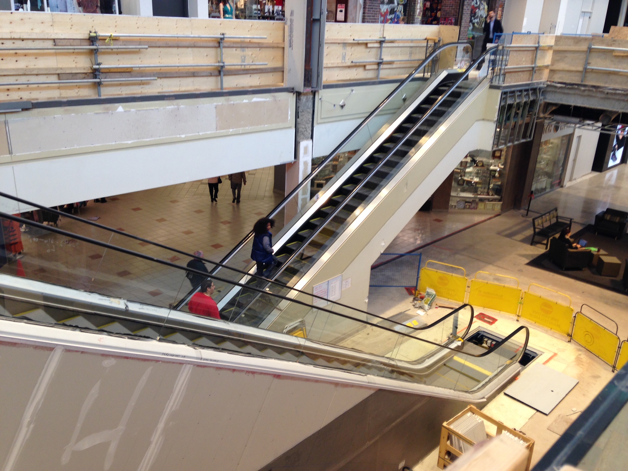
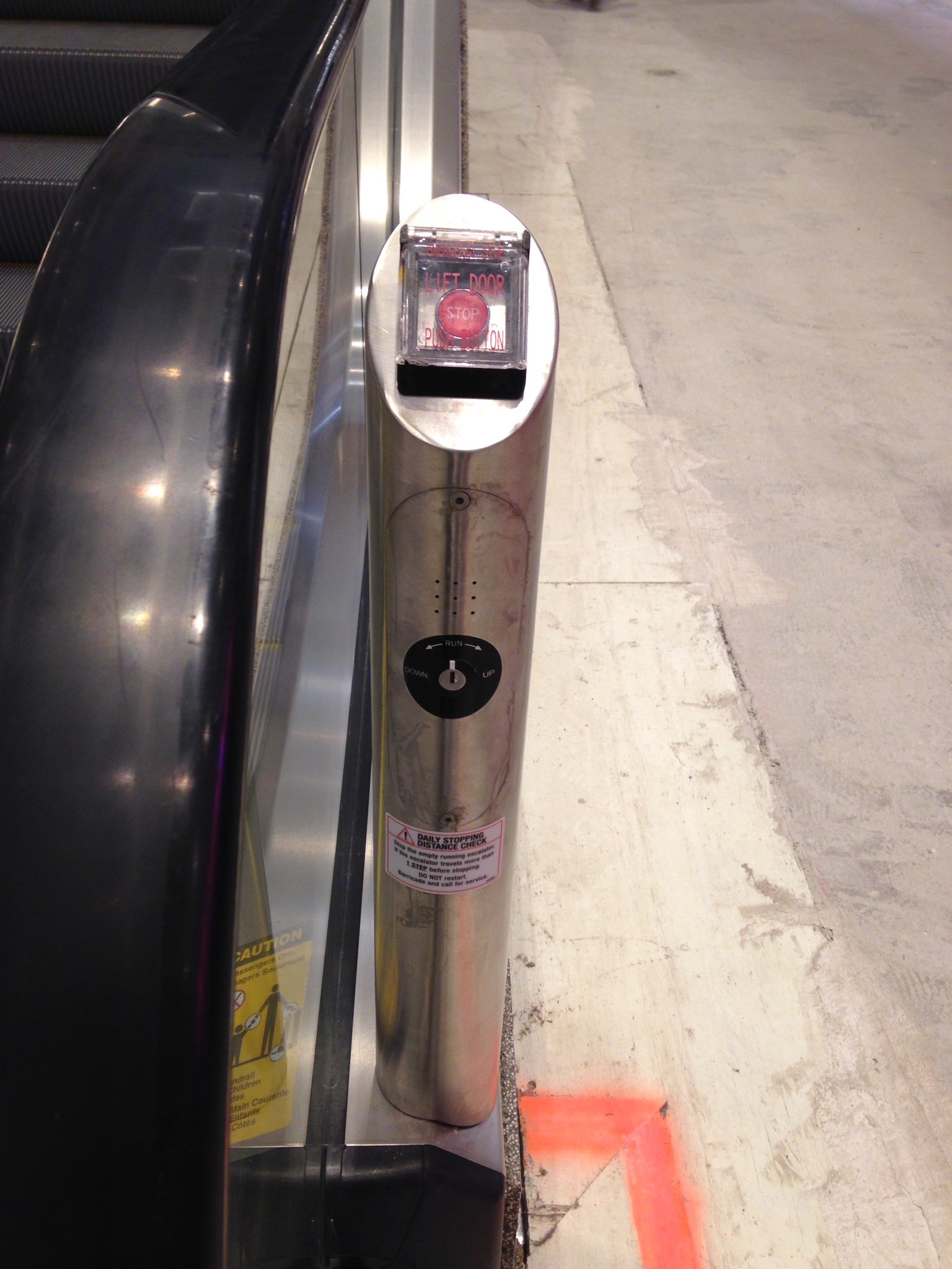
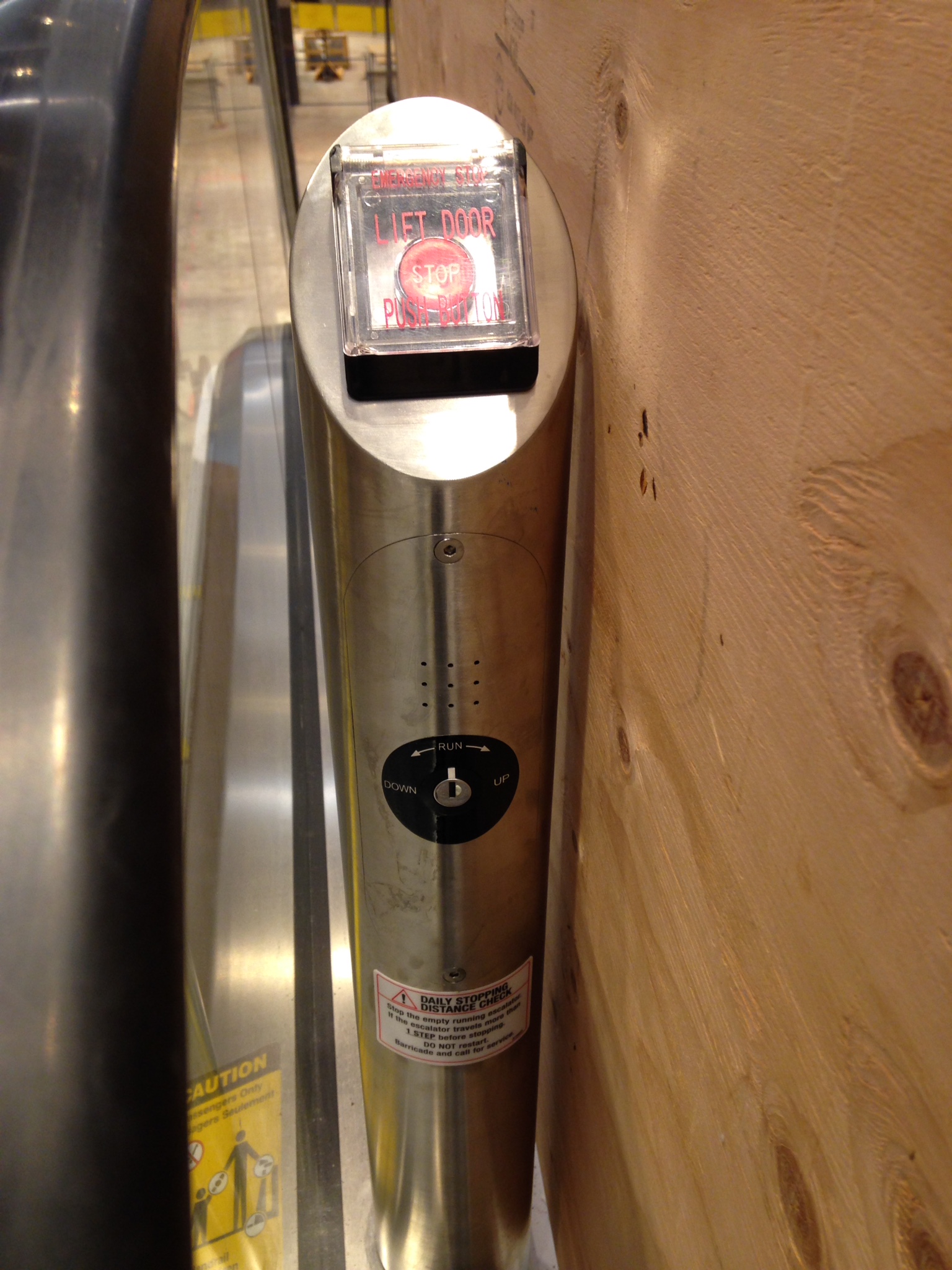

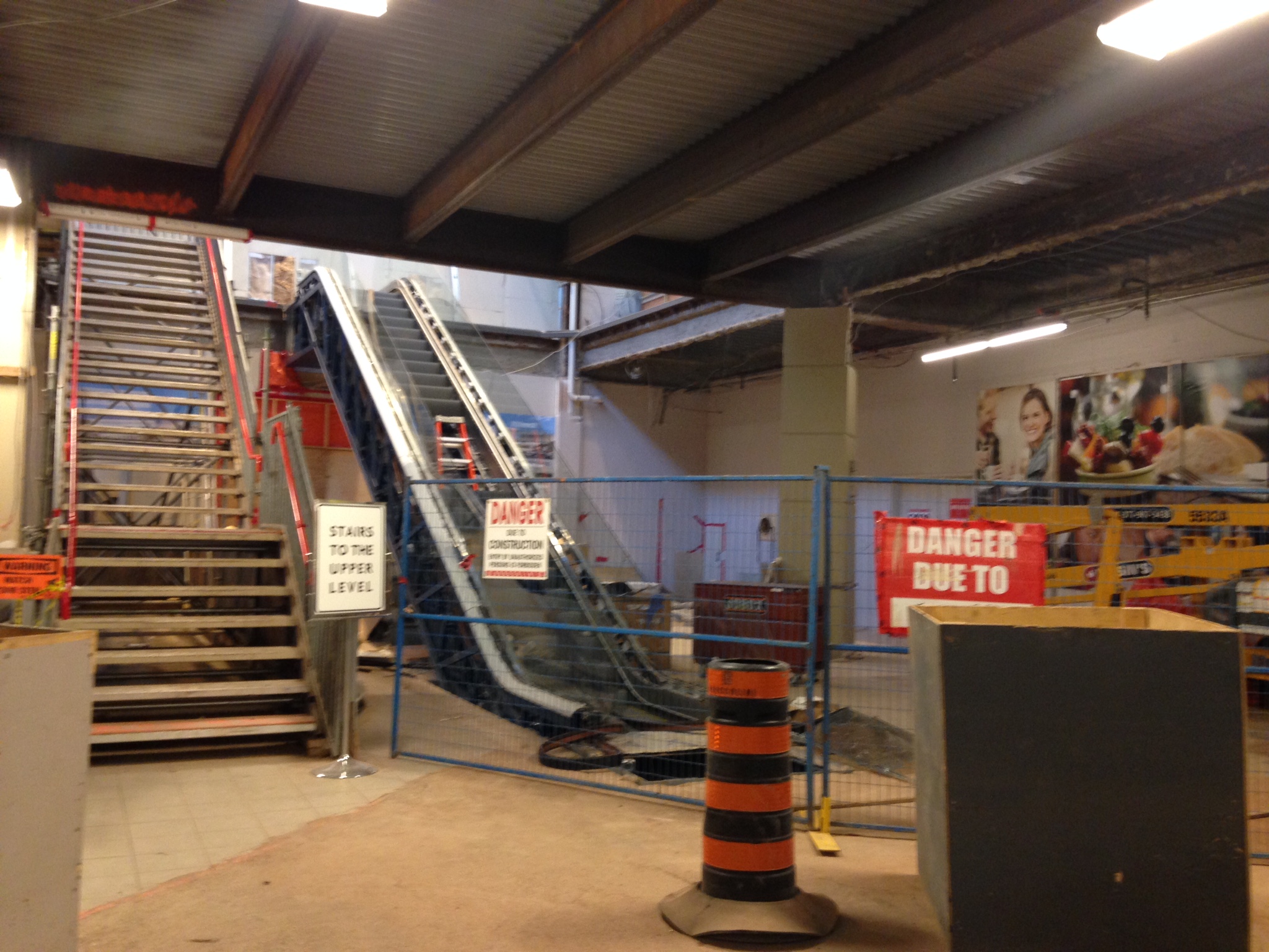
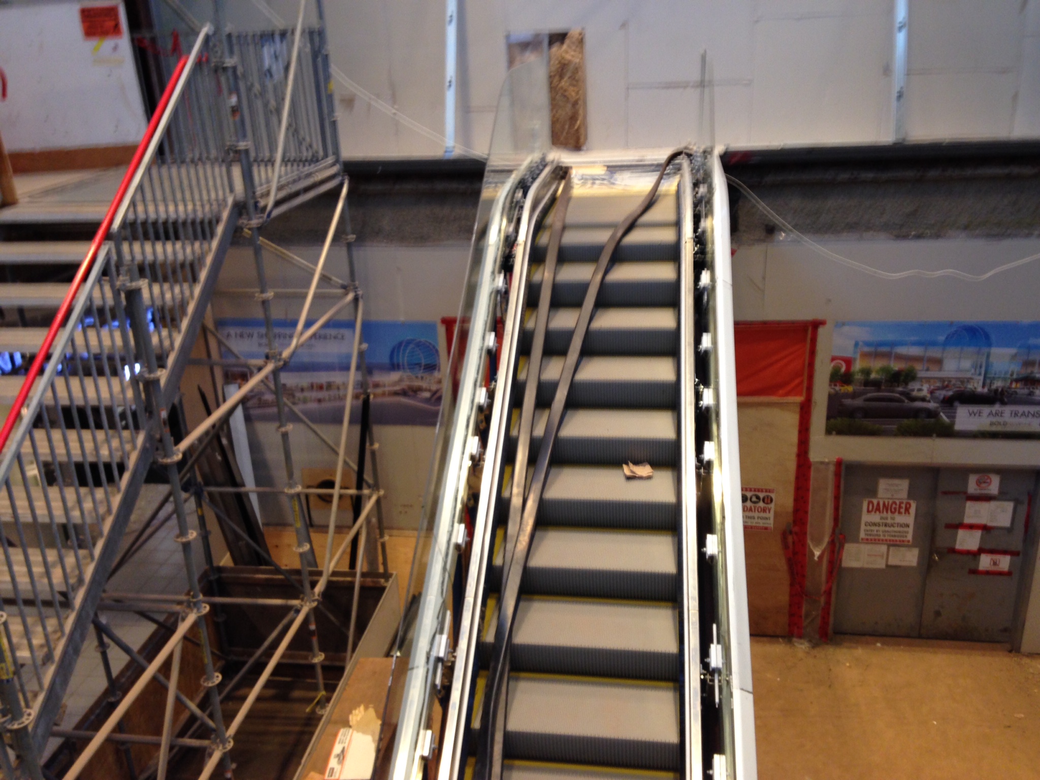
Escalators Update

Tiles Update
New Lighthing Installed On Hudson's Bay Wing
Food Court And Main Entrance Update
Escalators Update
Tiles Update
Attachments
-
 01889c1c1c6b575fa3975fc96e48bdd99869738972.jpg572.2 KB · Views: 1,803
 -
 01ce9b2410f99bb1c9c52018292fbc312fcc79203d.jpg646.1 KB · Views: 1,789
 -
 01b56b56fc57c3b07269542299145aae3b1f1b29ab.jpg748.5 KB · Views: 1,973
 -
 017b759c9bc90d7c3bcd2307fbc27d7476e1f43ca3.jpg598.7 KB · Views: 1,743
 -
 0125c62fca7b8c9e4c944b3f0c2672c37e5a6fbcb3.jpg554.8 KB · Views: 1,754
 -
 01608e525e68fba8d0c581e050b1dd3950316dbd84.jpg870.6 KB · Views: 1,702
 -
 01442067bbe0b4ac7cc937d0e45d1a38573df02081.jpg638.6 KB · Views: 1,739
 -
 01a8834febbba73414fce82fa999d15fe9c6af82da.jpg691.8 KB · Views: 1,696
 -
 01efe69569e136039fdadc07edf6bc258d40d88600.jpg669.2 KB · Views: 1,738
 -
 0192dec1beafe031ed0de95b93cd5c02712b6fbc41.jpg931.8 KB · Views: 1,768
 -
 01623e55bd083519a6fc3e711d8c79215c75a55a8f.jpg810.1 KB · Views: 1,605
 -
 0199bb97ab60b34aad88537ef91a4b3203f3359103.jpg845.9 KB · Views: 1,680
 -
 010c9103a6b06ad401f715d8cd43977e8238e7e7b4.jpg886.8 KB · Views: 1,726
 -
 01f71aaab548c9f7ed04a54b262963563e5efb9d46.jpg717 KB · Views: 1,663
 -
 01c51b34c3c066b59a18d50f0aa489b7669cb7e622.jpg710.7 KB · Views: 1,635
 -
 01f7baa0d4df567b48e3401f8b9d08680e906741a5.jpg759.6 KB · Views: 1,656
 -
 013c9c760ad268d6c5cc4b2cae05437fdb6bbf2880.jpg573.7 KB · Views: 1,694
vistaway
Active Member
This has to be one of the most dramatic renovations of any GTA mall - not a gradual change like Square One, Sherway or Yorkdale. But then, they left it without any changes for so long.
Dan416
Senior Member
I'm not sure how I feel about them covering up all the windows on the ceiling/roof/skylight. Why the need for a ceiling? Everyone else is moving toward MORE glass.
officedweller
Senior Member
Maybe the old skylights were leaking and a flat roof would stand up better?
Or maybe they just wanted to look more like Yorkdale, with the 60s era clerestory windows.
Seems very ordinary/sterile retro though
What do they have planned for the columns?
*****
At Guildford Town Centre in Surrey, BC, they did a great job redoing the columns
- putting lighted tops on them and a bright red ribbon sculpture down the middle of the mall
(a simple enough piece to liven it up)
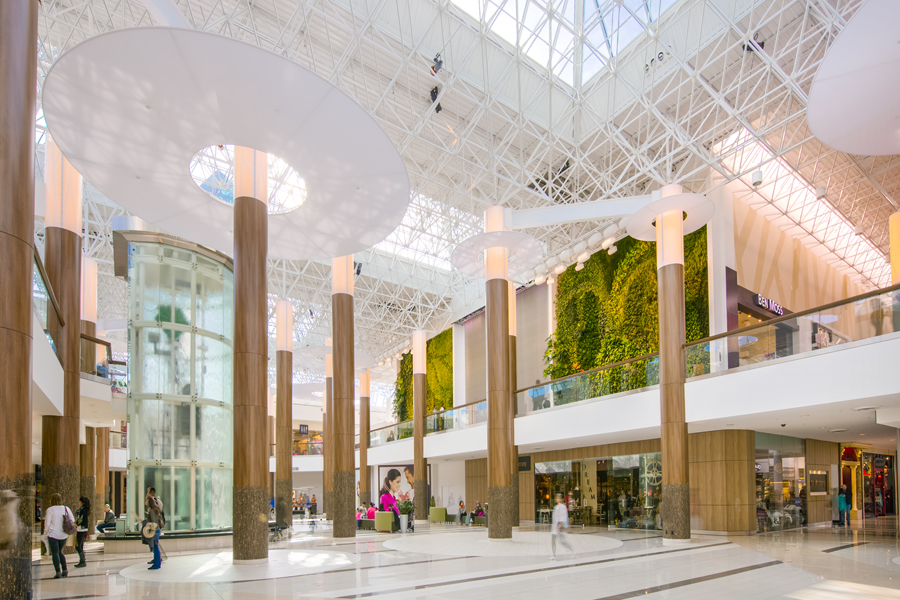
http://www.ivanhoecambridge.com/en/shopping-centres/projects/redevelopment/guildford-town-centre
http://transformit.com/newsletter-december-2013/guildford-mall-flying-ribbons/
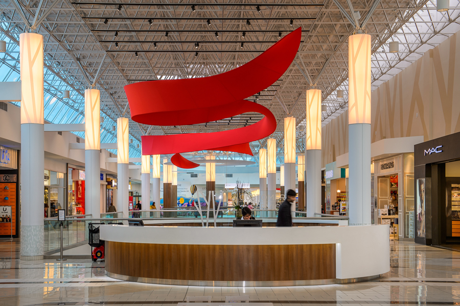
http://www.ivanhoecambridge.com/en/shopping-centres/projects/redevelopment/guildford-town-centre
Mid-reno by Yellow Fever at SSC:

http://farm8.staticflickr.com/7405/9558805947_d5b27d71fd_b.jpg
Or maybe they just wanted to look more like Yorkdale, with the 60s era clerestory windows.
Seems very ordinary/sterile retro though
What do they have planned for the columns?
*****
At Guildford Town Centre in Surrey, BC, they did a great job redoing the columns
- putting lighted tops on them and a bright red ribbon sculpture down the middle of the mall
(a simple enough piece to liven it up)
http://www.ivanhoecambridge.com/en/shopping-centres/projects/redevelopment/guildford-town-centre
http://transformit.com/newsletter-december-2013/guildford-mall-flying-ribbons/
http://www.ivanhoecambridge.com/en/shopping-centres/projects/redevelopment/guildford-town-centre
Mid-reno by Yellow Fever at SSC:
http://farm8.staticflickr.com/7405/9558805947_d5b27d71fd_b.jpg
Attachments
Last edited:
AlvinofDiaspar
Moderator
Unfortunately the spaceframe just screams late 70s/early 80s, in a Crystal Cathedral/Biosphere 2/Jarvits Centre sort of way.
AoD
AoD
airplane-dude
Active Member
I'm not sure how I feel about them covering up all the windows on the ceiling/roof/skylight. Why the need for a ceiling? Everyone else is moving toward MORE glass.
I think I know why they did that. To help brighten the lower level areas. They used to get so dark and dreary before.. These new lights should help brighten up the space quite a lot.
I think it's looking good so far, but I'd just like to see some more color.. Looks very minimalist so far.
theawesomeSC4sim
New Member
Update November 8, 2014
View attachment 37372
View attachment 37373
View attachment 37374
View attachment 37375
View attachment 37376
View attachment 37377
View attachment 37378
View attachment 37379
Main Entrance And New Facade Update - Looks Smaller Than I Thought
View attachment 37380
View attachment 37381
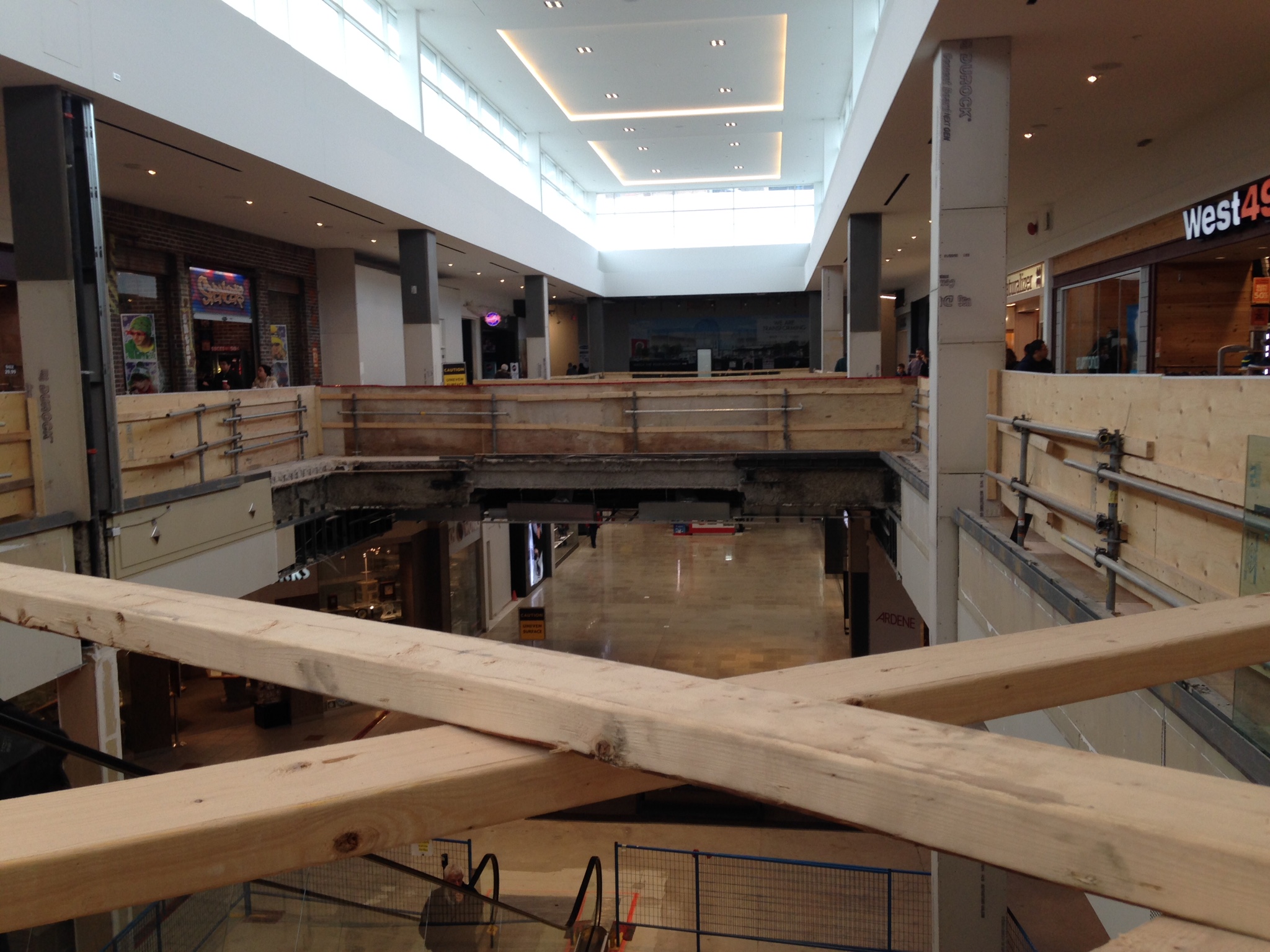
Sears Wing Update - Floor Level Extension For New Escalators
View attachment 37382
View attachment 37383
View attachment 37384
View attachment 37385
Hudson's Bay Wing Update - Hudson's Bay Logo Lights Up
View attachment 37386
View attachment 37387
View attachment 37388
Food Court Update - Marking For Future Look Down The Level Thingy, Food Court Tables Moved Down To Newly Filled Floor
View attachment 37389
Target Wing Update - New Floor Thingy Connecting The Two Aisles Of The Second Floor
View attachment 37379
New LED Light Post - Really Bright Modern Sick
View attachment 37390
Hudson's Bay Wing - Where Old Escalators Were
theawesomeSC4sim
New Member
Don't mind the rotated image, i took it sideways from my phone. My bad
Tuscani01
Senior Member
Don't mind the rotated image, i took it sideways from my phone. My bad
No worries
Might want to try again?
Don't mind the rotated image, i took it sideways from my phone. My bad
Yeah, somehow you didn't manage to attach any of those many photos. We'd love to see them!
If you want to try again, you can try this method: http://urbantoronto.ca/forum/showthread.php/20910-New-Way-To-Upload-Photos-To-Threads or go with the original: http://urbantoronto.ca/forum/showth...otos-On-Urban-Toronto-(updated-February-2013)
42
theawesomeSC4sim
New Member
Update November 8, 2014
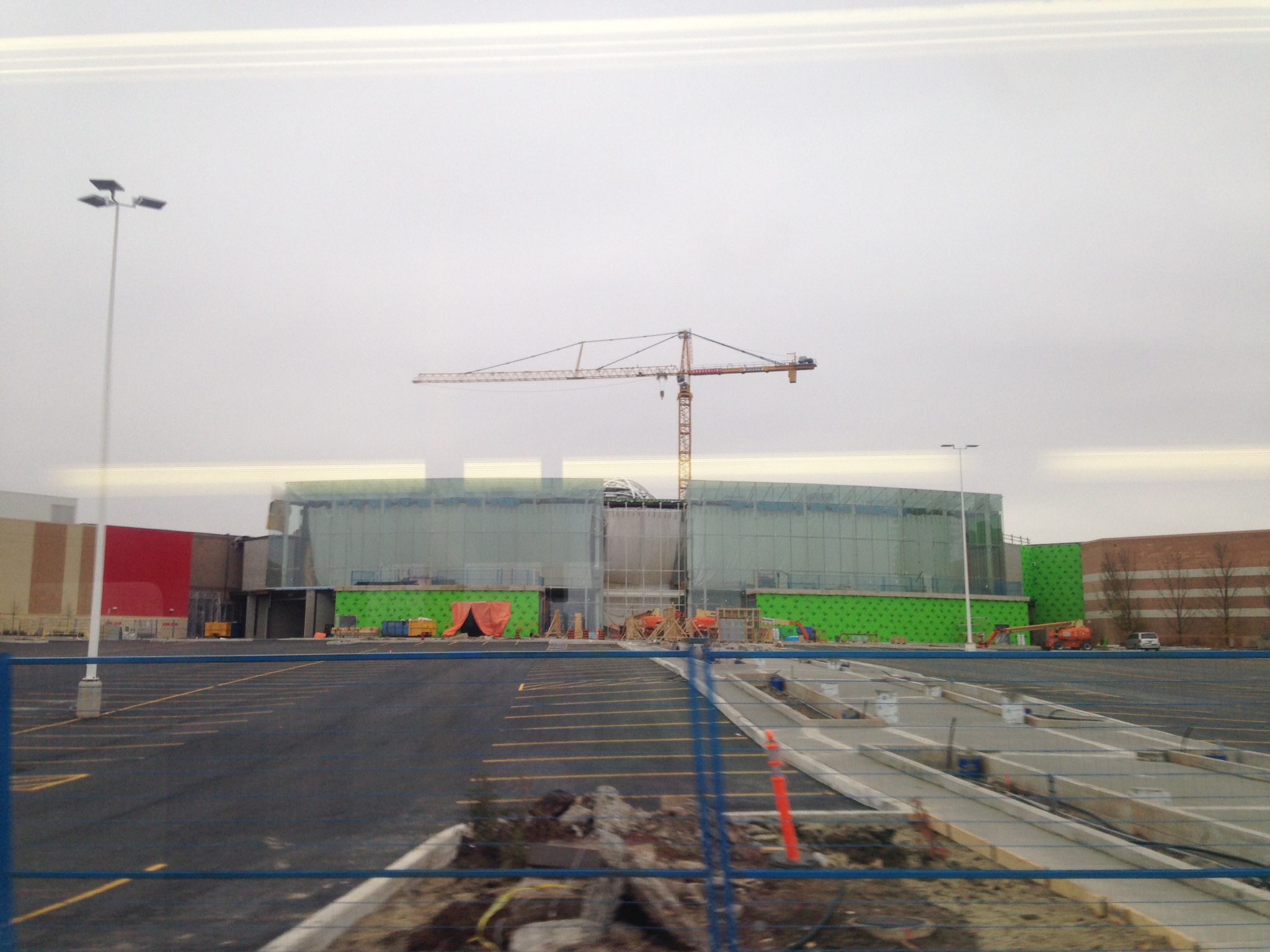
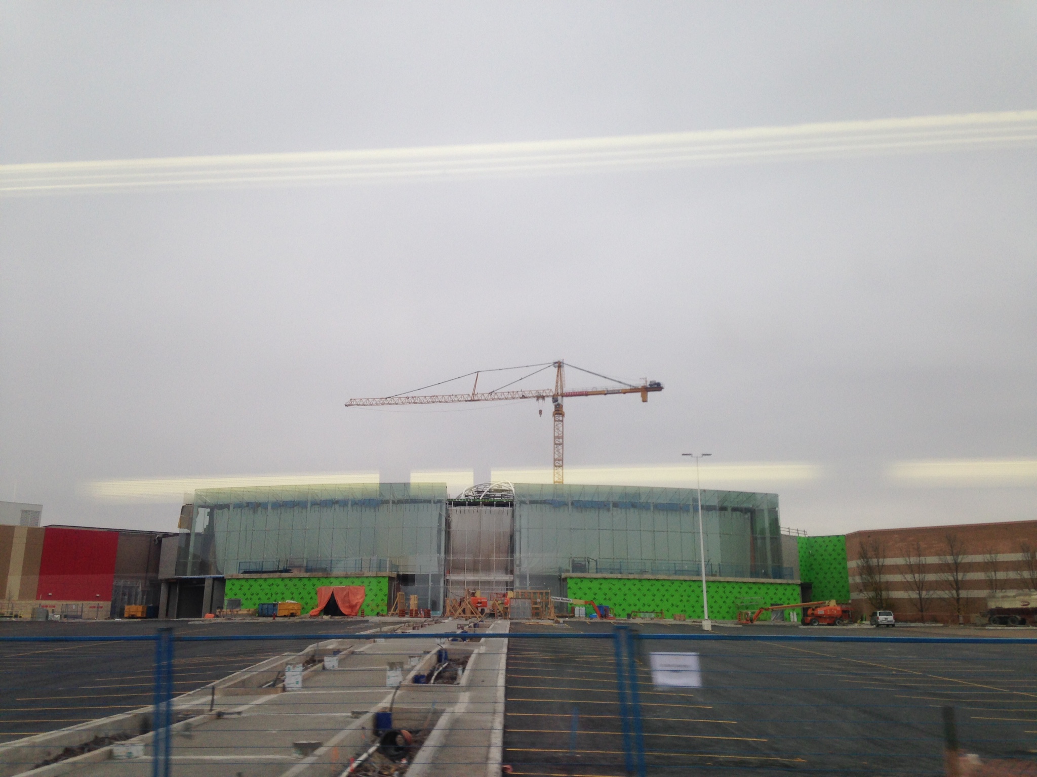
Main Entrance And New Facade Update - Looks Smaller Than I Thought
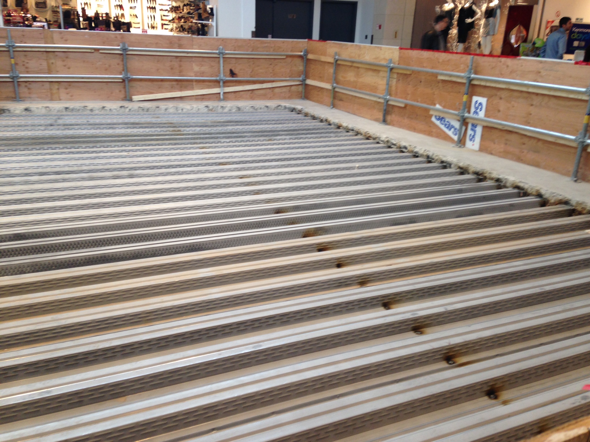
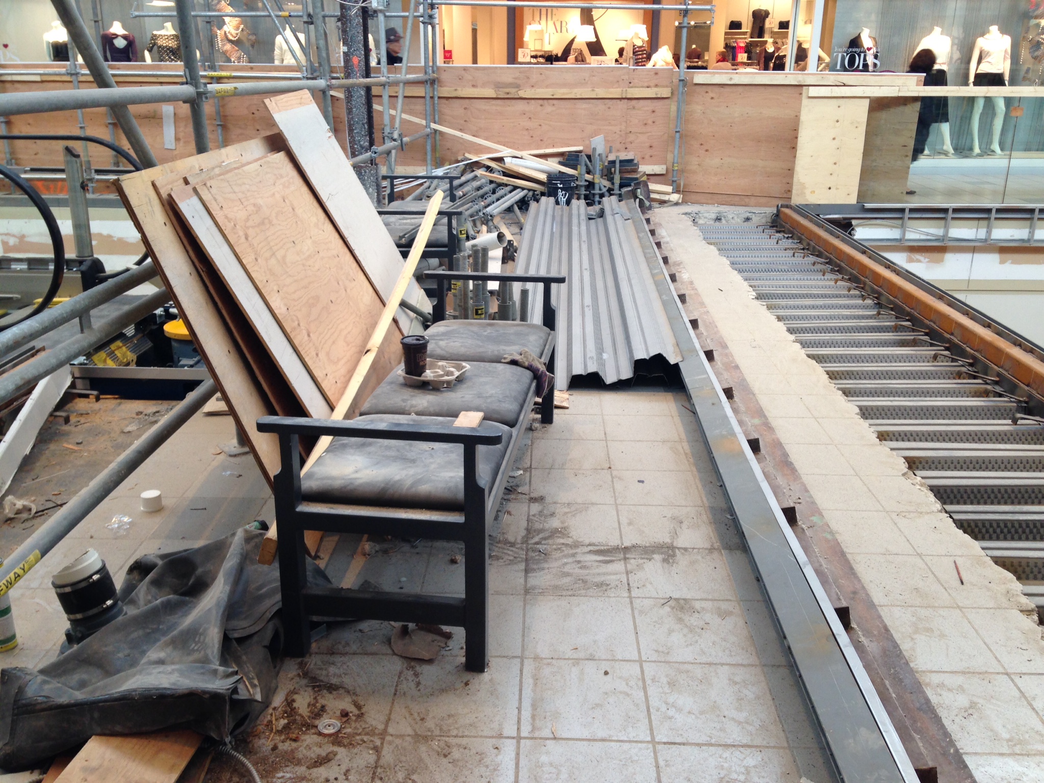
Sears Wing Update - Floor Extention For New Escalators
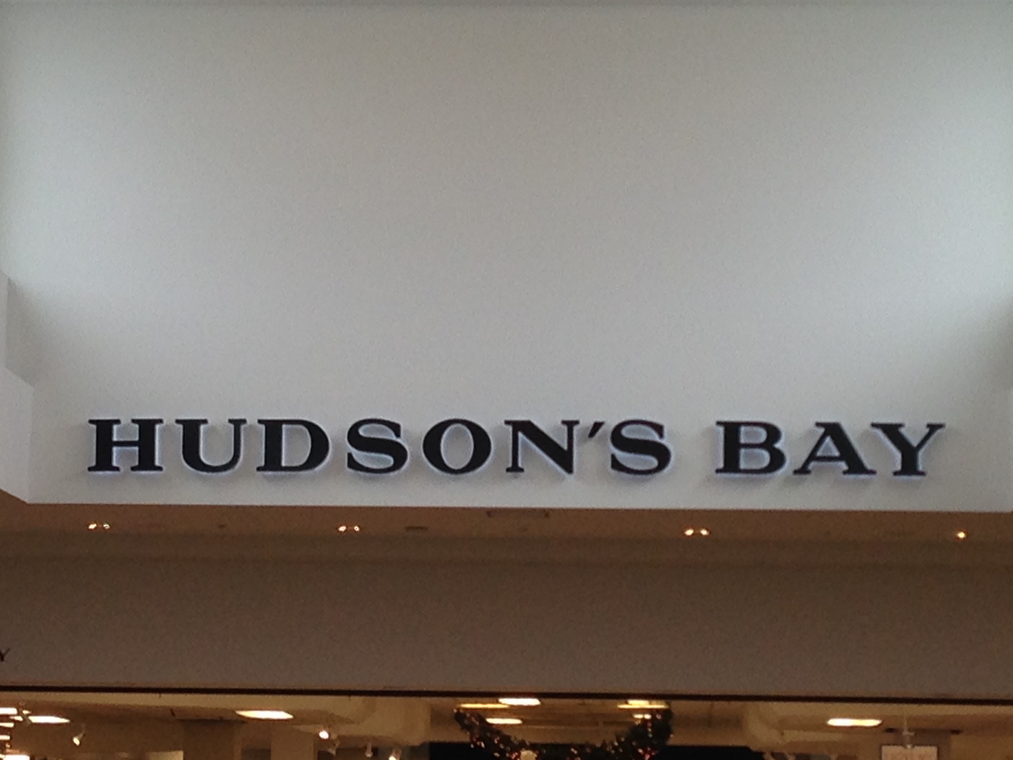
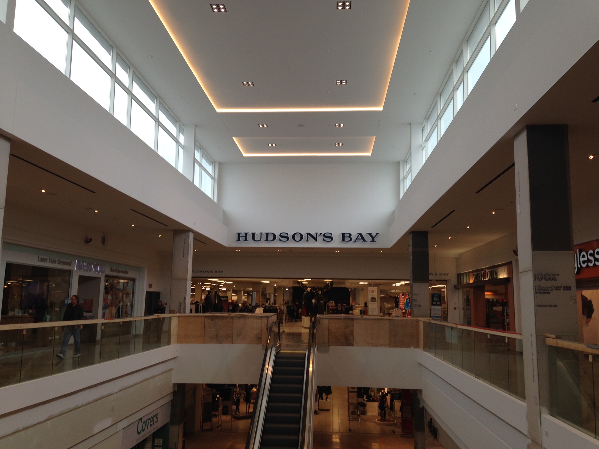
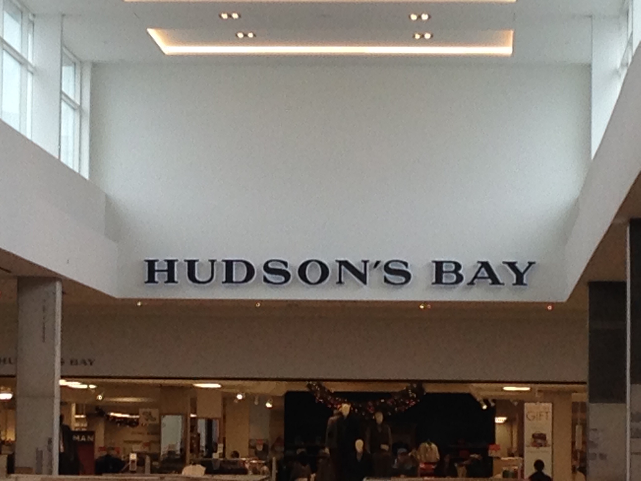
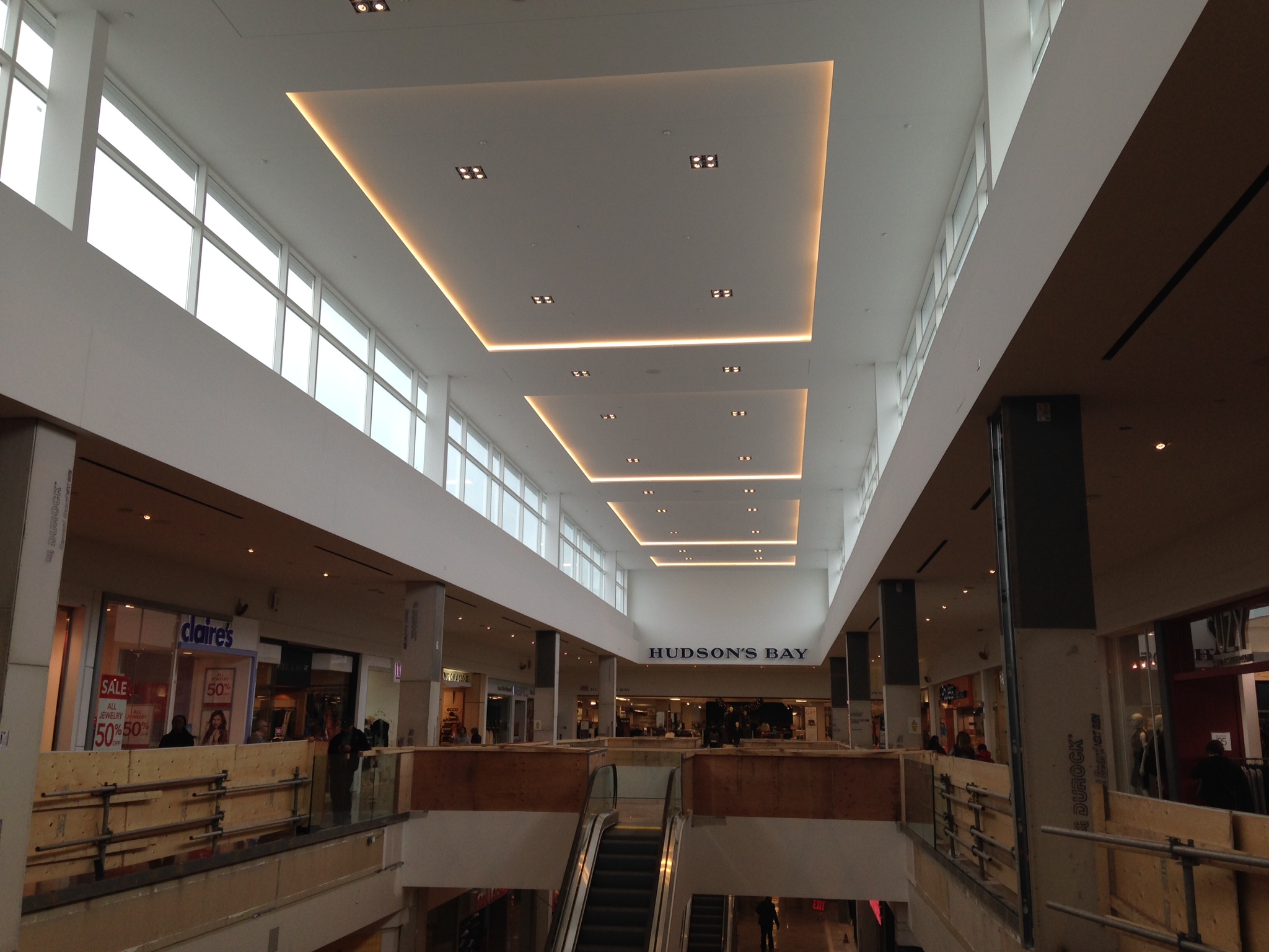
Hudson's Bay Wing Update - Hudson's Bay Logo Lights Up
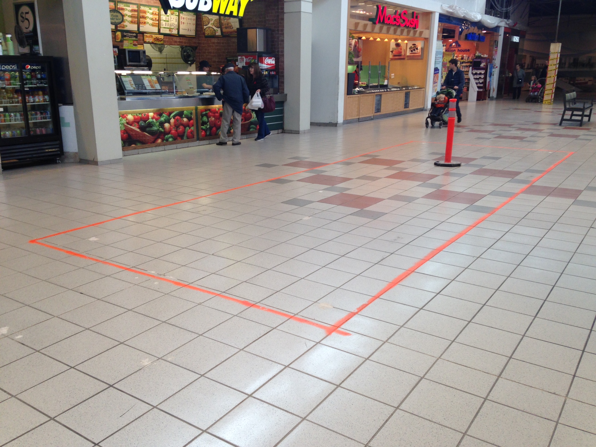
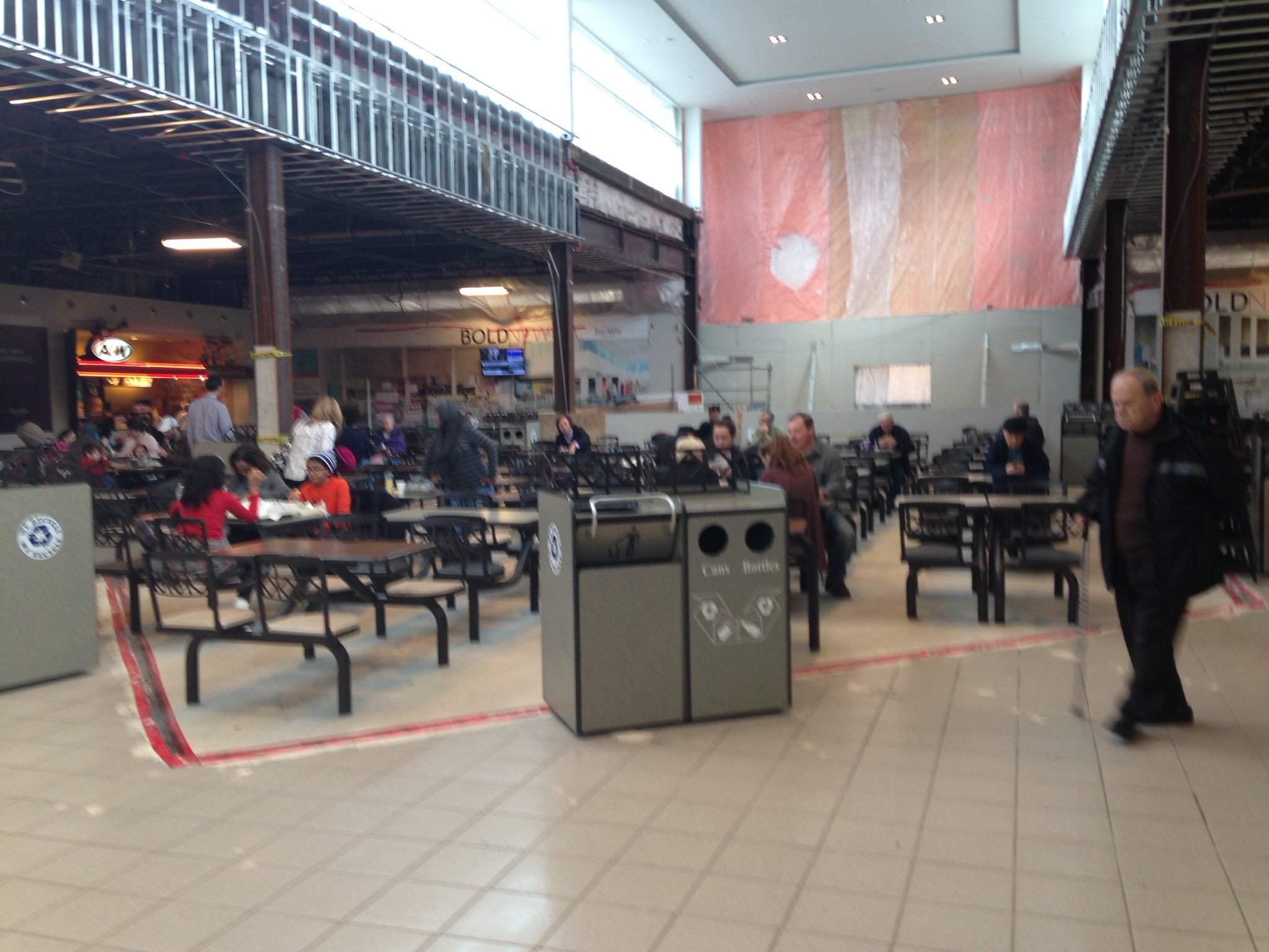
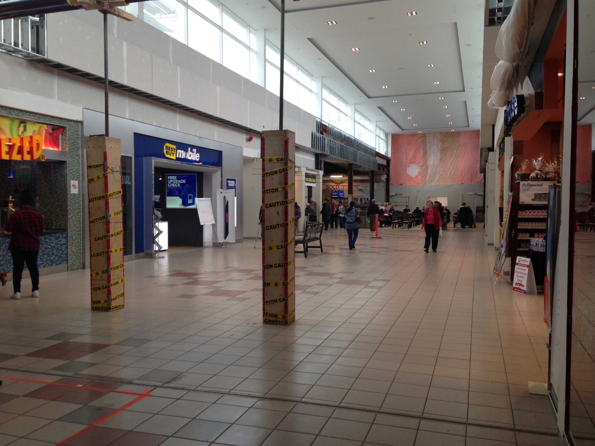
Food Court Update - Marking For Future Look Down The Level Thingy, Food Court Tables Moved To Newly Filled Floor

Target Wing Update - New Floor Thingy Connecting The Two Aisles Of The Second Floor
*DON'T MIND THE ROTATED IMAGES - MY iPHONE TOOK IT SIDEWAYS*
Main Entrance And New Facade Update - Looks Smaller Than I Thought
Sears Wing Update - Floor Extention For New Escalators
Hudson's Bay Wing Update - Hudson's Bay Logo Lights Up
Food Court Update - Marking For Future Look Down The Level Thingy, Food Court Tables Moved To Newly Filled Floor
Target Wing Update - New Floor Thingy Connecting The Two Aisles Of The Second Floor
*DON'T MIND THE ROTATED IMAGES - MY iPHONE TOOK IT SIDEWAYS*
Attachments
-
 01ff29ff4b232422616b032c0e2e8351070706ac54.jpg739.3 KB · Views: 1,278
 -
 0172761bc531bdf90624790d412811711f7a06e3b4.jpg681 KB · Views: 1,186
 -
 01e10ba14b3a959fb1756e01e6969b1ad1acc76fd7.jpg999.4 KB · Views: 1,210
 -
 01e9929a2c1ded4cb4673dc7358dc46da7d14f9589.jpg375.9 KB · Views: 1,325
 -
 01ea9b19f9b78745ba3d4826c9d826ce154f53b520.jpg811.6 KB · Views: 2,900
 -
 01e041f8a5862bd14db66ffe6f2c875e78dafeb24e.jpg1,022.8 KB · Views: 1,277
 -
 0149482ca1298c91b2d7c94689e361dad7fca825bc.jpg1.1 MB · Views: 1,228
 -
 013092c23090dbf5d9669c0802d515bdf1e17514bb.jpg745.2 KB · Views: 1,337
 -
 01fba58192e0602f946c877a03c7a6349937409e92.jpg439.9 KB · Views: 1,172
 -
 01ebf90fe09ea16f1ff8009ca778ccabc45a45ed30.jpg662.2 KB · Views: 1,376
 -
 0198af4baba51541cd1709311017eca6639fb25d71.jpg438.1 KB · Views: 1,315
 -
 01729afccc9977931af6d3884d6d4cc6f8cba0134f.jpg654.5 KB · Views: 1,252
 -
 01c1d49512832db6af5cb32ba19371b35aafe484e7.jpg680.9 KB · Views: 1,324
Last edited:
Marko
Active Member
I am curious to know how they'd be able to keep it watertight.
AoD


