urbandreamer
recession proof
5 June 2010--massive photo update.
I like this corner building--looks good.


Doesn't look so great here:

This building on the side street is sorta blah.

And this one is the worst of the trio: very dull blank walls and the brick colour is gross.


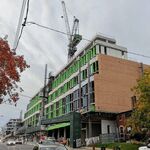
Now I'm confused--I thought there was 3 phases to this development, yet is the building just starting across the street part of the same project? Here it is:


I like this corner building--looks good.


Doesn't look so great here:

This building on the side street is sorta blah.

And this one is the worst of the trio: very dull blank walls and the brick colour is gross.


Now I'm confused--I thought there was 3 phases to this development, yet is the building just starting across the street part of the same project? Here it is:


