


M II A II R II K
Senior Member
Are Our Transit Maps Tricking Us?
Aug 27, 2012
By Jessica Gross

Read More: http://www.theatlanticcities.com/commute/2012/08/are-our-transit-maps-tricking-us/3072/
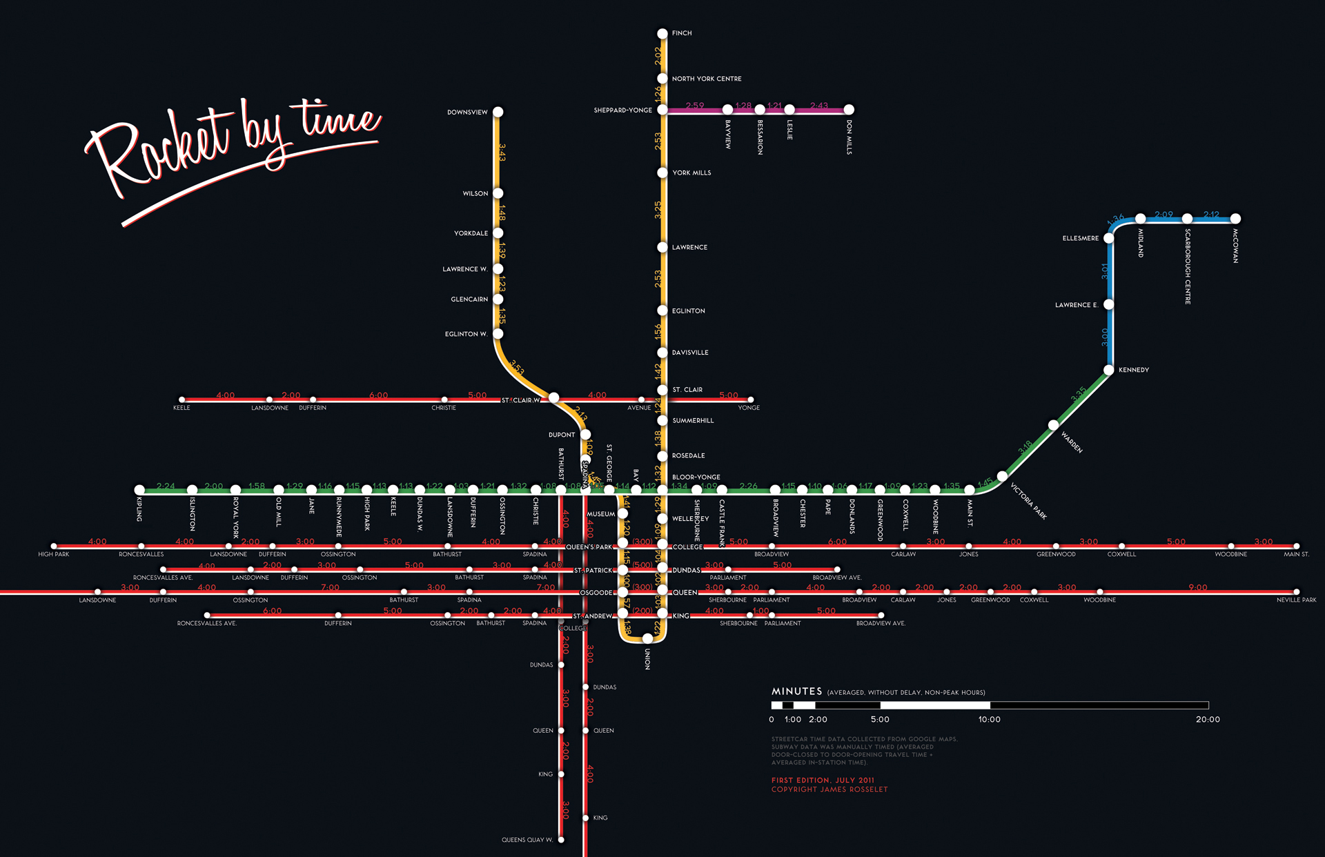
London’s city center takes up about two percent of the city. On the Tube map, it looks four times as big. Over in New York City, Central Park—which is a skinny sliver, much longer than it is wide—was depicted in some 1960s and ‘70s IRT maps as a fat rectangle on its side. So public transit maps are distorted, quite on purpose. All of them enlarge city centers. Many use a fixed distance between stations out in the boonies, even if, in reality, they’re spaced wildly differently. Curvy lines are made straight. Transfers are coded with dots, lines, and everything in between.
- According to Zhan Guo, an assistant professor of urban planning and transportation policy at NYU Wagner, certain cities allow for more flight of fancy than others. San Francisco and New York have a lot of geographic markers, so passengers will only accept so much map distortion. New York’s grid system further discourages excessive futzing. In Chicago, the line is elevated, which leaves even less leeway. But in a place like London, with twisty streets, few geographical markers other than the Thames, and an underground system, you can pull a lot more over on people. Not that transit map distortions are malicious. A lot of these simplifications are necessary for good design. If people could keep a geographically accurate map in their heads, we might use them more—but, as we’ve known for decades, we can only remember so many discrete bits of information at once.
- Schematic maps, by necessity, balance between detail and readability. “If you try to get everything in, it becomes meaningless, usually,†says Lance Wyman, who designed D.C.’s Metro map more than 30 years ago and is redesigning it to incorporate the new Silver Line. When Wyman, who also designed the Mexico City Metro map, sits down to convert a wily transit system into something people can understand, he aims not just to make it readable, but to enable each viewer to describe it to a friend. The stations need to be sequenced correctly, and their intersections must be clear. Color-coding helps—but be mindful of the colorblind. Keep the map legible—which includes simple station names. Finally, give the map some character: "A big part of my work has always been to integrate the essence of the community," Wyman says. "From my own experience, when it works, everyone kind of sees that it works."
- In an extensive study of the London Tube, published last year, Guo found that passengers tend to take routes that look shorter, even if they’re actually longer. This is no small difference: the map depiction is about two times more influential than lived experience. Passengers who knew the system well were less likely to be duped than first-time riders, but even they still regularly fell under the Tube map’s spell. It makes intuitive that sense that we prefer transfers that look convenient, but convenience gets tricky when complicated transfers appear simpler than they actually are. In the London Underground, the Victoria and Oxford Circus stations are depicted as dots, while Baker St. and Bank/Monument are each two dots connected with lines. The first two involve relatively complex transfers, but by modeling the various alternatives a passenger on a given route must consider before making a transfer choice, Guo calculated that their codification on the map might attract 960 and 516 additional passengers, respectively, every workday. As for Baker St. and Bank/Monument? That dot-line-dot icon, which looks like it involves an underground trek, probably deters 216 and 147 respective passengers each day.
- Or take the enlarged-center syndrome. In Boston, the distance from Park St. to Downtown Crossing looks at least a mile long on the MBTA map (at left) but in reality, it’s easily walkable. If we blindly rely on the map, we’ll probably waste time. Individual decisions bloom into system-wide effects. Center enlargement—a necessity if you want all the names and transfers to be legible—has a dual effect on mass behavior, Guo surmises. "Those last one or two stops are generally in an urban center, so they tend to congest the system," he says. If passengers got out at Park St. and walked instead of transferring for one stop, it would clear out a ton of human traffic underground. The flip side: the apparently short distance from the outskirts to downtown areas could make city hubs seem much more accessible to many people who live far away. Which leads to Guo’s big question: "Can we change the map in order to change people’s behavior?"
.....

Aug 27, 2012
By Jessica Gross
Read More: http://www.theatlanticcities.com/commute/2012/08/are-our-transit-maps-tricking-us/3072/
London’s city center takes up about two percent of the city. On the Tube map, it looks four times as big. Over in New York City, Central Park—which is a skinny sliver, much longer than it is wide—was depicted in some 1960s and ‘70s IRT maps as a fat rectangle on its side. So public transit maps are distorted, quite on purpose. All of them enlarge city centers. Many use a fixed distance between stations out in the boonies, even if, in reality, they’re spaced wildly differently. Curvy lines are made straight. Transfers are coded with dots, lines, and everything in between.
- According to Zhan Guo, an assistant professor of urban planning and transportation policy at NYU Wagner, certain cities allow for more flight of fancy than others. San Francisco and New York have a lot of geographic markers, so passengers will only accept so much map distortion. New York’s grid system further discourages excessive futzing. In Chicago, the line is elevated, which leaves even less leeway. But in a place like London, with twisty streets, few geographical markers other than the Thames, and an underground system, you can pull a lot more over on people. Not that transit map distortions are malicious. A lot of these simplifications are necessary for good design. If people could keep a geographically accurate map in their heads, we might use them more—but, as we’ve known for decades, we can only remember so many discrete bits of information at once.
- Schematic maps, by necessity, balance between detail and readability. “If you try to get everything in, it becomes meaningless, usually,†says Lance Wyman, who designed D.C.’s Metro map more than 30 years ago and is redesigning it to incorporate the new Silver Line. When Wyman, who also designed the Mexico City Metro map, sits down to convert a wily transit system into something people can understand, he aims not just to make it readable, but to enable each viewer to describe it to a friend. The stations need to be sequenced correctly, and their intersections must be clear. Color-coding helps—but be mindful of the colorblind. Keep the map legible—which includes simple station names. Finally, give the map some character: "A big part of my work has always been to integrate the essence of the community," Wyman says. "From my own experience, when it works, everyone kind of sees that it works."
- In an extensive study of the London Tube, published last year, Guo found that passengers tend to take routes that look shorter, even if they’re actually longer. This is no small difference: the map depiction is about two times more influential than lived experience. Passengers who knew the system well were less likely to be duped than first-time riders, but even they still regularly fell under the Tube map’s spell. It makes intuitive that sense that we prefer transfers that look convenient, but convenience gets tricky when complicated transfers appear simpler than they actually are. In the London Underground, the Victoria and Oxford Circus stations are depicted as dots, while Baker St. and Bank/Monument are each two dots connected with lines. The first two involve relatively complex transfers, but by modeling the various alternatives a passenger on a given route must consider before making a transfer choice, Guo calculated that their codification on the map might attract 960 and 516 additional passengers, respectively, every workday. As for Baker St. and Bank/Monument? That dot-line-dot icon, which looks like it involves an underground trek, probably deters 216 and 147 respective passengers each day.
- Or take the enlarged-center syndrome. In Boston, the distance from Park St. to Downtown Crossing looks at least a mile long on the MBTA map (at left) but in reality, it’s easily walkable. If we blindly rely on the map, we’ll probably waste time. Individual decisions bloom into system-wide effects. Center enlargement—a necessity if you want all the names and transfers to be legible—has a dual effect on mass behavior, Guo surmises. "Those last one or two stops are generally in an urban center, so they tend to congest the system," he says. If passengers got out at Park St. and walked instead of transferring for one stop, it would clear out a ton of human traffic underground. The flip side: the apparently short distance from the outskirts to downtown areas could make city hubs seem much more accessible to many people who live far away. Which leads to Guo’s big question: "Can we change the map in order to change people’s behavior?"
.....