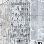


Northern Light
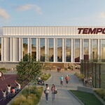
Superstar
From time to time, if not often, we all have odd dreams.
Most of which we don't remember, most of those we do should probably not see the light of day in conversation in this forum.........
But I woke up the other day remembering that my last dream was about UT.
And as odd as it was.........it's been making me smile off and on for awhile now.
So I thought I'd share.
I dreamt I was attending a press conference by the Mayor; and several well known Toronto developers.
I immediately noticed @interchange42 was accredited media for the event.
The theme was the Mayor's Design Excellence initiative.
So it opened with all the appropriate platitudes from the Mayor and thank yous and intros and then the floor was turned over to one developer who was to act as spokesperson for the group of developers participating in the initiative.
I knew that developer too, but he shall remain anonymous............LOL
Anyways.......The announcement is made that a consortium of Toronto developers has agreed to elevated and original design in their new buildings in exchange for expedited planning review, and reduced development charges.
Then the floor is opened to questions w/o a single building being unveiled.
After a few uninteresting media questions, it was 42's turn..................and......he started with this:
"One concern expressed by many Torontonians, and in particular, members of our community at Urban Toronto has been the over-reliance on safe colours in design, is there any commitment in this process to avoid more pale greens and greys?"
The developer then answered "Thank you for the question, there is, in fact a specific commitment to avoid green, grey and pale blue as primary colours in any designs under this initiative"
To ensure originality, we asked a team of designers and architects to pick a selection of colours they thought would make interesting buildings; and there will be, and has been for the first few buildings a draw, in which each colour picked by a developer can be used only by that developer for 3 years, as a primary design colour."
He then added; "Before you ask, our company drew the first colour, and it was a deep blush colour"
*****
'42' then asked for a follow-up question....
" That's excellent to hear about variety of colour", said 42 " but many would also like to know what effort will be made to keep form original and dynamic"
The developer then answered........."We all agreed to pick a theme each year around which buildings had to be designed, that had to be reflected in the form/shape, in addition to the colours chosen"'; " There is no requirement to be
photo-realistic to the inspiration, but many of us are aspiring to that"
The developer then moved to ask for other questioners.
Then my phone went off............everyone's phone went off.......as we all got a text than included a render...........
The first new building was to be inspired by a watermelon.........standing on its end, with wedges cut out on 4 sides to allow windows..................the primarily colour inside the wedges was to be the deep blush on both the cladding and glazing, with every unit having a single juliet balcony in black emulating the seeds of a watermelon.
The outside of the building was the secondary and tertiary colour, a variegated two-tone green.
The windows again tinted the same colour as the cladding.
I looked down and saw the text was the front the Front Page of Urban Toronto, with a credit underneath to @ProjectEnd .
****
That's when I woke up............
It having stuck with me.............I actually googled........"building shaped like watermelon"...............to my amusement...............this came up:

Credit: https://www.pinterest.ca/pin/71283606577244927/
It's a hotel, in Sao Paulo
Most of which we don't remember, most of those we do should probably not see the light of day in conversation in this forum.........
But I woke up the other day remembering that my last dream was about UT.
And as odd as it was.........it's been making me smile off and on for awhile now.
So I thought I'd share.
I dreamt I was attending a press conference by the Mayor; and several well known Toronto developers.
I immediately noticed @interchange42 was accredited media for the event.
The theme was the Mayor's Design Excellence initiative.
So it opened with all the appropriate platitudes from the Mayor and thank yous and intros and then the floor was turned over to one developer who was to act as spokesperson for the group of developers participating in the initiative.
I knew that developer too, but he shall remain anonymous............LOL
Anyways.......The announcement is made that a consortium of Toronto developers has agreed to elevated and original design in their new buildings in exchange for expedited planning review, and reduced development charges.
Then the floor is opened to questions w/o a single building being unveiled.
After a few uninteresting media questions, it was 42's turn..................and......he started with this:
"One concern expressed by many Torontonians, and in particular, members of our community at Urban Toronto has been the over-reliance on safe colours in design, is there any commitment in this process to avoid more pale greens and greys?"
The developer then answered "Thank you for the question, there is, in fact a specific commitment to avoid green, grey and pale blue as primary colours in any designs under this initiative"
To ensure originality, we asked a team of designers and architects to pick a selection of colours they thought would make interesting buildings; and there will be, and has been for the first few buildings a draw, in which each colour picked by a developer can be used only by that developer for 3 years, as a primary design colour."
He then added; "Before you ask, our company drew the first colour, and it was a deep blush colour"
*****
'42' then asked for a follow-up question....
" That's excellent to hear about variety of colour", said 42 " but many would also like to know what effort will be made to keep form original and dynamic"
The developer then answered........."We all agreed to pick a theme each year around which buildings had to be designed, that had to be reflected in the form/shape, in addition to the colours chosen"'; " There is no requirement to be
photo-realistic to the inspiration, but many of us are aspiring to that"
The developer then moved to ask for other questioners.
Then my phone went off............everyone's phone went off.......as we all got a text than included a render...........
The first new building was to be inspired by a watermelon.........standing on its end, with wedges cut out on 4 sides to allow windows..................the primarily colour inside the wedges was to be the deep blush on both the cladding and glazing, with every unit having a single juliet balcony in black emulating the seeds of a watermelon.
The outside of the building was the secondary and tertiary colour, a variegated two-tone green.
The windows again tinted the same colour as the cladding.
I looked down and saw the text was the front the Front Page of Urban Toronto, with a credit underneath to @ProjectEnd .
****
That's when I woke up............
It having stuck with me.............I actually googled........"building shaped like watermelon"...............to my amusement...............this came up:
Credit: https://www.pinterest.ca/pin/71283606577244927/
It's a hotel, in Sao Paulo


