


Hint to anyone wanting to run for office. Go through old social media accounts and delete anything that may be problematic.
|
|
|
You are using an out of date browser. It may not display this or other websites correctly.
You should upgrade or use an alternative browser.
You should upgrade or use an alternative browser.
2022 43rd Ontario general election (June 2, 2022)
- Thread starter W. K. Lis
- Start date
John_Dee
Active Member
Dumping Alec Mazurek for using a homophobic slur on social media when he was a young teenager is ridiculous (and I'm gay). Are they going to root out former bedwetters while they are at it?
Agreed about Alec Mazurek, and I'm another gay male, for whatever it's worth. One asshole comment, made when the guy was only a teenager for Chrissakes, shouldn't be grounds for this kind of dismissal. It simply isn't fair to hold a grown man accountable for one off-color remark made when he was a kid.
Admiral Beez
Superstar
Anyone who grew up in the 1970s and 80s would have heard all the homophobic and racist slurs and insults. If there was social media and its forever archive back then we’d all be screwed in this new puritanically woke world.Agreed about Alec Mazurek, and I'm another gay male, for whatever it's worth. One asshole comment, made when the guy was only a teenager for Chrissakes, shouldn't be grounds for this kind of dismissal. It simply isn't fair to hold a grown man accountable for one off-color remark made when he was a kid.
adma
Superstar
One thing I'm noticing is that the PC signs (including the way the party logo looks on them) look ugly and half-baked this year--not really as a sign of a misfiring campaign, more like they have this thing so much in the bag at this point, they don't give AF, and are even proud of letting their own not giving AF hang out...
DirectionNorth
Active Member
If we're going to talk about ugly logos, can I introduce you to the Liberal logo?One thing I'm noticing is that the PC signs (including the way the party logo looks on them) look ugly and half-baked this year--not really as a sign of a misfiring campaign, more like they have this thing so much in the bag at this point, they don't give AF, and are even proud of letting their own not giving AF hang out...
adma
Superstar
It at least *tries* to be something, i.e. it shows that they're giving AF (and it's not like the Wynne-era "Tetris L" was any better)If we're going to talk about ugly logos, can I introduce you to the Liberal logo?
View attachment 399993
evandyk
Senior Member
But what is that weird line over the "e" for?
Bayer
Senior Member
A stylized acute accent. Their logo works in both languages, unlike those of the other parties.But what is that weird line over the "e" for?
Admiral Beez
Superstar
That line above the e draws my eye to L i e. Surely not intended. What’s the grammatical point of that line?If we're going to talk about ugly logos, can I introduce you to the Liberal logo?
View attachment 399993
adma
Superstar
I don't see it, unless you're blanking out on the B. (And the "grammatical point" is as per mentioned: bilingualism. A little like the maple leaf stem on the federal Liberal logo...)That line above the e draws my eye to L i e. Surely not intended. What’s the grammatical point of that line?
If the inscribed-within-circle motif makes me think of anything "unfortunate", it's the current Money Mart logo.
Admiral Beez
Superstar
How is that bilingual? The English does not have an accent. Instead they‘ve gone with unilingual French that conveniently resembles the English.I don't see it, unless you're blanking out on the B. (And the "grammatical point" is as per mentioned: bilingualism.
zang
Senior Member
Because with the exception of diaereses (and even then), English doesn't have regular accents and readers aren't trained to pay attention to them.How is that bilingual? The English does not have an accent.
adma
Superstar
The only people hung up over that fine detail are anti-bilingual racist trolls. Otherwise, the word "Liberal" is clear, and luckily enough, all it takes is an accent to make the word "Liberal" bilingual (as opposed to the "NDP/NPD" dilemma)How is that bilingual? The English does not have an accent. Instead they‘ve gone with unilingual French that conveniently resembles the English.
As for PC signage
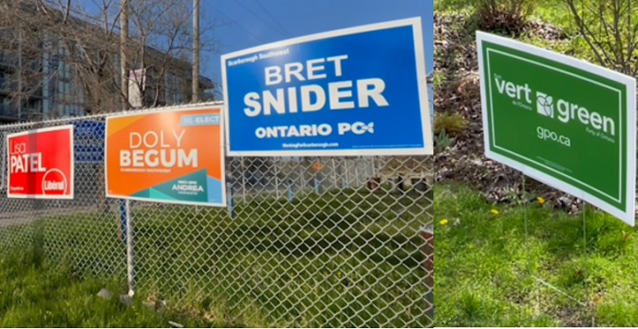
I don't know, *something* about the horizontal "Ontario PC" looks unsightly--like it's not "logo-y" enough...
zang
Senior Member
The lack of colour in the trillium just makes it blend in, giving the illusion of "PO" with a flower overtop of it. C'mon you tools, you couldn't put a screen on the flower? It's just a bland logo and a bland sign, period; the kind of thing you'd expect from the owner of a label company.The only people hung up over that fine detail are anti-bilingual racist trolls. Otherwise, the word "Liberal" is clear, and luckily enough, all it takes is an accent to make the word "Liberal" bilingual (as opposed to the "NDP/NPD" dilemma)
As for PC signage
I don't know, *something* about the horizontal "Ontario PC" looks unsightly--like it's not "logo-y" enough...
But then, political parties rarely have good logos. The Green's trillium square looks like it should've been on a mall in the 1990s, and the sign in general just makes me think of a discount environmentally friendly cleaning product label. Their federal logo—while a sad mock-off of BP's sunflower—is at least interesting.
Kudos to the NDP for going multi-colour on the signs and looking like someone there uses Adobe Creative Suite (rather than just some intern using a hackneyed Microsoft Word template). But they don't even have their logo prominent, giving more attention to Andrea.
adma
Superstar
Except that even Ford's done better in the past, signage-wise. This is the sort of thrown-off thing one might expect if the *PCs* were the ones going into this election with 7 seats, not the Liberals...The lack of colour in the trillium just makes it blend in, giving the illusion of "PO" with a flower overtop of it. C'mon you tools, you couldn't put a screen on the flower? It's just a bland logo and a bland sign, period; the kind of thing you'd expect from the owner of a label company.