Toronto Ten York Street Condos | 224.02m | 65s | Tridel | Wallman Architects

yyzer:

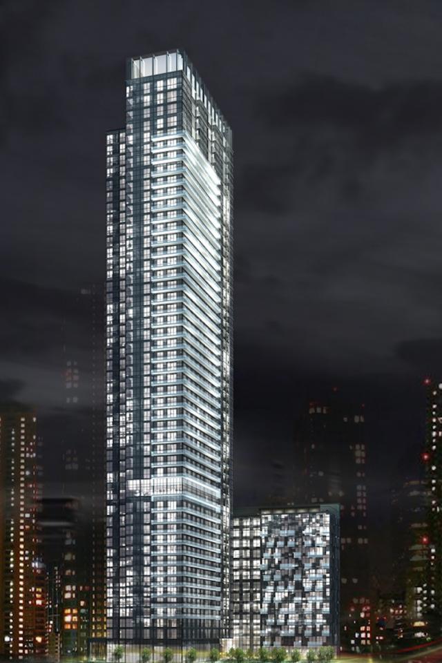
Hence the disclaimer about the materials - but even then, this design is far cleaner, far more pleasing in its' form with clear lines and rhythm than Aura the dog's breakfast.

AoD

I'm not sold at all....5 out of 10 max...
 
yyzer:

Let's just put it this way, I have far more faith in the abilities of Wallman than on G+C.

AoD

I do too, but I don't know what happened here....the original designs had originality, and a sense of playfullness...this now has - ? I sense a monolithic slab of spandrel in the making..

The base looks good, but buried under the Gardiner, hardly anyone will see it...so it won't have the impact that the similar design at the Distillery has.
 
Last edited:
I think what we're getting will turn out pretty great. I lament the lack of colour on the tower, which would have been so easy to incorporate, but that doesn't push it over the edge to be called a failure of sorts. With the unique envelope and quality of materials they're touting, it might be Tridel's best yet.

What is so special about Ice by the way that you consider this a slap in the face to that project? It's nice to have some curved buildings and the materials are good but it's incredibly monotonous. There is nothing to break it up. A quality building but certainly not the best or even in the top five projects going up this cycle.

Edit: Where is this massive amount of spandrel everyone is crying about? I don't see an egregious amount. The white bits are precast.
 
Last edited:
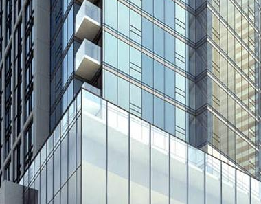
Yeah, what spandrel are you guys going on about? Are you confusing the curtain wall glazing for spandrel?

42

Wasn't the same thing said about 300 Front ? Maybe I'm wrong about that though.
 
It was pretty clear from the renders of 300 Front that there would be quite a bit of spandrel. The day time render here makes it even more clear.

urbantoronto-1102-3719.jpg


Cladding looks nothing like what is being shown for 10 York.
 
Re: Ten York

1) Look at the renderings. You can clearly see spandrel.
2) Don't trust renderings in any case. They are often used solely as marketing tools and should not be trusted.
3) A building cannot be completely glazed these days. Apart from pre-cast/panels shown on Ten York in the renderings, the building is largely glazed. A building cannot be entirely glazed without a certain percentage of spandrel, as more recent towers have been privy to. There's no way this tower WON'T have a generous dose of spandrel, IMO. Or else it would not meet targets.

ScreenShot2013-06-14at120841AM_zpsb42711ec.png~original


You can see some of the spandrel in this snippet of one of the renderings, very obviously, running in bands up the tower.

Also, glass does not meet the slab as is shown in the podium in this fanciful rendering. Expect that all-glass podium to be plastered with a fair amount of spandrel.

Anyways, I think this tower looks forgettable, clunky, and to be honest, awkward. It just doesn't work cohesively, and the glazed portion "sliced" through the main box volume could have been interesting but is ruined by awkward angles. If people here want to buy into the marketing schlock about what an iconic design it is, that's cool, but what else do you expect Tridel to say? I don't see anything special here.

You say I'm cynical. I say you're naive. ;)
 
Last edited:
I'm also not convinced that the opaque portions of the north and south facades consist of only precast. I worry that we could see a good dose of spandrel there too.
 
really don't see why anyone would want to live here, it would make a great office building though.
 
really don't see why anyone would want to live here, it would make a great office building though.

Are you kidding? I would live here in a heartbeat.

It's all about location. Access to the waterfront, Rogers center, the ACC, Union Station, the Path, QEW Etc, etc.

Now, if only they could design some livable floorplans, one where I could actually thrive, not just survive.
 
I don't know about everyone else but I think Tridel should have improved on this design because it's waaay beter than the final one.

At first I didn't like the final design because it looked too corporate, monolithic, and mediocre. I was surprised that it was even approved.

The second version has a lot going for it, but I find its rooftop element to be hideous. Additionally, if it was the final design going forward, its box pattern would probably end up being criticized as a rip off of something in Cityplace.

The latest renders of the final design are making me start to warm up to it. A last-minute cheapening could very well undermine it, but the contrast between the curtainwall and spandrel sections will make it visually unique, and perhaps even understatedly elegant. The podium will be jazzy and visually interesting at street level. It also makes the most of its unique land parcel shape.

Admittedly, the tower may never be an attention-grabber in the manner of the L-Tower. But perhaps it doesn't need it be.
 
Admittedly, the tower may never be an attention-grabber in the manner of the L-Tower. But perhaps it doesn't need it be.

Every building should strive to be a head-turner. Having a passive attitude like that, especially a tall building, only reinforces to developers that they don't have to do better.
 

Back
Top