Toronto St Regis Toronto Hotel and Residences | 281.93m | 58s | JFC Capital | Zeidler

I am sorry to say but I am actually quite unimpressed with the exterior of this building. I was hoping it would improve as the tower progressed, but at this point it is rather ugly. It looks almost institutional. I hope those windows don’t open as I fear some of the multimillion dollar purchasers might try to use them once they see what they bought into.

Really? I find it very sharp and clean. I think it will look even better when there is more glass.
 
good observations Steveve... the other thing I took notice of just now in the model is the treatment of the lower floors on the east wall. It shows two vertical rows of windows which is definitely a cleaner look than what we have seen in reality. Still makes me wonder if they will finish it off that way. Personally I think they should have just went with a blank wall to the top of the parking levels. And ya, its pretty much all glass from here on up...
 
Here is a photo of the rendering that is on the hoarding. It shows the upcoming setback and the second setback from the model has been removed. Were they going to use a light and dark shade of granite on the west wall or is that caused by a shadow?

 
Old floor plans show the different setbacks, balconies and how the amenity spaces are going to be used. It is interesting how the residential floors are going to have an angled east wall after the next setback according to these old plans.
Ziggy said:
From the international section:

Trump3.png


Trump1.png


Ziggy said:
 
Last edited:
I agree ^^^. thanks for posting those floorplans ^^^

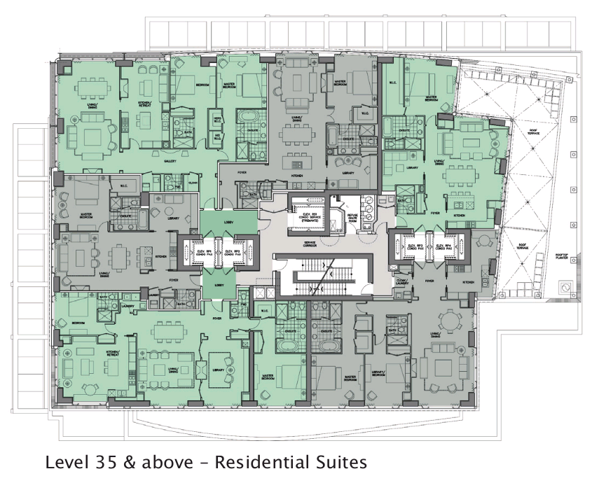
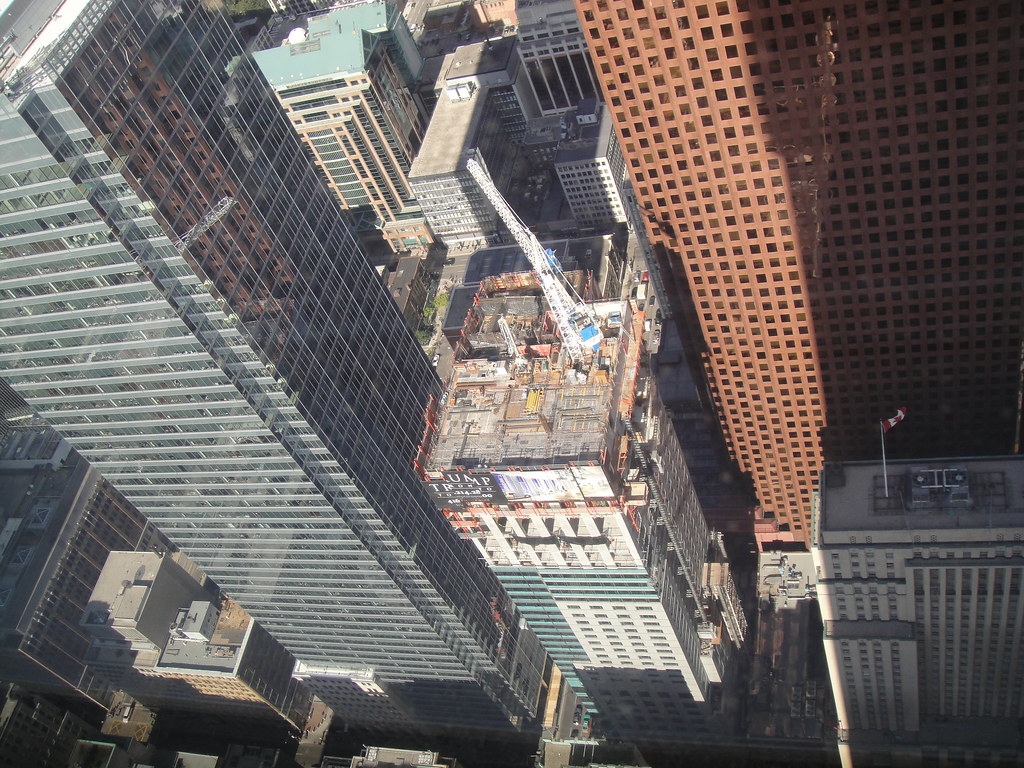
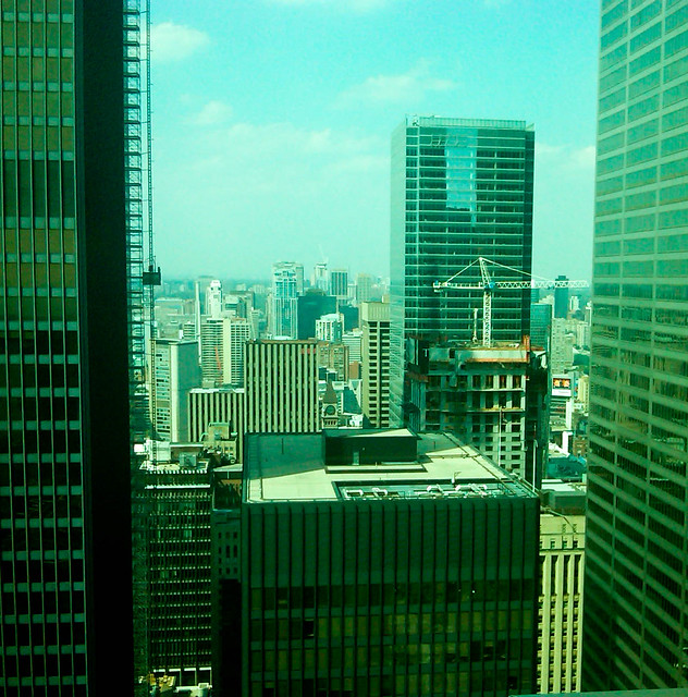
Okay, so according to them, we should see the major setback (which will be slanted... i never knew that!) on the east side at level 35. i believe we are at around 34 now. so we should see the weather wall removed on the east side (while the weather wall is re-installed on the south side).

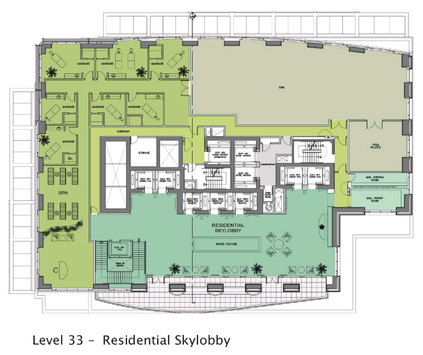
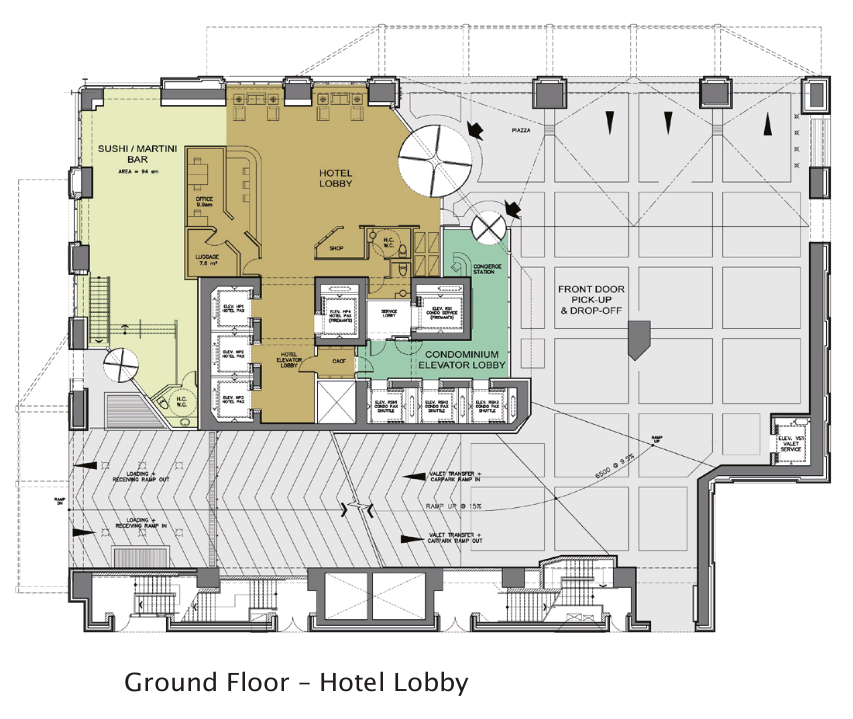
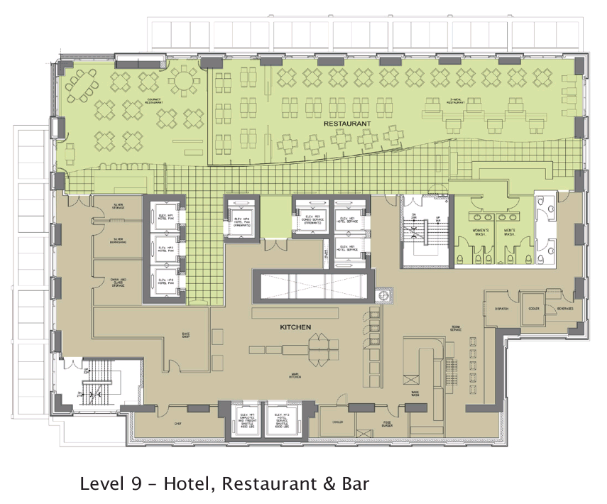
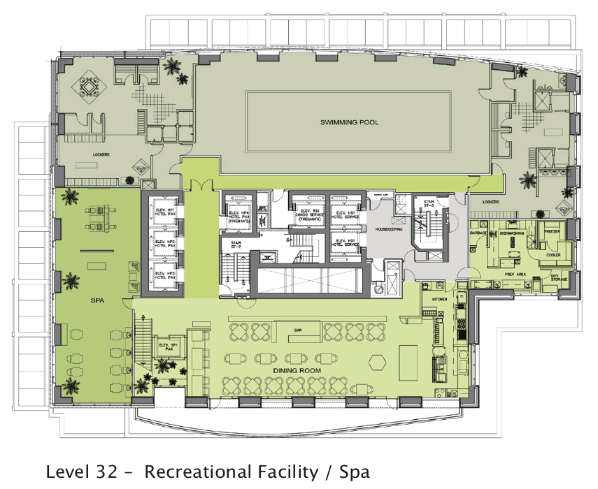
wow! Those are some really cool floorplans!. the hotel portion looks like it'll be one of the best in town! the hotel portion has a really nice layout.

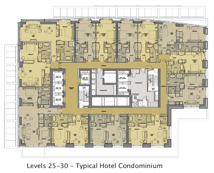
And the residences have interesting elevator layouts. the minute you step out of one, you're essentially at your door.
two elevators for 4 suites is nice as well. they make your choices simple:

1. exit the elevator
2. make a left/right
3. enter your doorway

Let me get this straight. a resident must take 2 elevators to get to their suite right?. (1 from the parking level/hotel lobby, and then 1 from the residential skylobby).

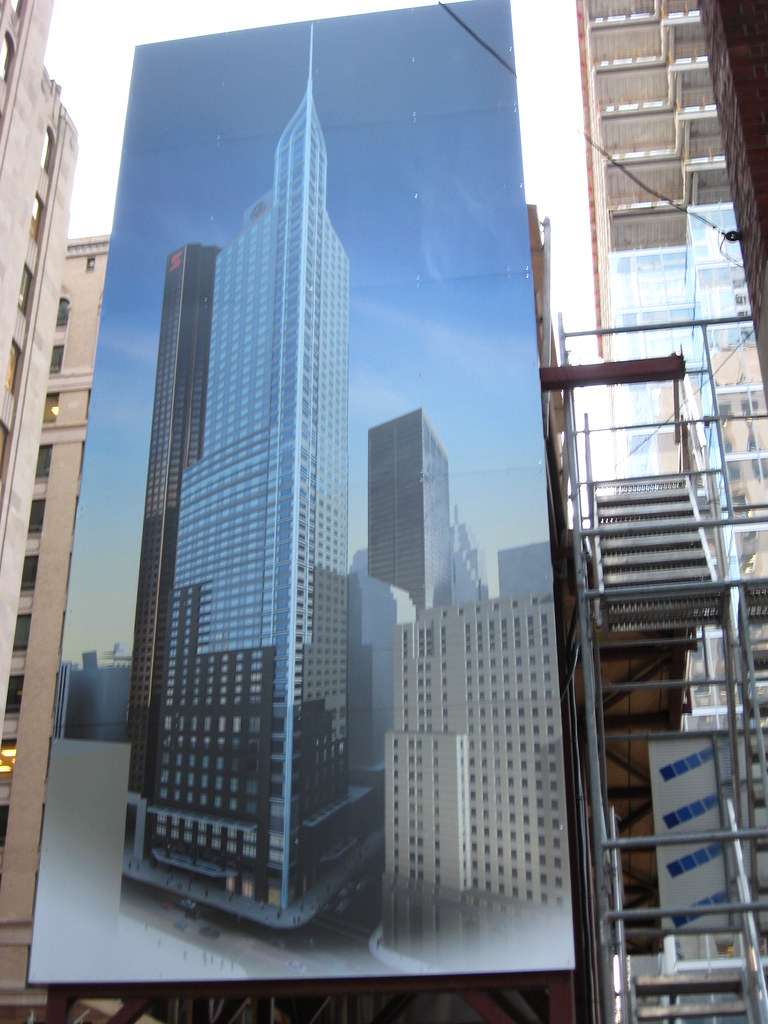
I really like what they've done with this building. i've gotta get inside asap!

***we haven't gotten any shots from commerce court west, facing north toward trump tower. anyone work in commerce court west? :)
 
ya, thanks for posting those floor plans again... its much easier to put them in context now that we are over half way up and they help to answer a few questions. The angled east wall will act as a further set back and give the upper floors of Scotia a bit more room to breathe. As far as the render posted on site, my interpretation of the two shades of granite is that it is just shadowing from other buildings.
 
Ughh I can't get over the colour of the granite... It resembles the cement floor in my basement! Hopefully something's done to give it at least SOME asthetic appeal. It's just looking too sterile and bland for my liking at the moment...
 
Ughh I can't get over the colour of the granite... It resembles the cement floor in my basement! Hopefully something's done to give it at least SOME asthetic appeal. It's just looking too sterile and bland for my liking at the moment...

Precisely my point in post #4756. This is not in the least bit attractive. I get the impression they are or have cut costs on the exterior for some reason because this is not represenative of a first class building.
 
Is there a stone finish still to come on this area or is the sidealk concrete the final deal?
 
Last edited:
I'm not usually one to jump to conclusions but now that a significant portion of the granite is installed, it does indeed look like $hit. It's definitely bad for a building of this calibre. The darker granite in the render looked better and my only hope is that they're going to coat it with colour when it's done but that makes no sense so it appears that this is the final look of the stone portion of the tower.
 
The granite definitely can come off as cheap because of its colour, but i think it was a good choice considering its surrounding neighbours. Black may have gone bad with the streetwall:

As you can see in this older photo, the granite goes well with the other older buildings

4930947284_b1f879fd10_b.jpg
 
I agree that it's good that the granite is light in colour rather than dark as seen in some of the later renderings. Bay-Adelaide Centre is dark and the light granite allows for some contrast. Yet at the same time, the granite ties the building in with the older light coloured stone facades of the older buildings around it. A slightly warmer hue would look much better, though.
 
Adelaide St. entrance as posted on Trump's facebook page.....

46677_394795602823_90955842823_4080166_647603_n.jpg
 

Back
Top