


grey
Senior Member
Thanks for sharing that info, Eck!
|
|
|

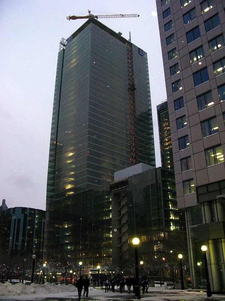
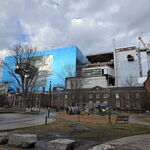
For all the complaining on the Bay-Adelaide thread, RBC is the more boring tower, IMO.
things that could of made BA better: more dynamic glass, variance in form and structure, a more creative use of the fins. oh, and a podium that wasn;t merely a recreation of a once beautiful building.
The podium is the best part of the building. It fits in perfectly with the scale of the existing buildings on Wellington.rbc: height, instead of a fat podium, i think, wouyld have made this buiding better.
?
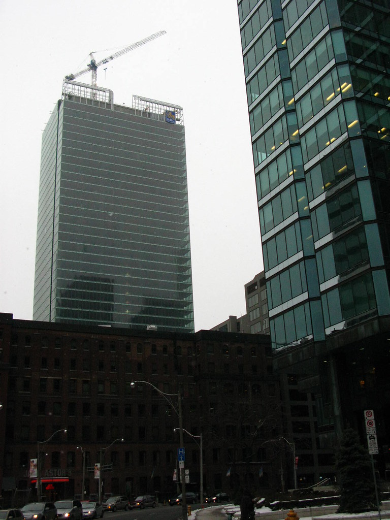
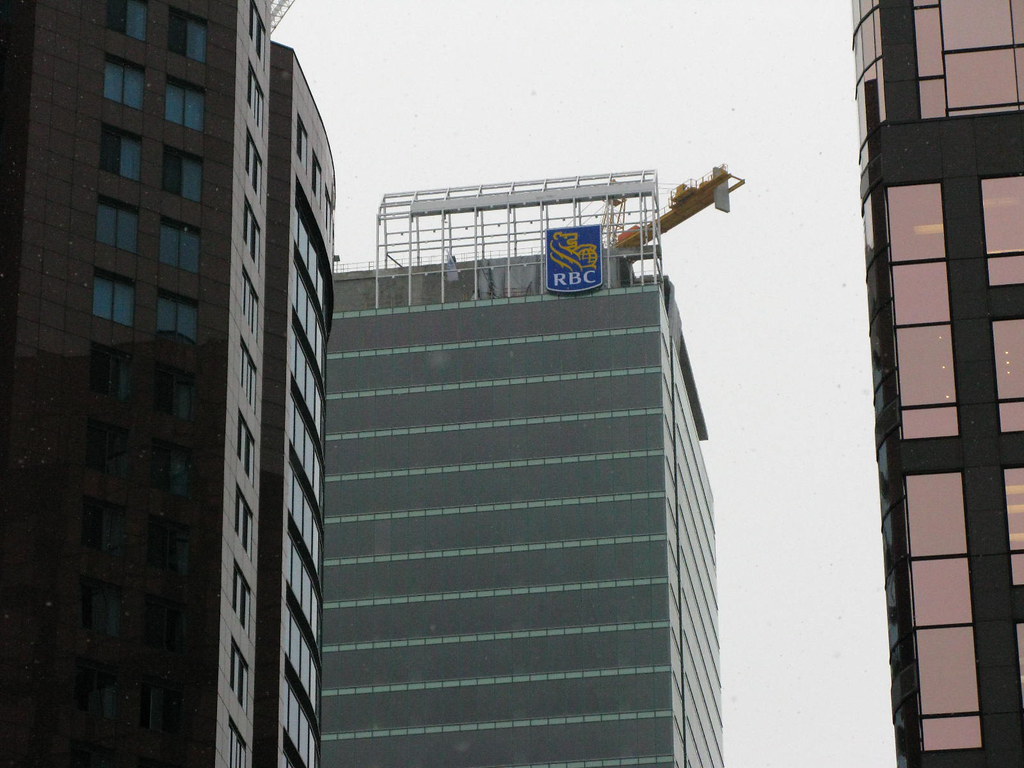
So, the lantern (still to be finished), the vertical slots (potentially lit all the way to the top with LEDs), the horizontal slot, the sloped sections top and bottom, and the podium with some fritted sections all adds up to a more boring tower which adds nothing architecturally to the city?
RBC's transparency even holds out the hope of some animation behind its windows once it is occupied, whereas that dull as dishwater BAC has next to nothing to look at and promises nothing either.
42
