Toronto Union Station Revitalization | ?m | ?s | City of Toronto | NORR

I'm just basing my assumptions off what was there before.

The Bagel Stop and Pumpernickles never were very busy despite Bagel Stop being next to Second Cup and the GO ticket windows.

I can't speak to Pumpernickles, but apparently you weren't hanging around the Bagel Stop in Union at the right times. Bagel Stop regularly had 5 employees working in the front and lineups well out into the hall weekday mornings. Saturday mornings there was regularly a lineup as well. My understanding from people working down there was that it was well patronized at lunch, too.

Dan
Toronto, Ont.
 
I'd absolutely LOVE to see it finished, but isn't the York Northwest PATH tunnel extension from Front to Wellington on indefinite hold, a.k.a. cancelled, due to a complete lack of funds? And hasn't Royal York outright refused to connect to it?
Incentivization. Find some funds to dangle.

This could be a great opportunity for Royal York, business losses can easily be outweighed by business gains.
 
Incentivization. Find some funds to dangle.

This could be a great opportunity for Royal York, business losses can easily be outweighed by business gains.

Honestly though the important thing is extending it northward, not whether Royal York gets connected. Their participation is frankly irrelevant to the overall utility.

AoD
 
Except that the Subway/PATH entrance will be down at the lower level, so anyone coming underground to Union (from the northeast) will be forced to come through it.
Exactly, this is how Union Eatery will thrive with the commuter crowd. The TTC huge flow will flood directly into the lower levels, given stairless access between TTC and Union Eatery -- it's just a wide "L" shaped hallway between TTC and Union Eatery with zero stairs.

You just choose to go up the overcrowded Bay Concourse escalators, or decide to walk the less crowded wide cross hallway towards Union Eatery before going up the York Concourse escalators. And there will be connection between east/west moats too. It all balances out.

There will be three -- read that again, THREE -- different east-west hallway routes betwen the Bay-side and York-side.

1. Old current east-west pedestrian route (with some modifications to Bay-side).
2. New moat route; (you will be able to walk indoors to York side from TTC without entering the Union building proper yet)
3. New uninterrupted southern stairless route that will be visible just before the escalators -- allowing you to spontaneously decide whether to take peak-overburdened Bay escalators up to concourse level -- or instead decide walk towards York stairlessly. And in morning commute, you can decide to go down the York escalators to pickup your breakfast/coffee before walking stairlessly/escalatorlessly to TTC.

So cross-concourse access will be dramatically easier come 2018/2019-ish.

It's the lunchtime business crowd I'm concerned about. Union Eatery is on the York side, which is harder to access by the Financial District PATH system. It's one of the few cases a "TIF"-like funding arrangement might work -- the increased rents paying for the new PATH connection(s) -- over a 25 or 30 year time period.
 
Last edited:
Exactly, this is how Union Eatery will thrive with the commuter crowd. The TTC huge flow will flood directly into the lower levels, given stairless access between TTC and Union Eatery -- it's just a wide "L" shaped hallway between TTC and Union Eatery with zero stairs.

You just choose to go up the overcrowded Bay Concourse escalators, or decide to walk the less crowded wide cross hallway towards Union Eatery before going up the York Concourse escalators. And there will be connection between east/west moats too. It all balances out.

There will be three -- read that again, THREE -- different east-west hallway routes betwen the Bay-side and York-side.

1. Old current east-west pedestrian route (with some modifications to Bay-side).
2. New moat route; (you will be able to walk indoors to York side from TTC without entering the Union building proper yet)
3. New uninterrupted southern stairless route that will be visible just before the escalators -- allowing you to spontaneously decide whether to take peak-overburdened Bay escalators up to concourse level -- or instead decide walk towards York stairlessly. And in morning commute, you can decide to go down the York escalators to pickup your breakfast/coffee before walking stairlessly/escalatorlessly to TTC.

So cross-concourse access will be dramatically easier come 2018/2019-ish.

It's the lunchtime business crowd I'm concerned about. Union Eatery is on the York side, which is harder to access by the Financial District PATH system. It's one of the few cases a "TIF"-like funding arrangement might work -- the increased rents paying for the new PATH connection(s) -- over a 25 or 30 year time period.

I actually walked from Scotia Plaza to the York Concourse earlier via the path. It was the most utterly convoluted thing I've done in awhile.

I agree with Marks statement regarding the business crowd. It took me 15 minutes to get from Scotia Plaza to the York Concourse and honestly I doubt if anyone will walk that far just for lunch.

If they connected it to York Street it might help but not by much. They need to target commuters not the office towers at King Street if they are to be successful.

With that said it seems to be coming along well. Uncle Tetsus was virtually dead with only two customers at 12:45. Booster Juice had 5 customers and commuters seemed to be ignoring them.

One thing I will say is that there is a lack of direction when it comes to finding the Bay Street Teamway at Union. I had initially walked into Union trying to go to the GO bus terminal via the Teamway however gave up after walking on the lower level to the York Concourse and finding no signs pointing me in the right direction.

I eventually made my way to street level via the departures concourse and walked down front.
Given the other options....I doubt if there is anything they can do to make this a "1st choice" lunch destination for King/Bay folks....but there is a very significant and growing office population south of Front street now....I bet, with the right connections, they have a shot at those people.
 
One thing I will say is that there is a lack of direction when it comes to finding the Bay Street Teamway at Union. I had initially walked into Union trying to go to the GO bus terminal via the Teamway however gave up after walking on the lower level to the York Concourse and finding no signs pointing me in the right direction.
I agree that information is inconsistent.

Currently, Bay Teamway is only accessible via an outdoor walk or by walking along platforms. And for accessing the route to the bus terminal from Union -- it's also inconsistent. The route via Bay Teamway (labelled platform "3") and the route via the York Concourse (labelled with a bus logo; "41-47") -- really the same route, same platform -- but labelled differently.

IMHO, they will need a Union Wayfindng Reset Study sometime in 2020, to fix all the wayfinding flaws that has accumulated over the years, and the Version 1 wayfinding still existing in the York Concourse.
 
I hereby propose this doorway video signage, flexible enough to accommodate VIA & GO, as well as enough on-screen to indicate special trains (e.g. BLUE JAYS, NUIT BLANCHE, SUPERCRAWL, etc) with a new "special train" descriptor field. Here's a concept of the Future.

(And adding a cameo of a theoretical super-express weekday peak GO train of the year 2025):

upload_2016-8-11_22-6-39.png


Before:
entrance.jpg

(Credit: jimmywuphotography on flickr)

After:
entrance2.jpg


Also publicly tweeted to @femwriter who said she'll pass suggestion along (my videoboard concept is public domain; feel free to use for any purpose). Multiple layouts can be used for portrait signs on narrow doors and single-berth platforms. Compatible with multiple train services (e.g. VIA), and platform sharing compatible (e.g. #3).
 

Attachments

  • upload_2016-8-11_21-58-25.png
    upload_2016-8-11_21-58-25.png
    90.4 KB · Views: 254
  • upload_2016-8-11_22-6-39.png
    upload_2016-8-11_22-6-39.png
    118.2 KB · Views: 1,553
  • entrance.jpg
    entrance.jpg
    503.6 KB · Views: 1,559
  • entrance2.jpg
    entrance2.jpg
    518.2 KB · Views: 1,584
Last edited:
I hereby propose this doorway video signage, flexible enough to accommodate VIA & GO, as well as enough on-screen to indicate special trains (e.g. BLUE JAYS, NUIT BLANCHE, SUPERCRAWL, etc) with a new "special train" descriptor field. Here's a concept of the Future.

Also publicly tweeted to @femwriter who said she'll pass suggestion along (my videoboard concept is public domain; feel free to use for any purpose). Multiple layouts can be used for portrait signs on narrow doors and single-berth platforms. Compatible with multiple train services (e.g. VIA), and platform sharing compatible (e.g. #3).

Useful, but given the way commuter moves in the concourse, it would be even better to have the electronic signage on either side of the glass enclosure - or directly below the ceiling right in front of the entry. The amount of information communicated by that sign should be relatively minimal - name of line, departure time (with back up information such as colours for lines, and flashing for imminent departure); A secondary vertical sign by the door should show the stops in list format (Union at top). Show the most important information in the most accessible manner with the least amount of delay and cognitive processing. Most people do not need to know what the stops are - and the signage should reflect that relatively low level of importance.

Airport style displays are awful - way too much information crammed into way too small a display - and would I really care about what happens in the other lines? Nope.

AoD
 
Last edited:
Details like that definitely have to be worked out -- this is just a general concept -- maybe the platform numbers need to be real stickers that is stuck permanently on top of the TV (could be a translucent "4" and translucent "5" film on top of the video "4" and "5" -- to allow illumination by the TV whenever the TV is powered). Just in case the TV blacks out during power outages, or TV failures, etc. Then it falls back to being a regular sign. Details, details.

My personal preference is 1 video sign per platform entrance (with templates designed for horizontal and vertical use, but of similar styles) to avoid visual clutter. There's almost too many video signs in York Concourse. If you used two video board per entrance -- now imagine more than doubling the number of video boards in York concourse! So one videoboard per entrance, instead. BIG/MED/SMALL text for platform/route/stops. Even the small text is still much bigger than the text size used on the schedule boards. So there's still plenty of room to also display stops. Maybe even shrink the stops text smaller, and gray it a bit, to make the platform # and route stand out more.

I think one sign will reduce cognitive processing, given the complex layouts of many doors -- there's not enough room at some of the narrow doorways except for one video board (of a possibly smaller size). Consistency is MUCH more important. Same design for all platform entrances. That will massively reduce cognitive processing, especially for inexperienced users.

I think including stops is important for cognitive at this stage -- outweighs clutter, if properly carefully laid out and peer tested. You could omit the stops, but I don't think you can do that with a Paris-style RER system where including the stops in the displays become essential with multiple stopping plans. It's only going to get more important with RER.

Consider Lakeshore West has 5 different stopping schemes in the same evening peak on summer Fridays (Allstop, Express To Clarkson, Express To Oakville, West Harbour terminus, Downtown Hamilton terminus, and Niagara Summer Seasonal). Now consider this happening on several GO routes. You don't want to board the wrong Lakeshore West train!

Still, it needs to be dynamic signs, all the way, for all doors! All of them, all teamways, Skywalk entrance, VIA, concourses, etc. Wayfinding consistency.
 
Last edited:
Airport style displays are awful - way too much information crammed into way too small a display - and would I really care about what happens in the other lines? Nope.
Now imagine cherrypicking the world's best airport gate sign, and applying it to ALL gates. Make all airlines use it. Big improvement.
(P.S. imagine an improved version of my design -- yet still single videoboard; because some doors only have room for 1 small TV)

At that point, you learn to focus on essential information and ignore others. That's my concept -- consistency at all doors all over Union. If airports were consistent, it would be much easier!

Then you don't have to cognitively focus anymore since consistency breeds familiarity, and you learn to be able to glance for your station much like Parisians already learn to do at, for example, RER B (which has displays more complex than my sign), because of 5 different stopping plans interspersed onto the same route name (and 2025 is going to be massively more complex than today in interspersed stopping plans), at a station that has multiple routes that often switch platforms! Ouch.

The train platforms are a problem in that there are 2 trains per platform, so you need to display supplemental information. To display stops for both, you'd have to find place to put 2 separate video boards for them next to the SAME door. That's more cognitively confusing, and we're more than doubling the number of videoboards in the York Concourse... That's even worse.

And if we're keeping the old platform number separate from the video displays...Then we have to find an alternate side-window for the vertical video boards -- and because there's 2 trains, we have to display platform numbers on the video boards displaying the stop list. Platform numbers shown again! Duplicating information already displayed above the door. Narrow doors, wide doors, portrait AND landscape signs clashing with each other. And some doors only has room for 1 reduced-size videoboard. Ouch.

But platform numbers (video or physical or hybrid) on a cramped door should usually be shown only once per platform entrance -- seemed cognitively easier to do if it's just 1 screen. It's not like a big airport gate waiting per boarding door -- where you have gate number and info displays far apart. You're cramming onto tiny entrances, some of them with no room for a 40" TV (portrait and landscape) requiring a reduced-sized video display. In this situation, informational consistency wins out. Imagine having 10 video boards displayed on 5 cramped stairway entrances -- rinse and repeat for both sides of the York escalators, then repeat again for elevator shafts. Now if we followed the suggestion of separate video boards per train per entrance, 2 video boards per entrance, 20 new videoboards becomes way too much added clutter in already heavily video-filled York Concourse....

If you're rushing to catch a train, if the sign was consistent, then it's easy to learn to ignore information, and glance at needed info (e.g. whether the route you catch has your stop). This is an essential habit of worldwide "RER" systems that expands on the interspersed allstop-semiexpress-express-superexpress-mixedexpress(etc) concept ...

The RER commuter of other cities (e.g. Paris, etc) glances at the station list display and recognizes their stop is listed, and boards that particular train. Good RER-type signage contains glanceable information that are quick to glance (yet is also easy for new 1st time commuters to avoid getting lost), and this is a challenge of RER type systems worldwide. GO has a logistical challenge on their hands even bigger than those -- because at Union, any GO route can stop at any particular platform. Even if Metrolinx may be able to make the platform assignments a little more consistent/permanent, the flexibility is critical. Station list displays will become essential at all doors eventually, especially with further spurring that will occur (Old Oakville terminus vs Bowmanville terminus, Bolton, etc)

As you can see, I already creatively "thought ahead" of unanticipated cognitive confusion factors, reconciled nearly all of them, and came up with a compromise (that isn't perfect yet) that can be improved even further by others.

After realizing all the competing issues, it was apparently very plainly clear, it was essential to have just one videoboard per door to keep things simple and avoid doubling the number of screens in York concourse (cognitive clutter). Maybe the platform numbers can be separated out, but still, the complexity actually seemed to go down when I included the numbers on the sign. Perhaps platform numbers could be incorporated to the left of the TV, creating more space for the two-banners on the TV screen itself. Or alternate ideas.

Mix it up, improve my design, add color coding, maybe shrink/grow font sizes, changes colors, make platform numbers bigger, etc. Brainstorm.
 
Last edited:
How to read signage at German rail stations
By fotoeins on 16 February 2015

The following is a short visual descriptive guide to signage at German rail stations to help get you on your way. Examples below are taken from Frankfurt am Main Hauptbahnhof (central or main train station). The general descriptions should apply everywhere throughout the country.

Where’s my train? The departures board (Abfahrtstafel)
hl_fhbf_6634_ptmod1a1.jpg

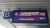
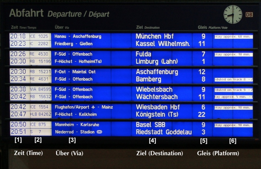
In most medium- to large-sized German cities, every Hauptbahnhof (Hbf) or central train station will have a large departures board in the central hall and/or over the information booth. The photo above shows the departures board in the middle of Frankfurt’s station with the message:

“Herzlich Willkommen in Frankfurt am Main Hbf – Welcome to Frankfurt am Main Central Station”.
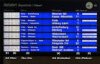
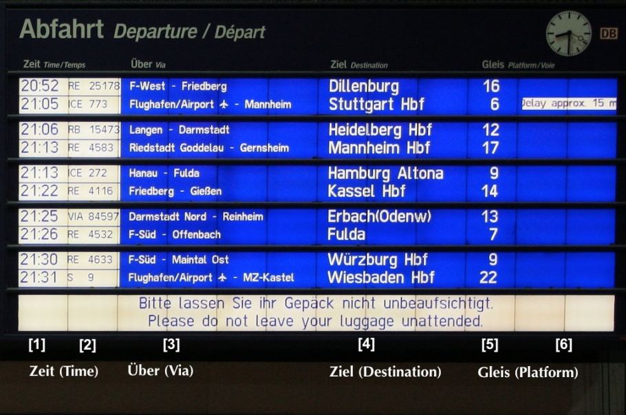
Information on the departures board appears as white block lettering on a dark blue background. From left to right in the photo below, there are six primary columns of information:

  1. Departure time (Zeit)
  2. Train number
  3. Intermediate stops (Über)
  4. Final destination for train (Ziel)
  5. Platform number (Gleis)
  6. Additional information
hl_fhbf_6634_ptmod3a.jpg

The departures board above shows Regional Bahn train RB 15231 leaving at 830pm (2030h) for Aschaffenburg from platform 12, with stops at F-Ost (Frankfurt Ost) and Maintal Ost. There’s no additional information which means the train is scheduled to depart on time.

hl_fhbf_6634_ptmod4a.jpg

The other departures board shows InterCity Express ICE 773 leaving for Stuttgart from platform 6 at 905pm (2105h), with stops at Frankfurt Airport (Flughafen) and the city of Mannheim. There’s an additional note that the train is about 15 minutes late, putting the departure time to about 920pm.

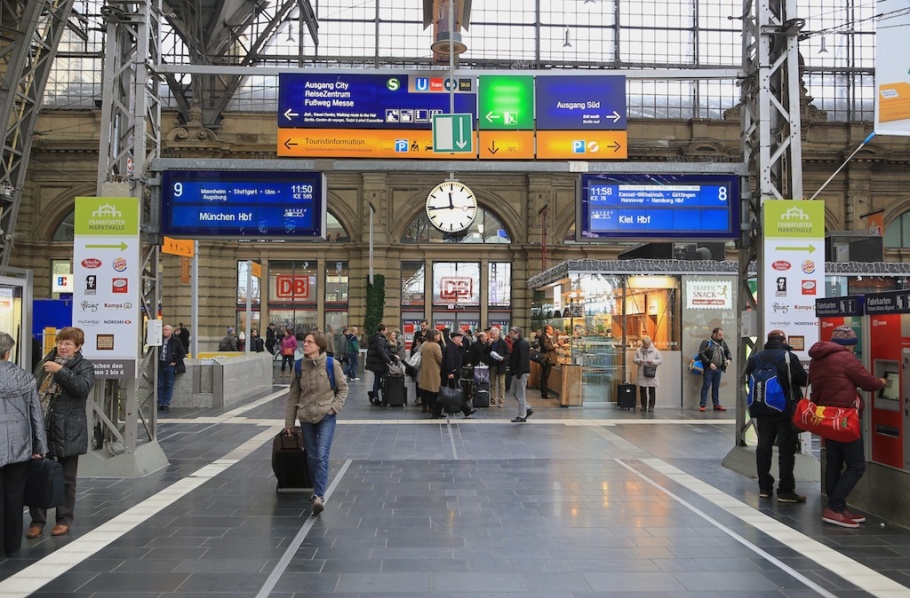
What’s my train? Destination signage (Zugzielanzeiger), by day
Above every platform are overhead digital signs to confirm what travelers might see on the central board. The signs also appear as white lettering on a blue background. Occasionally, two trains will share the same platform which the signage will also reflect. Highlighted sections will correspond to the appropriate train; take note that you board the correct train.

The following are examples of daytime departures from platforms 8 and 9.

hl_ffm_0405_ptmoda.jpg

hl_ffm_0406_ptmodb.jpg

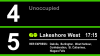
From platform 8, InterCity Express train ICE 76 leaves at 1158am for Kiel Hauptbahnhof (Hbf), with stops in Kassel-Wilhelmshöhe, Göttingen, Hannover, and Hamburg Hauptbahnhof. There’s a five-minute delay, pushing the departure time to about 1203pm.

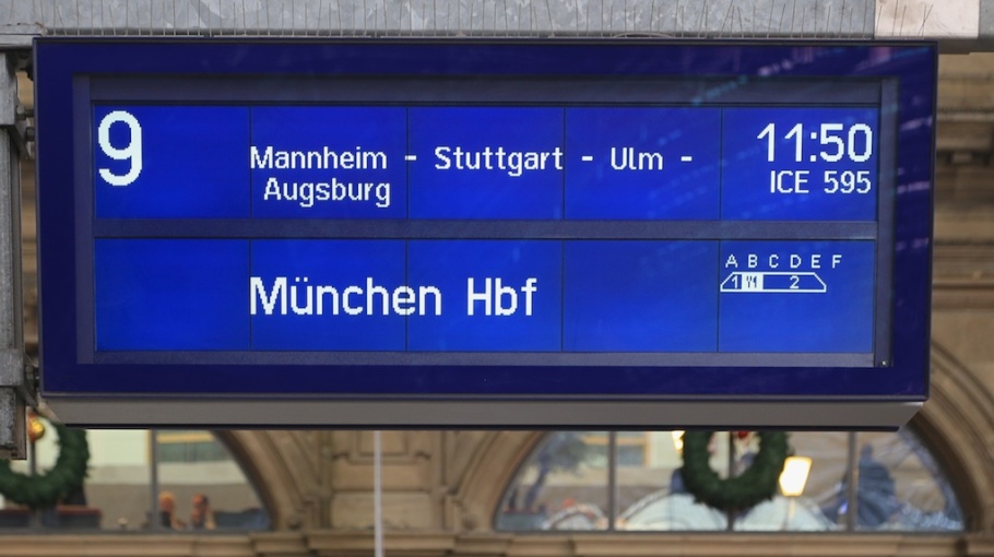
Every platform is “divided” into sections, which are also labeled with overhead signage (A, B, C, etc.) indicating where you are along the platform. The electronic sign also shows how the train itself is divided. 1st-class cars are in section A, the dining car is in section B, and the rest of the train consists of 2nd-class cars from sections C through E.

hl_ffm_0407_ptmoda.jpg

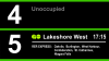
From platform 9, InterCity Express train ICE 595 leaves at 1150am for München (Munich) Hauptbahnhof, with stops in Mannheim, Stuttgart, Ulm, and Augsburg. The sign above shows that first-class cars are along section A, the dining car along section B, and the rest of the train consists of second-class cars from sections C through E.

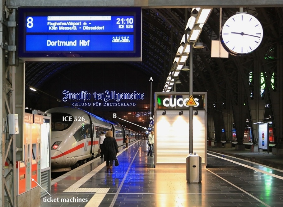
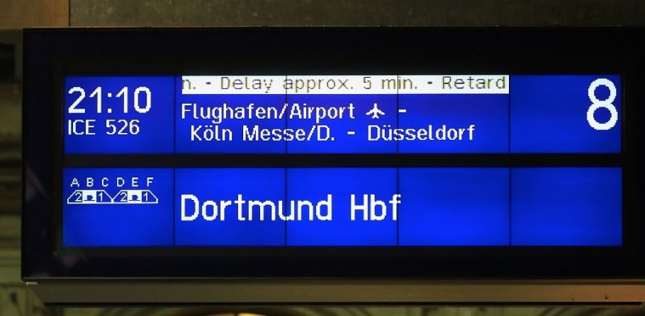
What’s my train? Destination signage (Zugzielanzeiger), at night
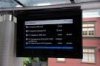
The following is an example of a nighttime departure from platform 8.

hl_fhbf_0589ptmod1a-gesp.jpg

It’s 917pm, but the 910pm train from platform 8 hasn’t departed. I’ve labeled the train ICE 526, overhead signage indicating platform sections ‘A’ and ‘B’, as well as the familiar red and blue Deutsche Bahn ticket machines. It’s preferable (and often cheaper) to purchase a ticket before boarding the train; the ticket machines have multilingual options and sell tickets for regional and long-distance trains.

hl_fhbf_0595ptmoda-gesp.jpg

In fact, ICE 526 heading to Dortmund Hauptbahnhof is approximately 5 minutes late, which means this train is about to leave at any moment. The train makes stops at Flughafen Frankfurt am Main Airport and in Köln (Cologne) at Messe/Deutz station. Note that 2nd-class cars are located along sections A and D, dining cars at sections B and E, and 1st-class cars at sections C and F

Where’s my coach? Coach sequence signage (Wagenreihungsplan)
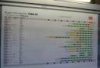
If you’ve purchased a ticket with assigned seating in a specific coach or car, you have to locate the correct coach for the train. Every station platform has a large sign “Wagenreihungsplan” or “Wagenstandsanzeiger”, describing how coaches are sequenced for each train leaving from that platform.

The labeled columns shown left to right in the photo below are for trains leaving from platform 12:

  1. Departure time (Zeit)
  2. Train (Zug)
  3. Information, notes (Hinweis)
  4. Direction, destination (Richtung, Ziel)
  5. Coach sequence (Wagenreihung)
  6. Signage location, “where am I?” (Standort)
hl_ffm_0384ptmoda.jpg

Coaches in green are 2nd-class cars, coaches in yellow are 1st-class cars, and coaches in red are dining cars. Every coach is labeled by a number. The short black arrow next to the train engine indicates the direction leaving the station. In other words, coaches next to platform sections C, D, E are at the “front” of the departing train at Frankfurt station.

Where is this “Wagenreihungsplan” signage located? (“Where am I?”) The red dot and red vertical line indicate the sign’s location between platform sections B and C.

For example, train IC2297 leaves platform 12 at 820pm (2020h) for Stuttgart. However, there are three rows for the same train number, indicating different coach sequences for different days of the week. The train indicated by the white asterisk or star is assigned for departures Monday to Wednesday (Montag bis Mittwoch) inclusive. Where the red vertical line intersects this row shows that the “Wagenreihungsplan” signage shown here would be located opposite 2nd-class coach number 6.

At times, you may hear a public announcement and/or see a notice on the overhead track signage about changes to the coach sequence: namely,

• “umgekehrte Wagenreihung”: coach sequence is completely reversed.
• “abweichende Wagenreihung”: coach sequence is different than scheduled.

Schedules for departures & arrivals
You’ll also see printed-paper displays for arrivals and departures. Arrivals are always displayed as black text on a light grey background, and departures are always displayed as black text on a yellow background. The lists of arriving and departing trains are ordered by the time of day.

hl_fhbf_0385pta.jpg

The Deutsche Bahn website also provides an updated to-the-minute online version of an arrivals and departures board here in German or here in English. Up-to-date information is given two hours in advance from your present time, including information about the assigned platform for arriving/departing trains and whether trains are early or late. Just like the printed-paper displays, arrivals and departures are shown on light grey and yellow backgrounds, respectively.

Questions or comments about trains in Germany? Please leave them below!
I made the photos above at Frankfurt am Main Hauptbahnhof on 10 October 2009 and 20 November 2014. This post appears on Fotoeins Fotopress at fotoeins.com as http://wp.me/p1BIdT-6k7.
https://fotoeins.com/2015/02/16/how-to-read-signage-at-german-rail-stations/
 
hl_ffm_0406_ptmodb.jpg

(more at your link)

Yes, this is the example of the RER complexity problem, especially in platform sharing situations. They even have more complex platform-entrance signage than we do.

But still better than what GO has now, despite being German! If my ticket said "ICE526" and "Hannover", I can still recognize I am entering the correct platform entrance, and even reconfirm I am on the correct platform without knowing German.

Thankfully videoboards are completely redesignable -- unlike old departure boards of yesteryear. If my design is not good, design something better...

Over time, Metrolinx will need to allot some budget to RER signage at Union...
And possibly, eventually, on many platforms GO-wide as a reconfirm you are on correct platform -- but priority is Union. The Union overhead dot matrix will need to be replaced with clearer, easier to read outdoor TV videoboards (they also come in thin long strip format now too...)
 
Last edited:
Yes, this is the example of the RER complexity problem, especially in platform sharing situations. They even have more complex platform-entrance signage than we do.
And until GO can improve their lagging signage *and* PA, they should consider a WiFi realtime stream address, and a low-power FM band stream, for those with simple cell-phones, to remain tuned-in to the latest up-dates, even when sitting in nearby rest areas, so they don't all have to gather around the present notice boards, desperate for the latest update.

Newer signs will cost a fair amount, streaming real-time info is very cheap to institute. Time and again, waiting on platforms to take a GO train into TO, it's the passengers with i-phones who've inform the crowd, not the notice boards or PA announcements.

I've never used my open channel SMS, but that would be another way of informing waiting passengers of any delays, cancellations, or instructions to board buses in lieu of trains.

One shouldn't have to have an i-phone/pad to be informed. Text messaging is crude, but it works, and the vast majority of GO patrons have a cell-phone.
 

Back
Top