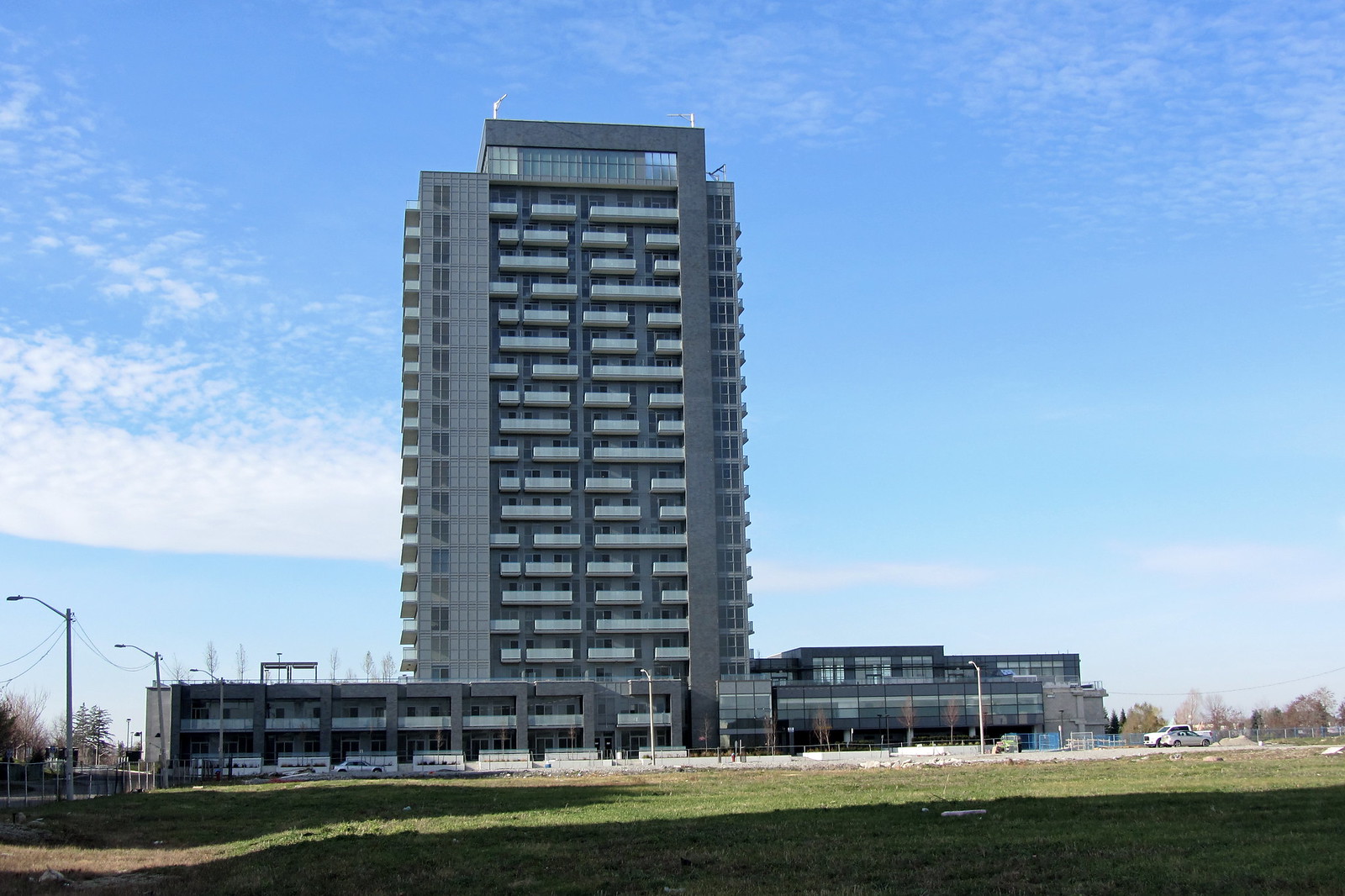
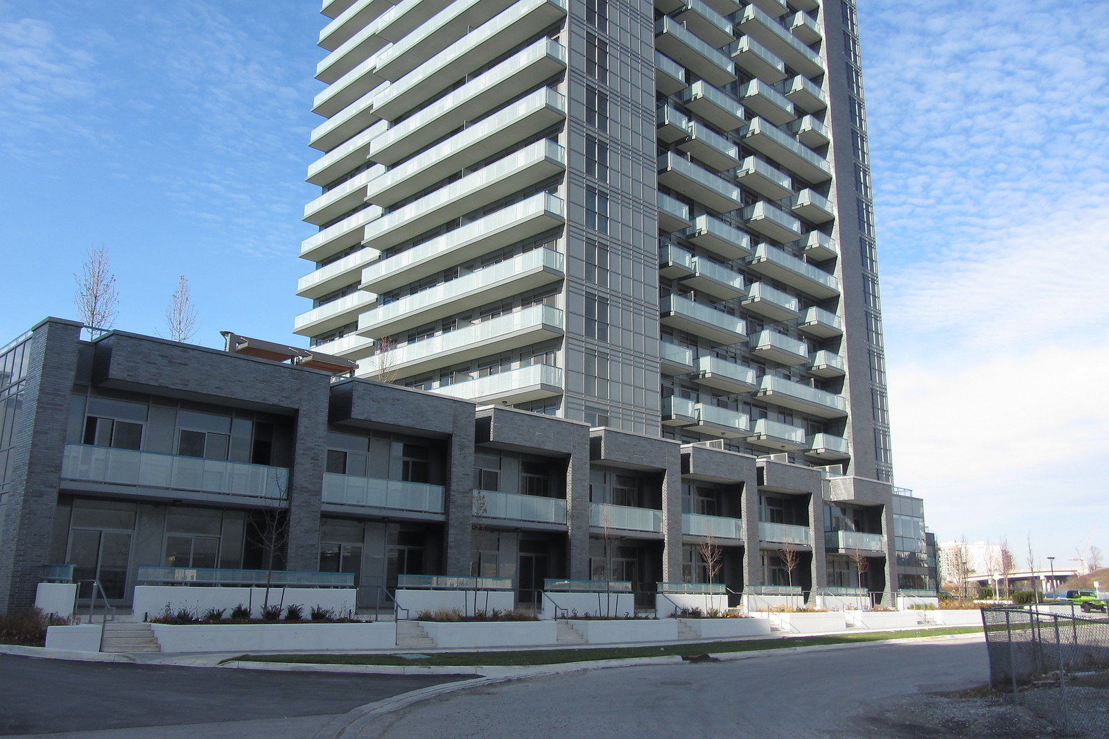
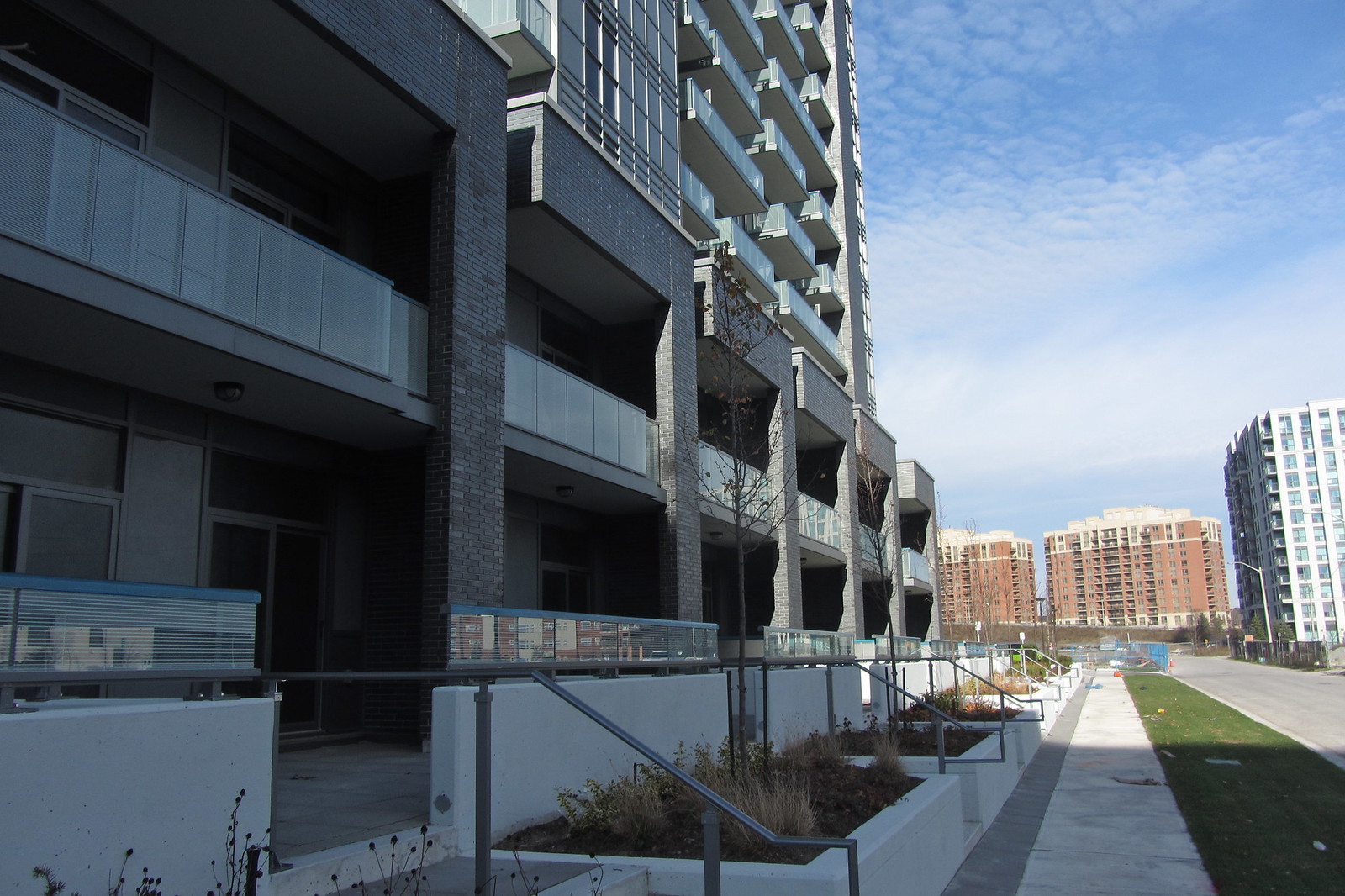
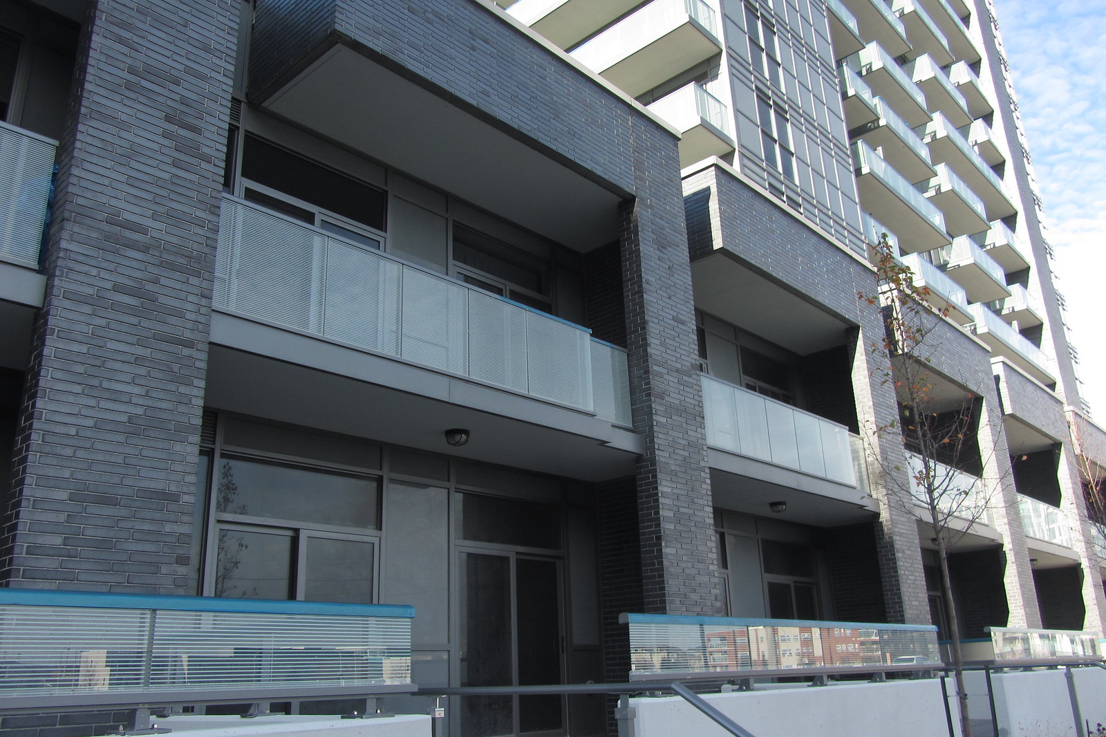
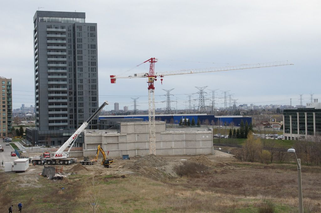
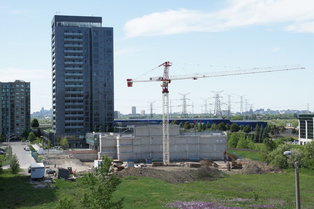
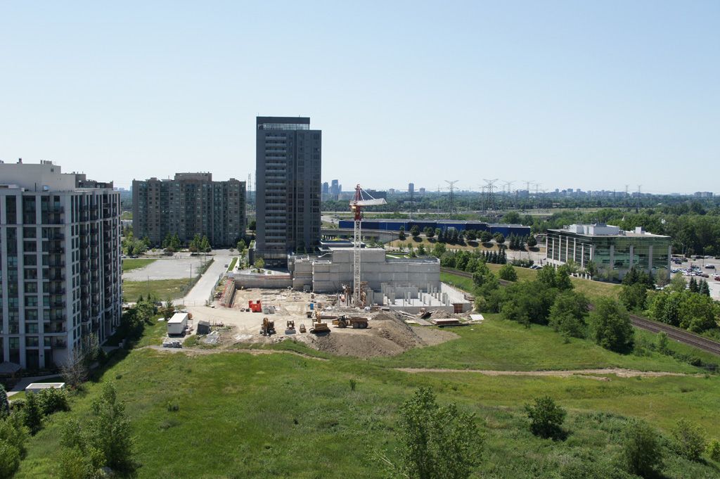
I have nothing against the form of the building in general, but the gray on gray on gray is dull on dull on lovely Roman bricks. If only the spandrel provided some relief from the relentless, unrelieved colourlessness. What if the developer and architect had dared to go—on at least some of the spandrels—with a rusty red-brown similar in tone to the colour that Wallman Architects have applied on The Yorkville and which is now showing up on Bisha? You'd have a complimentary rich earth tone to go with the beautiful bricks, and you'd have warmth and an indication of the human touch. What we have instead looks overly machined to my eyes, without looking slick, and if you're going with the machined look, it had better be slick.
So, either more warmth or more slickness, please, and less of the dishwater-dull middle ground.
42
