Toronto Royal Ontario Museum | ?m | ?s | Daniel Libeskind

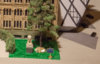
We were at the opening this morning: http://urbantoronto.ca/news/2017/12/royal-ontario-museum-opens-weston-entrance-queen’s-park

Bonus photos of course:
IMG_8090.JPG
IMG_8097.JPG
IMG_8099.JPG
IMG_8103.JPG
IMG_8108.JPG
IMG_8115.JPG
IMG_8118.JPG
IMG_8130.JPG

Siamak Hariri mingling with the crowd
IMG_8146.JPG

This cake...
IMG_8182.JPG
IMG_8208.JPG
IMG_8333.JPG
 

Attachments

  • IMG_8090.JPG
    IMG_8090.JPG
    952 KB · Views: 515
  • IMG_8097.JPG
    IMG_8097.JPG
    1.1 MB · Views: 614
  • IMG_8099.JPG
    IMG_8099.JPG
    828.8 KB · Views: 528
  • IMG_8103.JPG
    IMG_8103.JPG
    1 MB · Views: 572
  • IMG_8108.JPG
    IMG_8108.JPG
    1.1 MB · Views: 479
  • IMG_8115.JPG
    IMG_8115.JPG
    1.1 MB · Views: 468
  • IMG_8118.JPG
    IMG_8118.JPG
    1,011.3 KB · Views: 506
  • IMG_8130.JPG
    IMG_8130.JPG
    1 MB · Views: 476
  • IMG_8146.JPG
    IMG_8146.JPG
    811.9 KB · Views: 474
  • IMG_8182.JPG
    IMG_8182.JPG
    801.4 KB · Views: 494
  • IMG_8208.JPG
    IMG_8208.JPG
    901.7 KB · Views: 462
  • IMG_8333.JPG
    IMG_8333.JPG
    963.8 KB · Views: 472
And Bozikovic on both this step and on the need to ensure crystal renos are done right:

https://www.theglobeandmail.com/lif...itecturalmove/article37310707/?click=sf_globe

Re: the horrible interior experience of the crystal, this caught my eye:

"The museum now aims to fix this. The stair is the first stage of what the ROM calls the Welcome Project, a promised revamp of its lobby, adjoining spaces and the landscape around the building. The museum won't divulge details yet, but Basseches says to "expect two announcements in the first quarter of 2018."
 
The lobby truly is horrible - cold in winter, dark, confused layout, no sense of occasion, cheap materials...
 
The lobby truly is horrible - cold in winter, dark, confused layout, no sense of occasion, cheap materials...

I have no problem with an austere interior, but cheap materials definitely did it in (think the quality of the space if they had used black granite and white neoparies instead of tile and drywall). I hope they can resist the urge to stray too much from that vocabulary for the Libeskind addition.

AoD
 
I went last night and I'm thinking it isn't a very good idea to have two entrances. The place was closing and security was telling people to leave. A couple of visitors indicated they were waiting for someone they were with to come down so they could leave together. Both times security asked them at which entrance did they agree to meet at. Neither had an answer for security.
 
I went last night and I'm thinking it isn't a very good idea to have two entrances. The place was closing and security was telling people to leave. A couple of visitors indicated they were waiting for someone they were with to come down so they could leave together. Both times security asked them at which entrance did they agree to meet at. Neither had an answer for security.

Or they could have Bloor as an entrance and University as exit only. Move the gift shop under the rotunda and repurpose the existing space as a cafe.

AoD
 
I have no problem with an austere interior, but cheap materials definitely did it in (think the quality of the space if they had used black granite and white neoparies instead of tile and drywall). I hope they can resist the urge to stray too much from that vocabulary for the Libeskind addition.

AoD

Yeah, the combination of the drywall and the very low ceilings is what gets me. Twice in the last couple years, I've taken international visitors there and they've both remarked (apropos of nothing) that they thought it was a temporary entrance/under construction.
 
Similarly the dry-walled spaces between galleries within the 'crystal' also feels like a work in progress. It provides little sense of the unique space and architecture around you. I like the idea of a cafe in or near the lobby, the cafeteria in the basement is fine for families with kids but not great for a group of adults looking to take a break.
 
The lobby truly is horrible - cold in winter, dark, confused layout, no sense of occasion, cheap materials...

Definitely not enough glazing making things dark and claustophobic. There was a huge missed opportunity in making the lobby frontage completely glazed.
 
I can't get over how detailed this cake is. It took over 100 hours and several photographic references to create this, and the attention to detail is ridiculous:
IMG_8182 2.JPG
IMG_8182 4.JPG

Even the heritage plaque!!!!
IMG_8182.JPG
 

Attachments

  • IMG_8182 2.JPG
    IMG_8182 2.JPG
    801.4 KB · Views: 482
  • IMG_8182 4.JPG
    IMG_8182 4.JPG
    1.5 MB · Views: 535
  • IMG_8182.JPG
    IMG_8182.JPG
    943.8 KB · Views: 507
Among other things, I want to see…
  • the Bloor doors doubled in height and made 50% wider, with an angled canopy reaching somewhat into the public plaza out front
  • the plaza landscaped with a café built into the area in front of the gift shop (that may be coming in the announcements), and the concrete replaced with stone
  • a major upgrade to the stair of wonders, with more wonders cases, glass doors replacing those terrible crash doors, glass & steel balustrades to open it up when you're in it, and glass and steel at landings at each floor where it overlooks the atrium
  • the textile gallery moved so that it's not on the top floor where there are all those closed windows: move the minerals gallery up there (not light-sensitive), and open those wonderfully jagged windows up!
  • get the early earth gallery finished (finally) as a lead-in to the dinosaur galleries
  • figure out something inspiring for Spirit House space: an artist could fill it with something amazing that makes good use of the acute 3D aspects of its irregular interior (or maybe it's large enough to mount the whale skeleton that was one display at the exhibition earlier this year, once it gets back from the road show it's on now, and then go for underwater lighting and whale song soundscape in there)
  • close off back-of-scenes views where the old building and the crystal meet up (or at least clear those spaces so that we can't see the junk that's currently stored in them)
42
 

Back
Top