Toronto 88 Scott Street | 203.9m | 58s | Concert | P + S / IBI

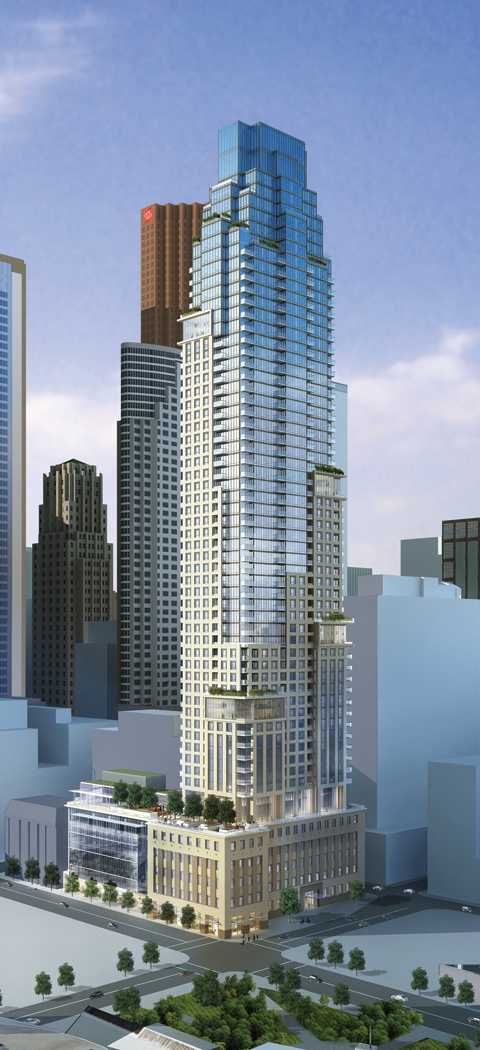
I'm pleased that they're adding office space to the podium but I agree that the top is now much less elegant. Why would they make such a seemingly arbitrary change?
 
I thought the top was the most awkward part of the original design -- the new treatment is far more consistent with the stepped nature of the rest of the building.
 
That redesigned top is a real bummer. The original was quite original, and quite well proportioned. It was also the saving grace on a design that was otherwise mediocre.

With that out of the way, I've officially stopped caring about this project.
 
Wow ... Concert really killed the top of this design .... simplified, the tower basically shoots straight up now with a stepback on the 4th and 2nd floor to the top ... a change that is very unfortunate

I'm definitely liking the previous scheme a whole lot more:

6705129703_7715e9d724_o.jpg


http://88scott.com/
 
The more I look at it the more I think the design is completely ruined now. For one, the less pronounced setbacks make the tower clunky and poorly proportioned. Secondly, I'm not sure why they shifted the top of the tower over to one side like that. It has no symmetry and finishes so awkwardly now. It has lost its most interesting gesture. What a shame.

I know that developers are all about making a buck, but it amazes me that they'd be so willing to completely devastate a design for the sake of squeezing in a small handful of units.
 
Last edited:
To each their own I guess; I felt the crown in the original rendering too tall/heavy somehow. I don't see anything wrong with the revised setbacks either - the glass boxes higher up don't appear to have changed - and in fact the revised drawings make the tower look more streamlined and refined.
 
The earlier design was more symmetrical, but with an awkwardly out of scale box on the top. The new design is asymmetrical, but the upper setbacks now echo the precast-to-glass transition partway up the building, and the top is now more in scale with the rest of the building.

Overall, I call it a near-wash, with a slight advantage to the new version.
 
And with a few simple changes, most elegance has been lost. :( I loved the proportions of the old "crown". Now it doesn't have a "crown", nor any sort of concluded roofline at all!
 
Wow ... Concert really killed the top of this design .... simplified, the tower basically shoots straight up now with a stepback on the 4th and 2nd floor to the top ... a change that is very unfortunate

I'm definitely liking the previous scheme a whole lot more:

Did Concert kill it or did the city demand that, due to some kind of shadowing or whatever:confused:
 
And with a few simple changes, most elegance has been lost. :( I loved the proportions of the old "crown". Now it doesn't have a "crown", nor any sort of concluded roofline at all!

And those window boxes, bad as they were, were at least a little more hidden in the old design.

Now they stick out like tumours.
 
It's gone from being an 'A minus' to maybe a 'C minus'......if these changes were mandated by the city, then the city is a jackass..
 

Back
Top