News   Apr 26, 2024
 1.7K     4 
News   Apr 26, 2024
 374     0 
News   Apr 26, 2024
 949     1 

Street Signs

This thread has a lot of cool stuff. I'm glad someone out there is documenting these little details of city like street signs. I'd like to see a website that details the history of street signs, street furniture and street lights in Toronto.
 
I'd like to see a website that details the history of street signs, street furniture and street lights in Toronto.

I'd deffinitely be on board with something like this

I actually used to have collections of various pay-phones, mailboxes, garbage/recycling bins, and public benches found throughout the city as well. But I recently deleted them as they were taking up valuable street sign space on my free Flickr account (most of them weren't that great, photographically, anyway).

I do, however, still have my collection of various Toronto bus shelters up: http://www.flickr.com/photos/e_victor_c/sets/72157624088889996/
 
Sweet stuff: I'll add this little addition from the city's street sign consultations:

Signs015.jpg
 
Sweet stuff: I'll add this little addition from the city's street sign consultations:

Wow! What an intersection! Did you attend those consultations yourself?

I recently found this sign on Harbord near Bathurst. Is it a very old city sign or handmade by someone in the neighbourhood?

Amazing find! If it is an official sign, it almost looks like it was salvaged from a fire or something.
Its inspired me to put together a little collage of some of my other favourite damaged goods:

4899723809_268852c053_z.jpg


As for Prometheus' previous tip:

4899677443_dcc8b8c03d.jpg


Thanks! I also checked out W.K. Lis' tip about the "three generations" at Wright & Sunnyside today. Confirmed! Unfortunately I couldn't get them all in one shot as I would have liked to as they were spread out over three or four separate corners. I did, however, notice alot of other signage around that neighbourhood getting the bag treatment:

4900252658_ff3eeb32e7_z.jpg


Makes me wonder what might be hiding under there........

4750699709_58091db672_z.jpg

4823280070_0eda344b46_z.jpg

4822663543_b7c5d1689e_z.jpg

4822664523_96e5122255_z.jpg

4822664797_f528dc7d39_z.jpg

4822665697_443fc26932_z.jpg

4861496691_1ebfd8ce38_z.jpg

4594467080_11221f18df_z.jpg
 
not a street sign, but a sign all the same. i came across it last year on Old Weston Road. it seems to begs the question...if you're a psychic, um, why don't you know someone is at the door?


8455fe31.gif
 
being that cleveland is located in the rust belt, it's quite fitting that cleveland street has a rusty sign.
 
^

Funny thing too - as I recall, every other sign in the area seemed to be in perfectly fine condition...


^ thedeepend

Indeed! I often find signs of the homemade variety to reveal the most interesting things:

4618954899_52bd937a8c_z.jpg
 
^
Interesting...

According to Etymonline.com "Avenue" originally derives from the Latin "advenire," meaning roughly "to come to;" while "Road" comes from the Old English "rad," apparently meaning, among other things, a "hostile incursion."
So, in a roundabout way, "Avenue Road" might be loosely translated as something like "Going to War" - as opposed to a pleasant, leafy boulevard...


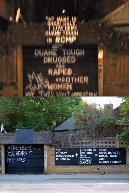
Man, the state of signage in this city is deplorable. Do blind monkeys put them together?

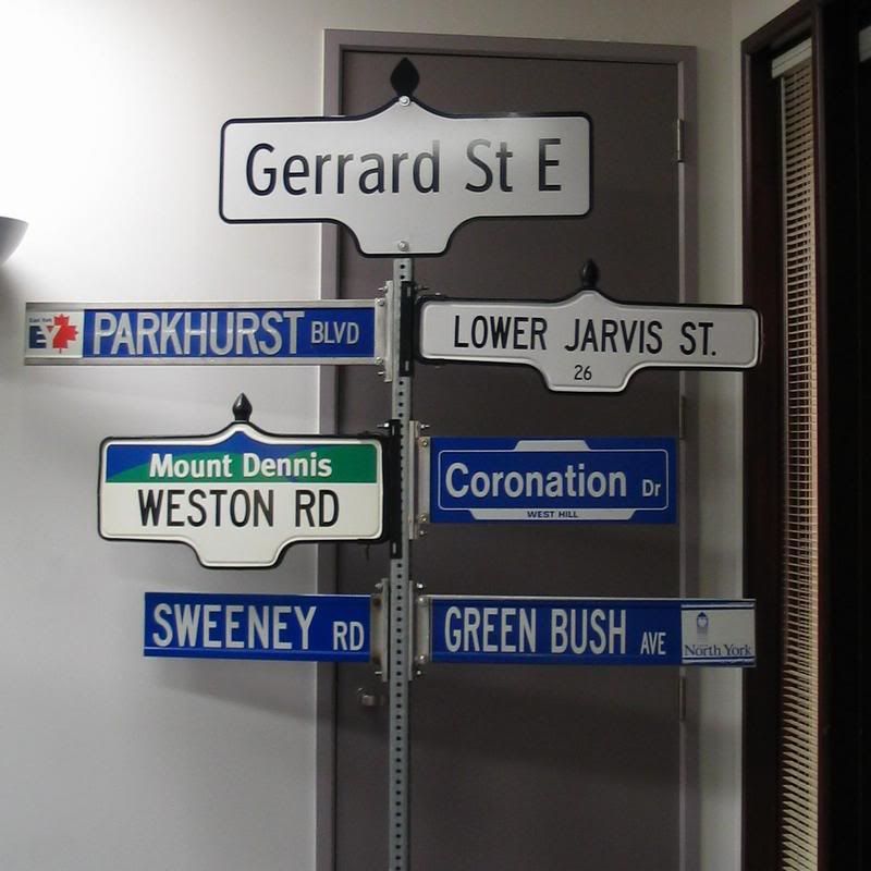
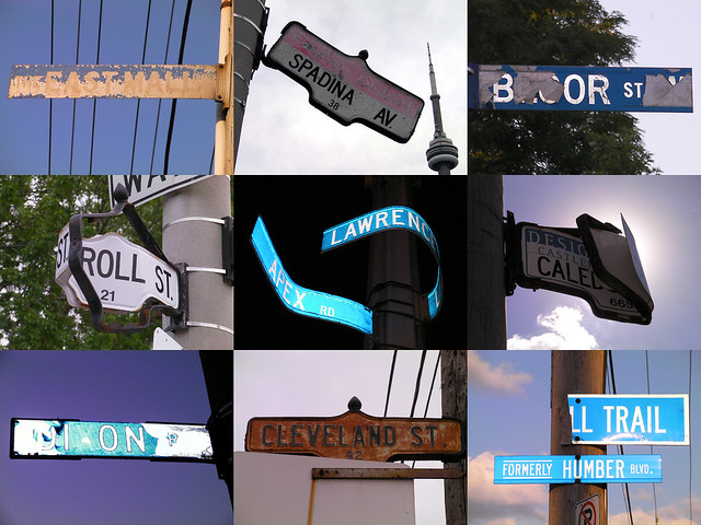
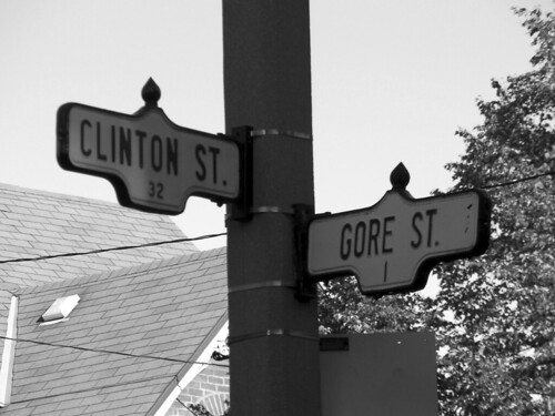
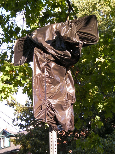
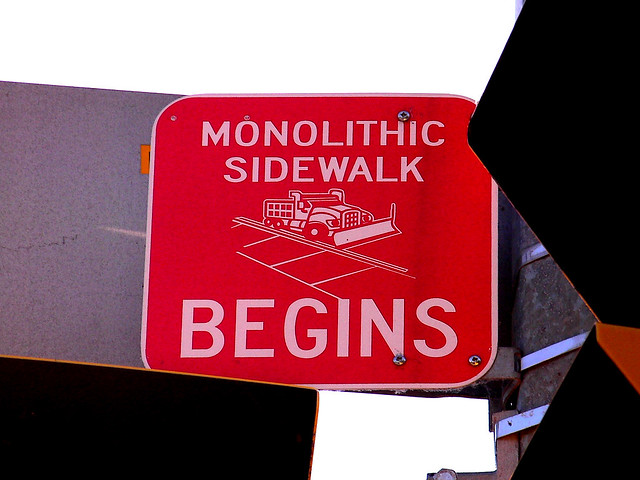
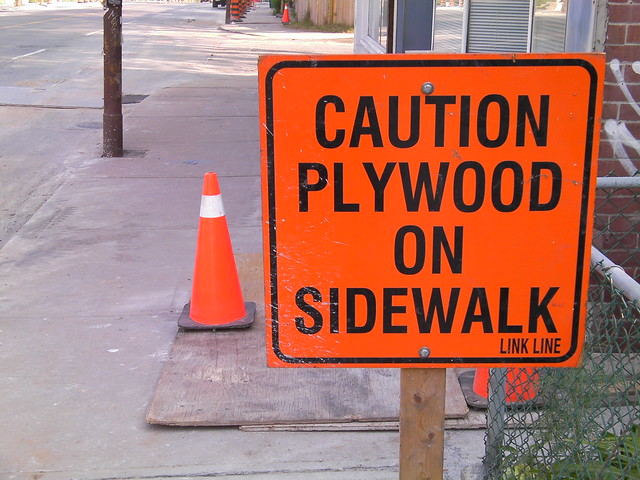
It certainly is a gargantuan mish-mash of shapes, styles, sizes, and states of condition out there. As much as I personally enjoy the variety, a little more uniformity, 15 years after amalgamation, is probably in order. But I'm not sure how much the new signs are helping - or even how far they'll go. I started taking all those bus shelter pics after they began replacing them with the new Astral ones, thinking by now they'd all be gone. But, howevermany years later, there's still as much variety as ever (including the new shelters, even more)! And if funding, interest, or whatever happens to run out along the way you're stuck like that until the next updating initiative, with a whole new design, etc. And on and on it grows.......

As for the new signs themselves, I actually don't mind them that much - while a little bland, I find they do project a certain "Torontoness." My main issue is with the neighbourhood/distric nameplates. Granted, the blue and silver colour scheme certainly limits your options with regards to other colours on the sign, but still, so much of what I've seen so far I find minimal to the point of being just lazy. If anyone compares the old "Korean Business Area" signs with the new "Koreatown" ones, you'll see what I mean. Or, as per my original post, near where I live they've recently installed new "Danforth Village" street signs: plain black arial/helvetica text with this little logo of - I think its supposed to be some buildings? - that I swear was lifted directly from the clip art files of Windows '95 or something. Of course, that my have more to do with the local neighbourhood association or BIA. Perhaps that's their official logo or something. Around that area there's also been a bunch of other new street signs going up with rather corny/gimicky BIA names like "Danforth Mosaic" and "Crossroads of the Danforth." I can only hope these are all as temporary as they look.
 
Last edited:
Wow! What an intersection! Did you attend those consultations yourself?

I did. I think that display was meant to show what each of the six former municipalities' signs looked like, and with the then-current design on top. Regretfully, they missed the old City of York's Helvetica's upper/lower case sign (though they had the City of Toronto-style BIA sign for Mount Dennis) and Etobicoke's signs, up almost to the end had a lighter shade of blue as the backing, and used to use the ground-mounted advance signs. Also, the green signs for Forest Hill (which continued up until the new sign issue) are missing from the display.
 

Back
Top