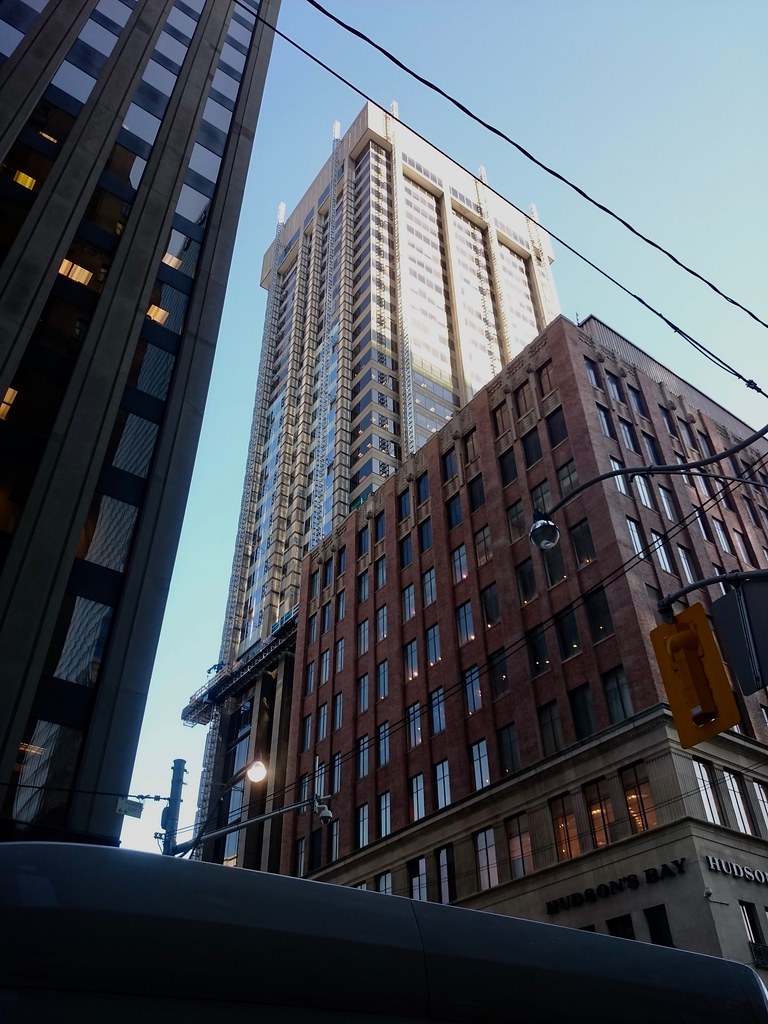
Toronto 401 Bay Street | 143.86m | 33s | Cadillac Fairview | WZMH

Have a feeling that when the whole thing is completed it won't look as bad as people fear. But it hinges on ^ the crown as stjames2queenwest mentioned.
 
I'm happy for the change. This was one of my least liked buildings in the core. This change doesn't turn it into an architectural marvel, but at least it no longer contribute to the bulb of beige concrete in that area.

Don't get me wrong, I'm a huge fan of the style, and I think the original design for this tower would have made it a classic. However this current cheapened out version that became reality is simply a below mediocre excuse for its genre and should be covered up in anyway possible.
 
Last edited:
Today:

33417694112_6beac24809_b.jpg
 
Don't get me wrong, I'm a huge fan of the style,

Coulda fooled me.

and I think the original design for this tower would have made it a classic. However this current cheapened out version that became reality is simply a below mediocre excuse for its genre and should be covered up in anyway possible.

Under the circumstance, you might as well be chiding the postwar Beck & Eadie Bank of Nova Scotia at King & Bay as a below mediocre cheapening out of the original John Lyle plans.
 
The recladding is visible from University now:
Front-Trinity-3 copy 2.jpg

And two days ago:
Front-Trinity-4 copy 2.jpg
 

Attachments

  • Front-Trinity-3 copy 2.jpg
    Front-Trinity-3 copy 2.jpg
    358.4 KB · Views: 460
  • Front-Trinity-4 copy 2.jpg
    Front-Trinity-4 copy 2.jpg
    1.2 MB · Views: 514
Got to say it goes well with that b*tt-ugly TD branch redo across the street.

AoD

Yeah. I shake my head at that everytime I walk by. The bank branch on that corner was no Mies van der Rohe banking pavilion, but it was a good design with some quality materials. The new building is really just a video billboard that also happens to offer some branch services.
 
All the same, the "Thomson Twins" (has anyone ever called them that?) ought to be a critical element in any hypothetical "precinct plans" (HCD or otherwise) for the City Hall zone, i.e. watch how you handle them.

Myself, I find the new TD pavilion inoffensive; but I also respect how the complex at large has always had a soiled rep thanks to its replacing the Temple Building on behalf of tower-in-the-plaza "banality"--as for the towers themselves, they're like Toronto's miniaturized answer to Rockefeller Center West (Celanese, McGraw-Hill, Exxon). On the whole, I'm less regretful about the pavilion rebuild than about the crude replacement of the illuminated "390" at the top with a Munich Re sign...
 
Coulda fooled me. Under the circumstance, you might as well be chiding the postwar Beck & Eadie Bank of Nova Scotia at King & Bay as a below mediocre cheapening out of the original John Lyle plans.

Um no? I'm not sure where you're drawing the similarities.

The scotia bank building carries all the important characteristics and beautifying elements of an Art Deco building, whilst the Simpson's tower left out almost all of the geometric design features important in the brutalistic style.
 
Last edited:

Back
Top