News   Dec 20, 2024
 1.3K     7 
News   Dec 20, 2024
 920     2 
News   Dec 20, 2024
 1.8K     0 

TTC: Redesigning TTC Signage

TheTigerMaster

Superstar
Member Bio
Joined
Feb 3, 2012
Messages
13,384
Reaction score
7,463
Location
Best Toronto
The TTC has a laundry list of customer service issues. But one of the biggest one of them is the horrible lack of uniformity and the extremely confusing nature of the TTCs signs. I often find myself confused about where to go; and I consider myself to be somewhat of a Toronto transit expert.

I personally think that it is about time that the TTC replace every single one of their signs with ones that are more modern and less confusing.

Below I've pasted some of the countless examples of bad TTC signs:
sheppard-yonge-subway-station-sign.jpg


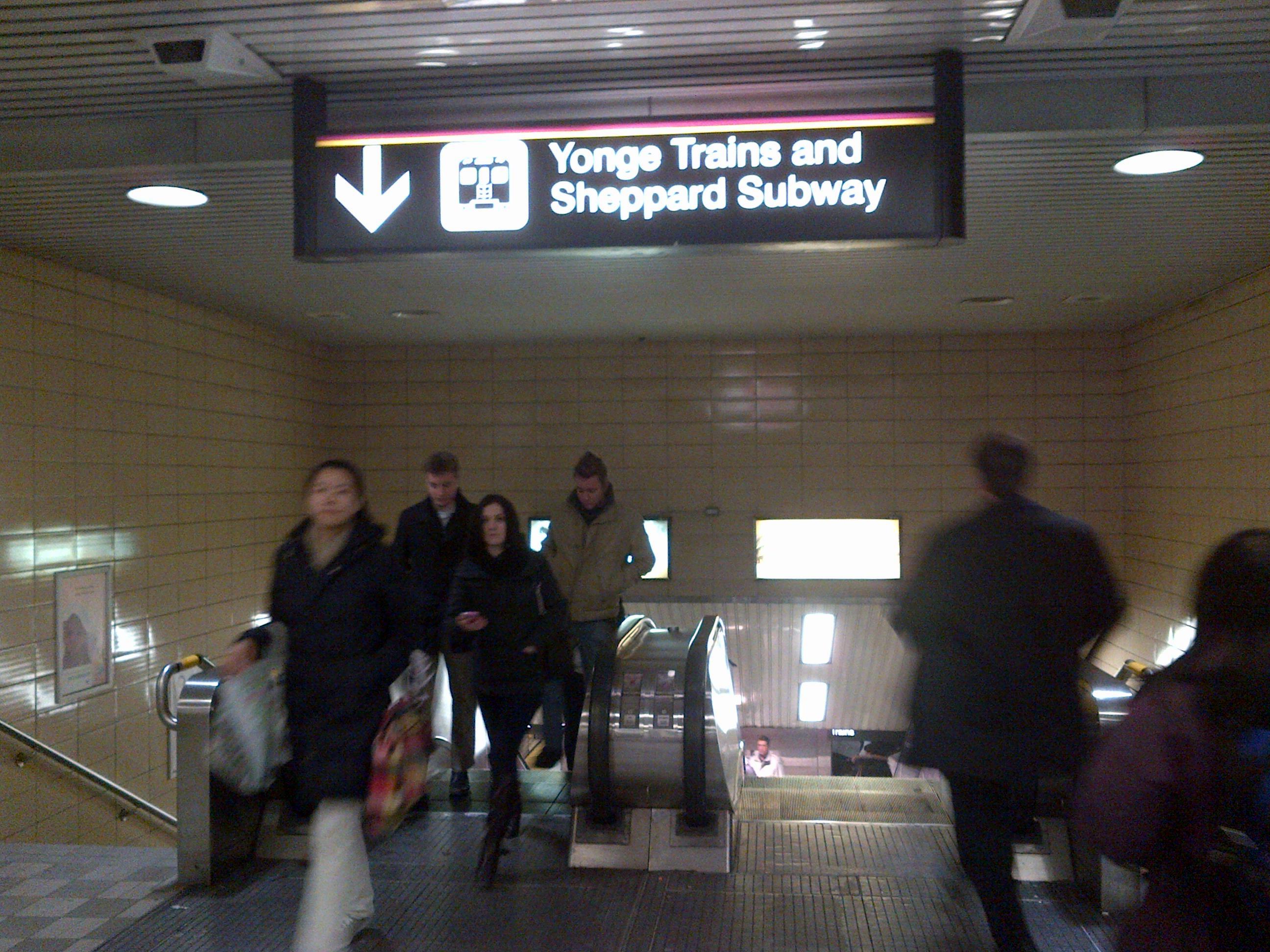
Why is it "Yonge Trains and Sheppard Subway"? last time I checked they were both subways. This will also be made more confusing when the LRT lines open. Some people will think that trains mean LRT, and subway means either underground LRT (which is NOT a subway) or traditional subways (Like YUS)
TTC_Sign-Downsview-strapline.jpg


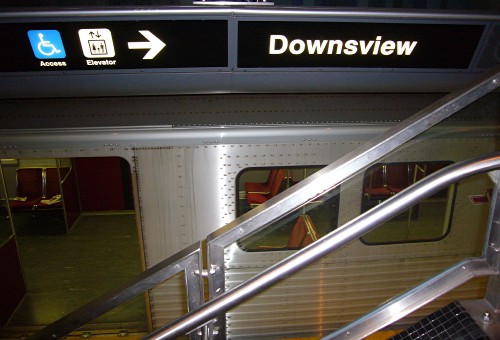
Why does Downsview station have this, but most other stations don't? Where do people look to know what station they're at?
osgoode-station-ttc-signs-edit.jpg


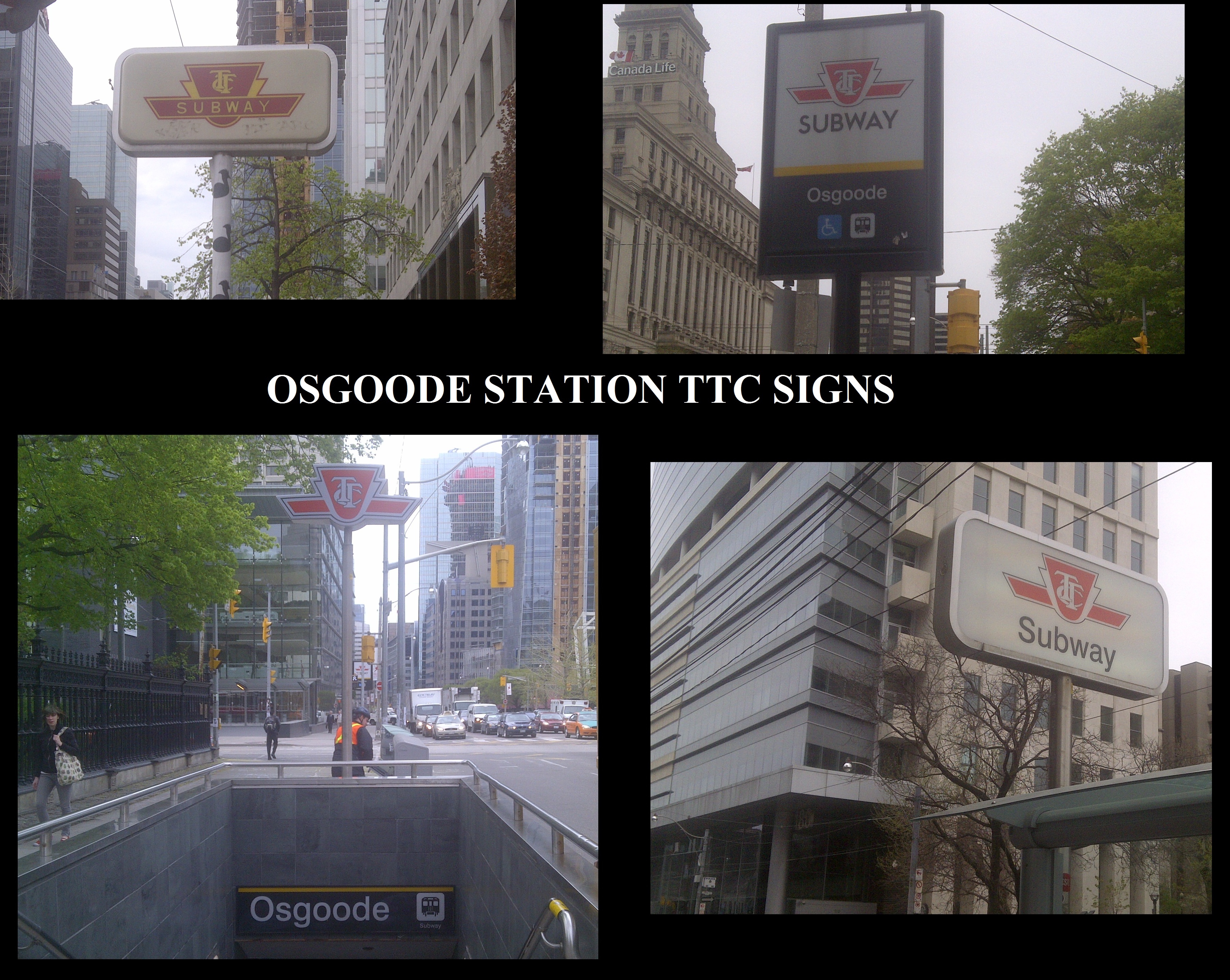
Why does Osgoode station have 4 different signs with different designs? And why does only one sign have the station's name? How will pedestrians know what station they're are? And why does only one sign show that its on the YUS line. How are riders supposed to know what line they're on. And more importantly, why is Osgoode not called Queen West so the name is uniform with Sheppard West, Eglinton West, Lawrence West, St. Clar West etc... Why do only 2 signs show the subway car pictogram. Is Osgoode a subway or underground LRT station?

imgres


Self explanatory

imgres


Whats with this sign? And why is there a dragon on the shield?

pgn_ttcsigns.jpg


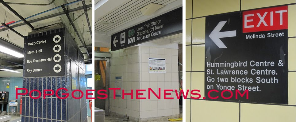
Why do these signs for the exit have completley different designs? And how are customers supposed to know where the Melinda St exit is if the sign is on the wall. Most people don't look at walls when they're walking, so customers would likely walk right past this.
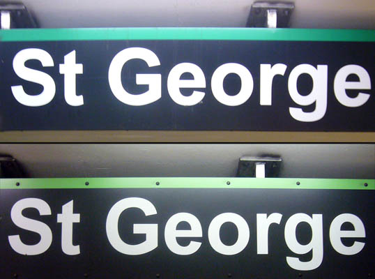
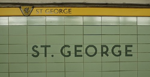
TTC_Sign_StGeorge_PlatformArialSigns.jpg


Slightly different colours and different font. Small problem, but this is important for design uniformity.

715496650_2da1319fc1.jpg

Why is there another dragon and why don't any other stations have pictograms on their shield?
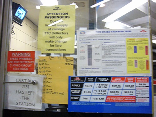
TTC_Sign-ComicSans.jpg


Looks like customers will be playing a game of "I-Spy" to find out whats happening at this station

2324724960_79a1624f32_z.jpg


I had to think for a few seconds to figure these out. For the sign in the foreground, some customers may think that streetcars and busses are to the left and that something (probably subways) that goes northbound and southbound is to the right. And why is there another sign saying the same thing hidden directly behind it.
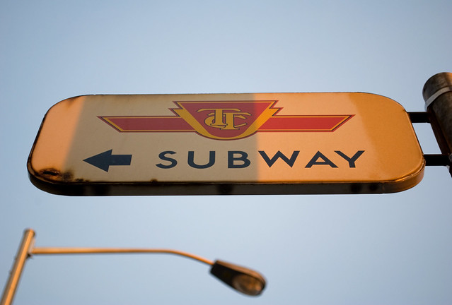
3216094883_989564fc70_z.jpg


Why are these signs still used in 2012. They were put there in the 1960s when the subways were first built to show people that streetcars were replaced by subways.

m1sign.jpg


Is there a westbound train at this station? And do I walk left to find the exit to downtown?

joe-clarks-ttc-type-and-tile-tour


I suppose this means that I should walk all the way to the other side of the platform to exit.
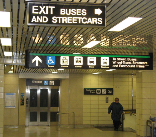
1795748710_6ee2964830_o.jpg

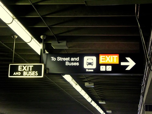
This one is simply confusing. I think it speaks for itself.
5596268597_dbd23247d1.jpg


Obviously redundant.


I could keep posting more, but I think that I've made my point clear. The TTC needs to replace EVERY sign on the system with new ones with brand new design. I personally think that the TTC should adopt the design that the Eaton Centre uses to direct its customers to Dundas and Queen stations (I don't have any photos of this. I'll take a photo and post it next time I vist the Eaton Centre).
 
TTM, what do you think of Joe Clark's analysis here: http://joeclark.org/appearances/atypi/2007/TTC/inscribed/

I know that you have read it, since some of the images were taken from that webpage. Regarding the Paul Arthur signage, they should have expanded the pictographs to every station.

Let's play the guessing game:

The pictograph for Bessarion Station would have looked like a condo or some Byzantine bishop. The pictograph for Leslie Station would have resembled a certain Swedish furniture store.
 
Last edited:
TTM, what do you think of Joe Clark's analysis here: http://joeclark.org/appearances/atyp...TTC/inscribed/

I found Joe Clark's analysis of the issue very intriguing to say the least. He wrote a thorough and well put together document about TTC signs and the horrible condition that they are in. He didn't really present a clear solution to the problem, but I don't think that he set out to redesign the TTCs signs in his analysis. Regardless, it was an extremely interesting read and anybody who is interested in Toronto transit or design should definitely read it.


I know that you have read it, since some of the images were taken from that webpage. Regarding the Paul Arthur signage, they should have expanded the pictographs to every station.

I did read the whole thing a few weeks ago. But I lifted the images off Google image search. I tried to find Joe Clark's article so could get images directly from his website, but I was unable to find the website again. Thanks for posting the link here.

I do agree that the Paul Author pictographs should have been expanded to every station. But the biggest problem with doing this is that most stations do not have anything particularly unique about them that would make a good pictograph. Like you mentioned, most of the pictographs for the Sheppard subway would likely be condos. We would also have the problem of the inevitable duplication of pictographs. For example, Royal York, Queen and King should logically use crowns as their pictograph to represent royalty. Christie and High Park would both logically use pictographs of parks as both stations have major parks near them. There is also the problem of choosing what should represent stations when there are multiple possible candidates for pictographs. For example, at Union what should the pictograph be? The CN Tower, train tracks, baseball (for the Rogers centre), the ACC logo, beaches, or islands etc...? Also, take a moment to imagine the potential political storm about how to choose the pictographs. Knowing Toronto, I could easily see there being tens of dozens of committee meetings for each station for people to decide what they want.

But once the process of selecting the pictographs is complete, I can see them being very successful.

Though the pictographs of the Paul Author design were great, the design didn't address the most sign chaos. We would still be dealing with situations like the ones in the photos on the first post. In my opinion, fixing those signs needs to be a priority over the Paul Author design.

For those who don't know about the Paul Arthur design, it was the sign design used at St. George station for a little while. Here is an example photo from Joe Clark's website:

St._George_yellow_LukeDSC_3118-cropped.jpg
 
Last edited:
I found Joe Clark's analysis of the issue very intriguing to say the least. He wrote a thorough and well put together document about TTC signs and the horrible condition that they are in. He didn't really present a clear solution to the problem, but I don't think that he set out to redesign the TTCs signs in his analysis. Regardless, it was an extremely interesting read and anybody who is interested in Toronto transit or design should definitely read it.

Probably because his aim was more like "restoration to original spirit" than "redesign"...
 
I'm thinking that no one would disagree that TTC wayfinding and signage is a complete mish-mash and a disaster.

I wonder if it is on the radar of the new TTC Customer Service guru - Chris Upfold? He seems to have been making some progress with the issues he has been tackling, washrooms, train cleaning, customer service panel.

Certainly TTC is quite a contrast to GO Transit, who even have their signage manual and guidelines on-line.

It may be on his radar, but if it is he hasn't talked about it at all.

The TTC does have sinage guidelines. I've heard it mentioned a few times. But the TTC hasn't published it so I havent been able to read it. The problem with the TTC's guidelines is that the commission completely ignores it.
 
I think what the TTC needs to do is the following:

1) Establish defined standards for different types of signage. What a 'Transfer to Buses' sign should look like. What an 'Exit to Street' sign should look like, etc. Same font, same arrow types, same placement.

2) Gradually replace signage with this new standard, starting with the oldest and/or most confusing signage.

This is going to be really key because of all the new LRT lines that will be opening in the next decade. The last thing we need is new sign styles on there that look completely different than everywhere else on the system.
 
Just another example of TTC incompetence. But in the end it gets back down to money, and the TTC doesn't have the money to replace all its signage even if it did have consistent guidelines.

I do like the pictograms, but not sure how they would work on a large scale and feel they could get confusing.
 
I think what the TTC needs to do is the following:

1) Establish defined standards for different types of signage. What a 'Transfer to Buses' sign should look like. What an 'Exit to Street' sign should look like, etc. Same font, same arrow types, same placement.

2) Gradually replace signage with this new standard, starting with the oldest and/or most confusing signage.

I'm pretty sure there is a standard and things are gradually being replaced, but the pace is so slow it is not really noticeable unless you deliberately pay attention to it. There has been a lot of new signage downtown recently and it has all been done in the same font and style. They should redo one entire station at a time, instead they are doing one sign at time switching randomly between stations and taking a month for each one.

Also the Paul Arthur signage should be immediately removed and trashed.

That's actually a really good idea. The signage in each station is roughly the same number of signs, so even if they do 1 station every couple of months, at least it'll get done.
 
There are some times when shamelessly copying New York is not such a bad idea. The characteristic wayfinding system and Helvetica-ish typeface designed by Massimo Vignelli for the New York City MTA was unveiled in the late 1960s - about the same time that Bloor Danforth stations were first opening up. The Vignelli wayfinding system has not ony aged very well, but the typeface the TTC finally settled on is remarkably similar to it...only about 35 years too late.

If we would have adopted that system earlier on, I'm sure even with the TTC's glacial construction and sign replacement rate, we would have consistent signage by now.
 
Just another example of TTC incompetence. But in the end it gets back down to money, and the TTC doesn't have the money to replace all its signage even if it did have consistent guidelines.

I do like the pictograms, but not sure how they would work on a large scale and feel they could get confusing.

To replace the old sinage with the Paul Author design it would have costed only $8 million. Thats not allot of money.
 
I'm pretty sure there is a standard and things are gradually being replaced, but the pace is so slow it is not really noticeable unless you deliberately pay attention to it. There has been a lot of new signage downtown recently and it has all been done in the same font and style. They should redo one entire station at a time, instead they are doing one sign at time switching randomly between stations and taking a month for each one.

Also the Paul Arthur signage should be immediately removed and trashed.

The issue is greater then just design uniformity. All of the TTC's signs have a horrible design and they are fairly difficult for people with certain disabilities to read. The TTC needs to throw out the old design(s) and come up with something brand new. And yes, that does mean that our beloved TTC font should be replaced with something more modern and accessible.


TTCfont_A-K.jpg


This needs to die! Its a horrible font to be used on signs. But it should still be used for the station name on platform walls.
 
Last edited:
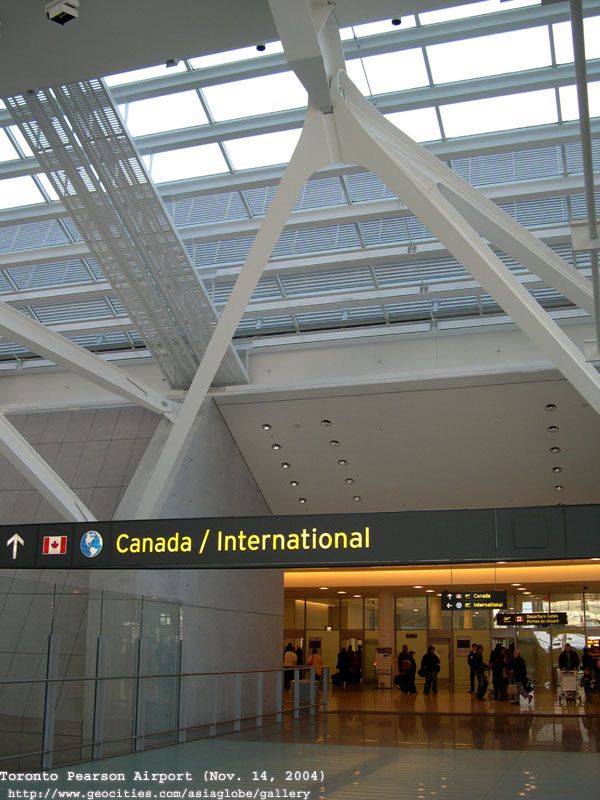
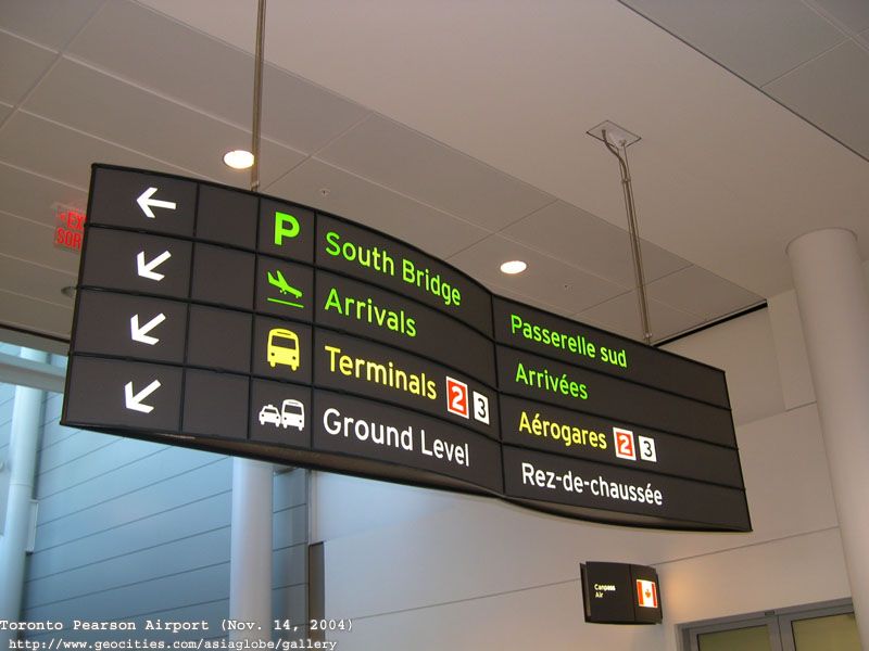
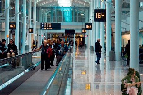
I'm a fan of the signs used at Pearson and I think that the TTC chould consider adopting it. The design is clean, simple and more importantly people can read it from a distance.

DSCN3761.jpg

DSCN3717.jpg

up-erin.jpg

AIN1218.jpg


The commission should also consider renaming the subway/LRT lines. Names like Eglinton Crosstown, Bloor-Danforth and Yonge-University-Spadina are a mouthful. I think that the best option would be changing the names to simple letters and numbers.

YUS becomes route A, represented by yellow.
BD become route B, represented by green.
Sheppard becomes route C, represented by purple.

Eglinton-Scarborough Crosstown LRT becomes route 1, represented by blue.
Sheppard LRT becomes route 2, represented by red.
Finch LRT becomes route 3, represented by brown.

I think this would be the best option. Especially when you consider that many people have no idea what the lines are actually called. I've lost count of the amount of times I've had to refer to our subway lines as "the green one", "the yellow u" and "that little purple one at the top".
 

Back
Top