SpadinaBus
Active Member
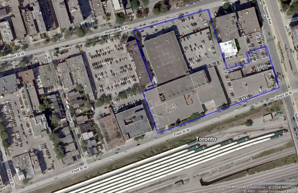
Considering that the transformation of both Front and Wellington continues at a frantic pace, I thought it was about time to open up a thread on the planning of the redevelopment of the Globe and Mail's site on Front Street W., backing on to Wellington St. West. Perhaps we can convince our very own Cabeman to post up an aerial of the site in this thread to give perspectives on the magnitude of the potential site.
It is my understanding that the Thomson family owns the site and potentially other lands down to Draper, but I am not sure. Some folks who contribute to this board appear to know what is being looked at now conceptually, so perhaps some teasing and discussion can take place. I believe the site has massive potential, so hopefully it will not be just your usual condo/ground floor retail concept - too boring and too easy. This site requires some innovative planning and I see it as a diamond point or gateway for the emerging King/Spadina and Wellington Place neighbourhoods.
It is my understanding that the Thomson family owns the site and potentially other lands down to Draper, but I am not sure. Some folks who contribute to this board appear to know what is being looked at now conceptually, so perhaps some teasing and discussion can take place. I believe the site has massive potential, so hopefully it will not be just your usual condo/ground floor retail concept - too boring and too easy. This site requires some innovative planning and I see it as a diamond point or gateway for the emerging King/Spadina and Wellington Place neighbourhoods.
")