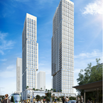
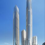
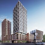
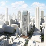
At last week's joint meeting of the Design Review Panels of the City of Toronto and of Waterfront Toronto, renderings were not the only depictions of the Hariri Pontarini Architects-designed Pinnacle One Yonge complex that were on display: there were also three physical models of the development at different scales for the panel members to consider, and there were diagrams that further detailed the phasing and programming of the complex. We are digging into those today as an addendum to our previous story. (If you have not read the earlier article, you may want to refer to it for the finer points: this article will be a quick overview of the supplementary materials.)
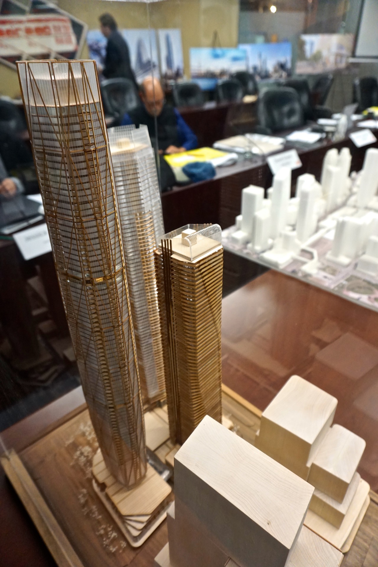 Pinnacle One Yonge scale model of Pinnacle One Yonge at the joint Design Review Panel meeting, image by Craig White
Members of the Design Review Panels get high-quality booklets with images and explanatory text, typically on coil-bound 11x17 inch printouts, several days in advance of the meeting. While both City Planning and the design teams make presentations to the panel in person before questions and comments begin, the earlier distribution of the booklets allow the members to better consider the proposals.
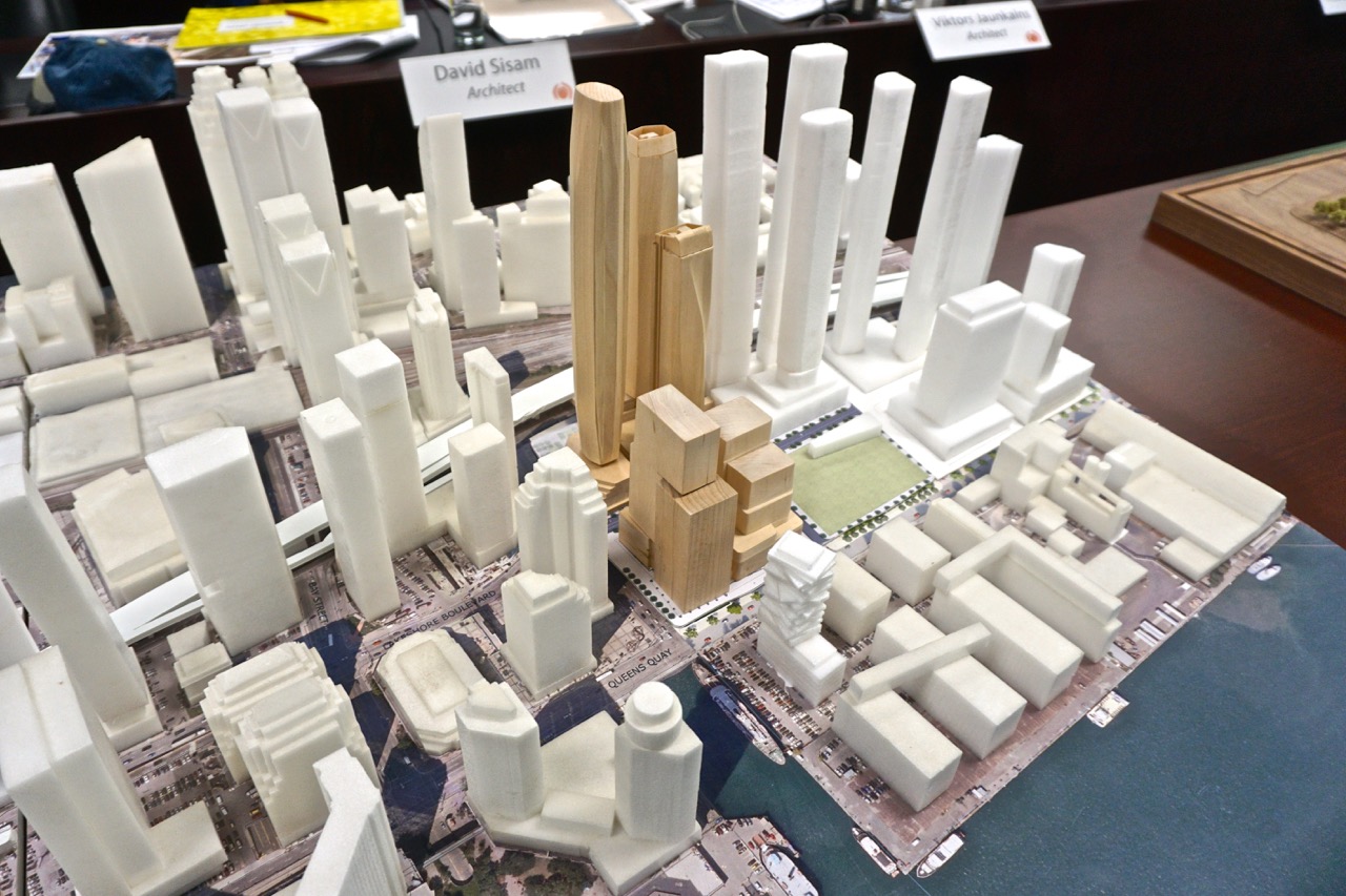 Downtown Toronto scale model of Pinnacle One Yonge at the joint Design Review Panel meeting, image by Craig White
Most Design Review Panel meetings do not include a display of physical models; what materials are presented are left up to the design teams to consider. Panelists do routinely comment on the quality of the materials that have been presented to them, both in terms of their thoroughness, or where they may have lacked enough information for the panelists to get a good feel for the proposal. In this instance, the panelists were quite pleased with the documentation, and especially happy to see the scale models.
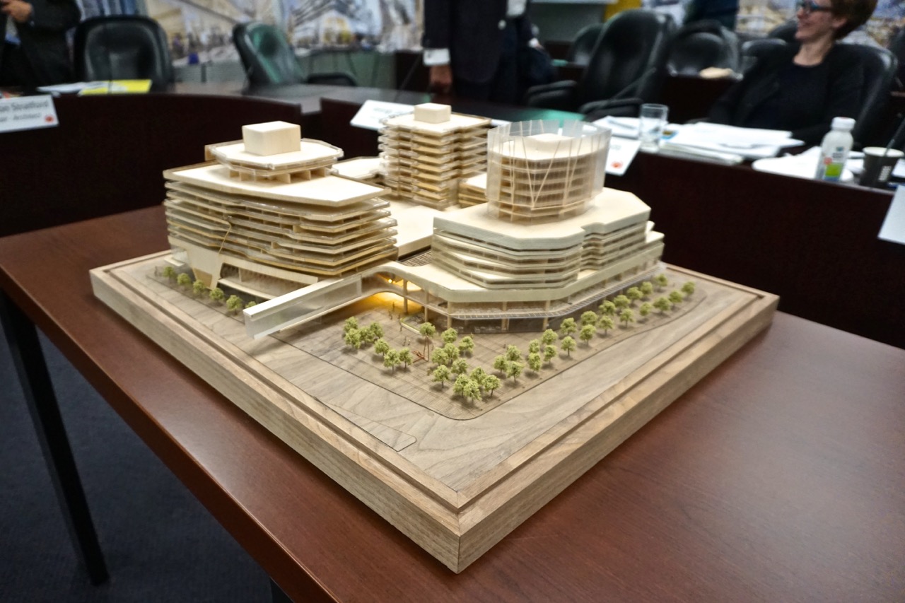 Podium scale model of Pinnacle One Yonge at the joint Design Review Panel meeting, image by Craig White
Along with the models being presented live, there were images included with the booklet, first this spin around the model showing each elevation…
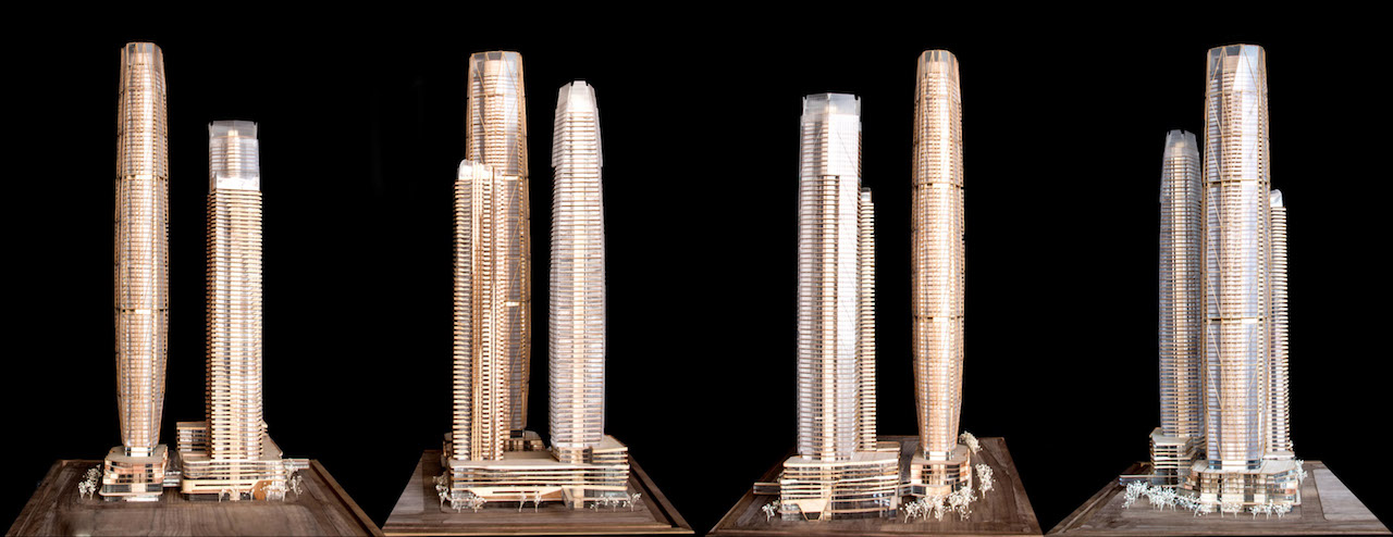 The model looking to the south, east, north, and west elevations, image courtesy of Pinnacle International
…and this close up, highlighting the diagrid-like wind channels on the tallest tower:
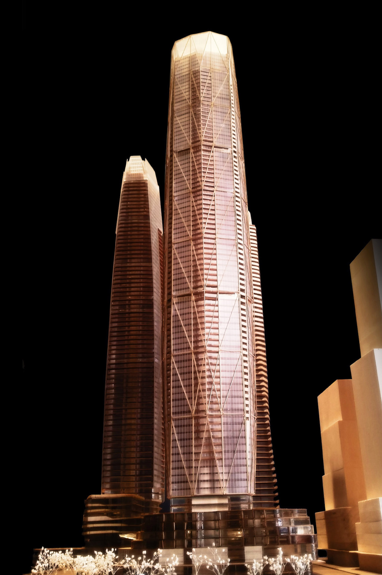 Looking east to Pinnacle One Yonge, image courtesy of Pinnacle International
While the renderings which we ran in the last article are meant to show off the beauty of the completed design in as close to a photo-realistic way as possible (on days with the best skies you can remember!), there are plenty of other diagrams presented to help explain aspects of the development.
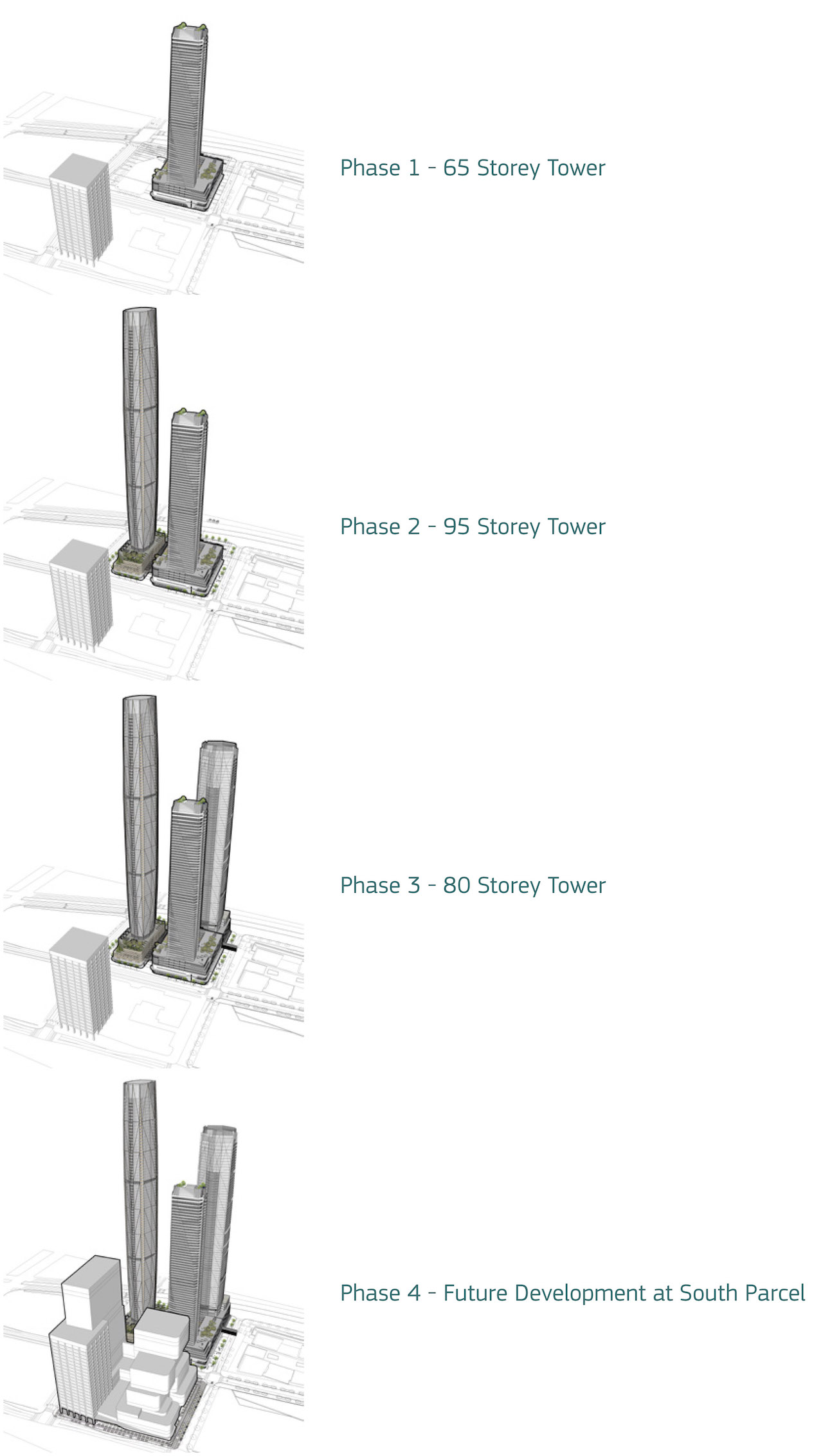 Phasing of the Pinnacle One Yonge development, image courtesy of Pinnacle International
While not exactly saying when it will all happen, the Phasing Diagram, of course, puts the timeline in order. Sections, meanwhile, give an idea of what the makeup of the floors will be in the towers:
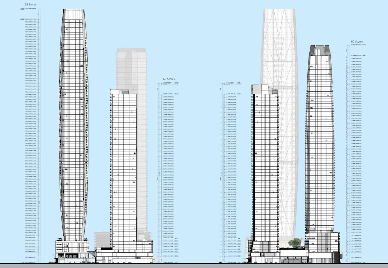 West to east, and south to north sections of Pinnacle One Yonge, image courtesy of Pinnacle International
More uncommonly, with this package an "exploded axonometric view" was included with extensive detailing to explain just how the development will be programmed:
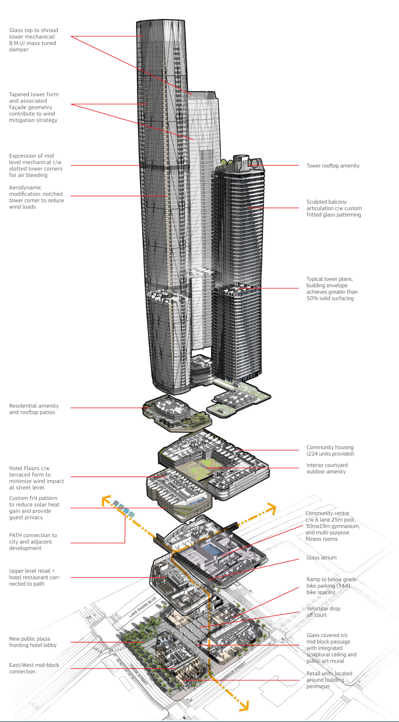 Exploded axonometric view of Pinnacle One Yonge, looking northeast, image courtesy of Pinnacle International
Clicking on any of the images makes them enlarge, but as UrbanToronto software prevents the ones in our stories from expanding beyond a certain size, our threads allow larger versions of the images to be seen. Click on the Projects & Construction thread link associated with the database file, below, if you want more detail! You can also get in on the conversation in that thread, or leave a comment in the space provided on this page.

 5.7K
5.7K 


