The University of Toronto has long been contemplating the improvement of the grounds of their main St. George Campus in Downtown Toronto, and recently launched a process to pick a design team to create a design. To that end, the Landmark Quality Innovative Design Competition provided four teams with a brief outlining goals that the university expects to be met at the end of the process, while allowing the teams room to interpret the ways to meet those goals.
Last night, the four competing teams' entries were revealed in a presentation at Convocation Hall, with each proposing varying approaches to updating and rejuvenating the campus' exterior features. With the proposals now public, we bring you an overview of the entries, noting each design's most prominent elements.
 Architects and U of T administration take the stage during the presentation, image by Craig White
The four entries were designed to meet the University's central aim of improving the campus experience, which sets out eight design principles for the proposals to meet. The revitalization project's principles seek to create a campus that is greener, more pedestrian-friendly, and can support large events. In addition, the project's goals include removing car traffic (while maintaining service access), removing surface level parking, and creating more public space. Finally a more comprehensive and coordinated wayfinding system is also prioritized.
Note: the images below can be viewed in higher resolution—and in full sets—on the U of T's main website for the competition.
DTAH + Michael Van Valkenburgh Associates
The DTAH + Michael Van Valkenburgh Associates proposal prioritizes an efficient, versatile, and user-friendly environment for pedestrians and cyclists on campus. New, durable paving stones would create separated cycling and pedestrian corridors, allowing for safe and quick travel throughout the campus.
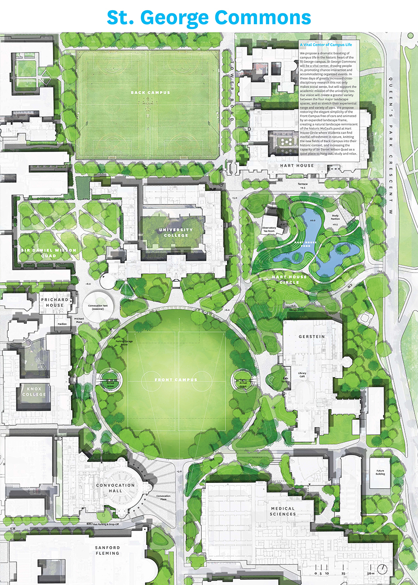 Overview of the DTAH + Michael Van Valkenburgh Associates proposal, image courtesy of U of T
In addition to an infusion of new greenery throughout the campus—designed to highlight southern Ontario's rich fall colours—the proposal features two major additions to the landscape. In a nod to the Taddle Creek pond that once occupied the site, a new Hart House pond would provide a calm and relaxing place to study and socialize, while the versatility of the paving would allow for a seasonal skating rink on Prichard Plaza.
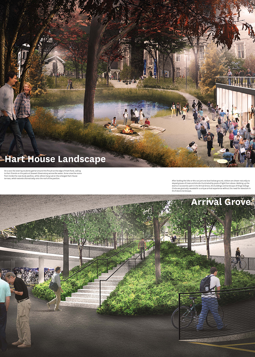 The pond (above) and parking entrance (below), image courtesy of U of T
The removal of above-ground parking would be offset by a new underground facility (beneath King's Circle) featuring covered parking for cars and bikes—a feature demanded by the university. The impact of garage entrances and exits on the east and west side of King's Circle would be minimized by conical greenery that shrinks the garage's circular exterior footprint.
The seasonal convocation tent that occupies Prichard Plaza would also be more gracefully accommodated, with the revamped space serving dual purposes depending on the season.
The most visually striking element of PUBLIC WORK's proposal would see the southwest corner of the King's Circle turf lifted to allow for a variety of programming to take place at the new, quasi-subterranean public hub, which would fronted by a plaza in front of the Medical Sciences Building.
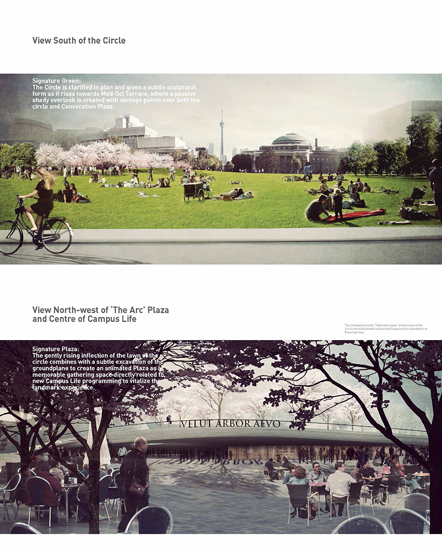 PUBLIC WORK's take in King's Circle, image courtesy of U of T
In addition to new greenery throughout campus, the most prominent of which would be the cherry blossom trees on the new southwest elevation of King's Circle, the Sir Daniel Wilson Quad would be re-made into the "Reaching Garden" (labeled below). The gardens are designed to slow down hectic student life by introducing a maze-like paving pattern surrounded by flowers and greenery.
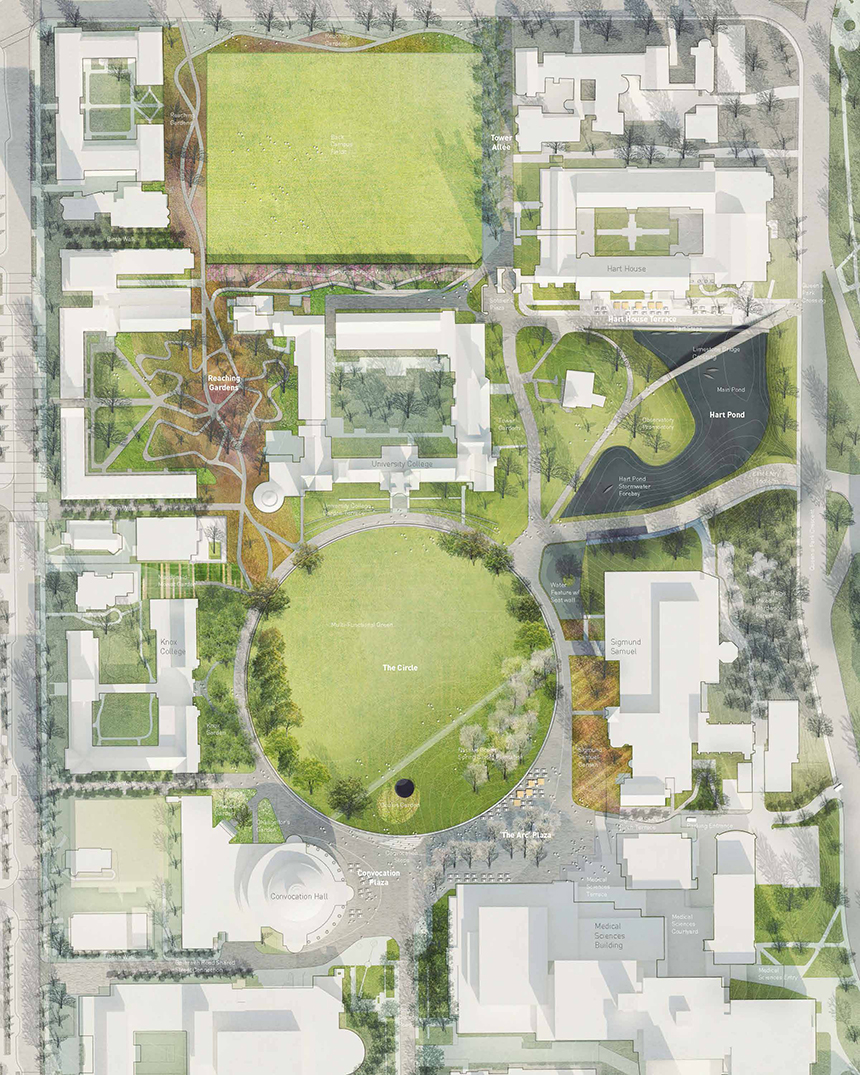 The 'Reaching Gardens' remake the Sir Daniel Wilson Quad, image courtesy of U of T
As in the DTAH proposal, a new Hart House pond would be introduced to the campus. In this case, a slightly larger pond would serve as more of a showpiece for the campus, while a bridge over the pond would help facilitate walking and cycling (above), smoothing out relatively sharp changes in grade to a gentle curve.
A parking garage under King's Circle would replace current above-ground parking, while the PUBLIC WORK proposal also considers the possibility of moving sporting facilities—including an Olympic-size swimming pool, from the current Athletic Centre on Spadina to directly underneath King's Circle. According to PUBLIC WORK, the "generator" of activity would bring new vibrancy to the heart of campus.
Janet Rosenberg & Studio + architectsAlliance + ERA Architects
As with the previous proposals, enhanced greenery and an underground parking garage are central features of the plan. Distinguishing this concept, however, are some the plan's unique uses of space, particularly at King's Circle and Hart House.
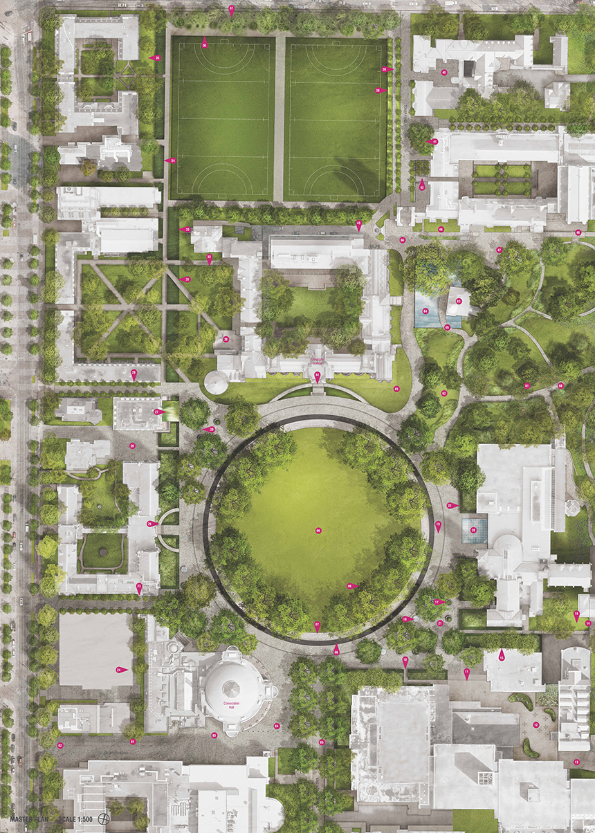 The Janet Rosenberg & Studio + architectsAlliance + ERA Architects layout, image courtesy of U of T
Surrounding King's Circle, a slender ring would allow for skating in the winter, providing one of the city's relatively few outdoor long-track facilities, while fostering a distinctly Canadian ambiance (below). Framing the showpiece skating rink, a continuous granite bench wraps around King's Circle, inviting passerby to linger at the centre of the campus.
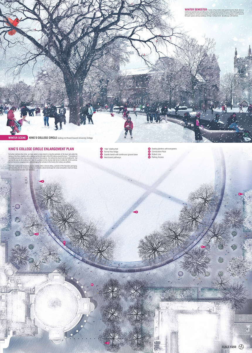 The skating area in winter, image courtesy of U of T
In front of Hart House, a small but accessible reflecting pool (seen in the layout above) would provide a relaxing social space for students, but no larger pond would be introduced to the area. Instead, the green space would be revamped into a more inviting environment, featuring the new paving that would replace the campus' asphalt-dominated roadways.
The plan also aims to minimize conflicts between different modes of transportation by fostering informal cycling paths—based on currently popular routes—that allow for a cohesive balance of cyclists and pedestrians, while eliminating car traffic.
KPMB Architects + Michael Van Valkenburgh Associates + Urban Strategies
This plan features a particularly diverse array of greenery, which aims to "stretch the seasons" by combining early-flowering Spring trees with species that stay green well into the Fall. A welcoming outdoor ambiance would be maintained for a longer period, with the campus already in bloom by the time students finish their second semester in early May.
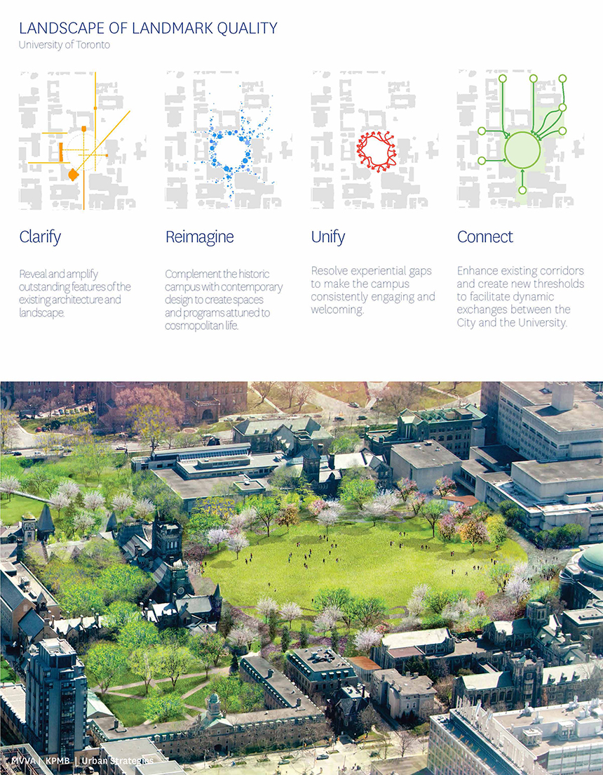 Aerial rendering of the plan, image courtesy of U of T
In this design, pedestrians and cyclists would share the same richly textured new surface, mixing modes of transportation. While this concept may slow travel times to some degree, the more informal context can also serve to create a relaxed setting. A slower, friendlier, ambiance is privilege in the design, with the subtly coloured paving and rich greenery creating an environment that the renderings suggest is more conducive to relaxed strolls than fast-paced commutes.
A cleaner sight-line towards Soldiers' Tower is created by extending Tower Road to the south and planting a row of trees along its eastern edge. However, two large, old trees would have to be removed in order to facilitate the new aesthetic.
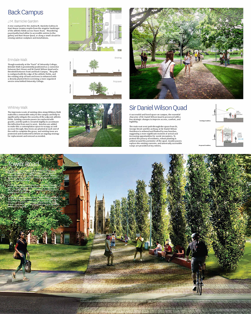 The new sightline to Soldiers Tower, image courtesy of U of T
While this concept does not feature a new Hart House pond, it does introduce a bridge that spans the length of the uneven terrain, fostering an easier flow of movement into the main campus while preserving a slower-paced, communal space beneath.
**
The University of Toronto is inviting members of the public to share their input regarding the designs. You may want to get a fuller picture of the proposals here first, and then answer this survey available on the project's official website.
Meanwhile, members of the UrbanToronto Forum are already discussing the proposed designs, with the DTAH/MVVA and Janet Rosenberg/aA/ERA proposals so far receiving the most support. What do you think? Feel free to share your thoughts regarding the designs by contributing to the Forum, or commenting in the space below.

 9.9K
9.9K 


