News   Nov 04, 2024
 375     4 
News   Nov 04, 2024
 524     0 
News   Nov 04, 2024
 478     0 

Wayfinding signage ideas

I like what you’re doing, but the TTC typeface isn’t really suitable for extended use on directional signage, don’t you agree?
 
One item I would add to the directional signs individual bus or streetcar are the next two vehicle departure times. For example, 510 2 & 7 minutes and 127 5 & 25 minutes. So that when one is on the subway platform, they can either hurry up or take their time getting to the transfer point.
 
Since the TTC advisory panel is actually taking email suggestions,

I've decided to email them about improving wayfinding and making the information more coherent. What do you guys think about my photoshopped examples? Are they clear or do they spew too much information at once?

How these signs are improved over the current standard:
-Information that is normally crammed is divided and neatly organized into exits by letters.
-It illustrates exactly how many exits there are
-Wheelchair users can instantly identify which exit is accessible and which is not (without having to walk all the way there to find the exit is N/A)
-Wheelchair users are given numbers to find the correct elevator that will take them to their destination

For reference, the last image is the standard that is currently in use.

The photos are from FlickR, not mine.
finchsign.jpg


osgoode.jpg


osgoodeold.jpg
 
I think you should use symbols for things like "Taxi" and a "Streetcar" symbol for 501 Eastbound, and some kind of stylized symbol for "regional buses".
 
With SEPTA, any rail line or route is now a "METRO". Toronto should do the same. Whether they be the legacy streetcars, legacy heavy rail subway, new light rail, or new whatever the Ontario Line trains will be, ALL branded as "METRO". Along with the priorities they should have over the single-occupant, or 5 people inside them, motor vehicles.
 
Other than costing us money to rebrand everything, what would be gained by doing that?

We don't need rebranding. We don't need new liveries or logos or any of that nonsense. The idea that we do is the product of hack marketing students and overpaid Metrolinx consultants. All we need a transit system that works, that runs reasonably on time and doesn't get bogged down in traffic. I, and I'm certain most people, wouldn't care if the vehicle I got showed up in factory white as long as it ran reliably.
 
Wayfinding and branding in Toronto is an absolute mess.

The prime example of this in my mind are the new Line 5 stations. Built by Metrolinx, but it will be part of the Toronto "Subway" system. The brains over at Metrolinx decided it was not important to keep the signage consistent between existing TTC Subway stations and these new stations.
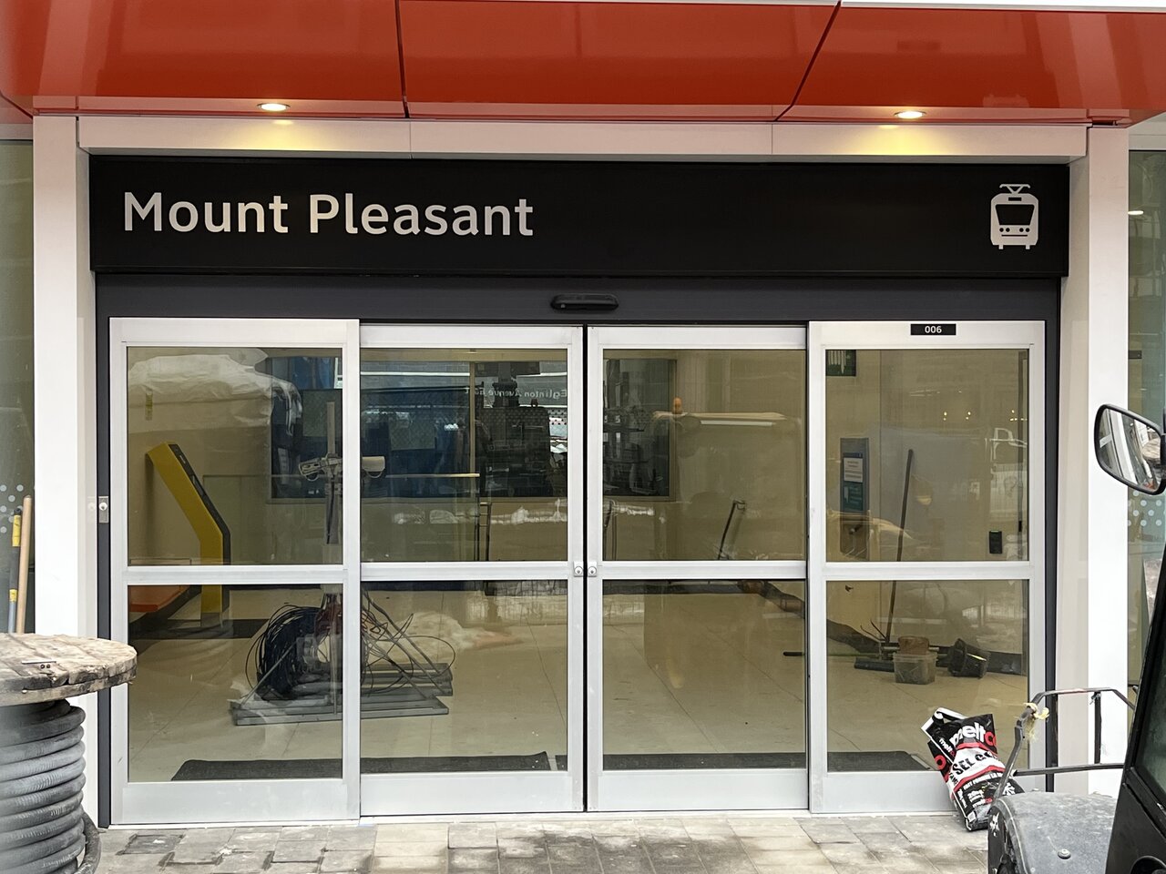
3d8caebe-ec5f-4408-8af2-4d2dd53f7692-jpeg.454360

(photo by gregv)

Really? Just the name and a picture of a light rail train? You couldn't even be bothered to write "station" after the name if your going to be diffrent...

This was the TTCs last attempt at station signage:
1683233137886.png


But a huge number of downtown entrances are signed extremely poorly:

1683233216387.png
1683233258002.png
1683233338064.png
1683233487155.png
1683233593953.png
1683233679862.png
1683233820202.png


I could go on, but even in this snippet you can see the wayfinding, even just the outside signage, is not only all over the place but also quite lacking. And no, the TTC logo alone is not enough. Sure, if your an urbanist local you can spot the logo 100 miles away. Tourist? No. Occasional transit user from the suburbs? Might just call an uber. There is absolutely no reason why every single subway station entrance can't have a BOLD and CONSISTENT sign. Just look at the London Underground. Hell of a lot older and larger then the Toronto Subway and yet...

1683234135400.png
1683234191279.png
1683234245505.png
1683234371897.png
1683234430714.png
1683234622312.png
1683234677620.png


With some exceptions, the Underground station entrances are always bold, always obvious, always front facing.

Can Toronto do better?
 
Wayfinding and branding in Toronto is an absolute mess.

The prime example of this in my mind are the new Line 5 stations. Built by Metrolinx, but it will be part of the Toronto "Subway" system. The brains over at Metrolinx decided it was not important to keep the signage consistent between existing TTC Subway stations and these new stations.

3d8caebe-ec5f-4408-8af2-4d2dd53f7692-jpeg.454360

(photo by gregv)

Really? Just the name and a picture of a light rail train? You couldn't even be bothered to write "station" after the name if your going to be diffrent...

This was the TTCs last attempt at station signage:
View attachment 474218

But a huge number of downtown entrances are signed extremely poorly:

View attachment 474219View attachment 474220View attachment 474221View attachment 474222View attachment 474223View attachment 474224View attachment 474225

I could go on, but even in this snippet you can see the wayfinding, even just the outside signage, is not only all over the place but also quite lacking. And no, the TTC logo alone is not enough. Sure, if your an urbanist local you can spot the logo 100 miles away. Tourist? No. Occasional transit user from the suburbs? Might just call an uber. There is absolutely no reason why every single subway station entrance can't have a BOLD and CONSISTENT sign. Just look at the London Underground. Hell of a lot older and larger then the Toronto Subway and yet...

View attachment 474229View attachment 474230View attachment 474232View attachment 474234View attachment 474235View attachment 474236View attachment 474237

With some exceptions, the Underground station entrances are always bold, always obvious, always front facing.

Can Toronto do better?
The equivalent to London Underground's signage would mean:
1. some sort of "rapid transit" logo
- Canadian example: Montreal has the metro logo and not STM's at their subway station entrances)
2. only station name is shown, no line numbers
- Metrolinx's signage already ommits line numbers.
 
The equivalent to London Underground's signage would mean:
1. some sort of "rapid transit" logo
- Canadian example: Montreal has the metro logo and not STM's at their subway station entrances)
2. only station name is shown, no line numbers
- Metrolinx's signage already ommits line numbers.

These points don't excuse Metrolinx or the TTC.

- The Metrolinx "T" logo is extremely generic.
- This logo will not be present at TTC owned stations which still use the TTC logo.
- There will still be a complete diffrent look between TTC and Metrolinx owned stations.
- Many stations, as seen above, have basically no modern signage.
- This is personal opinion, but I think adding the word "Station" to the end of the names would help.
- The line numbers are more relevant to Toronto because we have simple numbered lines and colours, and not very many interchange stations. Even still, some London Underground interchange stations try and advertise diffrent services in a messy way. If we have simple names, why not advertise this?
1683237751732.png


I don't even get caught up with the lack of number lines on the signs anymore. I would be willing to get rid of them if we made our signs a bolder colour then black.
Why don't we go back to red, and add station to the end. The most important thing is making the entrance obvious, not hidden in the grey nothingness of downtown buildings.
 
The equivalent to London Underground's signage would mean:
1. some sort of "rapid transit" logo
- Canadian example: Montreal has the metro logo and not STM's at their subway station entrances)
2. only station name is shown, no line numbers
- Metrolinx's signage already ommits line numbers.
Why? London has the roundel with the text underground over it, it doesn't have a rapid transit logo. Having the TTC logo, just bigger and more prominent, would be completely sufficient.

Metrolinx's T logo is a solution in search of a problem.
 
I don't love Metrolinx's proposed T logo. Beside being very bland, it's also not obvious to me that "T" stands for "transit", especially in a city named Toronto. However, I do agree that some consistent, region-wide logo or symbol that designates "this is a transit station/stop" is very useful. Personally, I don't see why that can't be the TTC logo. It's iconic for the city, and can't be confused for something else. Of course, using the logo outside of the city limits is where this gets complicated. But if we're truly going to have region-wide fare integration, as keeps getting promised, then I really think having just one brand identity for all transit in the region is the way to go - and so why not use something we're all already familiar with, which is TTC and its logo?
 

Back
Top