News   Jul 22, 2024
 270     0 
News   Jul 22, 2024
 1.1K     0 
News   Jul 22, 2024
 547     0 

URBAN TORONTO LOGO

D

dencity

Guest
Whew!, We'll I finally finished it tonight. Here is my concept for the new logo. I'll probably end up tweaking here and there.

Color Scheme: Black, Dark Grey, Red

logo.jpg


Hope you guys like it!


dencity
 
Nice work man! I was going to do something similar, but maybe with the buildings tapering in (a inverse "V" shape).
Maybe with blue and white incorporated as well, city colours.

The only think I don't like is the font used for Urban Toronto (maybe something simpler, more sophisticated). But the logo itself is great.

Do you have other variations?
 
Great work dencity.

Rather than submit alternatives, I suggest we build on this... if you are willing to consider some suggestions.

1. The font choice is perfect as is the uppercase. Interesting that you bolded urban rather than Toronto...

2. Colour

I'm kinda torn about the colour scheme.. on one hand, I wish it had more punch than black/grey (as you may know I have a thing about "lack of colour")... on the other hand, too much colour might make it look too much like cheap clip art, since the drawing style caricatures the skyline... I'm conflicted.

Since the logo will likely be used most often as a gif than faxed... I think it definitely needs a shot of colour. We don't really need a b/w logo though this would lend itself nicely to a b/w version anyway.


3. The Maple Leaf
I'm ambivalent about this but this idea is definitely overused. Everyone knows Toronto is in Canada (so far!) and I am extremely patriotic... but I think it is superfluous.

4 suggestions:

1. Change the font colour so the name jumps. Perhaps you could keep the bold grey "URBAN" and pick a colour for TORONTO.

2. Try other one colour versions for the skyline

3. Try one that hints at the actual colour of each building (not literal)

4. Ignore these suggestions 'cause it's great.

This is getting picky, but the only thing missing from the buidling icons is something historical. It's cliche but some of the Royal York would look very nice front and centre. ;)
 
dencity:

Do you still have this in layers? It would be handy to be able to super the logo on stuff without the background... you know, when we start to merchandise this baby!
 
Even the use of one extra colour in TORONTO ("URBAN TORONTO") gives it a bit of punch.

logosuggest.jpg


I'll shut up now.....
 
Awesome input, guys! Thanks for the great ideas. I was already thinking of color last night, but was too tired.

SD:I had Birch and/or Baskerville font in mind as well.

3D: The leaf will be gone, I knew someone would say something about it. Your on point with the clipart thing, we got to color it without losing the sketchbook look.

I might indv. colorize each building just to see what it looks like.

Get ready for a bunch more variations! I'll post later today.
Also, it was done in Illustrator so we can could blow it up huge, without pixelating.

Cheers,

dencity
 
Don't change the font if you're staying with the sketchbook style... it's loose, approachable and informal and we are not IBM.

A crisper, more formal font would exaggerate the skyline caricature too much by comparison.

Just add some colour!

P.S. Baskerville is a serif font if I recall... the one you chose is better.
 
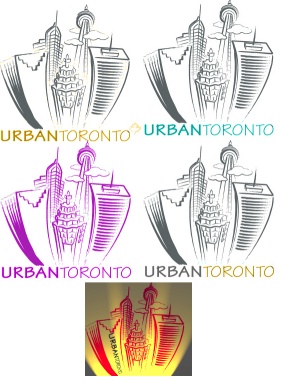
Here is a batch of variations. 3D, the Gold and Grey color scheme is starting to grow on me. Suttle color changes, do make a difference, thanks!

-We were right about the indv. colored buildings...def. clipart.
-Anymore suggestions would be helpful.

Thanks

newcolors.jpg
 
Its relly very good dencity. just a sujestion-a little bit of skydome peeking out from behind the boxy building(fcp) in the bottom right corner.
 
Thanks GAW,

I'm thinking if I put in the skydome on the right, and the old city hall on the left, we could cover most of toronto's great architecture.
 
WOW ! Excellent work dencity.

I really like the font on the last one. I will wait till the end of March for more entries(including mine) then we will have a vote to pick our new logo.
 
Good Stuff! I need to make some more changes on mine, aswell.

dencity
 
Ooh Im exited too see Dencity after the changes aswell as BC and all the others that put in a logo. i hope there will be lots of good one's.
 
I like the blue variation best.

Adding colours needn't look clipart-y.
 

Back
Top