News   Dec 18, 2024
 1.5K     3 
News   Dec 18, 2024
 530     0 
News   Dec 18, 2024
 678     0 

U of T: Rotman Expansion/Ctr for Jurisdictional Advantage and Prosperity (KPMB)

From this day here:

6479292393_c0ff3d041e_b.jpg

6479289715_86ac78d44e_b.jpg

6479286983_709f6926d8_b.jpg
 
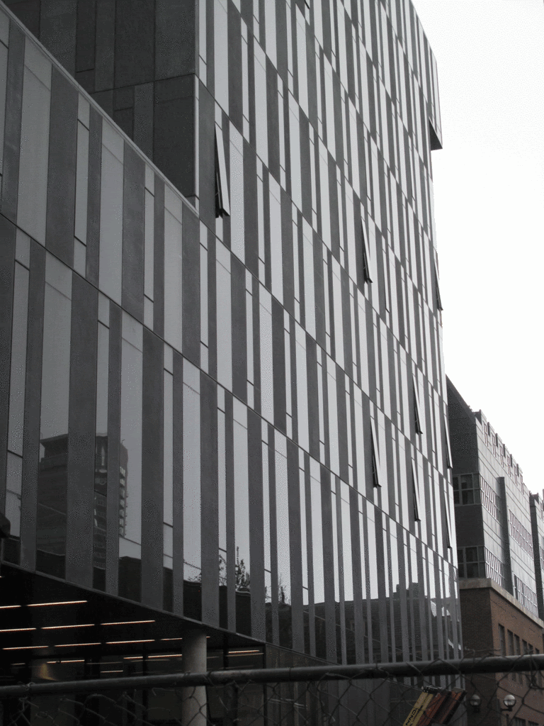
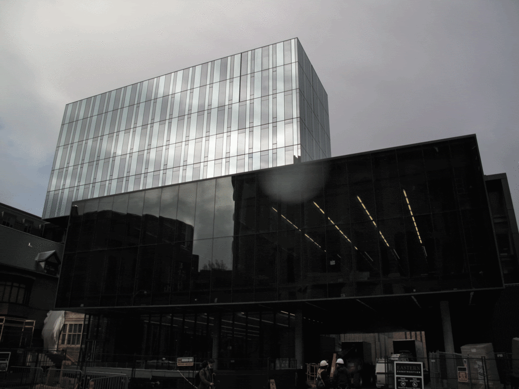
I like the box part that seems to flat above and its blue vertical strips of mirrored cladding, but having walked past this thing numerous times, I can't help but feel it's ghastly at ground level with absolutely no articulation.
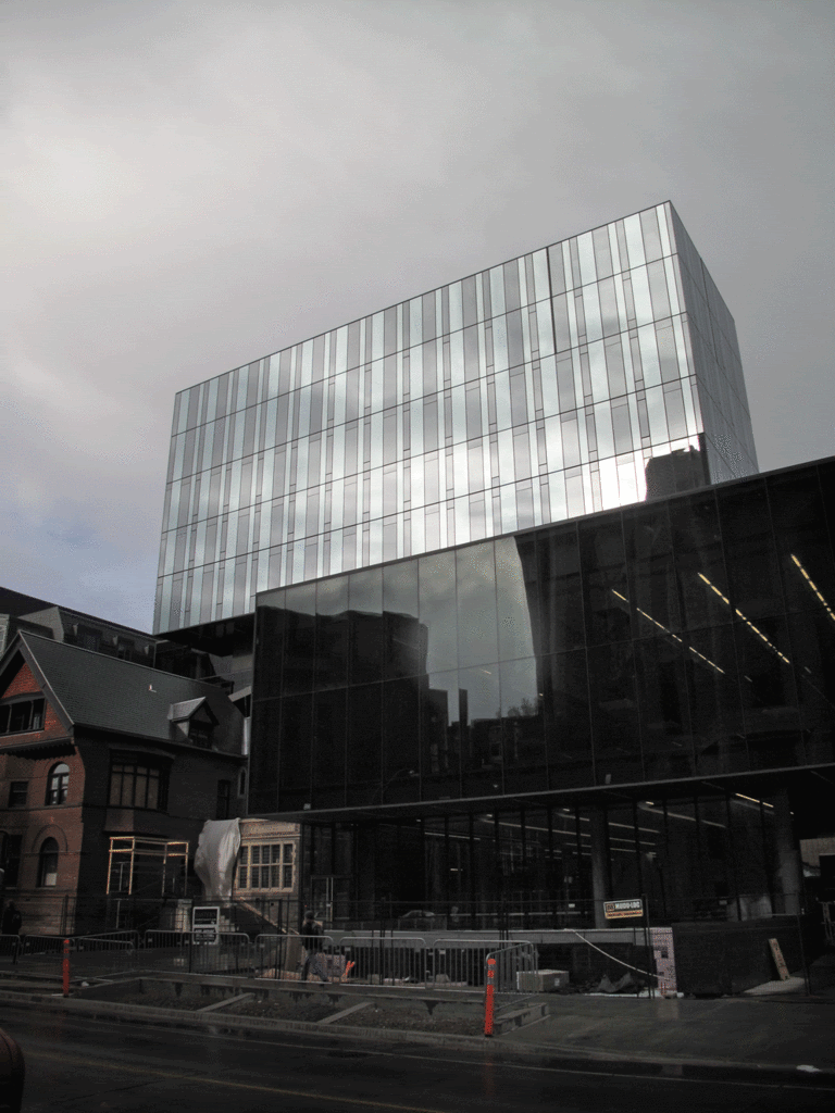
 
I like the box part that seems to flat above and its blue vertical strips of mirrored cladding, but having walked past this thing numerous times, I can't help but feel it's ghastly at ground level with absolutely no articulation.

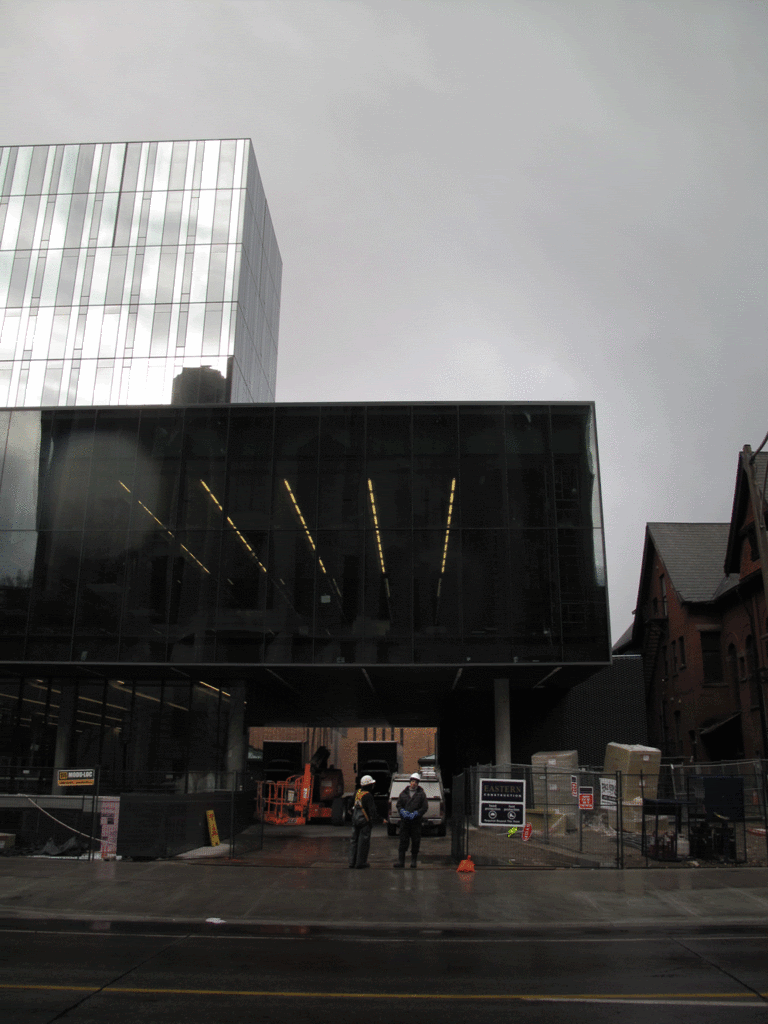
Agreed. It doesn't meet the street so much as fall on it.

And KPMB now has two projects, on the same block, that show nothing but disdain for the existing Victorian they're wrapped around. How did Koerner Hall turn out so well, I wonder?
 
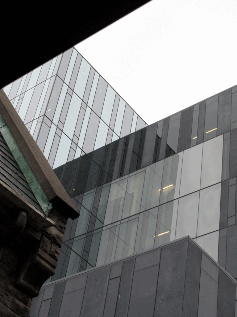
Interesting you guys think that. I quite like the building; I think it both hugs the area and sits back unobtrusively, while at the same time announcing itself really nicely. I think the top half especially is so tasteful. I love the glass columns.
 
They ended up making the house fit in rather well with the new, ultra modern structure. A new black shingled roof along with the very dark windows/window trip adds a bit of continuity. Really just not having it look like a dump adds to the whole project.
 
Toronto needs more buildings like this and Bridgepoint Health, which look better under overcast skies. Like with Bridgepoint, the grey sky seems to allow the alternating colours on this building to come into contrast.
 
The reflective glass facade is very well executed. I agree with a couple of above comments that it doesn't necessary meet the street well, but I think it visually serves its purpose as an institutional/academic building. Overall it's a solid addition to U of T's rich collection of buildings.
 
Last edited:
Toronto needs more buildings like this and Bridgepoint Health, which look better under overcast skies. Like with Bridgepoint, the grey sky seems to allow the alternating colours on this building to come into contrast.

Grey contains all the other colours, so it's the most versatile, understated neutral. Grey skies with diffused light are ideal conditions for appreciating the architectural details of buildings - the subtle tonal variation between the glass on this building being a good example. In the middle of the day, with a bright blue sky, that wouldn't be possible.
 
I think this building is really attractive, and I think it fits into the context here really well.
on its own, it looks nice, but it doesn't blend well at all with the original Rotman building it's connected to.
They ended up making the house fit in rather well with the new, ultra modern structure. A new black shingled roof along with the very dark windows/window trip adds a bit of continuity. Really just not having it look like a dump adds to the whole project.
I do like how they've fixed up the house, but it still feels really out of place to me. I don't like the way it connects physically.
It didn't look like all that interesting of a house in the first place, to be honest.
 
on its own, it looks nice, but it doesn't blend well at all with the original Rotman building it's connected to

Well, granted, I haven't seen that, on account of currently not living in Toronto. But, having spent nine years on that campus, I'm really familiar with the adjacent building and I can imagine that the two would clash some.

I do think, though, that by recessing the upper part of the building it sits back from the street, is less imposing, and effectively ensconces itself much better. That's mainly what I was referring to.
 
on its own, it looks nice, but it doesn't blend well at all with the original Rotman building it's connected to.

The only way they could have blended in with the Zeidler building would be to try to build something just as ugly. (Would be hard.) I think in this case they made the right choice: ignore it, and build something nice.
 

Back
Top