Northern Light
Superstar
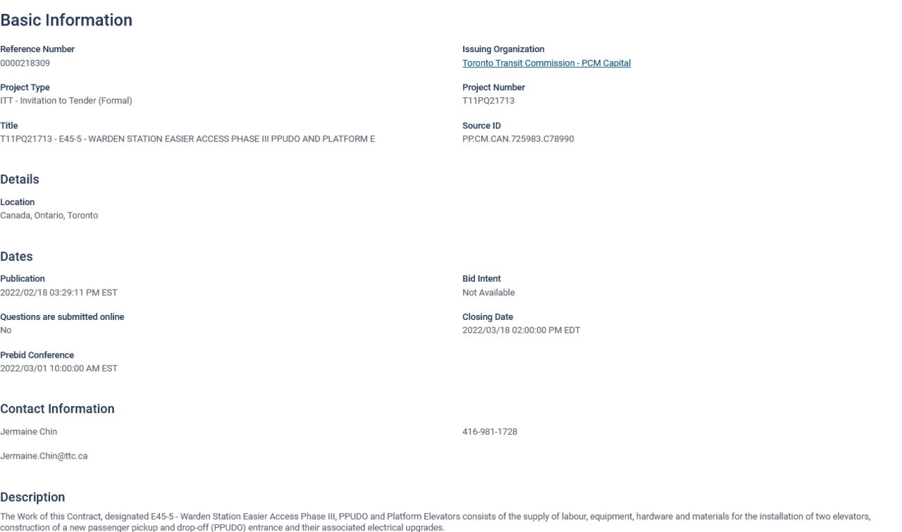
Warden Station, Easier Access tender is out (phase 1)

A couple of reports on Easier Access are heading to next week's TTC Meeting.
One is on Museum Station, which will also gain a Second Exit; the other is on High Park.
In respect of the former, there is the report:
From the above:
View attachment 390977
View attachment 390978
The report on High Park Station is here:
So much for uniformity with the design scheme at Museum.
This is why I wish they had kept the blue and beige tiles. So much easier to replace in instances like this when they are doing major renovations to the station.
?
Are there renders that I missed? How do we know what finishes will be used in this project?
Don't remember seeing this render of High Park before. (Apologies, the image is very low quality on the TTC site - not much I can do about that!)
https://www.ttc.ca/about-the-ttc/projects-and-plans/High-Park-Station
View attachment 393291
I wonder what the point of the larger building is, especially as less busses go to High Park station than previous.
They run 506 shuttles there sometimes, but are you suggesting the streetcar route would be expanded from High Park loop to High Park station?
Looks as if it's on a similar scale as the rebuild of Summerhill, who's headhouse is getting a similar enlargening.I wonder what the point of the larger building is, especially as less busses go to High Park station than previous.
Also ancillary space is always in demand - cleaning, storage, station staff offices - as well as retail units. Could make the station feel less cramped, tooLooks as if it's on a similar scale as the rebuild of Summerhill, who's headhouse is getting a similar enlargening.


